Related Research Articles

A set of primary colors or primary colours consists of colorants or colored lights that can be mixed in varying amounts to produce a gamut of colors. This is the essential method used to create the perception of a broad range of colors in, e.g., electronic displays, color printing, and paintings. Perceptions associated with a given combination of primary colors can be predicted by an appropriate mixing model that reflects the physics of how light interacts with physical media, and ultimately the retina.
Magenta is a color that is variously defined as pinkish-purplish-red, reddish-purplish-pink or mauvish-crimson. On color wheels of the RGB (additive) and CMY (subtractive) color models, it is located exactly midway between red and blue. It is one of the four colors of ink used in color printing by an inkjet printer, along with yellow and cyan, to make all other colors. The tone of magenta used in printing is called "printer's magenta". It is also a shade of pink.
Web colors are colors used in displaying web pages on the World Wide Web, and the methods for describing and specifying those colors. Colors may be specified as an RGB triplet or in hexadecimal format or according to their common English names in some cases. A color tool or other graphics software is often used to generate color values. In some uses, hexadecimal color codes are specified with notation using a leading number sign (#). A color is specified according to the intensity of its red, green and blue components, each represented by eight bits. Thus, there are 24 bits used to specify a web color within the sRGB gamut, and 16,777,216 colors that may be so specified.

Complementary colors are pairs of colors which, when combined or mixed, cancel each other out by producing a grayscale color like white or black. When placed next to each other, they create the strongest contrast for those two colors. Complementary colors may also be called "opposite colors".
In the visual arts, color theory is the body of practical guidance for color mixing and the visual effects of a specific color combination. Color terminology based on the color wheel and its geometry separates colors into primary color, secondary color, and tertiary color. The understanding of color theory dates to antiquity. Aristotle and Claudius Ptolemy already discussed which and how colors can be produced by mixing other colors. The influence of light on color was investigated and revealed further by al-Kindi and Ibn al-Haytham (d.1039). Ibn Sina, Nasir al-Din al-Tusi, and Robert Grosseteste discovered that contrary to the teachings of Aristotle, there are multiple color paths to get from black to white. More modern approaches to color theory principles can be found in the writings of Leone Battista Alberti and the notebooks of Leonardo da Vinci. A formalization of "color theory" began in the 18th century, initially within a partisan controversy over Isaac Newton's theory of color and the nature of primary colors. From there it developed as an independent artistic tradition with only superficial reference to colorimetry and vision science.

This is an index of color topic-related articles.

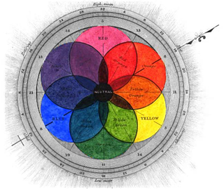
A color wheel or color circle is an abstract illustrative organization of color hues around a circle, which shows the relationships between primary colors, secondary colors, tertiary colors etc.

RYB is a subtractive color model used in art and applied design in which red, yellow, and blue pigments are considered primary colors. Under traditional color theory, this set of primary colors was advocated by Moses Harris, Michel Eugène Chevreul, Johannes Itten and Josef Albers, and applied by countless artists and designers. The RYB color model underpinned the color curriculum of the Bauhaus, Ulm School of Design and numerous art and design schools that were influenced by the Bauhaus, including the IIT Institute of Design, Black Mountain College, Design Department Yale University, the Shillito Design School, Sydney, and Parsons School of Design, New York.

A secondary colour is a color made by mixing of two primary colours in a given colour space.

Slate gray is a gray color with a slight azure tinge that is a representation of the average color of the material slate. As a tertiary color, slate is an equal mix of purple and green pigments.

Buff is a light brownish yellow, ochreous colour, typical of buff leather. Buff is a mixture of yellow ochre and white: two parts of white lead and one part of yellow ochre produces a good buff, or white lead may be tinted with French ochre alone.

Blue-green is the color that is between green and blue. It belongs to the cyan family of colors.
Rose is the color halfway between red and magenta on the HSV color wheel, also known as the RGB color wheel, on which it is at hue angle of 330 degrees.

A tertiary color or intermediate color is a color made by mixing full saturation of one primary color with half saturation of another primary color and none of a third primary color, in a given color space such as RGB, CMYK or RYB (traditional).
Varieties of the color red may differ in hue, chroma or lightness, or in two or three of these qualities. Variations in value are also called tints and shades, a tint being a red or other hue mixed with white, a shade being mixed with black. A large selection of these various colors are shown below.
The color magenta has notable tints and shades. These various colors are shown below.

Plum is a purple color with a brownish-gray tinge, like that shown on the right, or a reddish purple, which is a close representation of the average color of the plum fruit.

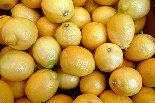
Citron is a dark lemon color similar to that of the fruit citron. As a tertiary color on the RYB color wheel, it is an equal mix of orange and green pigments.
References
- ↑ RGB approximations of RYB tertiary colors, using cubic interpolation. "RYB RGB conversion". Archived from the original on 2013-06-28. Retrieved 2012-12-29. The colors displayed here are substantially paler than the true colors a mixture of paints would produce.
- ↑ William J. Miskella, 1928, Practical Color Simplified: A Handbook on Lacquering, Enameling, Coloring And Painting, pp
- ↑ John Lemos, 1920, "Color Charts for the School Room", in School Arts, vol. 19, pp 580–584