Chartreuse | |
---|---|
Color coordinates | |
Hex triplet | #80FF00 |
sRGB B (r, g, b) | (128, 255, 0) |
HSV (h, s, v) | (90°, 100%, 100%) |
CIELChuv (L, C, h) | (90, 123, 119°) |
Source | On the RGB color wheel, Chartreuse is defined as the color halfway between yellow and green. |
ISCC–NBS descriptor | Vivid yellowish green |
B: Normalized to [0–255] (byte) |
Chartreuse (web color) | |
---|---|
Color coordinates | |
Hex triplet | #7FFF00 |
sRGB B (r, g, b) | (127, 255, 0) |
HSV (h, s, v) | (90°, 100%, 100%) |
CIELChuv (L, C, h) | (90, 123, 120°) |
Source | X11 |
ISCC–NBS descriptor | Vivid yellowish green |
B: Normalized to [0–255] (byte) |
Chartreuse green was codified to refer to this brighter colour when the X11 colours were formulated in 1987; by the early 1990s, they became known as the X11 web colours. The web colour chartreuse is the colour precisely halfway between green and yellow, so it is 50% green and 50% yellow. It is one of the tertiary colours of the HSV colour wheel, also known as the RGB colour wheel. Another name for this colour is chartreuse green. [1]
The term chartreuse is defined by the Oxford English Dictionary as: "A shade of colour; a paleu apple-green". The dictionary gives a quotation in the British publication Western Daily Press (26 Dec. 1884) Vol. 7 No. 5 as being the earliest occurrence found in print of the term 'chartreuse' used as the name of a colour. However the source does not define or describe the colour referred to. [2]
"Chartreuse Green" is also listed in Plochere Colour System (1948). [3]
In Colour: Universal Language and Dictionary of Names (1976), "Chartreuse Green" is listed under "116. Brilliant Yellow uGreen". [4]
In The Domestic Monthly (1885) is written, "The delicate, pale green, with a yellow tinge, entitled 'Chartreuse,' is a rival to the renewed apple green," and, "The new shade of Chartreuse green, from light to dark, is lovely in the large feather fans. ... Some of the corded silks have fancy stripes in a combination of colors such as ... mousse and Chartreuse, which is the stylish yellow green." [5]
In The Ladies' Home Journal of May 1889, is written, "Chantilly cloaks come shaped like the old-fashioned rotonde, with collar of narrow lace, and are worn over a lining of chartreuse green or jonquil yellow." [6]
In The Millinery Trade Review (1889) is written, "From Madame Catlin of Paris, a hat of velvet in moss-green of medium tone, or of strong Chartreuse-green." [7]
In The Mineral Industry (1898) is written, "The characteristic twin colors of a few doubly refractive gems will prove of interest ... tourmaline green (chartreuse green and bluish green). [8]
In Dry Goods Reporter (1905), it is noted under "Choosing an Easter Hat" — "Chartreuse greens are among the colors hardest of all to combine artistically, and yet with the new popular bluet are charming." [9]
In Pure Products (1910) is written, "The following colors can be bought in powder form ... chartreuse green". [10]
In a 1956 edition of Billboard, a jukebox is advertised as being available in "Delft blue, cherry red, embered charcoal, chartreuse green, bright sand, canary yellow, atoll coral and night-sky black." [11]
In 1988, Margaret Walch, director of the Color Association of the United States is reported to have said, "The hottest color out there now is an ugly chartreuse green.... It suggests what we don't have: nature, youth, energy, growth." [12]
Chartreuse (traditional) | |
---|---|
Color coordinates | |
Hex triplet | #DFFF00 |
sRGB B (r, g, b) | (223, 255, 0) |
HSV (h, s, v) | (68°, 100%, 100%) |
CIELChuv (L, C, h) | (95, 108, 97°) |
Source | Maerz and Paul [13] |
ISCC–NBS descriptor | Vivid yellowish green |
B: Normalized to [0–255] (byte) |
The first recorded use of chartreuse for the color that is now called chartreuse yellow in American English was in 1892. [14]
In the book Color Standards and Color Nomenclature (1912), "Chartreuse Yellow" is listed and illustrated. [15]
Yellow-green | |
---|---|
Color coordinates | |
Hex triplet | #9ACD32 |
sRGB B (r, g, b) | (154, 205, 50) |
HSV (h, s, v) | (80°, 76%, 80%) |
CIELChuv (L, C, h) | (77, 86, 107°) |
Source | X11 |
ISCC–NBS descriptor | Vivid yellow green |
B: Normalized to [0–255] (byte) |
Yellow-green is a dull medium shade of chartreuse. Before the X11 colors were formulated in 1987, the color term yellow-green was used to refer to the color that is now designated as the web color chartreuse (chartreuse green). Now, the term "yellow-green" is used to refer to this medium desaturated shade of chartreuse.
Green-yellow | |
---|---|
Color coordinates | |
Hex triplet | #ADFF2F |
sRGB B (r, g, b) | (173, 255, 47) |
HSV (h, s, v) | (84°, 82%, 100%) |
CIELChuv (L, C, h) | (92, 111, 112°) |
Source | X11 [16] |
ISCC–NBS descriptor | Vivid yellow green |
B: Normalized to [0–255] (byte) |
Green-yellow is a mixture of the colors green and yellow. It is a web color. It is a light tint of chartreuse.
"Green-yellow" is an official Crayola crayon color which was formulated in 1958.
Green-yellow is near the center of the light spectrum visible to the human eye, and is very eye-catching. For this reason, many emergency vehicles and uniforms exhibit green-yellow.
Lime | |
---|---|
Color coordinates | |
Hex triplet | #BFFF00 |
sRGB B (r, g, b) | (191, 255, 0) |
HSV (h, s, v) | (75°, 100%, 100%) |
CIELChuv (L, C, h) | (93, 111, 107°) |
Source | Maerz & Paul [17] |
ISCC–NBS descriptor | Vivid yellow green |
B: Normalized to [0–255] (byte) |
Lime is a color that is sometimes referred to as a representation of the color of the citrus fruit called limes. However, in its original form, it referred to the color of the samara fruits of the lime or linden tree (species in the genus Tilia ). The first recorded use of lime green as a color name in English was in 1890. [18] [14]
Spring bud | |
---|---|
Color coordinates | |
Hex triplet | #A7FC00 |
sRGB B (r, g, b) | (167, 252, 0) |
HSV (h, s, v) | (80°, 100%, 99%) |
CIELChuv (L, C, h) | (91, 114, 112°) |
Source | Maerz and Paul [19] |
ISCC–NBS descriptor | Vivid yellow green |
B: Normalized to [0–255] (byte) |
Spring bud was the color that was traditionally called "spring green" before the web color spring green was formulated in 1987.
The first recorded use of spring green as a color name in English (meaning the color that is now called spring bud) was in 1766. [20]
Pistachio | |
---|---|
Color coordinates | |
Hex triplet | #93C572 |
sRGB B (r, g, b) | (147, 197, 114) |
HSV (h, s, v) | (96°, 42%, 77%) |
CIELChuv (L, C, h) | (74, 58, 115°) |
Source | ISCC-NBS |
ISCC–NBS descriptor | Strong yellow green |
B: Normalized to [0–255] (byte) |
Pistachio is a dull yellowish-green color resembling the pistachio nut.
Avocado | |
---|---|
Color coordinates | |
Hex triplet | #568203 |
sRGB B (r, g, b) | (86, 130, 3) |
HSV (h, s, v) | (81°, 98%, 51%) |
CIELChuv (L, C, h) | (49, 61, 111°) |
Source | Pourpre.com |
ISCC–NBS descriptor | Deep yellow green |
B: Normalized to [0–255] (byte) |
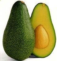
Avocado is a dark yellow-green color that is a representation of the color of the outer surface of an avocado. [21] Avocado, along with other earthy tones like harvest gold and burnt orange, was a common color for consumer goods like automobiles, shag carpets, and household appliances during the 1970s. [21]
Asparagus | |
---|---|
Color coordinates | |
Hex triplet | #87A96B |
sRGB B (r, g, b) | (135, 169, 107) |
HSV (h, s, v) | (93°, 37%, 66%) |
CIELChuv (L, C, h) | (65, 44, 113°) |
Source | Crayola [ citation needed ] |
ISCC–NBS descriptor | Moderate yellow green |
B: Normalized to [0–255] (byte) |
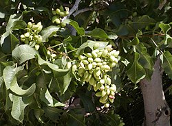
Asparagus is a tone of chartreuse that is named after the vegetable. Crayola created this color in 1993 as one of the 16 to be named in the Name the Color Contest.
It is also the color of a wild asparagus plant blowing in the wind of the 1949 classic film Sands of Iwo Jima .
Another name for this color is asparagus green. The first recorded use of "asparagus green" as a color name in English was in 1805. [22]
Artichoke | |
---|---|
Color coordinates | |
Hex triplet | #8F9779 |
sRGB B (r, g, b) | (143, 151, 121) |
HSV (h, s, v) | (76°, 20%, 59%) |
CIELChuv (L, C, h) | (61, 22, 98°) |
Source | ISCC-NBS [23] [24] |
ISCC–NBS descriptor | Moderate yellow green |
B: Normalized to [0–255] (byte) |
Artichoke is a color that is a representation of the color of a raw fresh uncooked artichoke. Another name for this color is artichoke chartreuse or artichoke green.
The first recorded use of "artichoke green" as a color name in English was in 1905. [24]
The various tones of the color coral are orange, red and pink representations of the colors of those cnidarians known as precious corals.
Beige is variously described as a pale sandy fawn color, a grayish tan, a light-grayish yellowish brown, or a pale to grayish yellow. It takes its name from French, where the word originally meant natural wool that has been neither bleached nor dyed, hence also the color of natural wool. It has come to be used to describe a variety of light tints chosen for their neutral or pale warm appearance.
Fuchsia is a vivid pinkish-purplish-red color, named after the color of the flower of the fuchsia plant, which was named by a French botanist, Charles Plumier, after the 16th-century German botanist Leonhart Fuchs.
Lime is a color that is a shade of yellow-green, so named because it is a representation of the color of the citrus fruit called limes. It is the color that is in between the web color chartreuse and yellow on the color wheel. Alternate names for this color included yellow-green, lemon-lime, lime green, or bitter lime.
Red-violet refers to a rich color of high medium saturation about 3/4 of the way between red and magenta, closer to magenta than to red. In American English, this color term is sometimes used in color theory as one of the purple colors—a non-spectral color between red and violet that is a deep version of a color on the line of purples on the CIE chromaticity diagram.
Baby blue is a tint of azure, one of the pastel colors.
Spring green is a color that was traditionally considered to be on the yellow side of green, but in modern computer systems based on the RGB color model is halfway between cyan and green on the color wheel.
In optics, orange has a wavelength between approximately 585 and 620 nm and a hue of 30° in HSV color space. In the RGB color space it is a secondary color numerically halfway between gamma-compressed red and yellow, as can be seen in the RGB color wheel. The complementary color of orange is azure. Orange pigments are largely in the ochre or cadmium families, and absorb mostly blue light.
Spring bud is the color that used to be called spring green before the X11 web color spring green was formulated in 1987 when the X11 colors were first promulgated. This color is now called spring bud to avoid confusion with the web color.
Varieties of the color green may differ in hue, chroma or lightness, or in two or three of these qualities. Variations in value are also called tints and shades, a tint being a green or other hue mixed with white, a shade being mixed with black. A large selection of these various colors is shown below.
Varieties of the color red may differ in hue, chroma or lightness, or in two or three of these qualities. Variations in value are also called tints and shades, a tint being a red or other hue mixed with white, a shade being mixed with black. A large selection of these various colors are shown below.
Pink colors are usually light or desaturated shades of reds, roses, and magentas which are created on computer and television screens using the RGB color model and in printing with the CMYK color model. As such, it is an arbitrary classification of color.
Varieties of the color yellow may differ in hue, chroma or lightness, or in two or three of these qualities. Variations in value are also called tints and shades, a tint being a yellow or other hue mixed with white, a shade being mixed with black. A large selection of these various colors is shown below.
Varieties of the color blue may differ in hue, chroma, or lightness, or in two or three of these qualities. Variations in value are also called tints and shades, a tint being a blue or other hue mixed with white, a shade being mixed with black. A large selection of these colors are shown below.
Shades of white are colors that differ only slightly from pure white. Variations of white include what are commonly termed off-white colors, which may be considered part of a neutral color scheme.
Variations of gray or grey include achromatic grayscale shades, which lie exactly between white and black, and nearby colors with low colorfulness. A selection of a number of these various colors is shown below.
The color cyan, a greenish-blue, has notable tints and shades. It is one of the subtractive primary colors along with magenta, and yellow.
There are numerous variations of the color purple, a sampling of which are shown below.
Shades of brown can be produced by combining red, yellow, and black pigments, or by a combination of orange and black—illustrated in the color box. The RGB color model, that generates all colors on computer and television screens, makes brown by combining red and green light at different intensities. Brown color names are often imprecise, and some shades, such as beige, can refer to lighter rather than darker shades of yellow and red. Such colors are less saturated than colors perceived to be orange. Browns are usually described as light or dark, reddish, yellowish, or gray-brown. There are no standardized names for shades of brown; the same shade may have different names on different color lists, and sometimes one name can refer to several very different colors. The X11 color list of web colors has seventeen different shades of brown, but the complete list of browns is much longer.
Shades of black are colors that differ only slightly from pure black. These colors have a low lightness. From a photometric point of view, a color which differs slightly from black always has low relative luminance. Variations of black include what are commonly termed off-black colors, which may be considered part of a neutral color scheme, usually in interior design as a part of a background for brighter colors. Black and dark gray colors are powerful accent colors that suggest weight, dignity, formality, and solemnity.