
Woodcut is a relief printing technique in printmaking. An artist carves an image into the surface of a block of wood—typically with gouges—leaving the printing parts level with the surface while removing the non-printing parts. Areas that the artist cuts away carry no ink, while characters or images at surface level carry the ink to produce the print. The block is cut along the wood grain. The surface is covered with ink by rolling over the surface with an ink-covered roller (brayer), leaving ink upon the flat surface but not in the non-printing areas.

The national flag of Norway is red with a navy blue Scandinavian cross bordered in white that extends to the edges of the flag; the vertical part of the cross is shifted to the hoist side in the style of the Dannebrog, the flag of Denmark.
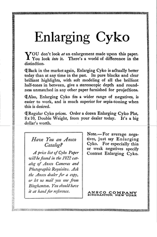
Photographic paper is a paper coated with a light-sensitive chemical formula, like photographic film, used for making photographic prints. When photographic paper is exposed to light, it captures a latent image that is then developed to form a visible image; with most papers the image density from exposure can be sufficient to not require further development, aside from fixing and clearing, though latent exposure is also usually present. The light-sensitive layer of the paper is called the emulsion. The most common chemistry was based on silver halide but other alternatives have also been used.
Prepress is the term used in the printing and publishing industries for the processes and procedures that occur between the creation of a print layout and the final printing. The prepress process includes the preparation of artwork for press, media selection, proofing, quality control checks and the production of printing plates if required. The artwork is often provided by the customer as a print-ready PDF file created in desktop publishing.

In offset printing, a spot color or solid color is any color generated by an ink that is printed using a single run, whereas a process color is produced by printing a series of dots of different colors.

Chromolithography is a method for making multi-colour prints. This type of colour printing stemmed from the process of lithography, and includes all types of lithography that are printed in colour. When chromolithography is used to reproduce photographs, the term photochrome is frequently used. Lithographers sought to find a way to print on flat surfaces with the use of chemicals instead of raised relief or recessed intaglio techniques.
Photographic printing is the process of producing a final image on paper for viewing, using chemically sensitized paper. The paper is exposed to a photographic negative, a positive transparency , or a digital image file projected using an enlarger or digital exposure unit such as a LightJet or Minilab printer. Alternatively, the negative or transparency may be placed atop the paper and directly exposed, creating a contact print. Digital photographs are commonly printed on plain paper, for example by a color printer, but this is not considered "photographic printing".
Color printing or colour printing is the reproduction of an image or text in color.
Cerulean, also spelled caerulean, is a shade of blue ranging between azure and a darker sky blue. The first recorded use of cerulean as a colour name in English was in 1590. The word is derived from the Latin word caeruleus, "dark blue, blue, or blue-green", which in turn probably derives from caerulum, diminutive of caelum, "heaven, sky".
In color management, an ICC profile is a set of data that characterizes a color input or output device, or a color space, according to standards promulgated by the International Color Consortium (ICC). Profiles describe the color attributes of a particular device or viewing requirement by defining a mapping between the device source or target color space and a profile connection space (PCS). This PCS is either CIELAB (L*a*b*) or CIEXYZ. Mappings may be specified using tables, to which interpolation is applied, or through a series of parameters for transformations.

Air Force blue colours are a variety of colours that are mostly various tones of the colour azure, the purest tones of which are identified as being the colour of the sky on a clear day.

Specifications for Web Offset Publications, invariably abbreviated to SWOP, is an organization and the name of a set of specifications that it produces, with the aim of improving the consistency and quality of professionally printed material in the United States, and of certain other products, programs and endorsements related to their work. Among other things, the organization specifies SWOP inks used in CMYK printing, colors of SWOP proofs, other physical qualities pertaining to printing. The organization publishes its own specification and ICC profile and runs a certification program.
The Desmet Method is a method for restoring the colours of early silent films, which had originally been subjected to the processes of either:
A variety of tests are used to determine ink and paper and paperboard quality, and to measure their interactions. They are necessary to balance print quality, cost, and wear on the press. Some of the important paper and ink tests are listed here:
Varieties of the color yellow may differ in hue, chroma or lightness, or in two or three of these qualities. Variations in value are also called tints and shades, a tint being a yellow or other hue mixed with white, a shade being mixed with black. A large selection of these various colors is shown below.

Chromoxylography was a colour woodblock printing process, popular from the mid-19th to the early-20th century, commonly used to produce illustrations in children's books, serial pulp magazines, and cover art for yellow-back and penny dreadfuls. The art of relief engraving and chromoxylography was perfected by engravers and printers in the 19th century, most notably in Victorian London by engraver and printer Edmund Evans who was particularly good with the process, producing a wide range of hues and tones through color mixing. Chromoxylography was a complicated technique, requiring intricate engraving and printing for the best results. Less expensive products, such as covers for pulp magazines, had to be produced with few colours, often only two or three, whereas more intricate and expensive books and reproductions of paintings used as many as a dozen or more colors. For each colour used, a separate woodblock had to be carved of the image being reproduced.

Varieties of the color blue may differ in hue, chroma, or lightness, or in two or three of these qualities. Variations in value are also called tints and shades, a tint being a blue or other hue mixed with white, a shade being mixed with black. A large selection of these colors are shown below.

Pantone 448 C is a colour in the Pantone colour system. Described as a drab dark brown and informally dubbed the "ugliest colour in the world", it was selected in 2012 as the colour for plain tobacco and cigarette packaging in Australia, after market researchers determined that it was the least attractive colour.
Media Standard Print is a publication of the Bundesverband Druck und Medien, available on its website. The publication contains instructions on how to produce data and proofs that are to be sent to a printer. It is based on ProcessStandard Offset and therefore on the ISO standards 12647 and 15930. As such, it serves as the foundation for smooth cooperation between customer, prepress service provider and printer during media production, covering data formats, colour spaces, printing conditions, workflows, means of proofing, standards, black composition and much more.
The European Color Initiative (ECI) is an expert group that is concerned with media-neutral reproduction of color data in digital publication systems. It was formed in June 1996 by German publishers Bauer, Burda, Gruner + Jahr and Springer in Hamburg.
