Color or colour is the visual perceptual property deriving from the spectrum of light interacting with the photoreceptor cells of the eyes. Color categories and physical specifications of color are associated with objects or materials based on their physical properties such as light absorption, reflection, or emission spectra. By defining a color space colors can be identified numerically by their coordinates.
Cyan is the color between green and blue on the visible spectrum of light. It is evoked by light with a predominant wavelength between 490 and 520 nm, between the wavelengths of green and blue.

Magenta is a color that is variously defined as purplish-red, reddish-purple or mauvish-crimson. On color wheels of the RGB (additive) and CMY (subtractive) color models, it is located exactly midway between red and blue. It is one of the four colors of ink used in color printing by an inkjet printer, along with yellow, black, and cyan, to make all other colors. The tone of magenta used in printing is called "printer's magenta". It is also a shade of purple.

A pigment is a colored material that is completely or nearly insoluble in water. In contrast, dyes are typically soluble, at least at some stage in their use. Generally dyes are often organic compounds whereas pigments are often inorganic compounds. Pigments of prehistoric and historic value include ochre, charcoal, and lapis lazuli.

The Natural Color System (NCS) is a proprietary perceptual color model. It is based on the color opponency hypothesis of color vision, first proposed by German physiologist Ewald Hering. The current version of the NCS was developed by the Swedish Colour Centre Foundation, from 1964 onwards. The research team consisted of Anders Hård, Lars Sivik and Gunnar Tonnquist, who in 1997 received the AIC Judd award for their work. The system is based entirely on the phenomenology of human perception and not on color mixing. It is illustrated by a color atlas, marketed by NCS Colour AB in Stockholm.

Vermilion is a color, color family and pigment, most often in antiquity and until the 19th century made from the powdered mineral cinnabar, and the corresponding color. It is very often synonymous with red orange, covered here, which often takes a modern form just 11% brighter, so at full brightness.

In color reproduction, including computer graphics and photography, the gamut, or color gamut, is a certain complete subset of colors. The most common usage refers to the subset of colors which can be accurately represented in a given circumstance, such as within a given color space or by a certain output device.
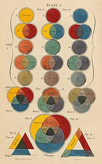
In the visual arts, color theory is a body of practical guidance to color mixing and the visual effects of a specific color combination. Color terminology based on the color wheel and its geometry separates colors into primary color, secondary color, and tertiary color. Understanding color theory dates to antiquity. Aristotle and Claudius Ptolemy already discussed which and how colors can be produced by mixing other colors. The influence of light on color was investigated and revealed further by al-Kindi and Ibn al-Haytham (d.1039). Ibn Sina, Nasir al-Din al-Tusi and Robert Grosseteste discovered that contrary to the teachings of Aristotle, there are multiple color paths to get from black to white. More modern approaches to color theory principles can be found in the writings of Leone Battista Alberti and the notebooks of Leonardo da Vinci. A formalization of "color theory" began in the 18th century, initially within a partisan controversy over Isaac Newton's theory of color and the nature of primary colors. From there it developed as an independent artistic tradition with only superficial reference to colorimetry and vision science.

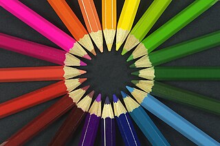
A color wheel or color circle is an abstract illustrative organization of color hues around a circle, which shows the relationships between primary colors, secondary colors, tertiary colors etc.

A spectral color is a color that is evoked in a typical human by a single wavelength of light in the visible spectrum, or by a relatively narrow band of wavelengths, also known as monochromatic light. Every wavelength of visible light is perceived as a spectral color, in a continuous spectrum; the colors of sufficiently close wavelengths are indistinguishable for the human eye.

Spring green is a color that was traditionally considered to be on the yellow side of green, but in modern computer systems based on the RGB color model is halfway between cyan and green on the color wheel.
A color model is an abstract mathematical model describing the way colors can be represented as tuples of numbers, typically as three or four values or color components. When this model is associated with a precise description of how the components are to be interpreted, the resulting set of colors is called "color space." This section describes ways in which human color vision can be modeled.
A tertiary color or intermediate color is a color made by mixing full saturation of one primary color with half saturation of another primary color and none of a third primary color, in a given color space such as RGB, CMYK or RYB (traditional).

Varieties of the color green may differ in hue, chroma or lightness, or in two or three of these qualities. Variations in value are also called tints and shades, a tint being a green or other hue mixed with white, a shade being mixed with black. A large selection of these various colors is shown below.
Historic paint analysis, or, architectural paint research, is the scientific analysis of architectural finishes, including not only paints but also metallic finishes and clear and translucent finishes used on historic buildings. The primary purpose of such analysis is to determine the color of the finish used at a particular time in the building's history, usually the original construction, but not always. Secondary purposes include determination of ingredients such as media and pigments. Paint analysis can also be used as a dating technique for various building elements.

Varieties of the color red may differ in hue, chroma or lightness, or in two or three of these qualities. Variations in value are also called tints and shades, a tint being a red or other hue mixed with white, a shade being mixed with black. A large selection of these various colors is shown below.

The color magenta has notable tints and shades. These various colors are shown below.
The Descriptive Color Names Dictionary is a dictionary of color names used for mass-market clothing and consumer merchandise, such as those in mail order catalogs. It relates each color name to one or more color swatches in the Color Harmony Manual, a color atlas based on the Ostwald color system. The book was edited by Helen Taylor, Lucille Knoche, and Walter Granville, and was published by the Container Corporation of America in 1950 and distributed free to owners of the Color Harmony Manual.

Varieties of the color blue may differ in hue, chroma, or lightness, or in two or three of these qualities. Variations in value are also called tints and shades, a tint being a blue or other hue mixed with white, a shade being mixed with black. A large selection of these colors is shown below.

Violet is a color term derived from the flower of the same name. There are numerous variations of the color violet, a sampling of which are shown below.

