Peach is a color that is named for the pale color of the interior flesh of the peach fruit. This name may also be substituted for "peachy". Like the color apricot, the color peach is paler than most actual peach fruits and seems to have been formulated primarily to create a pastel palette of colors for interior design.

Silver or metallic gray is a color tone resembling gray that is a representation of the color of polished silver.

Lavender is a light shade of purple or violet. It applies particularly to the color of the flower of the same name. The web color called lavender is displayed adjacent—it matches the color of the palest part of the flower; however, the more saturated color shown as floral lavender more closely matches the average color of the lavender flower as shown in the picture and is the tone of lavender historically and traditionally considered lavender by average people as opposed to website designers. The color lavender might be described as a medium purple, a pale bluish purple, or a light pinkish-purple. The term lavender may be used in general to apply to a wide range of pale, light, or grayish-purples, but only on the blue side; lilac is pale purple on the pink side. In paints, the color lavender is made by mixing purple and white paint.

Red-violet refers to a rich color of high medium saturation about 3/4 of the way between red and magenta, closer to magenta than to red. In American English, this color term is sometimes used in color theory as one of the purple colors—a non-spectral color between red and violet that is a deep version of a color on the line of purples on the CIE chromaticity diagram.

Spring green is a color that was traditionally considered to be on the yellow side of green, but in modern computer systems based on the RGB color model is halfway between cyan and green on the color wheel.
Mustard is a dull/dark yellow color that resembles culinary mustard. It is similar to the color Flax.

Amaranth is a reddish-rose color that is a representation of the color of the flower of the amaranth plant. The color shown is the color of the red amaranth flower, but there are other varieties of amaranth that have other colors of amaranth flowers; these colors are also shown below.
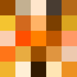
In optics, orange has a wavelength between approximately 585 and 620 nm and a hue of 30° in HSV color space. In the RGB color space it is a secondary color numerically halfway between gamma-compressed red and yellow, as can be seen in the RGB color wheel. The complementary color of orange is azure. Orange pigments are largely in the ochre or cadmium families, and absorb mostly blue light.

Varieties of the color green may differ in hue, chroma or lightness, or in two or three of these qualities. Variations in value are also called tints and shades, a tint being a green or other hue mixed with white, a shade being mixed with black. A large selection of these various colors is shown below.

Ruby is a color that is a representation of the color of the cut and polished ruby gemstone and is a shade of red or pink.

Varieties of the color red may differ in hue, chroma, lightness, or in two or three of these qualities. Variations in value are also called tints and shades, a tint being a red or other hue mixed with white, a shade being mixed with black. A large selection of these various colors are shown below.

The color magenta has notable tints and shades. These various colors are shown below.
Livid is a medium bluish-gray color. This color name comes from the Latin color term lividus meaning "'a dull leaden-blue color', and also used to describe the color of contused flesh, leading to the English expression 'black and blue'". The first recorded use of livid as a color name in English was in 1622.

The color sunset is a pale tint of orange. It is a representation of the average color of clouds when the sunlight from a sunset is reflected from them.
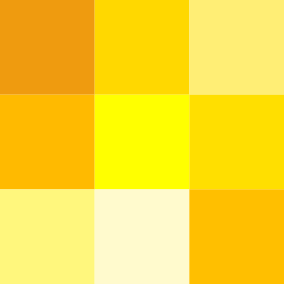
Varieties of the color yellow may differ in hue, chroma or lightness, or in two or three of these qualities. Variations in value are also called tints and shades, a tint being a yellow or other hue mixed with white, a shade being mixed with black. A large selection of these various colors is shown below.

Shades of white are colors that differ only slightly from pure white. Variations of white include what are commonly termed off-white colors, which may be considered part of a neutral color scheme.
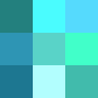
The color cyan, a greenish-blue, has notable tints and shades. It is one of the subtractive primary colors along with magenta, and yellow.
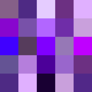
Violet is a color term derived from the flower of the same name. There are numerous variations of the color violet, a sampling of which are shown below.
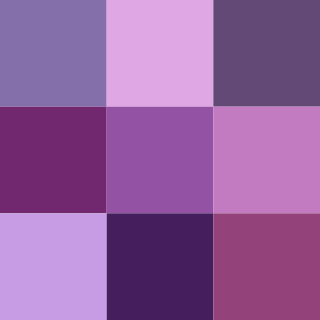
There are numerous variations of the color purple, a sampling of which is shown below.

Shades of chartreuse are listed below. Chartreuse is a color between yellow and green, so named because of its resemblance to the color of the French liqueur green chartreuse.


