
A chart is a graphical representation for data visualization, in which "the data is represented by symbols, such as bars in a bar chart, lines in a line chart, or slices in a pie chart". A chart can represent tabular numeric data, functions or some kinds of quality structure and provides different info.
Forecasting is the process of making predictions based on past and present data. Later these can be compared (resolved) against what happens. For example, a company might estimate their revenue in the next year, then compare it against the actual results creating a variance actual analysis. Prediction is a similar but more general term. Forecasting might refer to specific formal statistical methods employing time series, cross-sectional or longitudinal data, or alternatively to less formal judgmental methods or the process of prediction and resolution itself. Usage can vary between areas of application: for example, in hydrology the terms "forecast" and "forecasting" are sometimes reserved for estimates of values at certain specific future times, while the term "prediction" is used for more general estimates, such as the number of times floods will occur over a long period.

A bar chart or bar graph is a chart or graph that presents categorical data with rectangular bars with heights or lengths proportional to the values that they represent. The bars can be plotted vertically or horizontally. A vertical bar chart is sometimes called a column chart.

In mathematics, a time series is a series of data points indexed in time order. Most commonly, a time series is a sequence taken at successive equally spaced points in time. Thus it is a sequence of discrete-time data. Examples of time series are heights of ocean tides, counts of sunspots, and the daily closing value of the Dow Jones Industrial Average.

A scatter plot is a type of plot or mathematical diagram using Cartesian coordinates to display values for typically two variables for a set of data. If the points are coded (color/shape/size), one additional variable can be displayed. The data are displayed as a collection of points, each having the value of one variable determining the position on the horizontal axis and the value of the other variable determining the position on the vertical axis.

A hydrograph is a graph showing the rate of flow (discharge) versus time past a specific point in a river, channel, or conduit carrying flow. The rate of flow is typically expressed in cubic meters or cubic feet per second . Hydrographs often relate changes of precipitation to changes in discharge over time. It can also refer to a graph showing the volume of water reaching a particular outfall, or location in a sewerage network. Graphs are commonly used in the design of sewerage, more specifically, the design of surface water sewerage systems and combined sewers.

Infographics are graphic visual representations of information, data, or knowledge intended to present information quickly and clearly. They can improve cognition by using graphics to enhance the human visual system's ability to see patterns and trends. Similar pursuits are information visualization, data visualization, statistical graphics, information design, or information architecture. Infographics have evolved in recent years to be for mass communication, and thus are designed with fewer assumptions about the readers' knowledge base than other types of visualizations. Isotypes are an early example of infographics conveying information quickly and easily to the masses.
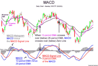
MACD, short for moving average convergence/divergence, is a trading indicator used in technical analysis of securities prices, created by Gerald Appel in the late 1970s. It is designed to reveal changes in the strength, direction, momentum, and duration of a trend in a stock's price.
In statistics and econometrics, and in particular in time series analysis, an autoregressive integrated moving average (ARIMA) model is a generalization of an autoregressive moving average (ARMA) model. To better comprehend the data or to forecast upcoming series points, both of these models are fitted to time series data. ARIMA models are applied in some cases where data show evidence of non-stationarity in the sense of mean, where an initial differencing step can be applied one or more times to eliminate the non-stationarity of the mean function. When the seasonality shows in a time series, the seasonal-differencing could be applied to eliminate the seasonal component. Since the ARMA model, according to the Wold's decomposition theorem, is theoretically sufficient to describe a regular wide-sense stationary time series, we are motivated to make stationary a non-stationary time series, e.g., by using differencing, before we can use the ARMA model. Note that if the time series contains a predictable sub-process, the predictable component is treated as a non-zero-mean but periodic component in the ARIMA framework so that it is eliminated by the seasonal differencing.
In time series analysis, the Box–Jenkins method, named after the statisticians George Box and Gwilym Jenkins, applies autoregressive moving average (ARMA) or autoregressive integrated moving average (ARIMA) models to find the best fit of a time-series model to past values of a time series.
Data and information visualization is the practice of designing and creating easy-to-communicate and easy-to-understand graphic or visual representations of a large amount of complex quantitative and qualitative data and information with the help of static, dynamic or interactive visual items. Typically based on data and information collected from a certain domain of expertise, these visualizations are intended for a broader audience to help them visually explore and discover, quickly understand, interpret and gain important insights into otherwise difficult-to-identify structures, relationships, correlations, local and global patterns, trends, variations, constancy, clusters, outliers and unusual groupings within data. When intended for the general public to convey a concise version of known, specific information in a clear and engaging manner, it is typically called information graphics.

A heat map is a 2-dimensional data visualization technique that represents the magnitude of individual values within a dataset as a color. The variation in color may be by hue or intensity.

In the analysis of data, a correlogram is a chart of correlation statistics. For example, in time series analysis, a plot of the sample autocorrelations versus is an autocorrelogram. If cross-correlation is plotted, the result is called a cross-correlogram.
Seasonal adjustment or deseasonalization is a statistical method for removing the seasonal component of a time series. It is usually done when wanting to analyse the trend, and cyclical deviations from trend, of a time series independently of the seasonal components. Many economic phenomena have seasonal cycles, such as agricultural production, and consumer consumption. It is necessary to adjust for this component in order to understand underlying trends in the economy, so official statistics are often adjusted to remove seasonal components. Typically, seasonally adjusted data is reported for unemployment rates to reveal the underlying trends and cycles in labor markets.
The decomposition of time series is a statistical task that deconstructs a time series into several components, each representing one of the underlying categories of patterns. There are two principal types of decomposition, which are outlined below.
Laboratory quality control is designed to detect, reduce, and correct deficiencies in a laboratory's internal analytical process prior to the release of patient results, in order to improve the quality of the results reported by the laboratory. Quality control (QC) is a measure of precision, or how well the measurement system reproduces the same result over time and under varying operating conditions. Laboratory quality control material is usually run at the beginning of each shift, after an instrument is serviced, when reagent lots are changed, after equipment calibration, and whenever patient results seem inappropriate. Quality control material should approximate the same matrix as patient specimens, taking into account properties such as viscosity, turbidity, composition, and color. It should be simple to use, with minimal vial-to-vial variability, because variability could be misinterpreted as systematic error in the method or instrument. It should be stable for long periods of time, and available in large enough quantities for a single batch to last at least one year. Liquid controls are more convenient than lyophilized (freeze-dried) controls because they do not have to be reconstituted, minimizing pipetting error. Dried Tube Specimen (DTS) is slightly cumbersome as a QC material but it is very low-cost, stable over long periods and efficient, especially useful for resource-restricted settings in under-developed and developing countries. DTS can be manufactured in-house by a laboratory or Blood Bank for its use.

A plot is a graphical technique for representing a data set, usually as a graph showing the relationship between two or more variables. The plot can be drawn by hand or by a computer. In the past, sometimes mechanical or electronic plotters were used. Graphs are a visual representation of the relationship between variables, which are very useful for humans who can then quickly derive an understanding which may not have come from lists of values. Given a scale or ruler, graphs can also be used to read off the value of an unknown variable plotted as a function of a known one, but this can also be done with data presented in tabular form. Graphs of functions are used in mathematics, sciences, engineering, technology, finance, and other areas.
In time series data, seasonality is the presence of variations that occur at specific regular intervals less than a year, such as weekly, monthly, or quarterly. Seasonality may be caused by various factors, such as weather, vacation, and holidays and consists of periodic, repetitive, and generally regular and predictable patterns in the levels of a time series.

A horizon chart or horizon graph is a 2-dimensional data visualisation displaying a quantitative data over a continuous interval, most commonly a time period. The horizon chart is valuable for enabling readers to identify trends and extreme values within large datasets. Similar to sparklines and ridgeline plot, horizon chart may not be the most suitable visualisation for precisely pinpointing specific values. Instead, its strength lies in providing an overview and highlighting patterns and outliers in the data.
