
Frutiger is a series of typefaces named after its Swiss designer, Adrian Frutiger. Frutiger is a humanist sans-serif typeface, intended to be clear and highly legible at a distance or at small text sizes. A popular design worldwide, type designer Steve Matteson described its structure as "the best choice for legibility in pretty much any situation" at small text sizes, while Erik Spiekermann named it as "the best general typeface ever".

Rail Alphabet is a neo-grotesque sans-serif typeface designed by Jock Kinneir and Margaret Calvert for signage on the British Rail network. First used at Liverpool Street station, it was then adopted by the Design Research Unit (DRU) as part of their comprehensive 1965 rebranding of the company.

Clearview, also known as Clearview Hwy, is the name of a humanist sans-serif typeface family for guide signs used on roads in the United States, Canada, Indonesia, the Philippines, Israel, Brazil and Sri Lanka. It was developed by independent researchers with the help of the Texas Transportation Institute and the Pennsylvania Transportation Institute, under the supervision of the Federal Highway Administration (FHWA). It was once expected to replace the FHWA typefaces in many applications, although newer studies of its effectiveness have called its benefits into question.
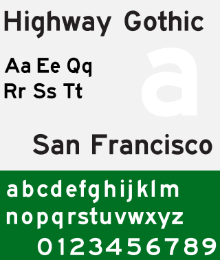
Highway Gothic is a sans-serif typeface developed by the United States Federal Highway Administration (FHWA) and used for road signage in the Americas, including the U.S., Canada, Latin America and some Caribbean countries, as well as in Asian countries influenced by American signage practices, including the Philippines, China, Taiwan, Malaysia, Indonesia and Thailand.

Rotis is a typeface developed in 1988 by Otl Aicher, a German graphic designer and typographer. In Rotis, Aicher explores an attempt at maximum legibility through a highly unified yet varied typeface family that ranges from full serif, glyphic, and sans-serif. The four basic Rotis variants are:
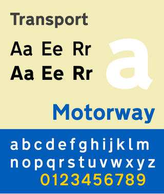
Transport is a sans serif typeface first designed for road signs in the United Kingdom. It was created between 1957 and 1963 by Jock Kinneir and Margaret Calvert as part of their work as designers for the Department of Transport's Anderson and Worboys committees.

DIN 1451 is a sans-serif typeface that is widely used for traffic, administrative and technical applications.
Austria, officially the Republic of Austria, is a European country.
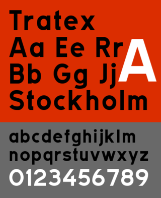
Tratex is a geometric sans-serif typeface family for road signs in Sweden. It was developed for maximal readability in traffic, and designed by Karl-Gustaf Gustafsson.

Interstate is a digital typeface designed by Tobias Frere-Jones in the period 1993–1999, and licensed by Font Bureau. The typeface is based on Style Type E of the FHWA series of fonts, a signage alphabet drawn for the United States Federal Highway Administration by Dr. Theodore W. Forbes in 1949.

The Traffic Signs Regulations and General Directions is the law that sets out the design and conditions of use of official traffic signs that can be lawfully placed on or near roads in Great Britain and the Isle of Man. The regulations, originally introduced in 1965, were the result of the review of British road signage carried out by the Worboys Committee.
Trafikkalfabetet is a sans-serif typeface used for road signs and, until 2002, vehicle registration plates in Norway. Developed in 1965 by Karl Petter Sandbæk, it was digitized in 2006 by Jacob Øvergaard.
Richard "Jock" Kinneir was a British typographer and graphic designer who, with his colleague Margaret Calvert, designed many of the road signs used throughout the United Kingdom, Crown Dependencies, and British overseas territories. Their system has become a model for modern road signage.

European traffic signs present relevant differences between countries despite an apparent uniformity and standardisation. Most European countries refer to the 1968 Vienna Convention on Road Signs and Signals. The convention has been adopted by the following countries : Albania, Armenia, Austria, Belarus, Belgium, Bosnia and Herzegovina, Bulgaria, Croatia, Cyprus, the Czech Republic, Denmark, Estonia, Finland, France, Georgia, Germany, Greece, Hungary, Italy, Latvia, Liechtenstein, Lithuania, Luxembourg, Moldova, Montenegro, Netherlands, North Macedonia, Norway, Poland, Portugal, Romania, Russia, San Marino, Serbia, Slovakia, Slovenia, Spain, Sweden, Switzerland, Turkey, Ukraine and the United Kingdom. The convention has not been adopted by Ireland, Iceland or Malta.

Motorway is a sans-serif typeface designed by Jock Kinneir and Margaret Calvert for use on the motorway network of the United Kingdom. Motorway was first used on the M6 Preston bypass in 1958 and has been in use on the UK's motorways ever since. The typeface is also used in some other countries, most notably Ireland and Portugal.
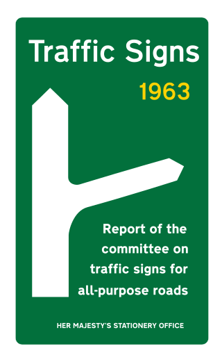
The Worboys Committee was formed by the British government to review signage on all British roads. In its July 1963 report Traffic signs: report of the committee on traffic signs for all-purpose roads, it found existing road signs to be obsolete for the increasing numbers of motor vehicles and their increasing speeds, and made over a dozen key recommendations. The committee went on to completely revise road signs in Britain, with an emphasis on symbols alone, adopting standard colour and shape practices used in mainland Europe and a new typeface. Its principles were adopted and are still the basis of all road signs in the United Kingdom.

SNV, also known as VSS, is a sans-serif typeface used on road signs in several European countries. It was originally defined by the Association of Swiss Road Traffic Experts and the Swiss Association for Standardization.
Engschrift is a condensed or "narrow" form of the DIN 1451 standard typeface. It is used in a modified form for road signage in Austria.
Tern is a sans-serif typeface, which is used on traffic signs in Austria and Slovakia.

