Letter spacing

Last updated
Docent sights juggernaut
Headline set tight with minus letter spacing
Docent sights juggernaut
Headline set with no additional letter spacing
Docent sights juggernaut
Headline with more open letter spacing
Docent sights juggernaut
Headline with open letter spacing similar to metal type
Docent sights juggernaut
Headline with still more letter spacing
Docent sights juggernaut
Headline with wide letter spacing
Docent sights juggernaut
Headline with wider letter spacing, sometimes used for broadcast
Examples of headline letter spacing

Letter spacing, character spacing or tracking is an optically consistent typographical adjustment to the space between letters to change the visual density of a line or block of text. Letter spacing is distinct from kerning, which adjusts the spacing of particular pairs of adjacent characters such as "7." which would appear to be badly spaced if left unadjusted, and leading, the spacing between lines.

Contents

History

Historically, with metal type, a kern meant having a letter stick out beyond the metal slug to which it was attached, or having part of the body of the slug cut off to allow letters to overlap. A kern could therefore only bring letters closer together (negative spacing). Digital kerning could go in either direction. Tracking can similarly go in either direction, but with metal type, one could make groups of letters only farther apart (positive spacing).

In the days of hot metal typesetting, letter spacing required adding horizontal space between letters of words set in metal type in increments of a minimum of a half-point. Some publishers and typesetters avoided letter spacing because it was costly in materials and labor. Letter spacing required hand insertion of copper (a half-point), brass (one point), and printer's "lead" (two points) spaces between individual pieces of type or between matrices. Despite the cost, letter spacing was used in print advertising, book publishing, and custom printing (such as high-end stationery, business cards, wedding invitations, and such). It was also used for very short phrases set in capital letters or small caps to prevent the phrases from appearing too dark in color compared to the rest of the page.

Printer and type designer Frederic Goudy stated that "Men who would letterspace blackletter would steal sheep." [1] Goudy's statement inspired the title of the book Stop Stealing Sheep, [2] an introduction to typography.

Digital systems

Word processing and desktop publishing programs for personal computers, such as LibreOffice Writer, Microsoft Word, Microsoft Publisher, WordPerfect, QuarkXPress, Adobe InDesign, Adobe FrameMaker, Adobe Illustrator, and Adobe Photoshop, use differing methods of adjusting letter spacing. Most systems have the default letter spacing at zero and instead use the character widths and kerning information built into the font itself.

Although digital type sets tighter than metal type on average, this results primarily from the availability of kerning. Digital type does allow for negative sidebearings, which were uncommon in metal type because of the difficulty in cutting a "kern".

In the days of machine-implemented lead typesetting, such as Linotype machines and the Monotype System, letter spacing had to be uniform. In modern digital page-layout software, high-end applications all use relative measurements proportional to the size of the type. QuarkXPress uses units of 1/200 of an em, and Adobe InDesign uses 1/1000 of an em. Therefore, in QuarkXPress, a tracking setting of 3 reduces the visual density of the text noticeably, but in InDesign a tracking setting of 3 is barely noticeable.

Fixed spaces

Letter spacing may also refer to the insertion of fixed spaces, as was commonly done in hand-set metal type to achieve letter spacing. Fixed spaces vary by size and include hair spaces, thin spaces, word spaces, en-spaces, and em-spaces. An en-space is equal to half the current point size, and an em-space is the same width as the current point size.

Changing kerning perception

Kerning contrasted with tracking (letter spacing): with spacing the "kerning perception" is lost.
While tracking adjusts the space between characters evenly, regardless of the characters, kerning adjusts the space based on character pairs. There is strong kerning between the "V" and the "A" and no kerning between the "S" and the "T". Tracking-vs-Kerning2.png
Kerning contrasted with tracking (letter spacing): with spacing the "kerning perception" is lost.
While tracking adjusts the space between characters evenly, regardless of the characters, kerning adjusts the space based on character pairs. There is strong kerning between the "V" and the "A" and no kerning between the "S" and the "T".

Even with no kerning control, a visually pleasing result can be achieved with some control of the space between letters. [3] [4]

With CSS1, a standard of 1996, the letter-spacing property (illustrated) offers some control for "kerning perception", as kerning can be simulated with non-uniform spacing between letters. The CSS3 standard includes the font-kerning property. [5] In the meantime, web designers used the workaround of letter-spacing, mainly to enhance spaced texts of titles and banners.

Legibility

Adjusting the letter spacing of a given text has been shown to affect reading speed and accuracy. A wide body of research suggests that text with wider letter spacing, as well as wider line and word spacing, leads to increased reading comprehension among both dyslexic and non-dyslexic children. [6] [7] [8] Contrarily, tighter spacing is thought to decrease comprehension among such population subgroups, and is accompanied by crowding and a perception of smallness. [6]

Letter spacing adjustments are frequently employed in news design. Due to deadlines, news editors do not usually have time to rewrite paragraphs that end in split words or create widows or orphans.[ citation needed ]

Discussing Comic Sans, some researchers, including Sue Walker, Jenny Thomson, and John Stein, posit that the typeface's wide spacing, rather than the shape of its characters, is the reason for its success among dyslexics. [9]

See also

Notes

  1. Comment by Erik Spiekermann (15 October 2005) in Wardle de Sousa, Tiffany (2 July 2005). "Famous Quotes from Type Designers". Typophile.com. Archived from the original on 25 August 2013. Retrieved 30 April 2014.
  2. Spiekermann, Erik; Ginger, E. M. (2002). Stop Stealing Sheep & find out how type works. Adobe Press. ISBN   978-0-201-70339-9.
  3. Slattery, Timothy J.; Rayner, Keith (2013). "Effects of intraword and interword spacing on eye movements during reading: Exploring the optimal use of space in a line of text" (PDF). Attention, Perception, & Psychophysics. 75 (6): 1275–1292. doi: 10.3758/s13414-013-0463-8 . PMID   23709061. Lock-green.svg
  4. "The Rhetoric of Typography: Effects on Reading Time, Reading Comprehension, and Perceptions of Ethos", Eva Brumberger. Technical Communication, Volume 51, Number 1, February 2004, pp. 13-24.
  5. "CSS Fonts Module Level 3". w3.org.
  6. 1 2 Vanderschantz, Nicholas (22 June 2009). "Greater Understanding of Spacing Needs for Children's Eye Movements during On-Screen Reading is Required". Proceedings of ED-MEDIA 2009 — World Conference on Educational Multimedia, Hypermedia & Telecommunications. Association for the Advancement of Computing in Education: 807–813. ISBN   978-1-880094-73-0 . Retrieved 1 October 2022.
  7. Zorzi, Marco; Barbiero, Chiara; Facoetti, Andrea; Lonciari, Isabella; Carrozzi, Marco; Montico, Marcella; Bravar, Laura; George, Florence; Pech-Georgel, Catherine; Ziegler, Johannes (4 June 2012). Posner, Michael (ed.). "Extra-large letter spacing improves reading in dyslexia". Proceedings of the National Academy of Sciences of the United States of America. 109 (28): 11455–11459. doi: 10.1073/pnas.1205566109 . PMC   3396504 . PMID   22665803.
  8. Hakvoort, Britt; van den Boer, Madelon; Leenaars, Tineke; Bos, Petra; Tijms, Jurgen (12 August 2017). "Improvements in reading accuracy as a result of increased interletter spacing are not specific to children with dyslexia". Journal of Experimental Child Psychology. 164 (published December 2017): 101–116. doi:10.1016/j.jecp.2017.07.010. hdl: 11245.1/91d8afa0-403c-4532-a551-04114030b29a . PMID   28810134. S2CID   4629076 . Retrieved 1 October 2022.
  9. Severs, Jon (6 October 2020). "Does Comic Sans really help dyslexic learners?". TES Magazine. Retrieved 1 October 2022.

Related Research Articles

<span class="mw-page-title-main">Typography</span> Art of arranging type

Typography is the art and technique of arranging type to make written language legible, readable and appealing when displayed. The arrangement of type involves selecting typefaces, point sizes, line lengths, line spacing, letter spacing, and spaces between pairs of letters. The term typography is also applied to the style, arrangement, and appearance of the letters, numbers, and symbols created by the process. Type design is a closely related craft, sometimes considered part of typography; most typographers do not design typefaces, and some type designers do not consider themselves typographers. Typography also may be used as an ornamental and decorative device, unrelated to the communication of information.

<span class="mw-page-title-main">Type design</span> Art of designing typefaces and fonts

Type design is the art and process of designing typefaces. This involves drawing each letterform using a consistent style. The basic concepts and design variables are described below.

<span class="mw-page-title-main">QuarkXPress</span> Desktop publishing software

QuarkXPress is desktop publishing software for creating and editing complex page layouts in a WYSIWYG environment. It runs on macOS and Windows. It was first released by Quark, Inc. in 1987 and is still owned and published by them.

<span class="mw-page-title-main">Adobe InDesign</span> Desktop publishing software

Adobe InDesign is a desktop publishing and page layout designing software application produced by Adobe and first released in 1999. It can be used to create works such as posters, flyers, brochures, magazines, newspapers, presentations, books and ebooks. InDesign can also publish content suitable for tablet devices in conjunction with Adobe Digital Publishing Suite. Graphic designers and production artists are the principal users.

<span class="mw-page-title-main">Emphasis (typography)</span> Typographical distinction

In typography, emphasis is the strengthening of words in a text with a font in a different style from the rest of the text, to highlight them. It is the equivalent of prosody stress in speech.

<span class="mw-page-title-main">Kerning</span> Process in typography

In typography, kerning is the process of adjusting the spacing between characters in a proportional font, usually to achieve a visually pleasing result. Kerning adjusts the space between individual letterforms while tracking (letter-spacing) adjusts spacing uniformly over a range of characters. In a well-kerned font, the two-dimensional blank spaces between each pair of characters all have a visually similar area. The term "keming" is sometimes used informally to refer to poor kerning.

In typography, leading is the space between adjacent lines of type; the exact definition varies.

An em is a unit in the field of typography, equal to the currently specified point size. For example, one em in a 16-point typeface is 16 points. Therefore, this unit is the same for all typefaces at a given point size.

<span class="mw-page-title-main">All caps</span> Text with all capital letters

In typography, text or font in all caps contains capital letters without any lowercase letters. For example:

THIS TEXT IS IN ALL CAPS.

Word spacing in typography is space between words, as contrasted with letter-spacing and sentence spacing. Typographers may modify the spacing of letters or words in a body of type to aid readability and copy fit, or for aesthetic effect. In web browsers and standardized digital typography, word spacing is controlled by the CSS1 word-spacing property.

In typesetting and page layout, alignment or range is the setting of text flow or image placement relative to a page, column (measure), table cell, or tab.

<span class="mw-page-title-main">Type color</span> Measure of typographic weight or density

Type color, or colour, is an element of typography that describes how dense or heavy the text appears on the page. Finding the correct balance of type color and white space can make text more easily readable. The term type color should not be confused with the usual meaning of color, ; instead it has more to do with the blackness or boldness of the text on the page. A bold font weight creates more contrast on the page, therefore creates more emphasis. Using a bold font is therefore one way that type color can be adjusted.

Sentence spacing concerns how spaces are inserted between sentences in typeset text and is a matter of typographical convention. Since the introduction of movable-type printing in Europe, various sentence spacing conventions have been used in languages with a Latin alphabet. These include a normal word space, a single enlarged space, and two full spaces.

<span class="mw-page-title-main">Slug (typesetting)</span>

In typesetting, a slug is any of several kinds of piece of lead or other type metal. One kind of slug is a piece of spacing material used to space paragraphs. In the era of commercial typesetting in metal type, they were usually manufactured in strips of 6-point lead. Another kind of slug is a single sort, bearing a single letter or any other symbol. More recently, a slug can be an entire line of Linotype typeset matter, where a single piece of lead has been cast bearing a line of text.

<span class="mw-page-title-main">Hz-program</span>

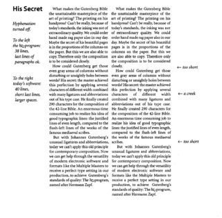
Hz-program was a proprietary, patented typographic composition computer program, created by German typeface designer Hermann Zapf. The goal of this program was - "To produce the perfect grey type area without the rivers and holes of too-wide word spacing."

Legibility is the ease with which a reader can decode symbols. In addition to written language, it can also refer to behaviour or architecture, for example. From the perspective of communication research, it can be described as a measure of the permeability of a communication channel. A large number of known factors can affect legibility.

Microtypography is a range of methods for improving the readability and appearance of text, especially justified text. The methods reduce the appearance of large interword spaces and create edges to the text that appear more even. Microtypography methods can also increase reading comprehension of text, reducing the cognitive load of reading.

Tasmeem was a set of Arabic enhancements for Adobe InDesign ME, developed by WinSoft International and DecoType. Tasmeem allowed users to create typographically advanced text in Arabic in the Middle Eastern and North African versions of InDesign, turning it into a typesetting and design tool for Arabic.

<span class="mw-page-title-main">History of sentence spacing</span> Evolution of sentence spacing conventions from the introduction of movable type in Europe

The history of sentence spacing is the evolution of sentence spacing conventions from the introduction of movable type in Europe by Johannes Gutenberg to the present day.

References

Wiktionary-logo-en-v2.svg The dictionary definition of letterspacing at Wiktionary