The HyperText Markup Language or HTML is the standard markup language for documents designed to be displayed in a web browser. It defines the meaning and structure of web content. It is often assisted by technologies such as Cascading Style Sheets (CSS) and scripting languages such as JavaScript.

A typeface is a design of letters, numbers and other symbols, to be used in printing or for electronic display. Most typefaces include variations in size, weight, slope, width, and so on. Each of these variations of the typeface is a font.

Arial is a sans-serif typeface and set of computer fonts in the neo-grotesque style. Fonts from the Arial family are included with all versions of Microsoft Windows after Windows 3.1, as well as in other Microsoft programs, Apple's macOS, and many PostScript 3 printers.
An HTML element is a type of HTML document component, one of several types of HTML nodes. The first used version of HTML was written by Tim Berners-Lee in 1993 and there have since been many versions of HTML. The most commonly used version is HTML 4.01, which became official standard in December 1999. An HTML document is composed of a tree of simple HTML nodes, such as text nodes, and HTML elements, which add semantics and formatting to parts of document. Each element can have HTML attributes specified. Elements can also have content, including other elements and text.

Tahoma is a humanist sans-serif typeface that Matthew Carter designed for Microsoft Corporation. Microsoft first distributed it, along with Carter's Verdana, as a font with Office 97.
In digital typography, Lucida Sans Unicode OpenType font from the design studio of Bigelow & Holmes is designed to support the most commonly used characters defined in version 1.0 of the Unicode standard. It is a sans-serif variant of the Lucida font family and supports Latin, Greek, Cyrillic and Hebrew scripts, as well as all the letters used in the International Phonetic Alphabet.

Lucida is an extended family of related typefaces designed by Charles Bigelow and Kris Holmes and released from 1984 onwards. The family is intended to be extremely legible when printed at small size or displayed on a low-resolution display – hence the name, from 'lucid'.

Lucida Grande is a humanist sans-serif typeface. It is a member of the Lucida family of typefaces designed by Charles Bigelow and Kris Holmes. It is best known for its implementation throughout the macOS user interface from 1999 to 2014, as well as in other Apple software like Safari for Windows. As of OS X Yosemite, the system font was changed from Lucida Grande to Helvetica Neue. In OS X El Capitan the system font changed again, this time to San Francisco.

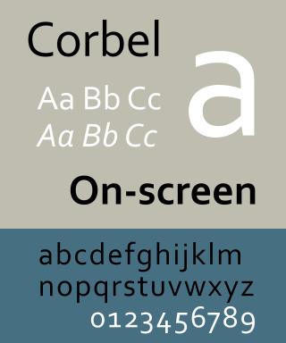
Corbel is a humanist sans-serif typeface designed by Jeremy Tankard for Microsoft and released to consumers in 2007. It is part of the ClearType Font Collection, a suite of fonts from various designers released with Windows Vista. All start with the letter C to reflect that they were designed to work well with Microsoft's ClearType text rendering system, a text rendering engine designed to make text clearer to read on LCD monitors. The other fonts in the same group are Calibri, Cambria, Candara, Consolas and Constantia.
Oblique type is a form of type that slants slightly to the right, used for the same purposes as italic type. Unlike italic type, however, it does not use different glyph shapes; it uses the same glyphs as roman type, except slanted. Oblique and italic type are technical terms to distinguish between the two ways of creating slanted font styles; oblique designs may be labelled italic by companies selling fonts or by computer programs. Oblique designs may also be called slanted or sloped roman styles. Oblique fonts, as supplied by a font designer, may be simply slanted, but this is often not the case: many have slight corrections made to them to give curves more consistent widths, so they retain the proportions of counters and the thick-and-thin quality of strokes from the regular design.

Century Gothic is a digital sans-serif typeface in the geometric style, released by Monotype Imaging in 1991. It is a redrawn version of Monotype's own Twentieth Century, a copy of Bauer's Futura, to match the widths of ITC Avant Garde Gothic. It is an exclusively digital typeface that has never been manufactured as metal type.

In metal typesetting, a font is a particular size, weight and style of a typeface. Each font is a matched set of type, with a piece for each glyph. A typeface consists of various fonts that share an overall design.
Font substitution is the process of using one typeface in place of another when the intended typeface either is not available or does not contain glyphs for the required characters.

Monotype Grotesque is a family of sans-serif typefaces released by the Monotype Corporation for its hot metal typesetting system. It belongs to the grotesque or industrial genre of early sans-serif designs. Like many early sans-serifs, it forms a sprawling family designed at different times.

Liberation is the collective name of four TrueType font families: Liberation Sans, Liberation Sans Narrow, Liberation Serif, and Liberation Mono. These fonts are metrically compatible with the most popular fonts on the Microsoft Windows operating system and the Microsoft Office software package, for which Liberation is intended as a free substitute. The fonts are default in LibreOffice.

Web typography, like typography generally, is the design of pages – their layout and typeface choices. Unlike traditional print-based typography, pages intended for display on the World Wide Web have additional technical challenges and – given its ability to change the presentation dynamically – additional opportunities. Early web page designs were very simple due to technology limitations; modern designs use Cascading Style Sheets (CSS), JavaScript and other techniques to deliver the typographer's and the client's vision.

Cascading Style Sheets (CSS) is a style sheet language used for describing the presentation of a document written in a markup language such as HTML or XML. CSS is a cornerstone technology of the World Wide Web, alongside HTML and JavaScript.
HTML attributes are special words used inside the opening tag to control the element's behaviour. HTML attributes are a modifier of a HTML element type. An attribute either modifies the default functionality of an element type or provides functionality to certain element types unable to function correctly without them. In HTML syntax, an attribute is added to a HTML start tag.
A reset stylesheet is a collection of CSS rules used to clear the browser's default formatting of HTML elements, removing potential inconsistencies between different browsers. It also prevents developers from unknowingly relying on the browser default styling and force them to be explicit about the styling they want to apply on the page.