Andrew Spence | |
---|---|
Born | 1947 Bryn Mawr, Pennsylvania, United States |
Nationality | American |
Education | University of California at Santa Barbara, Tyler School of Art |
Known for | Painting, printmaking |
Awards | Guggenheim Fellowship, National Endowment for the Arts, American Academy of Arts and Letters |
Website | Andrew Spence |
Andrew Spence (born 1947) is an American artist known for abstract paintings that combine a minimalist vocabulary with playful references to the observed world. [1] [2] [3] In the 1970s and 1980s, he gained recognition as one of a number of younger artists who were re-examining geometric modernism through a contemporary lens that invited humor and reference to everyday objects and life experience into the tradition. [4] [5] [6] [7] Spence's method of distilling visual phenomena into simple, emblematic images has been compared to Ellsworth Kelly, but his work has differed in its more even balance between abstraction and recognition (often aided by the picture titles), intuitive approach, and varied, expressive paint surfaces. [8] [9] [10] [11] Art in America critic Ken Johnson wrote that his work maintains "an ironic tension between lofty purism of modernist geometry and earth-bound ordinariness of the vernacular sources." [12] In later paintings, Spence has increasingly obscured the original inspirations of his abstractions, in both form and titling. [1] [13] His work belongs to the permanent collections of the Metropolitan Museum of Art, [14] Museum of Modern Art, [15] and Whitney Museum of American Art, [16] among others. He has received a Guggenheim Fellowship and awards from the American Academy of Arts and Letters and National Endowment for the Arts. [17] [18]
Spence was born in 1947 in Bryn Mawr, Pennsylvania and raised in Philadelphia. [1] [19] He attended the University of Oklahoma, then transferred to the Tyler School of Art, studying in Rome and Philadelphia before graduating with a BFA in 1969. [1] In 1971, he completed an MFA at University of California at Santa Barbara and moved to Los Angeles. [1] [20] He continued to make art and worked for several years as an art handler and crater, which reinforced an interest in the built world and afforded him direct access to the work of minimalist painter John McLaughlin and designer Charles Eames, both early influences. [20] [21] In his first professional decade, Spence was selected for the 1975 Whitney Biennial [16] and group exhibitions at MoMA PS1, the La Jolla Museum of Contemporary Art, Los Angeles Institute of Contemporary Art (LAICA), and Indianapolis Museum of Art. [19] [22] [21] His first solo exhibitions were at the Nicholas Wilder Gallery in Los Angeles in 1974 and 1976. [4] [23]
In 1977, Spence moved to New York City, where he exhibited in seven solo shows at the Barbara Toll Gallery between 1982 and 1990. [1] [24] [9] He has had subsequent exhibitions at the Worcester Art Museum (1991) and Max Protetch Gallery (1992, 1993), Edward Thorp Gallery (2001, 2002, 2006) and 57W57 Arts (2016) in New York, among others. [25] [12] [26] He also appeared in the 1989 Whitney Biennial, the 40th Biennial at the Corcoran Gallery of Art (1987), and group exhibitions at the Metropolitan Museum of Art and the Whitney Museum. [27] [28] [29] [30]
Spence lives and works in New York with his wife, Sique Spence. [21]
Spence's work has been related to minimalist predecessors such as Constructivism, Malevich and McLaughlin, as well as to contemporary movements such as Neo-Geo. [5] [8] However, critics suggest that it evades simple categorization, developing out of an intuitive "internal momentum," [7] rather than theoretical frameworks or ideological trends. [9] [31] [13] Eleanor Heartney wrote that his "quietly effective paintings steer a course between the austere reductiveness of an Ellsworth Kelly and the self-proclaimed negation of a Peter Halley." [9] Writers point to Spence's synthesis of humanizing aspects outside the formalist tradition as defining characteristics: a quirky sense of humor and associativeness; [24] [9] the use of personal imagery and observed experience; [31] [32] [8] a populist enthusiasm for vernacular design and the breakdown of high-low distinctions; [33] [12] [34] and densely worked surfaces that reveal the artistic process and impart an emotional quality to otherwise cool work. [7] [1]
Spence's art often occupies an ambiguous position between abstract and representational, sophisticated and ordinary, and meditative and deadpan that is echoed by shifting figure-ground relationships. [35] [32] [12] [1] His paintings arise out of a rigorous drawing process, which results in schematic images refined to edge of recognition and a core of essence. [36] [2] This formal concision extends to his use of color, which is non-associative, and while sometimes bold, often limited to two or three colors, one of which is nearly always white. [20] [7] Carol Diehl wrote that the work's "innate drollness" is offset by Spence's acute attention to surface. [10] While his paintings appear flat and hard-edged in reproduction, reviewers frequently note their physicality and dense, varied textures. [37] [12] [34] Spence builds them in waxy layers applied with a paint-laden palette knife, creating shapes with nearly engraved edges that he sands and polishes to an opaque sheen. [1] [10] [8]
Spence first received attention in the mid-1970s for abstract work compared to modernists from Malevich to Barnett Newman in terms of its reductive visual grammar, geometric integrity and stillness. [38] [4] [23] [39] The paintings referenced the texture and color of Los Angeles's built environment (e.g., prefabricated homes and trailers, aluminum siding or painted walls), incorporating molded-acrylic structural elements, abutting panels, impersonal industrial hues, and thickly applied enamel that sometimes formed vertical spines dividing color areas. [22] [4] [38] Critics compared them to "abstract facades ripped out of context" situated between paintings and painted objects, [40] and physical coarseness and compositional elegance. [35] Artweek's Suzanne Muchnic wrote "Spence attends to the anonymous, manmade beauty frequently overlooked in mundane surroundings"; [22] Los Angeles Times critic William Wilson likened the contemplative quality of the textured surfaces to the metaphysical paintings of Giorgio Morandi. [23] [4]
In the 1980s, Spence moved away from a rectilinear vocabulary, incorporating arcs, spirals and triangles and biomorphic shapes into his work. [36] [5] His images initially consisted of singular, iconic images in limited colors that were embedded in heavily textured surfaces and read like graphic language symbols or fragments of advertising logos. [24] [36] As the decade progressed, he turned increasingly to tongue-in-cheek, schematic renderings of common objects and architecture or modernist furniture (e.g., Light, 1987), whose inspirations and eccentric perspectival views (often overhead) only became apparent through the picture titles. [24] [30] [6] For example, Swivel Chairs (1988) drew on the well-known Eames armchair design, while Blue Canoe (1988) presented a field of horizontal stripes, two of which were blue and altered to mimic half-canoe shapes. [7] [9]
Critics such as Eleanor Heartney and Stephen Westfall contrasted the work's minimalist qualities—frontality, figure-ground equilibrium, a sense of planar rigor, proportion and balance—with its divergences from the tradition: idiosyncratic references to manufactured objects, elemental concepts and life experiences and an emphasis on the artist's hand, conveyed through expressive, evidently reworked surfaces. [5] [9] [7] [41] Heartney described paintings such as Ivy Windows (1988) as "simple without being simplistic," comparing its subtle and intricate relationships between shape, negative space and proportion and irregular rhythmic patterns to Mondrian's Broadway Boogie Woogie . [9]
By the end of the 1980s, Spence shifted toward enigmatic, formal compositions whose titles were comparably cryptic, seeking to extend viewer engagement with the work. [32] [20] For example, Commander (1989) and Citibanker (1990)—inspired respectively by a television remote control and an ATM—each presented spare abstractions of shifting planes, squares and rectangles, rendered in heavy, textured brushwork and surfaces scraped into smooth patinas. [20] [25] The minimal forms of Sculpture/Painting (1989) offered Spence's humorous recreation of the sight of his work behind a sculpture at the Whitney Biennial, as well as a meditation on the arbitrary nature of various art distinctions—representational, abstract, flat, three-dimensional, object and image. [20] [32]
Between 1993 and 1996, in shows at Max Protetch and Morris Healy, Spence continued to create visual complexity within simple configurations, relying on plays with similarity and difference, precise cropping, and repetition to push his images further into the nonfunctional, purely aesthetic realm. [33] [42] [43] [34] Two-color works, such as Up and Up and Space Saver (both 1993), alternated in terms of figure and ground to complicate readings, while others, like Cover Up (1993) and Goggleplex (1995), rotated and repeated simple forms (zigzags or letters, outlines of goggles) to create rhythmic visual puzzles that, given time, snapped into recognizability for viewers. [12] [44] [3]
In the 2000s, Spence altered his palette (often using bright saturated colors, in greater quantities), approach to pictorial space, and according to Carol Diehl, his content, shifting toward more fanciful images inspired by emotions rather than the emblematic objects of his past work. [10] [26] [45] [1] For example, works such as Bob (2002), presented complex spatial and optical effects that shifted under scrutiny, in that case, using horizontal stripes that changed color to suggest an ovoid shape in motion against a rectangle and curve. [10] [26] Faye Hirsch noted in Spence's 2006 show at Edward Thorp a relaxed approach to allusion that introduced a wider range of visual jokes and puns. The paintings Hidden Landscape (2005) and Untitled (Camouflage) (2004) combined bright and stereotypically girly colors with camouflage patterns, undermining traditional associations (masculinity, concealment); the lines and squiggles of Squid (2003) suggested both the aquatic creature and a lightbulb and its filaments. [1]
Spence has turned to linear forms that suggest contemporary signage, architectural schematics or scaffolding, and further disguise his original inspirations in much of his later work. [13] [46] [47] Earlier examples include Paint Run (2005)—which features a scaffold-like red line overlaid on pink and light green blocks—and Red Line (2005)—a continuous, red stroke tracing sideways flames on white. [1] Later works, such as Red Pink White 3 (2011) or Untitled Brown/Violet (2018), use spare lines and shapes to suggest layered or shifting two-dimensional planes within or on the periphery of canvasses, and continue Spence's longstanding explorations of picture, object, architecture and design. [46] [48]
Spence has received a Guggenheim Fellowship in 1994, as well as awards from the American Academy of Arts and Letters (2008) and the National Endowment for the Arts (1987). [17] [18] [21] His work belongs to corporate, university and museum collections, including those of the Metropolitan Museum of Art, [14] [49] Museum of Modern Art, [15] Whitney Museum of American Art, [16] Albright-Knox Art Gallery, [50] Boston Museum of Fine Arts, [51] Carnegie Museum of Art, [52] Cleveland Museum of Art, [53] Philadelphia Museum of Art, [54] Smithsonian Institution [55] and Walker Art Center, [56] among others.
Amy Sillman is a New York-based visual artist, known for process-based paintings that move between abstraction and figuration, and engage nontraditional media including animation, zines and installation. Her work draws upon art historical tropes, particularly postwar American gestural painting, as both influences and foils; she engages feminist critiques of the discourses of mastery, genius and power in order to introduce qualities such as humor, awkwardness, self-deprecation, affect and doubt into her practice. Profiles in The New York Times, ARTnews, Frieze, and Interview, characterize Sillman as championing "the relevance of painting" and "a reinvigorated mode of abstraction reclaiming the potency of active brushwork and visible gestures." Critic Phyllis Tuchman described Sillman as "an inventive abstractionist" whose "messy, multivalent, lively" art "reframes long-held notions regarding the look and emotional character of abstraction."
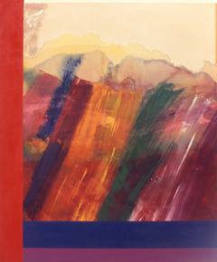
Ronnie Landfield is an American abstract painter. During his early career from the mid-1960s through the 1970s his paintings were associated with Lyrical Abstraction, and he was represented by the David Whitney Gallery and the André Emmerich Gallery.
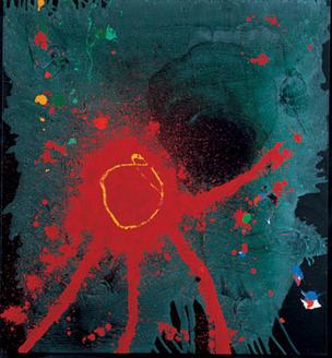
Lyrical abstraction is either of two related but distinct trends in Post-war Modernist painting:
Ronald "Ron" Davis is an American painter whose work is associated with geometric abstraction, abstract illusionism, lyrical abstraction, hard-edge painting, shaped canvas painting, color field painting, and 3D computer graphics. He is a veteran of nearly seventy solo exhibitions and hundreds of group exhibitions.
Olivier Mosset is a Swiss visual artist. He lives and works in Tucson, Arizona.
Seymour Boardman (1921–2005) was a New York abstract expressionist. Since his first solo exhibition in Paris in 1951, Boardman developed a personal vision and style of his own, following his own path of abstraction. As a painter he sought to reduce the image to its bare essence.
Alvin D. Loving Jr., better known as Al Loving, was an African-American abstract expressionist painter. His work is known for hard-edge abstraction, fabric constructions, and large paper collages, all exploring complicated color relationships.
Carol Diehl is an American artist, art critic and poet. In addition to her writing, most recently appearing in her blog Art Vent, she is best known for her paintings, which have often documented daily life in a manner described as diaristic, even compulsive, using dense, painterly, often indecipherable words, numbers and symbols in grid or geometric frameworks. Diehl has also been a prolific art critic, having contributed features and reviews to numerous periodicals, including Art in America, ARTnews, and Art + Auction, as well as to books and artist catalogues. In the 1990s, she became active in New York's performance poetry scene. Diehl lives in New York City and southwestern Massachusetts. She has two sons, Matt Diehl and Adam Diehl.
Thornton Willis is an American abstract painter. He has contributed to the New York School of painting since the late 1960s. Viewed as a member of the Third Generation of American Abstract Expressionists, his work is associated with Abstract Expressionism, Lyrical Abstraction, Process Art, Postminimalism, Bio-morphic Cubism and Color Field painting.
Candida Alvarez is an American artist and professor, known for her paintings and drawings.
John Zurier is an abstract painter born in Santa Monica, CA, known for his minimal, near-monochrome paintings. His work has shown across the American West as well as in Europe and Japan. He has worked in Reykjavik, Iceland and Berkeley, Ca.
Ralph Humphrey was an American abstract painter whose work has been linked to both Abstract Expressionism and Minimalism. He was active in the New York art scene in the 1960s and '70s. His paintings are best summarized as an exploration of space through color and structure. He lived and worked in New York, NY.
Victor George Kord is an American painter and educator. He currently maintains a studio and exhibits in New York City. He previously served as art department chair for several major universities, and remains professor emeritus of painting at Cornell University Department of Art.
Rodney Carswell is an American abstract artist. He first gained recognition for human-scaled, geometric paintings that feature exposed, projected support structures, creating interplay between sculptural presence and richly painted pictorial surfaces. His recent paintings eschew the superstructures and evoke a greater sense of immediacy, playfulness, and narrative. Critics often describe Carswell's work as uncanny, elusive or quirky, for its tendency to negotiate "in-between" spaces and embrace contradictions such as order and instability, intention and accident, or back and front. Employing irregularly shaped canvasses, thick supports, and openings or holes that reveal the stretcher construction and walls behind them, works like 3 (1994) often occupy a place between painting and sculpture. In a similar way, Carswell uses the modernist languages of Minimalism, Suprematism and Constructivism, yet eludes those categories with postmodern allusions to architecture, the body and spiritual iconography, and with his process-oriented, "hand-made" surfaces. In his essay for Carswell's mid-career retrospective at Chicago's Renaissance Society, Los Angeles Times critic David Pagel suggested that his understated paintings worked their way into the one's consciousness in a "supple, somewhat unsettling manner" that achieves a subtle, but lingering shift in perception.
Judith Murray is an American abstract painter based in New York City. Active since the 1970s, she has produced a wide-ranging, independent body of work while strictly adhering to idiosyncratic, self-imposed constants within her practice. Since 1975, she has limited herself to a primary palette of red, yellow, black and white paints—from which she mixes an infinite range of hues—and a near-square, horizontal format offset by a vertical bar painted along the right edge of the canvas; the bar serves as a visual foil for the rest of the work and acknowledges each painting’s boundary and status as an abstract object. Critic Lilly Wei describes Murray's work as "an extended soliloquy on how sensation, sensibility, and digressions can still be conveyed through paint" and how by embracing the factual world the "abstract artist can construct a supreme and sustaining fiction."
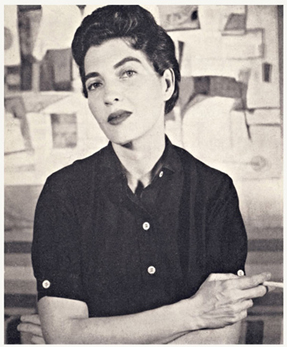
Ethel Fisher was an American painter whose career spanned more than seven decades in New York City, Miami and Los Angeles. Her work ranges across abstraction and representational genres including large-scale portraiture, architectural "portraits," landscape and still-life, and is unified by a sustained formal emphasis on color and space. After studying at the Art Students League in the 1940s, Fisher found success as an abstract artist in Florida in the late 1950s, and began exhibiting her work nationally and in Havana, Cuba. Her formative work of this period embraced the history of art, architecture and anthropology; she referred to it as "abstract impressionist" to distinguish her approach to form and color from that of Abstract Expressionism.
Frances Barth is an American visual artist best known for paintings situated between abstraction, landscape and mapping, and in her later career, video and narrative works. She emerged during a period in which contemporary painters sought a way forward beyond 1960s minimalism and conceptualism, producing work that combined modernist formalism, geometric abstraction, referential elements and metaphor. Critic Karen Wilkin wrote, "Barth’s paintings play a variety of spatial languages against each other, from aerial views that suggest mapping, to suggestions of perspectival space, to relentless flatness … [she] questions the very pictorial conventions she deploys, creating ambiguous imagery and equally ambiguous space that seems to shift as we look."
Woody De Othello is an American ceramicist and painter. He lives and works in the San Francisco Bay Area, California.
James Little is an American painter and curator. He is known for his works of geometric abstraction which are often imbued with exuberant color. He has been based in New York City.
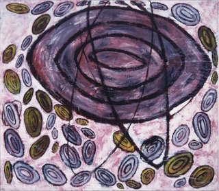
Joan Moment is an American painter based in Northern California. She emerged out of the 1960s Northern California Funk art movement and gained attention when the Whitney Museum of American Art Curator Marcia Tucker selected her for the 1973 Biennial and for a solo exhibition at the Whitney in 1974. Moment is known for process-oriented paintings that employ non-traditional materials and techniques evoking vital energies conveyed through archetypal iconography. Though briefly aligned with Funk—which was often defined by ribald humor and irreverence toward art-world pretensions—her work diverged by the mid-1970s, fusing abstraction and figuration in paintings that writers compared to prehistoric and tribal art. Critic Victoria Dalkey wrote that Moment's methods combined chance and improvisation to address "forces embodied in a universe too large for us to comprehend, as well as the … fragility and transience of the material world."