 | |
| Category | Display |
|---|---|
| Designer(s) | Roger Excoffon |
| Foundry | Olive |
| Date released | 1951 |
 | |
| Sample | |
Banco is an inclined titling typeface. It was designed by Roger Excoffon for the Fonderie Olive foundry in 1951. [1]
 | |
| Category | Display |
|---|---|
| Designer(s) | Roger Excoffon |
| Foundry | Olive |
| Date released | 1951 |
 | |
| Sample | |
Banco is an inclined titling typeface. It was designed by Roger Excoffon for the Fonderie Olive foundry in 1951. [1]
Like Excoffon's prior fonts Mistral and Choc, Banco was designed to be eye-catching, with what designer Cyrus Highsmith called an "outspoken flair." [1]
The font was considered old-fashioned and unappealing by designers of the time, [1] [2] and after launch it was primarily used by small businesses in Europe. The font's popularity was renewed when it appeared on the cover of Bob Marley's 1974 album Natty Dread , and subsequently on many other reggae records. The skateboarding magazine Thrasher , which was heavily influenced by reggae and dub culture, adopted it for its 1981 launch and later issues. [3] It was used on the PK Ripper BMX and the tv series Darkwing Duck .
While Excoffon did not design a lowercase alphabet for Banco, Phill Grimshaw and the ITC font foundry released a lighter-weight version of the font in 2000, which included lowercase letters. [4] Banco was also translated into Cyrillic in 2000. [3]
== See also ==}

Helvetica, also known by its original name Neue Haas Grotesk, is a widely-used sans-serif typeface developed in 1957 by Swiss typeface designer Max Miedinger and Eduard Hoffmann.

Matthew Carter is a British type designer. A 2005 New Yorker profile described him as 'the most widely read man in the world' by considering the amount of text set in his commonly used typefaces.

Futura is a geometric sans-serif typeface designed by Paul Renner and released in 1927. It was designed as a contribution on the New Frankfurt-project. It is based on geometric shapes, especially the circle, similar in spirit to the Bauhaus design style of the period. It was developed as a typeface by the Bauer Type Foundry, in competition with Ludwig & Mayer's seminal Erbar typeface of 1926.

In metal typesetting, a font or fount is a particular size, weight and style of a typeface, defined as the set of fonts that share an overall design. For instance, the typeface Bauer Bodoni includes fonts "Roman", "bold" and "italic"; each of these exists in a variety of sizes.
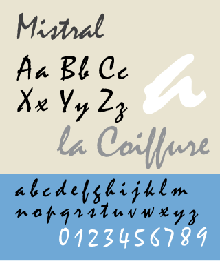
Mistral is a casual script typeface designed by Roger Excoffon for the Fonderie Olive type foundry, and released in 1953. The Amsterdam Type foundry released a version in 1955.

Peignot is a sans-serif display typeface, designed by the poster artist A. M. Cassandre in 1937. It was commissioned by the French type foundry Deberny & Peignot.

FF Scala Sans is a humanist sans-serif typeface designed by Dutch designer Martin Majoor in 1993 for the Vredenburg Music Center in Utrecht, the Netherlands. It was designed as a companion to Majoor's earlier serif old style typeface FF Scala, designed in 1990.

Syntax comprises a family of fonts designed by Swiss typeface designer Hans Eduard Meier. Originally just a sans-serif font, it was extended with additional serif designs.

Benton Sans is a digital typeface family begun by Tobias Frere-Jones in 1995, and expanded by Cyrus Highsmith of Font Bureau. It is based on the sans-serif typefaces designed for American Type Founders by Morris Fuller Benton around the beginning of the twentieth century in the industrial or grotesque style. It was a reworked version of Benton Gothic developed for various corporate customers, under Frere-Jones's guidance. In developing the typeface, Frere-Jones studied drawings of Morris Fuller Benton's 1908 typeface News Gothic at the Smithsonian Institution. The typeface began as a proprietary type, initially titled MSL Gothic, for Martha Stewart Living magazine and the website for Martha Stewart Living Omnimedia. As Benton Gothic, there are 7 weights from Thin to Black and only 2 widths.

Interstate is a digital Typeface designed by Tobias Frere-Jones in the period 1993–1999, and licensed by Frere-Jones Type. The typeface is based on the FHWA series of fonts, a series of signage alphabets drawn for the Federal Highway Administration by Dr. Theodore W. Forbes in 1949, assisted by J.E. Penton and E.E. Radek.
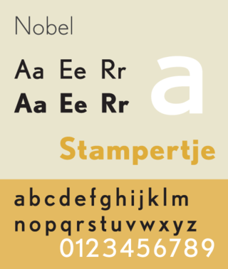
Nobel is a geometric sans-serif typeface designed by Sjoerd Henrik de Roos (1877–1962) and Dick Dooijes (1909–1998) in the period 1929–1935 for the Amsterdam Type foundry). Capitalizing upon Lettergieterij Amsterdam's substantial financial interest in the Berlin typefoundry H. Berthold AG, de Roos decided as a Dutch competitor to Futura to license the Berthold foundry's geometric Berthold Grotesk, change some characters and sell it in the Netherlands under this name. The resulting face became very popular in Dutch printing.

Roger Excoffon was a French typeface designer and graphic designer.
The Fonderie Olive, in English, Olive Foundry, was a small but high-profile type foundry located in Marseille, France. It is best known for the work of the typeface designer Roger Excoffon. In 1978 the foundry was acquired by the Mergenthaler Linotype Company which transferred photocomposition rights for all faces to Haas.
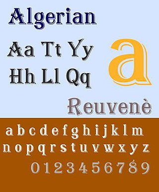
Algerian is a decorative serif digital font family, originally produced in the early 20th century by British foundry Stephenson, Blake and Co. The design for the typeface is owned by Linotype, while the name 'Algerian' is a trademark of the International Typeface Corporation.
FontShop International was an international manufacturer of digital typefaces (fonts), based in Berlin. It was one of the largest digital type foundries.
The Font Bureau, Inc. or Font Bureau is a digital type foundry based in Boston, Massachusetts, United States. The foundry is one of the leading designers of typefaces, specializing in type designs for magazine and newspaper publishers.

Miller is a serif typeface, released in 1997 by the Font Bureau, a U.S.-based digital type foundry. It was designed by Matthew Carter and is of the 'transitional' style from around 1800, based on the "Scotch Roman" type which originates from types sold by Scottish type foundries that later became popular in the United States. It is named for William Miller, founder of the long-lasting Miller & Richard type foundry of Edinburgh.

Choc is a display script typeface designed by Roger Excoffon in 1955.

Metro is a sans-serif typeface family created by William Addison Dwiggins and released by the American Mergenthaler Linotype Company from 1929 onwards.
Cyrus Highsmith is an American typeface designer, illustrator, and author.
{{Commons category|Banco (typeface)}