Cartographic labeling

Last updated
Maps template-en.svg

Cartographic labeling is a form of typography and strongly deals with form, style, weight and size of type on a map. Essentially, labeling denotes the correct way to label features (points, arcs, or polygons).

Cartography The study and practice of making maps

Cartography is the study and practice of making maps. Combining science, aesthetics, and technique, cartography builds on the premise that reality can be modeled in ways that communicate spatial information effectively.

Typography Art and the craft of printing and the arranging of layouts

Typography is the art and technique of arranging type to make written language legible, readable, and appealing when displayed. The arrangement of type involves selecting typefaces, point sizes, line lengths, line-spacing (leading), and letter-spacing (tracking), and adjusting the space between pairs of letters (kerning). The term typography is also applied to the style, arrangement, and appearance of the letters, numbers, and symbols created by the process. Type design is a closely related craft, sometimes considered part of typography; most typographers do not design typefaces, and some type designers do not consider themselves typographers. Typography also may be used as a decorative device, unrelated to communication of information.

Typeface Set of characters that share common design features

In typography, a typeface is a set of one or more fonts each composed of glyphs that share common design features. Each font of a typeface has a specific weight, style, condensation, width, slant, italicization, ornamentation, and designer or foundry. For example, "ITC Garamond Bold Condensed Italic" means the bold, condensed-width, italic version of ITC Garamond. It is a different font from "ITC Garamond Condensed Italic" and "ITC Garamond Bold Condensed", but all are fonts within the same typeface, "ITC Garamond". ITC Garamond is a different typeface from "Adobe Garamond" or "Monotype Garamond". There are thousands of different typefaces in existence, with new ones being developed constantly.

Contents

Form

In type, form describes anything from lengths between letters to the case and color of the font. Form works well for both nominal (qualitative) and ordered (quantitative) data.

Italics

Italics describe the sloping of letters setting it apart from non-italicized words (or vice versa). Using italics on a map also slightly decreases the size of the font as it shapely squeezes it around features. When introduced, the idea was to condense the text by italicizing it, thus creating more text on the pages. The slope in the font was created to mimic the flow of cursive handwriting and thus, the angles of italic letters range anywhere from 11 to 30 degree and consequently, serifs are absent.

As a general rule on maps, the smaller the point size of a font, the more condensed and difficult it becomes to read. In an example of labeling a globe, ocean features are generally italicized to give an obvious discernment. In cartographic conventions, natural features are adequate in italics such as the aforementioned hydrographic features.

Hydrography Applied science of measurement and description of physical features of bodies of water

Hydrography is the branch of applied sciences which deals with the measurement and description of the physical features of oceans, seas, coastal areas, lakes and rivers, as well as with the prediction of their change over time, for the primary purpose of safety of navigation and in support of all other marine activities, including economic development, security and defence, scientific research, and environmental protection.

Case

Case is another way of emphasizing—whether it be uppercase, lowercase or a combination of the two (or even different size points within the same case). In general, uppercase fonts denote a higher emphasis, but according to Bringhurst (1996), an uppercase initial of a word has the seniority; but the lowercase letters have the control. In other words, the strong boldness of a larger letter draws the audience into its viewpoint. The lowercase letters contain the information needed to convey further. When viewing the text on maps, it is still crucial to gain the audience’s attention as a way of informing them of something other than the map(s). As for design, uppercase is much harder to read than mixed-use. In the globe example, mountain ranges should be in uppercase. When showing a larger scale, such as a region of the United States, it is useful to classify different case sizes. States should be in uppercase, with counties in small uppercase, and cities in lowercase.

Letter case Distinction between alphabetic letters in taller, "upper" case and shorter "lower" case

Letter case is the distinction between the letters that are in larger upper case and smaller lower case in the written representation of certain languages. The writing systems that distinguish between the upper and lower case have two parallel sets of letters, with each letter in one set usually having an equivalent in the other set. The two case variants are alternative representations of the same letter: they have the same name and pronunciation and are treated identically when sorting in alphabetical order.

Color

Color (value and hue) alterations also allow for further emphasis on certain features. By changing the color of the font to correspond to the feature it is representing, the two become joined. If the cartographer were to label a river, the extra emphasis would be inherent if the font chosen was blue, to correspond with the blue feature (arc). On the contrary, though, this is not always necessarily the case. If the cartographer chose a color of the font for an ocean feature (polygon), blue would not be the obvious choice because it would appear to be washed out and thus, no emphasis. In this case, it is useful to label the feature with a more rich, bolder color (such as the black font on blue polygon).

Color Characteristic of human visual perception

Color, or colour, is the characteristic of human visual perception described through color categories, with names such as red, orange, yellow, green, blue, or purple. This perception of color derives from the stimulation of cone cells in the human eye by electromagnetic radiation in the visible spectrum. Color categories and physical specifications of color are associated with objects through the wavelength of the light that is reflected from them. This reflection is governed by the object's physical properties such as light absorption, emission spectra, etc.

Spacing

The spacing of the letters on features also gives a more appealing map-—visually speaking. By enlarging the increments between each letter of a word, the word in turn, becomes more pronounced. In the case for a long arc feature (river), to add more emphasis on the label, the letters would need to be extended or stretched. On the other hand, in some cases, the letters would have to be condensed (shortened increment gaps) to give a more proportional label for a feature.

Style

Serifs

The type style affects to the overall look of the map and is adequately used to symbolize nominal (qualitative) data within the map. In general, style amounts to the use of serifs versus sans serifs. A serif is, by definition, a cross-line at the end of a stroke along with a letter. On a map, the text that is chosen should be consistent. Generally, serif fonts are utilized to give a more regimented block body of text—similar to those used in traditional printing. Serifs are more widely used for historical information or a historical map.

Sans serifs

The serif counterpart is sans serifs (meaning without serifs). Sans serif fonts are the more modern of the two fonts. But choosing one over the other requires that the audience will be able to read the text without strain. Generally, sans serifs are not for large bodies of text in print but instead, are ideal for the internet. On the same facet, sans serifs are optimal for a more-clean appearance in such places like a header, title, or legend. In map design, it’s useful to also use sans serifs for natural features.

Weight

The type weight provides a substantial amount of emphasis of the cartographer’s choosing. Weight is important because it involves the difference between bold and regular contrast. The degree of power that is increased with weight, must be proportional to the size of the letter. If not, a letter can be too intense and thus more difficult to read. Similarly, the spacing between the letters must be extended to provide adequate to read smoothly. Bold text creates direct attention to the eyes of the audience to pronounce certain information from cartographer.

Size

The type size of fonts stresses the importance and emphasis of the intended map. Size is expressed in points through the American point system with 1 point equaling 1/72" of vertical height. Furthermore, points also show the spacing between letters, words and lines. A larger size implies more importance or a greater relative quantity; smaller denotes less importance or less quantity. For design purposes, text using a size of less than 6 point is difficult to read. On the contraire, text that is larger than 26 point is too cumbersome for a standard-size paper format. For titles, a font larger than 10 point generally allows for a good working title. Also, it is important to use at least a 2-point difference between type sizes to allow the audience to see subtle changes.

Placement

With all of the type in order and adequately designed, the final step is the correct placement of labels. Placement describes each feature and its subsequent label(s). For area features, it is important to curve and extend the spaces to properly fill in the areas enough that the audience can discern different areas. As a cartographic convention, labels are usually as horizontal as possible with no upside-down labels. For line features, it is useful to allow the label to conform to the line pattern. Similar to a river (e.g. geographic features), the label should flow around the edges along the line being careful not to have the letters too extended. For point patterns, the minor patterns to follow include keeping labels on/in their respective features (e.g. coastal cities with labels on the land and not ocean). The major pattern for points is the placement along the point itself. The most widely accepted pattern is to start at the center and work outward towards the northeast quadrant from the point. Many studies have been researched to address the correct strategy for the placements. The point feature cartographic label placement (PFCLP) problem offers the solutions when point boxes overlap. Many software features automatically choose label placements for the cartographer, but these are not always a fail-safe option. The use of good judgment and cartographic conventions are important to gain the best placement.

See also

Related Research Articles

Verdana humanist sans-serif font

Verdana is a humanist sans-serif typeface designed by Matthew Carter for Microsoft Corporation, with hand-hinting done by Thomas Rickner, then at Monotype. Demand for such a typeface was recognized by Virginia Howlett of Microsoft's typography group and commissioned by Steve Ballmer. The name "Verdana" is based on verdant, and Ana.

Sans-serif typeface classification for letterforms without serifs

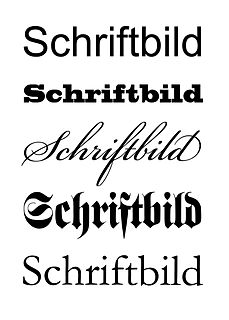
In typography and lettering, a sans-serif, sans serif, gothic, or simply sans letterform is one that does not have extending features called "serifs" at the end of strokes. Sans-serif fonts tend to have less line width variation than serif fonts. In most print, they are often used for headings rather than for body text. They are often used to convey simplicity and modernity or minimalism.

In typography, a serif is a small line or stroke regularly attached to the end of a larger stroke in a letter or symbol within a particular font or family of fonts. A typeface or "font family" making use of serifs is called a serif typeface, and a typeface that does not include them is a sans-serif one. Some typography sources refer to sans-serif typefaces as "grotesque" or "Gothic", and serif typefaces as "roman".

Emphasis (typography) Typographical distinction

In typography, emphasis is the strengthening of words in a text with a font in a different style from the rest of the text, to highlight them. It is the equivalent of prosodic stress in speech.

Italic type Font style characterised by cursive typeface and slanted design

In typography, italic type is a cursive font based on a stylised form of calligraphic handwriting. Owing to the influence from calligraphy, italics normally slant slightly to the right. Italics are a way to emphasise key points in a printed text, to identify many types of creative works, or, when quoting a speaker, a way to show which words they stressed. One manual of English usage described italics as "the print equivalent of underlining".

Small caps Lowercase characters that resemble uppercase letters except smaller in height

In typography, small capitals are lowercase characters typeset with glyphs that resemble uppercase letters ("capitals") but reduced in height and weight, close to the surrounding lowercase (small) letters or text figures. Note that this is technically not a case-transformation, but a substitution of glyphs, although the effect is often simulated by case-transformation and scaling. Small caps are used in running text as a form of emphasis that is less dominant than all uppercase text, and as a method of emphasis or distinctiveness for text alongside or instead of italics, or when boldface is inappropriate. For example, the "Text in small caps" appears as Tᴇxᴛ ɪɴ sᴍᴀʟʟ ᴄᴀᴘs in small caps. Small caps can be used to draw attention to the opening phrase or line of a new section of text, or to provide an additional style in a dictionary entry where many parts must be typographically differentiated.

x-height Distance between the baseline and the mean line of lower-case letters in a typeface

In typography, the x-height, or corpus size, is the distance between the baseline and the mean line of lower-case letters in a typeface. Typically, this is the height of the letter x in the font, as well as the v, w, and z. One of the most important dimensions of a font, x-height is used to define how high lower-case letters are compared to upper-case letters.

Trebuchet MS humanist sans-serif font

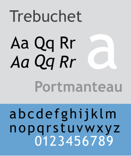
Trebuchet MS is a humanist sans-serif typeface that Vincent Connare designed for the Microsoft Corporation in 1996. It is named after the trebuchet, a medieval siege engine. The name was inspired by a puzzle question that Connare heard at Microsoft headquarters: "Can you make a trebuchet that could launch a person from main campus to the new consumer campus about a mile away? Mathematically, is it possible and how?" Connare "thought that would be a great name for a font that launches words across the Internet". Trebuchet MS was the font used for the window titles in the Windows XP default theme, succeeding MS Sans Serif and Tahoma. Released free of charge by Microsoft as part of their core fonts for the Web package, it remains one of the most popular body text fonts on webpages.

Corbel (typeface) typeface

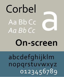
Corbel is a humanist sans-serif typeface designed by Jeremy Tankard for Microsoft and released in 2005. It is part of the ClearType Font Collection, a suite of fonts from various designers released with Windows Vista. All start with the letter C to reflect that they were designed to work well with Microsoft's ClearType text rendering system, a text rendering engine designed to make text clearer to read on LCD monitors. The other fonts in the same group are Calibri, Cambria, Candara, Consolas and Constantia.

Counter (typography) white space that is wholly enclosed by the stroke of a handwritten or typographic letterform

In typography, a counter is the area of a letter that is entirely or partially enclosed by a letter form or a symbol. The stroke that creates such a space is known as a "bowl". Letters containing closed counters include A, B, D, O, P, Q, R, a, b, d, e, g, o, p, and q. Letters containing open counters include c, f, h, i, s etc. The digits 0, 4, 6, 8, and 9 also possess a counter. An aperture is the opening between an open counter and the outside of the letter.

Font Particular size, weight and style of a typeface

In metal typesetting, a font was a particular size, weight and style of a typeface. Each font was a matched set of type, one piece for each glyph, and a typeface consisting of a range of fonts that shared an overall design.

Letter (alphabet) grapheme in an alphabetic system of writing

A letter is a segmental symbol of a phonemic writing system. The inventory of all letters forms the alphabet. Letters broadly correspond to phonemes in the spoken form of the language, although there is rarely a consistent, exact correspondence between letters and phonemes.

Akzidenz-Grotesk typeface

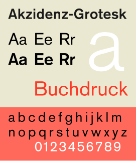
Akzidenz-Grotesk is a sans-serif typeface family originally released by the Berthold Type Foundry of Berlin. Akzidenz indicates its intended use as a typeface for commercial, or "occasional" or "jobbing", print runs such as publicity, tickets and forms, as opposed to fine printing.

Monaco (typeface) monospaced typeface

Monaco is a monospaced sans-serif typeface designed by Susan Kare and Kris Holmes. It ships with OS X and was already present with all previous versions of the Mac operating system. Characters are distinct, and it is difficult to confuse 0 and O, or 1, |, I and l. A unique feature of the font is the high curvature of its parentheses as well as the width of its square brackets, the result of these being that an empty pair of parentheses or square brackets will strongly resemble a circle or square, respectively.

Mrs Eaves Transitional serif typeface designed by Zuzana Licko

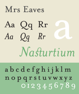
Mrs Eaves is a transitional serif typeface designed by Zuzana Licko in 1996. It is a variant of Baskerville, which was designed in Birmingham, England, in the 1750s. Mrs Eaves adapts Baskerville for use in display contexts, such as headings and book blurbs, through the use of a low x-height and a range of unusual combined characters or ligatures.

Microsoft Sans Serif

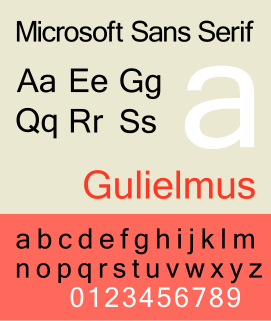
Microsoft Sans Serif is a TrueType font introduced with Windows 2000. It is a successor of MS Sans Serif, a proportional raster font introduced in Windows 1.0. Both fonts are very similar in design to Arial and Helvetica. This font was made to match the MS Sans bitmap included in the early releases of Microsoft Windows.

Syntax (typeface)

Syntax comprises a family of fonts designed by Swiss typeface designer Hans Eduard Meier. Originally just a sans-serif font, it was extended with additional serif designs.

Typeface anatomy describes the graphic elements that make up Font in a typeface.

References

  1. Judith A. Tyner (2017-09-12). Principles of Map Design. Books.google.com. ISBN   9781609180317 . Retrieved 2016-01-31.