In this map, Germany is the most clearly recognizable figure, with everything else (the "faded part") being ground. However, secondary (less prominent but still recognizable and usable) figures include the European Union, the land, the ocean, and the inset map, each with its unique corresponding ground. Some features do not have clear figure-ground contrast, such as Europe (dark green+light green+dark gray vs. light gray+white), and can be difficult to perceive unambiguously.
Figure-ground contrast, in the context of map design, is a property of a map in which the map image can be partitioned into a single feature or type of feature that is considered as an object of attention (the figure), with the remainder of the map being relegated to the background, outside the current focus of attention.[1] It is thus based on the concept of figure–ground from Gestalt psychology. For example, in a street map with strong figure-ground contrast, the reader would be able to isolate and focus attention on individual features, like a given street, park, or lake, as well as layers of related features, like the street network.
Strong figure-ground contrast has been seen as a desirable goal of map design, because it helps the map reader to perceive distinct geographic phenomena in the map. This allows more complex composition techniques such as visual hierarchy to organize these phenomena into clear structures that help readers use the map for its intended purposes.
Related disciplines and history
Fields other than cartography, such as psychology, neurology, and computer science, have studied differentiation of figure from ground. Many studies have employed different experiments, varying the shades, textures, and orientations of test pictures to determine the best method for figure–ground design with mixed results. A current application of figure–ground research is the development of computer vision for robots. By studying the way humans perceive figure and ground, methods can be developed to improve computer vision algorithms.[2] Unlike some of these other applications, in which figures and grounds are discovered in a natural visual field that may or may not have this contrast, in cartography they are intentionally created by design, based on knowledge of the visual perception tendencies of map readers.
Since the early days of academic cartography, there has been a recognition of the need for maps to have a conceptual structure. In The Look of Maps (1952), Arthur Robinson emphasized the need for visual contrast in making maps that are clearly organized, including the figure-ground relationship, "the visual relation of one or more components to the background on which they are seen."[3] In 1972, Borden Dent appears to have been the first to use the principles of perceptual psychology to develop a theory of how the figure-ground relationship emerges on maps (as well as Visual hierarchy), and a set of guidelines for design to strengthen it.[4] He identified heterogeneity (contrast), Contour (strong edges), Area (size) and Enclosedness (closure) as the primary determinants of figure identification, a model that gained wide support, soon becoming a core principle of the cartographic canon found in textbooks (including his own). He tied it directly to the idea of visual levels, the illusion that some elements on the map appear to float above the page, suggesting that figures are "above" their ground. This correlation has also gained widespread, if not universal, acceptance,[1] even though there are common situations when figures appear below their ground (such as a river beneath a road network).
Further research was largely grounded in Gestalt psychology and perception, which largely corroborated and expanded upon Dent's model. In summarizing the work to date, MacEachren added Orientation and Convexity to Dent's list, with the acknowledgment that these are relatively minor influences compared to the others.[5] MacEachren discussed the concept of visual levels as "related," but not equal, to figure-ground contrast.
Influences on figure–ground contrast
Several visual patterns are believed to contribute to figure-ground contrast, such that features that exhibit these patterns are easier to recognize as figures. These have been largely adopted from Gestalt psychology.
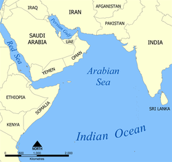
In this map, figures like Oman and the Arabian Sea are less obvious due to a lack of differentiation. The land and the ocean have strong differentiation, but can be difficult to recognize which is figure because neither is closed. Closure and centrality make Oman easier to isolate as a figure than India.
Differentiation or heterogeneity, the amount of difference in appearance between the intended figure and the intended ground.[4] A strong figure looks significantly different than everything in the ground, while the elements of the ground look relatively similar to each other. This can be accomplished using almost any of the visual variables, such as color, size, and texture. Achieving difference is more important than using prescribed design techniques on the figure and ground; for example, a dark figure stands out on a light background just as much as a light figure stands out on a dark background.[6]
Closure, the appearance of a figure to be completely contained within the visual field, and thus entirely surrounded by ground.[7] A figure with closure stands out because it looks like "a thing." The proclivity for closed objects is so strong in human visual processing that humans will perceive closure even when figures are only mostly closed.[4]
Centrality, in which features near the center of the visual field (the map) are easier to isolate as figures than features on the edge.[8] The concept of centrality is important because the object located in the center of a map is most often assumed to be the figure. Other map elements can be centered in the remaining visual space after the figure has been centered.
Size, in which smaller elements are more easily recognized as figures than those that fill the visual field.[5] This is one of the few factors in which figure-ground and visual hierarchy have opposite effect.
Interposition is when some features appear to be "in front" of others in the visual field, with the former partially obscuring the latter.[4] The former thus has a stronger recognition as a figure. This property could be considered a more complex use of closure.
Articulation utilizes texture to differentiate figure from ground. One common example of using articulation on a map is differentiating a continent from the ocean. The ocean, in most cases, will be the ground and the continent will be the figure.[4] By adding fine-textured shading to water, the continent pops out visually as the figure.[9] Another method that can be employed for articulation is called vignetting, or the inclusion of brightness gradients at the land-water edge.
Contour is the strength of the boundary or edge of a figure. The figure is formed by a contour or outline (as opposed to an isometric contour line), the common boundary between the figure and ground, usually through a brightness contrast.[6] If a figure is not separated entirely from the ground, a simple black contour line can be drawn around the figure enclosing it and thus differentiating it from the ground.[4]
Relationship to visual hierarchy
The concept of figure-ground contrast is often confused with the concept of visual hierarchy. Both are related elements of map composition, the same design techniques frequently achieve both goals simultaneously, and they are synergistic in that strengthening one typically has the side effect of strengthening the other. The primary difference is in intent. Figure-ground contrast is about making each feature appear distinct from the rest of the features in the map, while visual hierarchy is about making each feature appear more or less important than the rest of the features in the map.[10]
References
1 2 Tait, Alex (2018) Visual Hierarchy and LayoutArchived 2024-05-26 at the Wayback Machine . The Geographic Information Science & Technology Body of Knowledge (2nd Quarter 2018 Edition), John P. Wilson (ed.). DOI: 10.22224/gistbok/2018.2.4
↑ Robinson, Arthur, The Look of Maps, University of Wisconsin Press, 1952, p.69.
1 2 3 4 5 6 Borden D. Dent, 1972, "Visual organization and thematic map design", Annals of the Association for American Geographers, p. 79-93.
1 2 MacEachren, Alan M., How Maps Work, Guilford Press, 1995
1 2 Alan MacEachren and T.A. Mistrick, "The role of brightness differences in figure–ground: is darker figure?", The Cartographic Journal, 29:91-100, December 1992.
↑ Arthur Robinson et al., Elements of Cartography, 1995
↑ Terry A. Slocum, Robert B. McMaster, Fritz C. Kessler, and Hugh H. Howard, 2005, Thematic Cartography and Geographic Visualization, 2nd ed., Pearson Prentice Hall, Upper Saddle River, NJ
↑ G. Head, 1972, "Land-water differentiation in black and white cartography", The Canadian Cartographer, vol. 9, no. 1, p. 25-38.
↑ Mark Monmonier, 1993, Mapping it Out: Expository Cartography for the Humanities and Social Sciences, University of Chicago Press, Chicago, IL.
This page is based on this Wikipedia article Text is available under the CC BY-SA 4.0 license; additional terms may apply. Images, videos and audio are available under their respective licenses.