
Typography is the art and technique of arranging type to make written language legible, readable and appealing when displayed. The arrangement of type involves selecting typefaces, point sizes, line lengths, line spacing, letter spacing, and spaces between pairs of letters. The term typography is also applied to the style, arrangement, and appearance of the letters, numbers, and symbols created by the process. Type design is a closely related craft, sometimes considered part of typography; most typographers do not design typefaces, and some type designers do not consider themselves typographers. Typography also may be used as an ornamental and decorative device, unrelated to the communication of information.
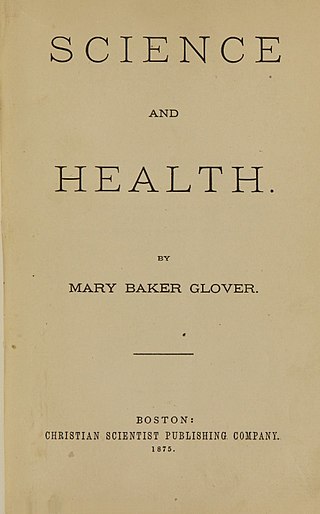
Science and Health with Key to the Scriptures by Mary Baker Eddy is, along with the Bible, one of two central texts of the Christian Science religion. Eddy described it as her "most important work". She began writing it in February 1872, and the first edition was published in 1875. She would continue editing it and adding to it for the rest of her life.

Frederic William Goudy was an American printer, artist and type designer whose typefaces include Copperplate Gothic, Goudy Old Style and Kennerley. He was one of the most prolific of American type designers and his self-named type continues to be one of the most popular in America.

Antiqua is a style of typeface used to mimic styles of handwriting or calligraphy common during the 15th and 16th centuries. Letters are designed to flow, and strokes connect together in a continuous fashion; in this way it is often contrasted with Fraktur-style typefaces where the individual strokes are broken apart. The two typefaces were used alongside each other in the germanophone world, with the Antiqua–Fraktur dispute often dividing along ideological or political lines. After the mid-20th century, Fraktur fell out of favor and Antiqua-based typefaces became the official standard in Germany.
NicholasJenson was a French engraver, pioneer, printer and type designer who carried out most of his work in Venice, Italy. Jenson acted as Master of the French Royal Mint at Tours and is credited with being the creator of one of the finest early Roman typefaces. Nicholas Jenson has been something of an iconic figure among students of early printing since the nineteenth century when the artist William Morris praised the beauty and perfection of his roman font. Jenson is an important figure in the early history of printing and a pivotal force in the emergence of Venice as one of the first great centers of the printing press.

A type foundry is a company that designs or distributes typefaces. Before digital typography, type foundries manufactured and sold metal and wood typefaces for hand typesetting, and matrices for line-casting machines like the Linotype and Monotype, for letterpress printers. Today's digital type foundries accumulate and distribute typefaces created by type designers, who may either be freelancers operating their own independent foundry, or employed by a foundry. Type foundries may also provide custom type design services.

Theodore Low De Vinne was an American printer and scholarly author on typography. Considered "the leading commercial printer of his day," De Vinne began the professionalization of American printing, as well as commissioning still-popular typefaces and writing extensively on the practice of his trade.

Bookman, or Bookman Old Style, is a serif typeface. A wide, legible design that is slightly bolder than most body text faces, Bookman has been used for both display typography, for trade printing such as advertising, and less commonly for body text. In advertising use it is particularly associated with the graphic design of the 1960s and 1970s, when revivals of it were very popular.

Modern typographers view typography as a craft with a very long history tracing its origins back to the first punches and dies used to make seals and coinage currency in ancient times. The basic elements of typography are at least as old as civilization and the earliest writing systems—a series of key developments that were eventually drawn together into one systematic craft. While woodblock printing and movable type had precedents in East Asia, typography in the Western world developed after the invention of the printing press by Johannes Gutenberg in the mid-15th century. The initial spread of printing throughout Germany and Italy led to the enduring legacy and continued use of blackletter, roman, and italic types.

Chauncey H. Griffith (1879–1956) was an American printer and typeface designer.
Ingalls Kimball was an American printer and entrepreneur.
Joseph Blumenthal was an American printer and publisher, typographer, and book historian. As founder of the Spiral Press, he was a well-known figure in the 20th-century fine-press movement, designing and printing work for prominent clients such as the poet Robert Frost. In 1952, the American Institute of Graphic Arts awarded him a medal for craftsmanship in printing. Blumenthal was also a self-taught historian of books and printing and wrote both anecdotal and more scholarly accounts of the book arts.
Sol Hess was an American typeface designer. After a three-year scholarship course at Pennsylvania Museum School of Industrial Design, he began at Lanston Monotype in 1902, rising to typographic manager in 1922. He was a close friend and collaborator with Monotype art director Frederic Goudy, succeeding him in that position in 1940. Hess was particularly adept at expanding type faces into whole families, allowing him to complete 85 faces for Monotype, making him America's fourth most prolific type designer. While he was with Monotype, Hess worked on commissions for many prominent users of type, including, Crowell-Collier, Sears Roebuck, Montgomery Ward, Yale University Press, World Publishing Company, and Curtis Publishing for whom he re-designed the typography of their Saturday Evening Post.

Humanist minuscule, or whiteletter, is a handwriting script or style of script that was invented in secular circles in Italy, at the beginning of the fifteenth century. "Few periods in Western history have produced writing of such great beauty", observes the art historian Millard Meiss. The new hand was based on Carolingian minuscule, which Renaissance humanists took to be ancient Roman:
[W]hen they handled manuscript books copied by eleventh- and twelfth-century scribes, Quattrocento literati thought they were looking at texts that came right out of the bookshops of ancient Rome".

Kennerley Old Style is a serif typeface designed by Frederic Goudy. Kennerley is a Venetian "old-style" serif design, with an organic structure loosely influenced by Italian and Dutch printing traditions of the Renaissance and early modern period and low stroke contrast giving a feeling of roundness and softness. It was named for New York publisher Mitchell Kennerley, who advanced Goudy money to complete the design. While Goudy had already designed 18 other typefaces, it was one of Goudy's most successful early designs in his own style. The regular or roman style was designed in 1911, the italic in 1918; bold styles followed in 1924.

Vojtěch Preissig was a Czech typographer, printmaker, designer, illustrator, painter and teacher. He studied in Prague at the School of Applied Industrial Art from 1892 to 1896 and at the School of Decorative Architecture from 1897 to 1898.

James Henry Wiggin was a Unitarian minister. He also worked as an editor and proofreader.

Old Style, later referred to as modernised old style, was the name given to a series of serif typefaces cut from the mid-nineteenth century and sold by the type foundry Miller & Richard, of Edinburgh in Scotland. It was a standard typeface in Britain for literary and prestigious printing in the second half of the nineteenth century and the early twentieth century, with many derivatives and copies released.

Bibliography of early American publishers and printers is a selection of books, journals and other sigmass devoted to these topics covering their careers and other activities before, during and after the American Revolution. Various works that are not primarily devoted to those topics, but whose content devotes itself to them in significant measure, are sometimes included here also. Works about Benjamin Franklin, a famous printer and publisher, among other things, are too numerous to list in this bibliography, can be found at Bibliography of Benjamin Franklin, and are generally not included here unless they are intensely devoted to Franklin's printing career. Single accounts of printers and publishers that occur in encyclopedia articles are not included here.


