In typography, a serif is a small line or stroke regularly attached to the end of a larger stroke in a letter or symbol within a particular font or family of fonts. A typeface or "font family" making use of serifs is called a serif typeface, and a typeface that does not include them is sans-serif. Some typography sources refer to sans-serif typefaces as "grotesque" or "Gothic", and serif typefaces as "roman".

Helvetica, also known by its original name Neue Haas Grotesk, is a widely used sans-serif typeface developed in 1957 by Swiss typeface designer Max Miedinger and Eduard Hoffmann.

Matthew Carter is a British type designer. A 2005 New Yorker profile described him as 'the most widely read man in the world' by considering the amount of text set in his commonly used typefaces.

In typography, emphasis is the strengthening of words in a text with a font in a different style from the rest of the text, to highlight them. It is the equivalent of prosody stress in speech.

Johnston is a sans-serif typeface designed by and named after Edward Johnston. The typeface was commissioned in 1913 by Frank Pick, commercial manager of the Underground Electric Railways Company of London, as part of his plan to strengthen the company's corporate identity. Johnston was originally created for printing, but it rapidly became used for the enamel station signs of the Underground system as well.
Raymond Larabie is a Canadian designer of TrueType and OpenType computer fonts. He owns Typodermic Fonts, which distributes both commercially licensed and shareware/freeware fonts.
A Google Doodle is a special, temporary alteration of the logo on Google's homepages intended to commemorate holidays, events, achievements, and notable historical figures. The first Google Doodle honored the 1998 edition of the long-running annual Burning Man event in Black Rock City, Nevada, and was designed by co-founders Larry Page and Sergey Brin to notify users of their absence in case the servers crashed. Early marketing employee Susan Wojcicki then spearheaded subsequent Doodles, including an alien landing on Google and additional custom logos for major holidays. Google Doodles were designed by an outside contractor, cartoonist Ian David Marsden until 2000, when Page and Brin asked public relations officer Dennis Hwang to design a logo for Bastille Day. Since then, a team of employees called Doodlers have organized and published the Doodles.

Franklin Gothic and its related faces are a large family of sans-serif typefaces in the industrial or grotesque style developed in the early years of the 20th century by the type foundry American Type Founders (ATF) and credited to its head designer Morris Fuller Benton. "Gothic" was a contemporary term meaning sans-serif.
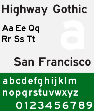
Highway Gothic is a sans-serif typeface developed by the United States Federal Highway Administration (FHWA) and used for road signage in the Americas, including the U.S., Canada, Latin America and some Caribbean countries, as well as in Asian countries influenced by American signage practices, including the Philippines, China, Taiwan, Malaysia, Indonesia and Thailand.
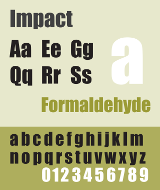
Impact is a sans-serif typeface in the industrial or grotesk style designed by Geoffrey Lee in 1965 and released by the Stephenson Blake foundry of Sheffield. It is well known for having been included in the core fonts for the Web package and distributed with Microsoft Windows since Windows 98. In the 2010s, it gained popularity for its use in image macros and other internet memes. However, in Google Slides, Impact is referred to as Anton.

Ruth Kedar is a Brazilian artist and designer, best known for designing the Google logo that was displayed from May 31, 1999 to September 1, 2015. Larry Page and Sergey Brin were looking at designers to design their logo and website and Kedar was asked to present them with some preliminary design ideas. They liked her approach and design style, and she was hired to design both. The design was accepted due to its playful design, the customized Catull typeface and unique visual expression.
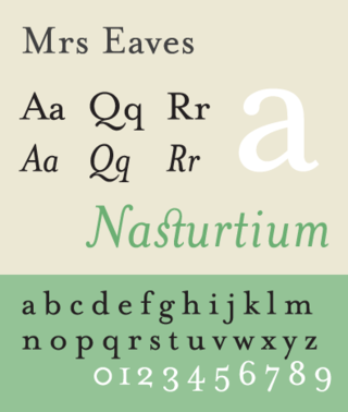
Mrs Eaves is a transitional serif typeface designed by Zuzana Licko in 1996. It is a variant of Baskerville, which was designed in Birmingham, England, in the 1750s. Mrs Eaves adapts Baskerville for use in display contexts, such as headings and book blurbs, through the use of a low x-height and a range of unusual combined characters or ligatures.

Linux Libertine is a digital typeface created by the Libertine Open Fonts Project, which aims to create free and open alternatives to proprietary typefaces such as Times New Roman. It was developed with the free font editor FontForge and is licensed under the GNU General Public License and the SIL Open Font License.

Gotham is a geometric sans-serif typeface family designed by American type designer Tobias Frere-Jones with Jesse Ragan and released through the Hoefler & Frere-Jones foundry from 2000. Gotham's letterforms were inspired by examples of architectural signs of the mid-twentieth century. Gotham has a relatively broad design with a reasonably high x-height and wide apertures.

Cantarell is the default typeface supplied with the user interface of GNOME since version 3.0, replacing Bitstream Vera and DejaVu. The font was originated by Dave Crossland in 2009.

Yale is an old style serif typeface designed by Matthew Carter and first released in 2004. It was commissioned by Yale University for use in all of its signage, promotional and internal material.

Open Sans is an open source humanist sans-serif typeface that was designed by Steve Matteson under commission from Google. It was released in 2011 and is based on his earlier design called Droid Sans, which was specifically created for Android mobile devices but with slight modifications to its width.

OpenDyslexic is a free typeface/font designed to mitigate some of the common reading errors caused by dyslexia. The typeface was created by Abbie Gonzalez, who released it through an open-source license. The design is based on DejaVu Sans, also an open-source font.

Product Sans is a contemporary geometric sans-serif typeface created by Google for branding purposes. It replaced the old Google logo on September 1, 2015. As Google's branding was becoming more apparent on a multitude of kinds of devices, Google sought to adapt its design so that its logo could be portrayed in constrained spaces and remain consistent for its users across platforms.

IBM Plex is an open source typeface superfamily conceptually designed and developed by Mike Abbink at IBM in collaboration with Bold Monday to reflect the design principles of IBM and to be used for all brand material across the company internationally. Plex replaces Helvetica as the IBM corporate typeface after more than fifty years, freeing the company from extensive license payments in the process.
 Initial Google logo from September 15, 1997 to September 27, 1997
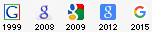
 Original logo in the Baskerville Bold typeface, used from September 28, 1997 to October 29, 1997. It uses a different color combination from the one in use today, with the initial "G" being colored green.
 The logo used from October 30, 1997 to May 30, 1999, differs from the previous version with an exclamation mark added to the end, an increased shadow, letters more rounded, and different letter hues. Note that the color of the initial G changed from green to blue. This color sequence is still used today, although with different hues and font.
 The company logo changed to one based on the Catull typeface and was used from May 31, 1999 to May 5, 2010. The exclamation mark was removed, and it remained the basis for the logo until August 31, 2015.
 The logo used from May 6, 2010 to September 18, 2013, showing a reduced distance of the projected shadow, a change in the second "o" to a different yellow hue and a more flattened lettering
 The logo used from September 19, 2013 to August 31, 2015, showing flattened lettering and the removal of shadows
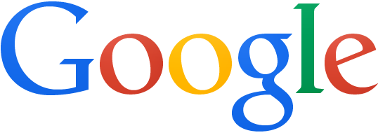
 The logo used since September 1, 2015, featuring a new typeface, Product Sans. The colors remain unchanged from the previous logo.