Map layout

Last updated
This map of the Falkland Islands incorporates several elements of map layout: a title, a scale bar, a legend, and an inset map. This is a compromise between the fluid and compartmentalized approaches to layout order, with the non-map elements sitting "on top" of the main map. Here, the top-heavy main map is balanced by the non-map elements below. Note the use of a locator inset map and limited additional text about the projection (metadata) and sovereignty dispute (explanatory), all appropriate for a general audience. The detailed scale bar in two measurement systems facilitates precise distance measurements by an international audience, which may or may not be the intent. Falkland Islands topographic map-en.svg
This map of the Falkland Islands incorporates several elements of map layout: a title, a scale bar, a legend, and an inset map. This is a compromise between the fluid and compartmentalized approaches to layout order, with the non-map elements sitting "on top" of the main map. Here, the top-heavy main map is balanced by the non-map elements below. Note the use of a locator inset map and limited additional text about the projection (metadata) and sovereignty dispute (explanatory), all appropriate for a general audience. The detailed scale bar in two measurement systems facilitates precise distance measurements by an international audience, which may or may not be the intent.

Map layout, also called map composition or (cartographic) page layout, is the part of cartographic design that involves assembling various map elements on a page. This may include the map image itself, along with titles, legends, scale indicators, inset maps, and other elements. It follows principles similar to page layout in graphic design, such as balance, gestalt, and visual hierarchy. The term map composition is also used for the assembling of features and symbols within the map image itself, which can cause some confusion; these two processes share a few common design principles but are distinct procedures in practice. Similar principles of layout design apply to maps produced in a variety of media, from large format wall maps to illustrations in books to interactive web maps, although each medium has unique constraints and opportunities. [1]

Contents

Layout principles

Geologic map of Australia, showing a layout with a strict compartmentalized order that clearly directs attention flow. The four thematic inset maps provide visual balance with the main map, which is enlarged to maximize scale and visual hierarchy. Note also the order created by arranging the title and legend consistently in all five maps (thanks to Australia's "serendipitous geography" providing spaces for non-map elements), which eases use but can look a little dull. The detailed legends and extensive metadata text block are designed for highly specialized use by a scientific audience. Australian radiogenic granite and sedimentary basin geothermal hot rock potential map - GA10333.pdf
Geologic map of Australia, showing a layout with a strict compartmentalized order that clearly directs attention flow. The four thematic inset maps provide visual balance with the main map, which is enlarged to maximize scale and visual hierarchy. Note also the order created by arranging the title and legend consistently in all five maps (thanks to Australia's "serendipitous geography" providing spaces for non-map elements), which eases use but can look a little dull. The detailed legends and extensive metadata text block are designed for highly specialized use by a scientific audience.

While much of cartographic design is constrained by geographic reality (i.e., things are what they are and where they are), the cartographer has more freedom in layout than in designing the map image. Therefore, page layout has more in common with graphic design, with its own principles of layout, than any other aspect of cartography. Another impact of this relationship is that the cartography profession has largely adopted these principles, with relatively less unique research on the topic by academic cartographers than other aspects. The work of Rudolf Arnheim, especially his 1954 Art and visual perception, was especially influential during the formative years of academic cartography, and is still quoted as part of the canon in cartography textbooks. [2] In practice, it is common in publishing teams for the layout portion to be executed by professional graphic designers, not cartographers.

Some of the major design principles that are most applicable to map layout are: [3]

Layout elements

In this map of Bryce Canyon National Park, Utah, the main map has been rotated to fit the page better; a north arrow (upper left) is necessary to avoid confusion. Note the very simple scale bar, which is effective at giving a general sense of size on a map in which users are not expected to make precise measurements. The light but non-white background color enables the use of white as a map symbol (the county boundary across the center). Also note the central box showing the location of a separate detail inset map. NPS bryce-canyon-national-park-map.pdf
In this map of Bryce Canyon National Park, Utah, the main map has been rotated to fit the page better; a north arrow (upper left) is necessary to avoid confusion. Note the very simple scale bar, which is effective at giving a general sense of size on a map in which users are not expected to make precise measurements. The light but non-white background color enables the use of white as a map symbol (the county boundary across the center). Also note the central box showing the location of a separate detail inset map.

In addition to the map itself, there are various elements that are included in the map layout. The following are common elements of a map layout. [7]

Map surround

A map surround is any of the supporting objects or elements that help a reader interpret a map. Typical map surround elements include the title, legend, north arrow, scale bar, border, source information and other text, and inset maps. [8]

Negative space

The background of the map may seem unimportant at first, but it plays several active roles in the use of the map. [9] It provides "breathing room" between the map elements, and can serve to distinguish elements without the use of borders. Isolating a particular element, such as a title, by surrounding it with wide white space increases its contrast with its surroundings, elevating it in the visual hierarchy.

Most importantly, the background color establishes a baseline with which the map symbols and other elements contrast, establishing the entire visual hierarchy. Four approaches to background color are common:

Main map

The primary element on a map page is almost always the map image itself. Placing it in the top of the visual hierarchy is typically done by making it large enough to fill the page, centrally placed, and due to its tendency to be more complex than other elements on the page. [6] Enlarging the map also gives it the maximum possible scale, which maximizes the ability to clearly show detail in the map.

Legend

Legend that features point, line, and area symbols and follows rules for grouping LegendExample.jpg
Legend that features point, line, and area symbols and follows rules for grouping

Legends define the meaning of the map's symbols, especially those that are not already intuitive or obvious. [10] In addition, a legend may also serve other purposes, including: organizing the symbols into a structure of layers and importance; educating about the subject matter; or describing how the map symbology was created. [11] The legend may also give details about the variable being displayed, publication, or authorship. Often, the legend is critical to understanding a map, so it is important that legends are designed effectively. Using principles of gestalt, various sets of rules have been created for legend spacing, alignment, and grouping. [12] [13] The word comes from ancient Latin plural word legenda meaning "things that have to be read".

Title

Titles should be short and to the point. They typically include information about the location of the map and the subject of the map. The title should be an important part of the layout's visual hierarchy because the title tells people what the map is about. [6]

Scale

Scale is important to include on a map because it explains the size relationship between map features and the real world. Scale is commonly represented with a scale bar, a representative fraction ("1:100,000"), or a verbal scale ("1 inch = 1 mile"). [14] The preferred type of scale indicator depends on the purpose and audience of the map: a representative fraction is precise, but most of the public does not know what it means; a very precisely marked scale bar is most useful when distance measurements need to be made, but can be overkill when they do not; many general-audience maps, such as web street maps or atlases, use very simple single-division scale bars to simply give a sense of size.

This seismic hazards map uses extension inset maps to display Alaska and Hawaii. Seismic Hazard Zones In The United States.pdf
This seismic hazards map uses extension inset maps to display Alaska and Hawaii.

Inset map

Inset maps are smaller maps that are included on the same page as the main map. They can show additional information related to the main map. Four types of inset maps are common: [6]

North arrow

North arrows orient readers and tell them which way the map is facing. They are especially important in areas that map viewers are not familiar with, or when the map is oriented such that north is not up. In other cases, they may be unnecessary, especially when the geography is well-known. North arrows can be very complex or very simple. [14]

Map of part of the South Shetland Islands in Antarctica, using several photographs to illustrate the mapped landscape, as well as text blocks for explanatory and metadata purposes. This is a relatively effective use of a high contrast background (highlighting the ice cover), although it does present some challenges, such as the green areas that appear as much like ocean as land. Livingston-Greenwich-map.jpg
Map of part of the South Shetland Islands in Antarctica, using several photographs to illustrate the mapped landscape, as well as text blocks for explanatory and metadata purposes. This is a relatively effective use of a high contrast background (highlighting the ice cover), although it does present some challenges, such as the green areas that appear as much like ocean as land.

Text

Supplementary text is used to provide context or explain the map or other map elements. Thematic mapping often uses text to add content that supports the purpose of the map, such as explanations or interpretations of the patterns seen therein. [15] A particular type of text block is the map metadata, which provides background information about the construction of the map. It may be as simple as a citation of the data sources, but could also include information such as the choice of Map projection, authorship credit, copyrights, date of production and/or source data, and construction methods used, chosen based on the purpose and audience.

Images

Non-map images can be added to a layout for a variety of reasons. It can offer a photo view of the area modeled in the map so that a reader can see the location looks like. Images can also be used to show examples of data points or illustrate the methods used to create the map. Logos of agencies or companies sponsoring the map are also a common use of images on layout. [16]

Charts

Charts and graphs can provide a non-spatial view of data to support the purpose map. This allows for data to be visualized in ways that may be more appropriate than a map, such as change over time. [17]

See also

Related Research Articles

<span class="mw-page-title-main">Cartography</span> Study and practice of making maps

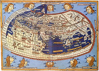
Cartography is the study and practice of making and using maps. Combining science, aesthetics and technique, cartography builds on the premise that reality can be modeled in ways that communicate spatial information effectively.

<span class="mw-page-title-main">Map</span> Symbolic depiction of relationships

A map is a symbolic depiction emphasizing relationships between elements of some space, such as objects, regions, or themes.

<span class="mw-page-title-main">Visual communication</span> Method of communication

Visual communication is the use of visual elements to convey ideas and information which include signs, typography, drawing, graphic design, illustration, industrial design, advertising, animation, and electronic resources. Humans have used visual communication since prehistoric times. Within modern culture, there are several types of characteristics when it comes to visual elements, they consist of objects, models, graphs, diagrams, maps, and photographs. Outside the different types of characteristics and elements, there are seven components of visual communication: color, shape, tones, texture, figure-ground, balance, and hierarchy.

<span class="mw-page-title-main">Infographic</span> Graphic visual representation of information

Infographics are graphic visual representations of information, data, or knowledge intended to present information quickly and clearly. They can improve cognition by utilizing graphics to enhance the human visual system's ability to see patterns and trends. Similar pursuits are information visualization, data visualization, statistical graphics, information design, or information architecture. Infographics have evolved in recent years to be for mass communication, and thus are designed with fewer assumptions about the readers' knowledge base than other types of visualizations. Isotypes are an early example of infographics conveying information quickly and easily to the masses.

Animated mapping is the application of animation, either a computer or video, to add a temporal component to a map displaying change in some dimension. Most commonly the change is shown over time, generally at a greatly changed scale. An example would be the animation produced after the 2004 tsunami showing how the waves spread across the Indian Ocean.

<span class="mw-page-title-main">Figure-ground (cartography)</span> Focus of attention on features in a map

Figure-ground contrast, in the context of map design, is a property of a map in which the map image can be partitioned into a single feature or type of feature that is considered as an object of attention, with the remainder of the map being relegated to the background, outside the current focus of attention. It is thus based on the concept of figure–ground from Gestalt psychology. For example, in a street map with strong figure-ground contrast, the reader would be able to isolate and focus attention on individual features, like a given street, park, or lake, as well as layers of related features, like the street network.

<span class="mw-page-title-main">Thematic map</span> Type of map that visualizes data

A thematic map is a type of map that portrays the geographic pattern of a particular subject matter (theme) in a geographic area. This usually involves the use of map symbols to visualize selected properties of geographic features that are not naturally visible, such as temperature, language, or population. In this, they contrast with general reference maps, which focus on the location of a diverse set of physical features, such as rivers, roads, and buildings. Alternative names have been suggested for this class, such as special-subject or special-purpose maps, statistical maps, or distribution maps, but these have generally fallen out of common usage. Thematic mapping is closely allied with the field of Geovisualization.

<span class="mw-page-title-main">Multivariate map</span> Thematic map visualizing multiple variables

A bivariate map or multivariate map is a type of thematic map that displays two or more variables on a single map by combining different sets of symbols. Each of the variables is represented using a standard thematic map technique, such as choropleth, cartogram, or proportional symbols. They may be the same type or different types, and they may be on separate layers of the map, or they may be combined into a single multivariate symbol.

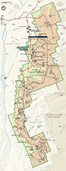
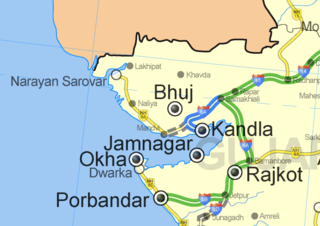
In cartography, a locator map, or just a locator, is typically a simple map used to show the location of a particular geographic region within its larger and presumably more familiar context. Depending on the needs of the cartographer, this type of map can be used on its own or as an inset or addition to a larger map.

<span class="mw-page-title-main">Visual hierarchy</span> Visual design technique to convey importance

Visual hierarchy, according to Gestalt psychology, is a pattern in the visual field wherein some elements tend to "stand out," or attract attention, more strongly than other elements, suggesting a hierarchy of importance. While it may occur naturally in any visual field, the term is most commonly used in design, where elements are intentionally designed to make some look more important than others. This order is created by the visual contrast between forms in a field of perception. Objects with highest contrast to their surroundings are recognized first by the human mind.

Cartographic generalization, or map generalization, includes all changes in a map that are made when one derives a smaller-scale map from a larger-scale map or map data. It is a core part of cartographic design. Whether done manually by a cartographer or by a computer or set of algorithms, generalization seeks to abstract spatial information at a high level of detail to information that can be rendered on a map at a lower level of detail.

<span class="mw-page-title-main">Flow map</span> Thematic map visualizing linear flow

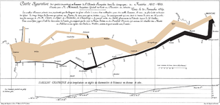
A flow map is a type of thematic map that uses linear symbols to represent movement. It may thus be considered a hybrid of a map and a flow diagram. The movement being mapped may be that of anything, including people, highway traffic, trade goods, water, ideas, telecommunications data, etc. The wide variety of moving material, and the variety of geographic networks through they move, has led to many different design strategies. Some cartographers have expanded this term to any thematic map of a linear network, while others restrict its use to maps that specifically show movement of some kind.

Borden D. Dent (1938–2000) was an American geographer and cartographer who served as professor emeritus and chairman of the Department of Geography and Anthropology at Georgia State University. His textbook, Cartography: Thematic Map Design, is one of the seminal texts in the field, and its sixth edition was reissued in 2009.

<span class="mw-page-title-main">Dot distribution map</span> Thematic map using dots to visualize distribution

A dot distribution map is a type of thematic map that uses a point symbol to visualize the geographic distribution of a large number of related phenomena. Dot maps are a type of unit visualizations that rely on a visual scatter to show spatial patterns, especially variances in density. The dots may represent the actual locations of individual phenomena, or be randomly placed in aggregation districts to represent a number of individuals. Although these two procedures, and their underlying models, are very different, the general effect is the same.

<span class="mw-page-title-main">Map symbol</span> Graphic depiction of a geographic phenomenon

A map symbol or cartographic symbol is a graphical device used to visually represent a real-world feature on a map, working in the same fashion as other forms of symbols. Map symbols may include point markers, lines, regions, continuous fields, or text; these can be designed visually in their shape, size, color, pattern, and other graphic variables to represent a variety of information about each phenomenon being represented.

<span class="mw-page-title-main">Chorochromatic map</span> Thematic map visualizing a discrete field

A Chorochromatic map, also known as an area-class, qualitative area, or mosaic map, is a type of thematic map that portray regions of categorical or nominal data using variations in color symbols. Chorochromatic maps are typically used to represent discrete fields, also known as categorical coverages. Chorochromatic maps differ from choropleth maps in that chorochromatic maps are mapped according to data-driven boundaries instead of trying to make the data fit within existing, sometimes arbitrary units such as political boundaries.

A visual variable, in cartographic design, graphic design, and data visualization, is an aspect of a graphical object that can visually differentiate it from other objects, and can be controlled during the design process. The concept was first systematized by Jacques Bertin, a French cartographer and graphic designer, and published in his 1967 book, Sémiologie Graphique. Bertin identified a basic set of these variables and provided guidance for their usage; the concept and the set of variables has since been expanded, especially in cartography, where it has become a core principle of education and practice.

<span class="mw-page-title-main">Cartographic design</span> Process of designing maps

Cartographic design or map design is the process of crafting the appearance of a map, applying the principles of design and knowledge of how maps are used to create a map that has both aesthetic appeal and practical function. It shares this dual goal with almost all forms of design; it also shares with other design, especially graphic design, the three skill sets of artistic talent, scientific reasoning, and technology. As a discipline, it integrates design, geography, and geographic information science.

<span class="mw-page-title-main">Typography (cartography)</span> Text used to label maps

Typography, as an aspect of cartographic design, is the craft of designing and placing text on a map in support of the map symbols, together representing geographic features and their properties. It is also often called map labeling or lettering, but typography is more in line with the general usage of typography. Throughout the history of maps to the present, their labeling has been dependent on the general techniques and technologies of typography.

<span class="mw-page-title-main">Proportional symbol map</span> Thematic map based on symbol size

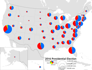
A proportional symbol map or proportional point symbol map is a type of thematic map that uses map symbols that vary in size to represent a quantitative variable. For example, circles may be used to show the location of cities within the map, with the size of each circle sized proportionally to the population of the city. Typically, the size of each symbol is calculated so that its area is mathematically proportional to the variable, but more indirect methods are also used.

References

  1. 1 2 Muehlenhaus, Ian (2014). Web Cartography: Map Design for Interactive and Mobile Devices. CRC Press.
  2. 1 2 Arnheim, Rudolf (1954). Art and Visual Perception: A Psychology of the Creative Eye (1974 2nd ed.). University of California Press.
  3. Tait, A. (2018). Visual Hierarchy and Layout. The Geographic Information Science & Technology Body of Knowledge (2nd Quarter 2018 Edition), John P. Wilson (ed.). DOI: 10.22224/gistbok/2018.2.4
  4. Dent, Borden D., Jeffrey S. Torguson, Thomas W. Hodler, Cartography: Thematic Map Design, 6th Edition, McGraw-Hill, 2009, p.209-215
  5. Krygier, J. & Wood, D. (original edition 2005, latest edition 2016). Making Maps: A Visual Gide to Map Design for GIS. The Guilford Press.
  6. 1 2 3 4 5 Tyner, Judith A. (2010). Principles of map design . New York: Guilford Press. pp.  32. ISBN   9781606235447.
  7. "Layout Essentials | GEOG 486: Cartography and Visualization". www.e-education.psu.edu. Retrieved 2019-12-11.
  8. Wade, T. and Sommer, S. eds. A to Z GIS
  9. Tufte, Edward (1990). Envisioning Information (2005 2nd ed.). Graphics Press. pp. 61–65. ISBN   0-9613921-1-8.
  10. "Building a Legend | GEOG 486: Cartography and Visualization". www.e-education.psu.edu. Retrieved 2019-12-11.
  11. Schlichtmann, Hansgeorg (1997). "Functions of the Map Legend" (PDF). 18th International Cartographic Conference: 430.
  12. Qin, Zhe; Li, Zhilin (2017). "Grouping Rules for Effective Legend Design". The Cartographic Journal. 54 (1): 36–47. Bibcode:2017CartJ..54...36Q. doi:10.1080/00087041.2016.1148105. S2CID   132127291.
  13. Li, Zhilin; Qin, Zhe (2014). "Spacing and alignment rules for effective legend design". Cartography and Geographic Information Science. 41 (4): 348–362. Bibcode:2014CGISc..41..348L. doi:10.1080/15230406.2014.933085. S2CID   62163937.
  14. 1 2 "Marginalia Design | GEOG 486: Cartography and Visualization". www.e-education.psu.edu. Retrieved 2019-12-11.
  15. "Text on Maps | GEOG 486: Cartography and Visualization". www.e-education.psu.edu. Retrieved 2019-12-17.
  16. "Working with graphic elements, neatlines, pictures, and objects—Help | ArcGIS for Desktop". desktop.arcgis.com. Retrieved 2019-12-17.
  17. "Chart frames—Layouts | ArcGIS Desktop". pro.arcgis.com. Retrieved 2019-12-17.