Earth tone

Last updated

Earth tone is a term used to describe a palette of colors that are similar to natural materials and landscapes. These colors are inspired by the earth's natural hues, including browns, greens, grays, and other warm and muted shades. The term earth tone first became popular in the 1970s during the environmental movement, as people sought to reconnect with nature and embrace more natural and organic lifestyles. [1]

Contents

People often connect earth tones with warmth, comfort, and steadiness, which is why they are commonly used in interior design, fashion, and graphic design. They are also versatile, making them suitable for a wide range of applications, from rustic and traditional to modern and minimalist.

Some of the most common earth tones include beige, taupe, khaki, olive, moss, and rust. These colors are often used together in a variety of combinations to create a connected and natural-looking palette. In interior design, earth tones can be used to create a calming and inviting ambiance, [2] while in fashion, they can add a touch of elegance and experience to any outfit.

While earth tones are often connected with nature, they can also be used in more urban and industrial settings to create a sense of harmony and balance. In recent years, earth tones have become increasingly popular in graphic design and branding, as companies seek to convey a sense of authenticity, sustainability, and environmental responsibility.

Practicality

The practicality of earth tone lies in its versatility and ability to blend seamlessly with different colors and styles.

One of the main advantages of earth tone is that they create a calming and soothing atmosphere, making them a popular choice in interior design. They are also considered timeless and can give a sense of grounding and stability to a space. Earth tones are also practical in fashion, as they are easy to mix and match with other colors, and can be used to create a range of looks from casual to formal.

Color palette

The color palette of earth tone typically includes warm and muted shades of brown, green, gray, and beige.

Other colors that may be included in the earth tone palette are muted shades of orange, red, and yellow. These colors are inspired by the colors of the earth and can be found in natural materials like clay, sandstone, and rusted metal. Overall, the earth tone palette is characterized by its warm, natural, and calming hues that are versatile and timeless in design.

Psychological and psychophysiological effects of natural colors

Cool colors

The psychology of cool colors pertains to the effects of certain hues on human emotions and perceptions. Cool colors, such as blues, greens, and purples, have been found to recede from the eye, creating an illusion of depth and making a space appear larger and more open. [3] As a result, these colors are often used in smaller rooms to increase the perceived size of the area. Furthermore, cool colors have a calming effect on individuals, evoking feelings of relaxation and tranquility. Consequently, they are often utilized in spaces intended for rest and rejuvenation, such as bathrooms and bedrooms.

Warm colors

The psychology of warm colors concerns the impact of certain hues on human emotions and perceptions. Warm colors, such as reds, oranges, and yellows, are known to create a sense of warmth and comfort, and can even provide the illusion of heat. These colors have a tendency to advance toward the eye, making them particularly effective in larger spaces, as they can create a feeling of coziness and security.

Additionally, warm colors are often associated with stimulation and activity, evoking strong emotions and promoting movement. As such, these colors are well-suited for environments such as gyms and living rooms, where physical activity and social interactions are encouraged. [4]

Common examples of such effects

Color psychology is the study of how different colors can affect human behavior, emotions, and mood. This field of study explores the way that color influences our thoughts and feelings, and how we respond to different colors in different contexts.

However, Color psychology is a complex and often subjective field, and there is no single "correct" way to use color to achieve a particular effect. Different individuals and cultures may have different associations with particular colors, and the same color may have different meanings in different contexts.

Red

Red is a highly evocative color that has been used in a variety of contexts throughout history. It is a primary color, meaning that it cannot be formed by mixing other colors together. In the RGB color model, which is commonly used in digital applications, red is represented by a combination of 100% red, 0% green, and 0% blue. [5] This unique combination of wavelengths gives red its characteristic hue and makes it a particularly powerful color for conveying a range of emotions and messages. From the vibrant hues of a rainbow to the romantic connotations of Valentine's Day, red continues to be a prominent and influential color in our cultural landscape.

Green

Green is a primary color that symbolizes our connection to nature. It is often associated with purity, health, and growth, and is commonly used by brands that promote productivity and vitality. [6] Green is also a relaxing and invigorating color that represents a connection to oneself, quiet moments, and nature. People often seek out nature to escape the stresses of modern life and reconnect with their primal roots. Green represents a return to inner peace and tranquility.

Blue

Blue is a calm and serene color, often associated with stillness and reflection. It has a calming effect on the body, resulting in lower heart rates and slower metabolisms. [7]

Brown

Brown is traditionally associated with seriousness, stability, and wisdom. It is often worn by people in positions of respect and authority, such as paternal figures or grandfathers. Brown is a color that represents stability and resourcefulness, which is important for families centered around the main male figure. People feel safe and secure around those wearing brown, as it represents reliability and support. Additionally, older individuals who wear brown exude a sense of stability, which is manifested in their accumulated life experience, possessions, and financial gain. [8]

Orange

Orange is a persuasive and energetic color that results from the combination of yellow and red. It has the power to enhance extraversion and encourages people to express themselves more freely by letting go of their inhibitions. [9]

Shades of earth tone

Overall, colors in earth tone are considered to be the colors of nature like sea, sky, land, and tree. Any color that is mixed with gray is considered an earth tone. Earth tone also includes any shade or tint color as well as brown, green, yellow, orange, or gray. For instance, earth tone colors are as follows: [10]

Examples of earth tone shades
Color displayColor numberColor name
    #555142 forest floor
    #434237 forest night
    #836539 dirt brown
    #a29259 desert yellow
    #d4cc9a dusty yellow
    #f0d696 straw yellow
    #cfbfb9 musk dusk
    #cec5ad prairie dusk
    #8d8468 brown gray
    #6e6969 charcoal gray
    #885132 charred clay
    #3d2b1f bistre
    #302621 wood bark
    #4f1507 earth brown
    #712f2c auburn
    #44382b bear brown
    #37290e brown tumbleweed
    #0e695f evergreen forest
    #0b5509 forest
    #184a45 forest biome
    #448811 kelp forest
    #002200 forest night
    #0a481e pine green
    #005f56 alpine green
    #4b6d41 artichoke
    #00cc99 caribbean green
    #5e6737 cedar
    #749551 drab green
    #67ad83 seagrass
    #99bb33 moss garden
    #638b27 moss green
    #6e9377 watercress
    #f1faea white sulfur
    #00626fblue lagoon
    #53734c irish clover
    #8caa95 peaslake
    #73b7a5 turtle lake
    #5a6d77 rolling sea
    #2d3032 cod gray
    #848585 dover gray
    #c5c6c7 glacier gray
    #9ca0a6 gray wolf
    #f5f5f5 white smoke
    #8f9aa4 canadian lake
    #4e5481 dusk
    #7eb7bf waterway
    #3ab0a2 waterfall
    #0f3b57 blue opal
    #f4e8e1 jasmine flower
    #563d5d english violet
    #8f4c3a burled redwood
    #3e0007 charred brown
    #6d1008 chestnut brown
    #be7249 orange lily
    #bf9b0c ochre

Applications in design practice

Nature always relates to humans both physically and mentally. That is the reason it is the inspiration for many designers to apply natural elements including earth tone (natural color palette), organic shape, and natural texture to design areas of practice. [11] The trend of natural design is influenced by the awareness of global warming and environmental problems.

Graphic design

It is very usual in graphic design to apply an earth tone palette. Earth tone is effective for making the audience relate to a design naturally. To soften a solid design and make them more comfortable in appearance, an earth tone is used. Earth tone is related to modernity and minimalism. In brand identity design, earth tone is applied in many logos, websites, and brochures. [12]

Fashion design

According to WWD weekend, earth tone had become a fashion trend in Fall 2021 in RTW (Read-to-Wear) runway, including many famous fashion brands such as Versace, Undercover, Theopphilio, Sportmax, Simone Rocha, Schiaparelli, Roseatta Getty, Hermes, etc.[6] In your wardrobe, earth tone closets release the sense of from warm, cozy, simple to elegant and authoritative. Earth tone dresses compliment any skin color which can be mixed with a different color in earth tone palette. [13]

Architecture

Earth tone is used by the architect to bring harmony between nature surrounding the building and the building together. The tone improves relaxation in the house and residence, and also, the atmosphere of cozy warm luxurious modern. Due to the fact that earth tone or natural color is comfortable and pleasing to the eye. Earth tone can complement natural light that shines into the architect by softening the light.

Applications in art practice

Painting

In painting, "brownness" defines earth tone. At the beginning of a painting, primitive painters used soil, animal fat, minerals, charcoal, and chalk combined to be a color around 40,000 years ago. [14] Therefore, the first group of colors was a natural palette by themselves. And earth tone palette was very handy to mix from scratch. There are many types of earth tone artists used. For example, burnt umber is an earthy shade that is a combination of phthalo blue and ultramarine, and a permanent rose. Additionally, Vandyke brown and sepia are similar in color to old photographs and can be useful for replicating vintage effects or a monochromatic look. [15]

Materials and pigments


The composition of earth pigments generally involves three elements: a clay base, a mineral component (iron oxide), and a secondary coloring agent. Iron oxide, which is present in different forms and shades all across the earth, is the primary coloring agent for most earth pigments. The properties of iron oxide vary, and its color is determined by the type of iron oxide used. Iron and oxygen are the two primary components of these minerals and are present in different amounts. Additionally, a secondary coloring agent such as manganese oxide, calcium, carbon, organic material, silica, limestone, or rutile (titanium dioxide) can also be present. [16]

See also

Related Research Articles

<span class="mw-page-title-main">Green</span> Additive primary color visible between cyan and yellow

Green is the color between blue and yellow on the visible spectrum. It is evoked by light which has a dominant wavelength of roughly 495–570 nm. In subtractive color systems, used in painting and color printing, it is created by a combination of yellow and cyan; in the RGB color model, used on television and computer screens, it is one of the additive primary colors, along with red and blue, which are mixed in different combinations to create all other colors. By far the largest contributor to green in nature is chlorophyll, the chemical by which plants photosynthesize and convert sunlight into chemical energy. Many creatures have adapted to their green environments by taking on a green hue themselves as camouflage. Several minerals have a green color, including the emerald, which is colored green by its chromium content.

Sienna is an earth pigment containing iron oxide and manganese oxide. In its natural state, it is yellowish brown, and it is called raw sienna. When heated, it becomes a reddish brown, and it is called burnt sienna. It takes its name from the city-state of Siena, where it was produced during the Renaissance. Along with ochre and umber, it was one of the first pigments to be used by humans, and is found in many cave paintings. Since the Renaissance, it has been one of the brown pigments most widely used by artists.

<span class="mw-page-title-main">Brown</span> Color

Brown is a color. It can be considered a composite color, but it is mainly a darker shade of orange. In the CMYK color model used in printing and painting, brown is usually made by combining the colors orange and black. In the RGB color model used to project colors onto television screens and computer monitors, brown combines red and green.

<span class="mw-page-title-main">Primary color</span> Sets of colors that can be mixed to produce gamut of colors

A set of primary colors or primary colours consists of colorants or colored lights that can be mixed in varying amounts to produce a gamut of colors. This is the essential method used to create the perception of a broad range of colors in, e.g., electronic displays, color printing, and paintings. Perceptions associated with a given combination of primary colors can be predicted by an appropriate mixing model that reflects the physics of how light interacts with physical media, and ultimately the retina. The most common color mixing models are the additive primary colors and the subtractive primary colors.

<span class="mw-page-title-main">Pigment</span> Colored material

A pigment is a powder used to add color or change visual appearance. Pigments are completely or nearly insoluble and chemically unreactive in water or another medium; in contrast, dyes are colored substances which are soluble or go into solution at some stage in their use. Dyes are often organic compounds whereas pigments are often inorganic. Pigments of prehistoric and historic value include ochre, charcoal, and lapis lazuli.

<span class="mw-page-title-main">Monochrome</span> Composed of one color

A monochrome or monochromatic image, object or palette is composed of one color. Images using only shades of grey are called grayscale or black-and-white. In physics, monochromatic light refers to electromagnetic radiation that contains a narrow band of wavelengths, which is a distinct concept.

Color theory, or more specifically traditional color theory, is the historical body of knowledge describing the behavior of colors, namely in color mixing, color contrast effects, color harmony, color schemes and color symbolism. Modern color theory is generally referred to as Color science. While there is no clear distinction in scope, traditional color theory tends to be more subjective and have artistic applications, while color science tends to be more objective and have functional applications, such as in chemistry, astronomy or color reproduction. Color theory dates back at least as far as Aristotle's treatise On Colors. A formalization of "color theory" began in the 18th century, initially within a partisan controversy over Isaac Newton's theory of color and the nature of primary colors. By the end of the 19th century, a schism had formed between traditional color theory and color science.

<span class="mw-page-title-main">Umber</span> Earth pigment

Umber is a natural earth pigment consisting of iron oxide and manganese oxide; it has a brownish color that can vary among shades of yellow, red, and green. Umber is considered one of the oldest pigments known to humans, first seen in Ajanta Caves in 200 BC – 600 AD. Umber's advantages are its highly versatile color, warm tone, and quick drying abilities. While some sources indicate that umber's name comes from its geographic origin in Umbria, other scholars suggest that it derives from the Latin word umbra, which means "shadow". The belief that its name derives from the word for shadow is fitting, as the color helps create shadows. The color is primarily produced in Cyprus. Umber is typically mined from open pits or underground mines and ground into a fine powder that is washed to remove impurities. In the 20th century, the rise of synthetic dyes decreased the demand for natural pigments such as umber.

<span class="mw-page-title-main">Grey</span> Intermediate color between black and white

Grey or gray is an intermediate color between black and white. It is a neutral or achromatic color, meaning literally that it is "without color", because it can be composed of black and white. It is the color of a cloud-covered sky, of ash, and of lead.

<span class="mw-page-title-main">Color wheel</span> Illustrative organization of color hues

A color wheel or color circle is an abstract illustrative organization of color hues around a circle, which shows the relationships between primary colors, secondary colors, tertiary colors etc.

Chrome yellow is a bright, warm yellow pigment that has been used in art, fashion, and industry. It is the premier orange pigment for many applications.

In color theory, a color scheme is a combination of 2 or more colors used in aesthetic or practical design. Aesthetic color schemes are used to create style and appeal. Colors that create a harmonious feeling when viewed together are often used together in aesthetic color schemes. Practical color schemes are used to inhibit or facilitate color tasks, such as camouflage color schemes or high visibility color schemes. Qualitative and quantitative color schemes are used to encode unordered categorical data and ordered data, respectively. Color schemes are often described in terms of logical combinations of colors on a color wheel or within a color space.

Visual design elements and principles describe fundamental ideas about the practice of visual design.
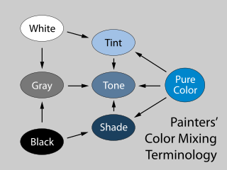
<span class="mw-page-title-main">Tint, shade and tone</span> Mixture of a color with white or black

In color theory, a tint is a mixture of a color with white, which increases lightness, while a shade is a mixture with black, which increases darkness. Both processes affect the resulting color mixture's relative saturation. A tone is produced either by mixing a color with gray, or by both tinting and shading. Mixing a color with any neutral color reduces the chroma, or colorfulness, while the hue remains unchanged.

<span class="mw-page-title-main">Shades of red</span> Varieties of the color red

Varieties of the color red may differ in hue, chroma or lightness, or in two or three of these qualities. Variations in value are also called tints and shades, a tint being a red or other hue mixed with white, a shade being mixed with black. A large selection of these various colors are shown below.

<span class="mw-page-title-main">Color psychology</span> Study of influence of color on human behavior

Color psychology is the study of hues as a determinant of human behavior. Color influences perceptions that are not obvious, such as the taste of food. Colors have qualities that can cause certain emotions in people. How color influences individuals may differ depending on age, gender, and culture. Although color associations can vary contextually between cultures, color preference is thought to be relatively uniform across gender and race.

<span class="mw-page-title-main">Shades of brown</span> Varieties of the color brown

Shades of brown can be produced by combining red, yellow, and black pigments, or by a combination of orange and black—illustrated in the color box. The RGB color model, that generates all colors on computer and television screens, makes brown by combining red and green light at different intensities. Brown color names are often imprecise, and some shades, such as beige, can refer to lighter rather than darker shades of yellow and red. Such colors are less saturated than colors perceived to be orange. Browns are usually described as light or dark, reddish, yellowish, or gray-brown. There are no standardized names for shades of brown; the same shade may have different names on different color lists, and sometimes one name can refer to several very different colors. The X11 color list of web colors has seventeen different shades of brown, but the complete list of browns is much longer.
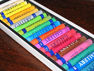
<span class="mw-page-title-main">Pastel (color)</span> Family of pale colors

Pastels or pastel colors belong to a pale family of colors, which, when described in the HSV color space, have high value and low saturation. They are named after an artistic medium made from pigment and solid binding agents, similar to crayons. Pastel sticks historically tended to have lower saturation than paints of the same pigment, hence the name of this color family. The popularity of pastel colors has evolved over time, with notable periods of prominence in various historical and cultural contexts. A significant era that saw a surge in the popularity of pastel colors was the late 19th century, particularly during the Victorian era.
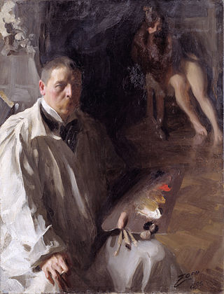
<span class="mw-page-title-main">Paint mixing</span>

Paint mixing is the practice of mixing components or colors of paint to combine them into a working material and achieve a desired hue. The components that go into paint mixing depend on the function of the product sought to be produced. For example, a painter of portraits or scenery on a canvas may be seeking delicate hues and subtle gradiations, while the painter of a house may be more concerned with durability and consistency of colors in paints presented to customers, and the painter of a bridge or a ship may have the weatherability of the paint as their primary concern.

References

  1. "Color Through the Decades: 1970s". Sherwin-Williams.
  2. Story, The Design. "Natural and Earthy Tones to Make Trend in 2020?". The Design Story.
  3. Braam, Hailey van (18 September 2018). "Warm and Cool Colors: What Are They, How They Are Used & Psychology". Color Psychology.
  4. Braam, Hailey van (18 September 2018). "Warm and Cool Colors: What Are They, How They Are Used & Psychology". Color Psychology.
  5. "Color Psychology 101: A Beginner's Guide to the Meaning of Colors". Color Psychology.
  6. "Color Psychology 101: A Beginner's Guide to the Meaning of Colors". Color Psychology.
  7. "Color Psychology 101: A Beginner's Guide to the Meaning of Colors". Color Psychology.
  8. "Color Psychology 101: A Beginner's Guide to the Meaning of Colors". Color Psychology.
  9. "Color Psychology 101: A Beginner's Guide to the Meaning of Colors". Color Psychology.
  10. Spacey, John. "75 Types of Earth Tone". Simplicable.
  11. Rimmer, Kelsie (5 August 2020). "Back to Basics: Organic Graphic Design Trends". Envato.
  12. Rimmer, Kelsie (5 August 2020). "Back to Basics: Organic Graphic Design Trends". Envato.
  13. "Miss Rich: WHY YOUR WARDROBE NEEDS EARTHY COLOUR TONES". Miss Rich.
  14. Taggart, Emma (14 December 2022). "Unearth the Colorful History of Paint: From Natural Pigments to Synthetic Hues". My Modern Met.
  15. "science of colour - Essential Earth Colours for Art". sites.google.com.
  16. "What are Earth Pigments? A Guide to Ochres, Oxides, and Minerals". Natural Earth Paint.