Cheltenham (typeface)

Last updated
CheltenhamSp.svg
Category Serif
Classification old style
Designer(s) Bertram Grosvenor Goodhue

Ingalls Kimball
Morris Fuller Benton

Joseph W. Phinney
Foundry American Type Founders
Date released1903
Shown hereITC Cheltenham

Cheltenham is a typeface for display use designed in 1896 by architect Bertram Goodhue and Ingalls Kimball, director of the Cheltenham Press. The original drawings were known as Boston Old Style and were made about 14" high. These drawings were then turned over to Morris Fuller Benton at American Type Founders (ATF) who developed it into a final design. Trial cuttings were made as early as 1899 but the face was not complete until 1902. The face was patented by Kimball in 1904. Later the basic face was spun out into an extensive type family by Morris Fuller Benton. [1]

Contents

Cheltenham is not based on a single historical model, and shows influences of the Arts and Crafts Movement. Originally intended as a text face, "Chelt" became hugely successful as the "king of the display faces." Part of the face's huge popularity is because, as it has elements of both an old style and transitional face, a Cheltenham headline complements virtually any body type. [2] The overwhelming popularity of the face for display purposes lasted until the advent of the geometric sans-serif typefaces of the 1930s.

Foundry Type

The following versions were available in foundry type: [3]

Cold Type Versions

The popularity of Cheltenham continued strong right in the cold type era, and it was offered by various manufacturers under the following names: [4]

A cold type variant ITC Cheltenham, was also designed by Tony Stan for the International Typeface Corporation, in 1975. It features a larger x-height and improved italic details. The family includes 4 weights and 2 width each, with complementary italics.

Digital versions

The original face has been digitized by the current owner, Kingsley/ATF and is sold by Bitstream Inc. The ITC version is also available from Linotype, Monotype, and Adobe Systems, along with ITC Cheltenham Handtooled, a 1993 version with highlight, designed by Ed Benguiat. Other versions are available from Tilde, Font Bureau, URW++, Scangraphic Digital Type Collection, and Elsner+Flake. Besley Clarendon is available from HiH. Monotype offers its version under the name Gloucester. [5]

Prominent usage

In 2003, The New York Times introduced a more unified Cheltenham typographic palette for its headline use in the print edition. Previously, Cheltenham was only one of several types including a sans-serif in a Victorian looking mix of headline faces. Tom Bodkin, assistant managing editor and design director of the Times, engaged typeface designer Matthew Carter to create multiple weights and a heavily condensed width of Cheltenham to replace most of the Latin Extra Condensed face in use, as well as Bookman and a variant of Century Bold. [6]

In the U.S. Congress the bill or resolution number of all bills and resolutions set for public printing is set in Cheltenham. [7] The typeface is also featured within the bills and laws themselves to designate title and section headings.

The Liturgical Press uses the Cheltenham Bold typeface for Lectionaries prescribed by the United States Conference of Catholic Bishops for Roman Catholic dioceses in the United States.

IDG's ...for Dummies series of how-to books are set in ITC Cheltenham.

L.L.Bean's logo is set in Cheltenham.

Akai's logo is set in ITC Cheltenham Ultra, with red letters over a white background, which creates a candle image effect on the negative space of letters A, K and A.

The street name plaques of Helsinki are set in Cheltenham. [8]

This font is used prominently in the Japanese anime Cowboy Bebop , most notably for the ending cards of each episode, usually with the phrase "See you Space Cowboy..."[ citation needed ]

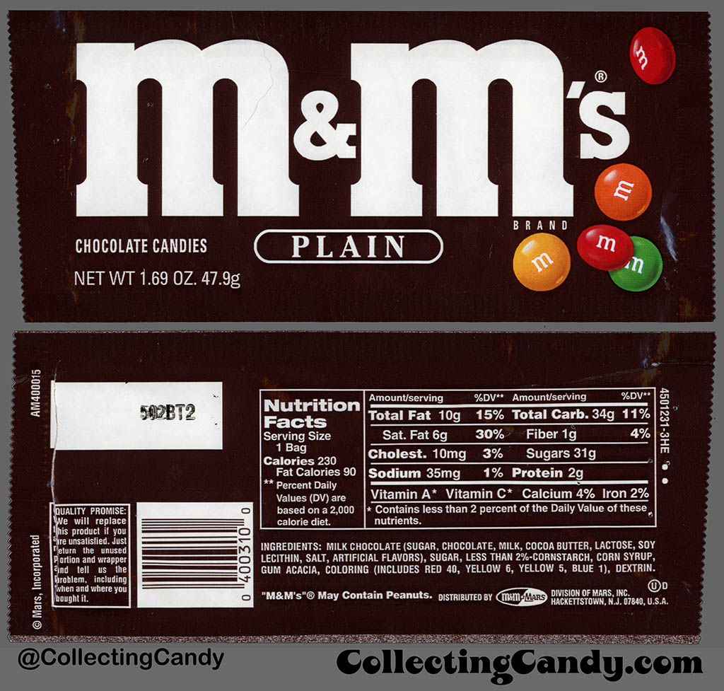
From 1992 to 2000, Mars Incorporated used this font for the flavor descriptions (Plain, Peanut, etc.) of the M&M's candies. [9] [10]

Bibliography

Related Research Articles

<span class="mw-page-title-main">Bodoni</span> Serif typeface

Bodoni is the name given to the serif typefaces first designed by Giambattista Bodoni (1740–1813) in the late eighteenth century and frequently revived since. Bodoni's typefaces are classified as Didone or modern. Bodoni followed the ideas of John Baskerville, as found in the printing type Baskerville—increased stroke contrast reflecting developing printing technology and a more vertical axis—but he took them to a more extreme conclusion. Bodoni had a long career and his designs changed and varied, ending with a typeface of a slightly condensed underlying structure with flat, unbracketed serifs, extreme contrast between thick and thin strokes, and an overall geometric construction.

<span class="mw-page-title-main">Franklin Gothic</span> Family of sans-serif fonts

Franklin Gothic and its related faces are a large family of sans-serif typefaces in the industrial or grotesque style developed in the early years of the 20th century by the type foundry American Type Founders (ATF) and credited to its head designer Morris Fuller Benton. "Gothic" was a contemporary term meaning sans-serif.

<span class="mw-page-title-main">Oswald Bruce Cooper</span> American type and graphic designer (1879–1940)

Oswald Bruce Cooper was an American type designer, lettering artist, graphic designer, and teacher of these trades. He is best known as the designer and namesake of the Cooper Black typeface.

<span class="mw-page-title-main">Goudy Old Style</span> Serif typeface

Goudy Old Style is an old-style serif typeface originally created by Frederic W. Goudy for American Type Founders (ATF) in 1915.

<span class="mw-page-title-main">News Gothic</span> Grotesque sans-serif typeface

News Gothic is a sans-serif typeface designed by Morris Fuller Benton, and was released in 1908 by his employer American Type Founders (ATF). The typeface is similar in proportion and structure to Franklin Gothic, also designed by Benton, but lighter.

<span class="mw-page-title-main">Clearface</span>

Clearface is a serif typeface designed by Morris Fuller Benton with the collaboration of his father Linn Boyd Benton, produced at American Type Founders in 1907.

<span class="mw-page-title-main">Broadway (typeface)</span> Typeface

Broadway is a decorative typeface, perhaps the archetypal Art Deco typeface. The original face was designed by Morris Fuller Benton in 1927 for ATF as a capitals-only display face. It had a long initial run of popularity, before being discontinued by ATF in 1954. It was re-discovered in the Cold Type Era and has ever since been used to evoke the feeling of the twenties and thirties. The font has been used in the TV shows Rhoda, My Life as a Teenage Robot, and Miami Vice. Several variants were made:

<span class="mw-page-title-main">Linn Boyd Benton</span> American typographer

Linn Boyd Benton was an American typeface designer and inventor of technology for producing metal type.

<span class="mw-page-title-main">R. Hunter Middleton</span> American book designer, painter and typeface designer

Robert Hunter Middleton was an American book designer, painter, and typeface designer. Born in Glasgow, Scotland he came to Chicago in 1908 where he studied at the School of the Art Institute. He joined the design department of the Ludlow Typograph Company in 1923 and served as director of the department of typeface design from 1933–71. In 1944 he began operating a private press, The Cherryburn Press. He died in Chicago.

<span class="mw-page-title-main">Barnhart Brothers & Spindler</span> American type foundry

Barnhart Brothers & Spindler Type Foundry was an American company based in Chicago.

Robert Wiebking (1870–1927) was a German-American engraver typeface designer who was known for cutting type matrices for Frederic Goudy from 1911 to 1926.

Sol Hess was an American typeface designer. After a three-year scholarship course at Pennsylvania Museum School of Industrial Design, he began at Lanston Monotype in 1902, rising to typographic manager in 1922. He was a close friend and collaborator with Monotype art director Frederic Goudy, succeeding him in that position in 1940. Hess was particularly adept at expanding type faces into whole families, allowing him to complete 85 faces for Monotype, making him America's fourth most prolific type designer. While he was with Monotype, Hess worked on commissions for many prominent users of type, including, Crowell-Collier, Sears Roebuck, Montgomery Ward, Yale University Press, World Publishing Company, and Curtis Publishing for whom he re-designed the typography of their Saturday Evening Post.

<span class="mw-page-title-main">Century type family</span> Typeface

Century is a family of serif type faces particularly intended for body text. The family originates from a first design, Century Roman, cut by American Type Founders designer Linn Boyd Benton in 1894 for master printer Theodore Low De Vinne, for use in The Century Magazine. ATF rapidly expanded it into a very large family, first by Linn Boyd, and later by his son Morris.

Joseph Warren Phinney (1848–1934) was an American printer, type designer, and business executive. Phinney began his career at the Dickinson Type Foundry in Boston where he designed type and worked in management, eventually becoming owner. He was a key player in arranging the merger of twenty-six large foundries to form the American Type Founders Company in 1892, becoming both manager of the Boston branch and head of the design department, where he oversaw the consolidation of type faces following the merger. Though his own designs were largely derivative, Phinney took a great interest in type and its history and throughout his tenure at A.T.F. he sought to preserve and protect that company's legacy, as for instance, when he oversaw the re-introduction of Binny & Ronaldson's 1796 type design, Roman No. 1, as Oxford in 1892, or when he purchased Frederick W. Goudy's first type design, Camelot, in 1896. He stayed with A.T.F. for the rest of his career, passing the role of design head to Morris Fuller Benton and becoming senior vice-president. Phinney retired shortly before the company fell upon hard times during the Great Depression and died in 1934.

<span class="mw-page-title-main">Souvenir (typeface)</span> Typeface

Souvenir is a serif typeface designed in 1914 by Morris Fuller Benton for American Type Founders. It was loosely based on Schelter-Antiqua and Schelter-Kursiv, a 1905 Art Nouveau type issued by the J.G. Schelter & Giesecke foundry in Leipzig. It has a much softer appearance than other old style faces, with a generally light look, rounded serifs, and very little contrast between thick and thin strokes. Like Cheltenham, it shows the influence of the Arts and Crafts Movement without belonging to a specific historical style. A 1970s redesign by Ed Benguiat, adding extra styles and an italic, became far more popular than the initial release, and is the source of most versions sold today.

<span class="mw-page-title-main">Cloister (typeface)</span> Serif typeface

Cloister is a serif typeface that was designed by Morris Fuller Benton and published by American Type Founders from around 1913. It is loosely based on the printing of Nicolas Jenson in Venice in the 1470s, in what is now called the "old style" of serif fonts. American Type Founders presented it as an attractive but highly usable serif typeface, suitable both for body text and display use.

The Inland Type Foundry was an American type foundry established in 1894 in Saint Louis, Missouri and later with branch offices in Chicago and New York City. Although it was founded to compete directly with the "type trust", and was consistently profitable, it was eventually sold to ATF.

References

  1. Some sources say that Joseph W. Phinney, head of ATF's design department, and not Benton, was responsible for finishing the type. See Mac McGrew, American Metal Typefaces of the Twentieth Century, Oak Knoll Books, New Castle Delaware, 1993, ISBN   0-938768-34-4, pp. 84 - 89.
  2. Hlasta, Stanley C., Printing Types & How to Use Them, Carnegie Press, Pittsburgh, Pennsylvania, 1950, p. 217.
  3. McGrew, Mac, American Metal Typefaces of the Twentieth Century, Oak Knoll Books, New Castle Delaware, 1993, ISBN   0-938768-34-4, pp. 84 - 89.
  4. W.F. Wheatley, Typeface Analogue, National Composition Association, Arlington, Virginia, 1988, p. 8. pp. 34 - 35.
  5. "Gloucester". MyFonts. Monotype Imaging. Retrieved 30 March 2021.
  6. By The New York Times. "A Face Lift for the Times, Typographically, That Is'" The New York Times, October 21, 2003, retrieved March 15, 2007.
  7. U.S. Government Printing Office. retrieved October 27, 2013.
  8. By The Guardian. "Walking tour of Helsinki's architecture'" The Guardian, June 10, 2012, retrieved September 29, 2012.
  9. Jason, Liebig (January 31, 2017). "Mars – M&M's Plain – 1.69 oz candy package – 1995". Collecting Candy. Archived from the original on 2021-10-19.
  10. Jason, Liebig (January 31, 2017). "How a 1970's Russian "Red Scare" Set M&M's Mascots Back Twenty Years!". Collecting Candy. Archived from the original on 2017-05-07.