
Jim Parkinson (born October 23, 1941, in Oakland, California) is an American type designer in Oakland, California.
Jim Parkinson (born October 23, 1941, in Oakland, California) is an American type designer in Oakland, California.
Parkinson studied advertising design and painting at the California College of Arts and Crafts in Oakland, graduating in 1963. In 1964, he worked as a lettering artist for Hallmark Cards under Myron McVay with some consultation from Hermann Zapf. Afterwards, Parkinson moved back to Oakland and freelanced as a lettering artist doing work for rock bands (including Creedence Clearwater, Taj Mahal, The Doobie Brothers, Kansas, et al.), sign painting, advertisements, packaging. [1] [2]
In the mid-1970s Dan X. Solo introduced Parkinson to Roger Black who was, at that time, the newly appointed Art Director for Rolling Stone magazine in San Francisco. Black hired Parkinson to design a series of typefaces and redesign the logo for Rolling Stone. [3]

Although Parkinson's lettering sensibility is rooted in old wood type and signage from the 19th century and during the first part of his career he used pen and ink for finished pieces, [4] in 1990 Parkinson put away his pen and ink and embraced digital technology while working for the San Francisco Chronicle , designing fonts.
Parkinson now operates his independent type foundry Parkinson Type Design in Oakland. His more high-profile clients include Fast Company , Esquire , Billboard , Newsweek , [5] [6] the San Francisco Examiner , and Ringling Bros. and Barnum & Bailey Circus. [7] His font designs have been inspired by lettering and often by the work of William Addison Dwiggins, including adaptations of his Metro and Electra typefaces for the Chronicle and Letterform Archive. [8] [9] [10] [11]

Typefaces designed by Jim Parkinson include:
Parkinson has designed and cleaned up numerous newspaper and magazine nameplates, making subtle adjustments to letterforms and character spacing to improve their appearance and legibility. Redesigned nameplates include The Washington Post , The Wall Street Journal , Houston Chronicle , New Zealand Herald and Los Angeles Times daily newspapers; Rolling Stone , Esquire , Fast Company and Newsweek magazines; The Daily Californian college newspaper at the University of California, Berkeley; [12] and alternative weeklies Santa Cruz Weekly , North Bay Bohemian and Pacific Sun . [13]

William Addison Dwiggins, was an American type designer, calligrapher, and book designer. He attained prominence as an illustrator and commercial artist, and he brought to the designing of type and books some of the boldness that he displayed in his advertising work. His work can be described as ornamented and geometric, similar to the Art Moderne and Art Deco styles of the period, using Oriental influences and breaking from the more antiquarian styles of his colleagues and mentors Updike, Cleland and Goudy.

Erik Spiekermann is a German typographer, designer and writer. He is an honorary professor at the University of the Arts Bremen and ArtCenter College of Design.

Ephram Edward Benguiat was an American type designer and lettering artist. He designed over 600 typefaces, including Tiffany, Bookman, Panache, Souvenir, Edwardian Script, and the eponymous Benguiat and Benguiat Gothic.

Franklin Gothic and its related faces are a large family of sans-serif typefaces in the industrial or grotesque style developed in the early years of the 20th century by the type foundry American Type Founders (ATF) and credited to its head designer Morris Fuller Benton. "Gothic" was a contemporary term meaning sans-serif.
Oblique type is a form of type that slants slightly to the right, used for the same purposes as italic type. Unlike italic type, however, it does not use different glyph shapes; it uses the same glyphs as roman type, except slanted. Oblique and italic type are technical terms to distinguish between the two ways of creating slanted font styles; oblique designs may be labelled italic by companies selling fonts or by computer programs. Oblique designs may also be called slanted or sloped roman styles. Oblique fonts, as supplied by a font designer, may be simply slanted, but this is often not the case: many have slight corrections made to them to give curves more consistent widths, so they retain the proportions of counters and the thick-and-thin quality of strokes from the regular design.

DIN 1451 is a sans-serif typeface that is widely used for traffic, administrative and technical applications.
Doyald Young was an American typeface designer and teacher who specialized in the design of logotypes, corporate alphabets, lettering and typefaces.

FF Scala is an old-style serif typeface designed by Dutch typeface designer Martin Majoor in 1991 for the Muziekcentrum Vredenburg in Utrecht, the Netherlands. The FF Scala font family was named for the Teatro alla Scala (1776–78) in Milan, Italy. Like many contemporary Dutch serif faces, FF Scala is not an academic revival of a single historic typeface but shows influences of several historic models. Similarities can be seen with William Addison Dwiggins' 1935 design for the typeface Electra in its clarity of form, and rhythmic, highly calligraphic italics. Eric Gill's 1931 typeface Joanna, with its old style armature but nearly square serifs, is also similar in its nearly mono-weighted stroke width.
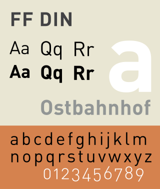
FF DIN is a sans-serif typeface in the industrial or "grotesque" style. It was designed in 1995 by Albert-Jan Pool, based on DIN-Mittelschrift and DIN-Engschrift, as defined in the German standard DIN 1451. DIN is an acronym for Deutsches Institut für Normung. It was published by FontShop in its FontFont library of typefaces.
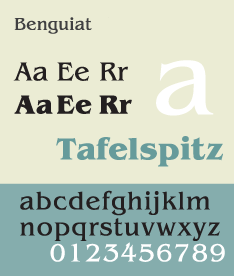
ITC Benguiat is a decorative serif typeface designed by Ed Benguiat and released by the International Typeface Corporation (ITC) in 1977. The face is loosely based upon typefaces of the Art Nouveau period but is not considered an academic revival. The face follows ITC's design formulary of an extremely high x-height, combined with multiple widths and weights.

Handel Gothic is a geometric sans-serif typeface designed in 1965 by Donald J. Handel (1936–2002), who worked for the graphic designer Saul Bass.

The Bauhaus typeface design is based on Herbert Bayer's 1925 experimental Universal typeface and the Bauhaus aesthetic overall.

Martin Majoor is a Dutch type designer and graphic designer. As of 2006, he had worked since 1997 in both Arnhem, Netherlands, and Warsaw, Poland.
FontShop International was an international manufacturer of digital typefaces (fonts), based in Berlin. It was one of the largest digital type foundries.
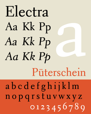
Electra is a serif typeface designed by William Addison Dwiggins and published by the Mergenthaler Linotype Company from 1935 onwards. A book face intended for body text, Dwiggins described the design as intended to be a 'modern roman type letter' with 'personality', avoiding direct revival of any historical model. He therefore chose the name Electra to suggest electricity and crisp modernity, "like metal shavings coming off a lathe".
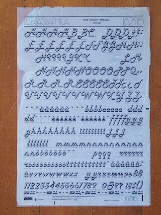
Harlow is a typeface intended for display use. Designed by Colin Brignall and originally published by Letraset, it is inspired by lettering in the Streamline Moderne style of the 1930s and 1940s.

The Stephenson Blake Grotesque fonts are a series of sans-serif typefaces created by the type foundry Stephenson Blake of Sheffield, England, mostly around the beginning of the twentieth century.
Just van Rossum is a Dutch typeface designer, software developer, and professor at the Royal Academy of Art in the Hague. He is the co-founder of design firm, LettError, along with Erik van Blokland. Just van Rossum is the younger brother of Guido van Rossum, creator of the Python programming language.
| International | |
|---|---|
| National | |