List of typefaces designed by Tobias Frere-Jones

Last updated

The following is a list of typefaces designed by Tobias Frere-Jones. [1] [2]

Contents

For FontFont

A FontShop specimen for FF Dolores FF Dolores.png
A FontShop specimen for FF Dolores

For Fuse

For Font Bureau

A digitisation of Eldorado by Font Bureau, on which Frere-Jones collaborated (shown is the Text optical size). EldoradoSpecimen.svg
A digitisation of Eldorado by Font Bureau, on which Frere-Jones collaborated (shown is the Text optical size).

Hoefler & Frere-Jones

Three of Frere-Jones' best-known typefaces were designed for Martha Stewart Living magazine, Surveyor, Archer and MSL Gothic, later released as Benton Sans. FrereJones typesample.svg
Three of Frere-Jones' best-known typefaces were designed for Martha Stewart Living magazine, Surveyor, Archer and MSL Gothic, later released as Benton Sans.

Collaborations with Jonathan Hoefler:
Frere-Jones Type

Related Research Articles

In typography, a serif is a small line or stroke regularly attached to the end of a larger stroke in a letter or symbol within a particular font or family of fonts. A typeface or "font family" making use of serifs is called a serif typeface, and a typeface that does not include them is sans-serif. Some typography sources refer to sans-serif typefaces as "grotesque" or "Gothic", and serif typefaces as "roman".

<span class="mw-page-title-main">Typeface</span> Set of characters that share common design features

A typeface is the design of lettering that can include variations in size, weight, slope, width, and so on. Each of these variations of the typeface is a font.

<span class="mw-page-title-main">Counter (typography)</span>

In typography, a counter is the area of a letter that is entirely or partially enclosed by a letter form or a symbol. The stroke that creates such a space is known as a "bowl". Latin letters containing closed counters include A, B, D, O, P, Q, R, a, b, d, e, g, o, p, and q. Latin letters containing open counters include c, f, h, s etc. The digits 0, 4, 6, 8, and 9 also possess a counter. An aperture is the opening between an open counter and the outside of the letter.

<span class="mw-page-title-main">Jonathan Hoefler</span> American typeface designer

Jonathan Hoefler is an American typeface designer. Hoefler founded the Hoefler Type Foundry in 1989, a type foundry in New York.

Oblique type is a form of type that slants slightly to the right, used for the same purposes as italic type. Unlike italic type, however, it does not use different glyph shapes; it uses the same glyphs as roman type, except slanted. Oblique and italic type are technical terms to distinguish between the two ways of creating slanted font styles; oblique designs may be labelled italic by companies selling fonts or by computer programs. Oblique designs may also be called slanted or sloped roman styles. Oblique fonts, as supplied by a font designer, may be simply slanted, but this is often not the case: many have slight corrections made to them to give curves more consistent widths, so they retain the proportions of counters and the thick-and-thin quality of strokes from the regular design.

<span class="mw-page-title-main">Didone (typography)</span> Classification of serif typefaces

Didone is a genre of serif typeface that emerged in the late 18th century and was the standard style of general-purpose printing during the nineteenth. It is characterized by:

<span class="mw-page-title-main">Tobias Frere-Jones</span>

Tobias Frere-Jones is an American type designer who works in New York City. He operates the company Frere-Jones Type and teaches typeface design at the Yale School of Art MFA program.

<span class="mw-page-title-main">Font</span> Particular size, weight and style of a typeface

In metal typesetting, a font is a particular size, weight and style of a typeface. Each font is a matched set of type, with a piece for each glyph. A typeface consists of a range of such fonts that shared an overall design.

Hoefler&Co. (H&Co) is a digital type foundry in Woburn, Massachusetts, founded by type designer Jonathan Hoefler. H&Co designs typefaces for clients and for retail on its website.
<span class="mw-page-title-main">Swash (typography)</span> Typographical flourish found on some letterforms, particularly in italics

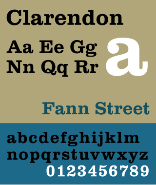
A swash is a typographical flourish, such as an exaggerated serif, terminal, tail, entry stroke, etc., on a glyph. The use of swash characters dates back to at least the 16th century, as they can be seen in Ludovico Vicentino degli Arrighi's La Operina, which is dated 1522. As with italic type in general, they were inspired by the conventions of period handwriting. Arrighi's designs influenced designers in Italy and particularly in France.

<span class="mw-page-title-main">Didot (typeface)</span> Serif typeface

Didot is a group of typefaces. The word/name Didot came from the famous French printing and type producing Didot family. The classification is known as modern, or Didone.

<span class="mw-page-title-main">Gotham (typeface)</span> Geometric sans-serif typeface

Gotham is a geometric sans-serif typeface family designed by American type designer Tobias Frere-Jones with Jesse Ragan and released through the Hoefler & Frere-Jones foundry from 2000. Gotham's letterforms were inspired by examples of architectural signs of the mid-twentieth century. Gotham has a relatively broad design with a reasonably high x-height and wide apertures.

<span class="mw-page-title-main">Archer (typeface)</span> Slab serif typeface

Archer is a slab serif typeface designed in 2001 by Tobias Frere-Jones and Jonathan Hoefler for use in Martha Stewart Living magazine. It was later released by Hoefler & Frere-Jones for commercial licensing.

<span class="mw-page-title-main">Monotype Grotesque</span> Typeface

Monotype Grotesque is a family of sans-serif typefaces released by the Monotype Corporation for its hot metal typesetting system. It belongs to the grotesque or industrial genre of early sans-serif designs. Like many early sans-serifs, it forms a sprawling family designed at different times.

Typeface anatomy describes the graphic elements that make up letters in a typeface.

Memphis is a slab-serif typeface designed by Dr. Rudolf Wolf and released in 1929 by the Stempel Type Foundry.
<span class="mw-page-title-main">Beton (typeface)</span> Slab-serif typeface designed by Heinrich Jost

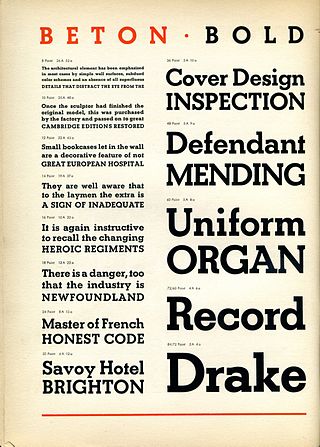
Beton is a slab-serif typeface designed by Heinrich Jost and released originally by the Bauer Type Foundry from 1929 onwards, with most major styles released by 1931. "Beton" is German for concrete, a choice of name suggesting its industrial aesthetic.

<span class="mw-page-title-main">Reverse-contrast typefaces</span> Kind of typeface or custom lettering

A reverse-contrast or reverse-stress letterform is a design in which the stress is reversed from the norm: a typeface or custom lettering where the horizontal lines are the thickest. This is the reverse of the vertical lines being the same width or thicker than horizontals, which is normal in Latin-alphabet writing and especially printing. The result is a dramatic effect, in which the letters seem to have been printed the wrong way round. The style invented in the early nineteenth century as attention-grabbing novelty display designs. Modern font designer Peter Biľak, who has created a design in the genre, has described them as "a dirty trick to create freakish letterforms that stood out."

<span class="mw-page-title-main">Display typeface</span> Font that is used at large sizes for headings

A display typeface is a typeface that is intended for use at large sizes for headings, rather than for extended passages of body text.
<span class="mw-page-title-main">John Downer (sign painter)</span>

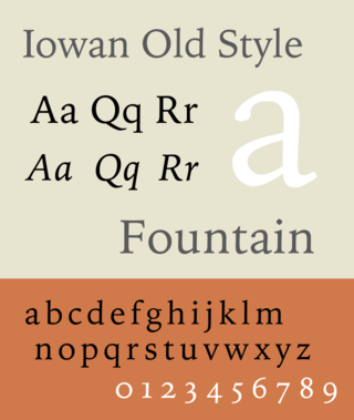
John Downer is an American sign painter, typeface and logo designer. Downer began his career as a painter of signs. Among his best-known digital fonts are Iowan Old Style, Roxy, Triplex Italic, and Brothers.

References

  1. Whitman, Sarah. "Do You See What I See? The Illusion of Typeface Mechanics". Print . Retrieved 22 June 2016.
  2. Fagone, Jason. "A Type House Divided". New York. Retrieved 22 June 2016.
  3. "FF Dolores". FontFont. Retrieved 22 June 2016.
  4. 1 2 3 4 Lupton, Ellen. "Interview, Ellen Lupton with Tobias Frere-Jones, November 1, 1995". Ellen Lupton. Retrieved 22 June 2016.
  5. Riechers, Angela. "3 Major Designers Confess Their Biggest Mess-ups and Do-overs—and What They Learned". Eye on Design. AIGA . Retrieved 22 June 2016.
  6. Lane, John A.; Lommen, Mathieu; de Zoete, Johan (1998). Dutch Typefounders' Specimens. De Graaf. pp. 29–31. Retrieved 4 August 2017.
  7. 1 2 3 Jason Tselentis; Allan Haley; Richard Poulin; Tony Seddon; Gerry Leonidas; Ina Saltz; Kathryn Henderson; Tyler Alterman (1 February 2012). Typography, Referenced: A Comprehensive Visual Guide to the Language, History, and Practice of Typography. Rockport Publishers. p. 87. ISBN   978-1-61058-205-6.
  8. "Nobel FB". MyFonts . Font Bureau. Retrieved 22 June 2016.
  9. Lupton, Ellen (1 September 1996). Mixing Messages. Princeton Architectural Press. pp. 35, 61. ISBN   978-1-56898-099-7.
  10. 1 2 3 4 5 6 7 8 9 10 11 12 Berlow, David. "Tobias Frere-Jones at the Font Bureau". Font Bureau . Retrieved 22 June 2016.
  11. 1897 Specimen Book (PDF). American Type Founders. 1897. pp. 207–8.
  12. "Eldorado FB". MyFonts. Retrieved 22 June 2016.
  13. Lupton, Ellen. "Typography in the 1990s". Print . Retrieved 22 June 2016.
  14. Hamato, Chris. "Fuse 1-20 (book review)". Typographica. Retrieved 22 June 2016.
  15. Yaffa, Joshua. "The Road to Clarity". New York Times . Retrieved 22 June 2016.
  16. Schwartz, Christian. "Interstate Monospaced". Orange Italic. Retrieved 22 October 2021.
  17. Hoefler, Jonathan. "Two Fools". Hoefler & Co. Retrieved 18 September 2021.
  18. "Technology, Fall '97". Rolling Stone . No. 774. 1997-11-27. p. 59.
  19. Schwartz, Christian. "Benton Modern". Orange Italic. Retrieved 22 October 2021.
  20. Middendorp, Jan. "Space and Rhythm". Eye. Retrieved 22 June 2016.
  21. Siegel, Dmitri. "Tobias Frere-Jones, type designer". Typotheque. Retrieved 22 June 2016.
  22. The Best of Newspaper Design 28. Society for News Design. 1997. p. 384. ISBN   978-1-61059-544-5.
  23. "Sale & Assignment of Type Fonts". New York State Unified Court System. Retrieved 31 October 2019. HTF hereby agrees to use its commercially best efforts to ensure that TFJ [Tobias Frere-Jones] shall receive a Design credit wherever the Fonts are displayed...nothing herein shall be interpreted as obligating HTF to require or enforce the display of a TFJ design credit
  24. Dunlap, David. "A 9/11 Cornerstone, Chiseled With a New York Accent". New York Times . Retrieved 22 June 2016.
  25. "Gotham: Overview". Hoefler Type Foundry (archived). Archived from the original on 7 February 2003. Retrieved 14 September 2019.
  26. Bryony Gomez Palacio; Armin Vit (1 December 2011). Graphic Design, Referenced: A Visual Guide to the Language, Applications, and History of Graphic Design. Rockport Publishers. p. 378. ISBN   978-1-59253-742-6.
  27. Brady, Will. "Obama's media campaign - branding our consciousness". The Guardian . Retrieved 22 June 2016.
  28. "Gotham Rounded: Corners Cut by Popular Demand". Typographica. Retrieved 22 June 2016.
  29. Twemlow, Alice. "Forensic Types". Eye Magazine. Retrieved 6 October 2014.
  30. Fagone, Jason. "A Type House Divided". New York . Retrieved 6 October 2014.
  31. McNaughton, Melanie. "Martha Stewart's Graphic Design for Living". Academia.edu. Retrieved 7 October 2014.
  32. Moll, Cameron. "Idlewild (review)". Typographica. Retrieved 22 June 2016.
  33. Adams, Lauren. "Is Archer's Use on Target?". AIGI.
  34. Earls, David John. "Archer (review)". Typographica. Retrieved 22 June 2016.
  35. "Archer, the elegant slab serif". i love typography. Retrieved 22 June 2016.
  36. Steven, Rachael. "Mallory: a new typeface from Tobias Frere-Jones". Creative Review. Retrieved 22 June 2016.
  37. Walker, Alissa. "Do digital typefaces really need to be different than print?". Gizmodo. Retrieved 22 June 2016.
  38. Stinson, Liz. "Tobias Frere-Jones' New Typeface 'Mallory' Has British Looks, American Irreverence". Wired. Retrieved 22 June 2016.
  39. Coles, Stephen. "New Arrivals: December 2015". Identifont. Retrieved 22 June 2016.
  40. Carey Smith, Elizabeth. "Mallory review". Typographica. Retrieved 22 June 2016.
  41. Dohmann, Antje. "Mehr Mallory". PAGE. Retrieved 23 August 2019.
  42. Shaw, Paul. "Ten Typefaces of the Decade". Print . Retrieved 22 June 2016.
  43. Schwartz, Christian. "Exchange (review)". Typographica. Retrieved 22 June 2016.
  44. Rosner, Helen. "Marching and Waltzing: Conductors Dual Structures". Frere-Jones Type. Retrieved 25 February 2018.
  45. Green, Jaime. "Archeology and Invention: Designing Empirica". Frere-Jones Type. Retrieved 5 October 2019.
  46. Ovink, G.W. (1971). "Nineteenth-century reactions against the didone type model - II". Quaerendo. 1 (4): 282–301. doi:10.1163/157006971x00239 . Retrieved 20 February 2016.
  47. Warren, Tom. "Microsoft is changing the default Office font and wants your help to pick a new one". The Verge. Retrieved 18 September 2021.
  48. "Schweizerin entwickelt neue Schriftart für Microsoft". SRF.