
A scrollbar is an interaction technique or widget in which continuous text, pictures, or any other content can be scrolled in a predetermined direction on a computer display, window, or viewport so that all of the content can be viewed, even if only a fraction of the content can be seen on a device's screen at one time. It offers a solution to the problem of navigation to a known or unknown location within a two-dimensional information space. It was also known as a handle in the very first GUIs. They are present in a wide range of electronic devices including computers, graphing calculators, mobile phones, and portable media players. The user interacts with the scrollbar elements using some method of direct action, the scrollbar translates that action into scrolling commands, and the user receives feedback through a visual updating of both the scrollbar elements and the scrolled content.
In computing, a window is a graphical control element. It consists of a visual area containing some of the graphical user interface of the program it belongs to and is framed by a window decoration. It usually has a rectangular shape that can overlap with the area of other windows. It displays the output of and may allow input to one or more processes.
Mouse chording is the capability of performing actions when multiple mouse buttons are held down, much like a chorded keyboard and similar to mouse gestures.

A text box is a control element of a graphical user interface, that should enable the user to input text information to be used by a program. Human Interface Guidelines recommend a single-line text box when only one line of input is required, and a multi-line text box only if more than one line of input may be required. Non-editable text boxes can serve the purpose of simply displaying text.

A checkbox is a graphical widget that allows the user to make a binary choice, i.e. a choice between one of two possible mutually exclusive options. For example, the user may have to answer 'yes' (checked) or 'no' on a simple yes/no question.
In computer graphical user interfaces, drag and drop is a pointing device gesture in which the user selects a virtual object by "grabbing" it and dragging it to a different location or onto another virtual object. In general, it can be used to invoke many kinds of actions, or create various types of associations between two abstract objects.
The taskbar is a graphical user interface element that has been part of Microsoft Windows since Windows 95, displaying and facilitating switching between running programs. The taskbar and the associated Start Menu were created and named in 1993 by Daniel Oran, a program manager at Microsoft who had previously collaborated on great ape language research with the behavioral psychologist B.F. Skinner at Harvard.

Aqua is the graphical user interface, design language and visual theme of Apple's macOS and iOS operating systems. It was originally based on the theme of water, with droplet-like components and a liberal use of reflection effects and translucency. Its goal is to "incorporate color, depth, translucence, and complex textures into a visually appealing interface" in macOS applications. At its introduction, Steve Jobs noted that "... it's liquid, one of the design goals was when you saw it you wanted to lick it".
A graphical widget in a graphical user interface is an element of interaction, such as a button or a scroll bar. Controls are software components that a computer user interacts with through direct manipulation to read or edit information about an application. User interface libraries such as Windows Presentation Foundation, Qt, GTK, and Cocoa, contain a collection of controls and the logic to render these.
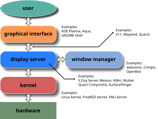
A window manager is system software that controls the placement and appearance of windows within a windowing system in a graphical user interface. Most window managers are designed to help provide a desktop environment. They work in conjunction with the underlying graphical system that provides required functionality—support for graphics hardware, pointing devices, and a keyboard—and are often written and created using a widget toolkit.
In human–computer interaction, a cursor is an indicator used to show the current position on a computer monitor or other display device that will respond to input.

GNOME Terminal is a terminal emulator for the GNOME desktop environment written by Havoc Pennington and others. Terminal emulators allow users to access a UNIX shell while remaining on their graphical desktop.

A menu bar is a graphical control element which contains drop-down menus.

Tkinter is a Python binding to the Tk GUI toolkit. It is the standard Python interface to the Tk GUI toolkit, and is Python's de facto standard GUI. Tkinter is included with standard Linux, Microsoft Windows and macOS installs of Python.
The Windows shell is the graphical user interface for the Microsoft Windows operating system. Its readily identifiable elements consist of the desktop, the taskbar, the Start menu, the task switcher and the AutoPlay feature. On some versions of Windows, it also includes Flip 3D and the charms. In Windows 10, the Windows Shell Experience Host interface drives visuals like the Start Menu, Action Center, Taskbar, and Task View/Timeline. However, the Windows shell also implements a shell namespace that enables computer programs running on Windows to access the computer's resources via the hierarchy of shell objects. "Desktop" is the top object of the hierarchy; below it there are a number of files and folders stored on the disk, as well as a number of special folders whose contents are either virtual or dynamically created. Recycle Bin, Libraries, Control Panel, This PC and Network are examples of such shell objects.
Layout managers are software components used in widget toolkits which have the ability to lay out graphical control elements by their relative positions without using distance units. It is often more natural to define component layouts in this manner than to define their position in pixels or common distance units, so a number of popular widget toolkits include this ability by default. Widget toolkits that provide this function can generally be classified into two groups:

This article details features of the Opera web browser.
ReAction GUI is the widget toolkit engine that is used in AmigaOS 3.2–4.1.

A mouse button is an electric switch on a computer mouse which can be pressed (“clicked”) to select or interact with an element of a graphical user interface. Mouse buttons are most commonly implemented as miniature snap-action switches.