A computer mouse is a hand-held pointing device that detects two-dimensional motion relative to a surface. This motion is typically translated into the motion of a pointer on a display, which allows a smooth control of the graphical user interface of a computer.

A scrollbar is an interaction technique or widget in which continuous text, pictures, or any other content can be scrolled in a predetermined direction on a computer display, window, or viewport so that all of the content can be viewed, even if only a fraction of the content can be seen on a device's screen at one time. It offers a solution to the problem of navigation to a known or unknown location within a two-dimensional information space. It was also known as a handle in the very first GUIs. They are present in a wide range of electronic devices including computers, graphing calculators, mobile phones, and portable media players. The user interacts with the scrollbar elements using some method of direct action, the scrollbar translates that action into scrolling commands, and the user receives feedback through a visual updating of both the scrollbar elements and the scrolled content.
In user interface design for computer applications, a modal window is a graphical control element subordinate to an application's main window.

Push-to-talk (PTT), also known as press-to-transmit, is a method of having conversations or talking on half-duplex communication lines, including two-way radio, using a momentary button to switch from voice reception mode to transmit mode.

A checkbox is a Graphical widget that permits the user to make a binary choice, i.e. a choice between one of two possible mutually exclusive options. For example, the user may have to answer 'yes' (checked) or 'no' on a simple yes/no question.
A radio button or option button is a graphical control element that allows the user to choose only one of a predefined set of mutually exclusive options. The singular property of a radio button makes it distinct from a checkbox, which allows more than one item to be selected and for the unselected state to be restored.
In computer graphical user interfaces, drag and drop is a pointing device gesture in which the user selects a virtual object by "grabbing" it and dragging it to a different location or onto another virtual object. In general, it can be used to invoke many kinds of actions, or create various types of associations between two abstract objects.
Point and click are the actions of a computer user moving a pointer to a certain location on a screen (pointing) and then pressing a button on a mouse, usually the left button (click), or other pointing device. An example of point and click is in hypermedia, where users click on hyperlinks to navigate from document to document.
A taskbar is an element of a graphical user interface which has various purposes. It typically shows which programs are currently running.
A graphical widget in a graphical user interface is an element of interaction, such as a button or a scroll bar. Controls are software components that a computer user interacts with through direct manipulation to read or edit information about an application. User interface libraries such as Windows Presentation Foundation, GTK, and Cocoa, contain a collection of controls and the logic to render these.
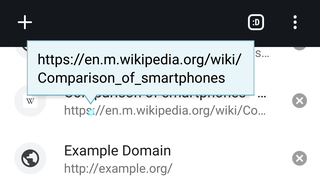
The tooltip, also known as infotip or hint, is a common graphical user interface element in which, when hovering over a screen element or component, a text box displays information about that element, such as a description of a button's function, what an abbreviation stands for, or the exact absolute time stamp over a relative time. The tooltip is displayed continuously as long as the user hovers over the element.
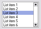
A list box is a graphical control element that allows the user to select one or more items from a list contained within a static, multiple line text box. The user clicks inside the box on an item to select it, sometimes in combination with the ⇧ Shift or Ctrl in order to make multiple selections. "Control-clicking" an item that has already been selected, unselects it.
A menu bar is a graphical control element which contains drop-down menus.
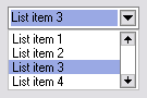
A drop-down list is a graphical control element, similar to a list box, that allows the user to choose one value from a list. When a drop-down list is inactive, it displays a single value. When activated, it displays a list of values, from which the user may select one. When the user selects a new value, the control reverts to its inactive state, displaying the selected value. It is often used in the design of graphical user interfaces, including web design.
A webform, web form or HTML form on a web page allows a user to enter data that is sent to a server for processing. Forms can resemble paper or database forms because web users fill out the forms using checkboxes, radio buttons, or text fields. For example, forms can be used to enter shipping or credit card data to order a product, or can be used to retrieve search results from a search engine.
The Windows shell is the graphical user interface for the Microsoft Windows operating system. Its readily identifiable elements consists of the desktop, the taskbar, the Start menu, the task switcher and the AutoPlay feature. On some versions of Windows, it also includes Flip 3D and the charms. In Windows 10, the Windows Shell Experience Host interface drives visuals like the Start Menu, Action Center, Taskbar, and Task View/Timeline. However, the Windows shell also implements a shell namespace that enables computer programs running on Windows to access the computer's resources via the hierarchy of shell objects. "Desktop" is the top object of the hierarchy; below it there are a number of files and folders stored on the disk, as well as a number of special folders whose contents are either virtual or dynamically created. Recycle Bin, Libraries, Control Panel, This PC and Network are examples of such shell objects.
Alt+Tab ↹ is the common name for a keyboard shortcut that has been in Microsoft Windows since Windows 2.0 (1987). This shortcut switches between application-level windows without using the mouse; hence it was named Task Switcher.

A mouse button is an electric switch on a computer mouse which can be pressed (“clicked”) to select or interact with an element of a graphical user interface.
Clickjacking is a malicious technique of tricking a user into clicking on something different from what the user perceives, thus potentially revealing confidential information or allowing others to take control of their computer while clicking on seemingly innocuous objects, including web pages.