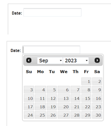
An example of a date picker in use. When the user clicks on the entry field, a calendar pops up below.
A date picker, popup calendar, date and time picker, or time picker is a graphical user interfacewidget which allows the user to select a date from a calendar and/or time from a time range. The typical practice is to provide a text box field which, when clicked upon to enter a date, pops up a calendar next to or below the field, allowing the user to populate the field with an appropriate date, or provides a text box with an icon of a calendar such that when the icon is clicked on, the calendar (or time field) appears, or show calendar widget directly (inline).
The date picker provides several advantages, including:
allowing the user to enter a date by merely clicking on a date in the pop-up calendar as opposed to having to take their hand off the mouse to type in a date.
validation of dates by restricting date ranges, e.g. only after today and for two weeks later, or only for dates in the past.
a date range can be entered such that for a set of "from-to" date fields, if the "from" field is filled, the "to" field cannot be set to a date before the "from" field, or if the "to" field is filled, the "from" field cannot be set to a later date than the "to" field.
can have a "today" button
can customize the day the week begins on
Only legal dates can be entered, e.g. February 29, 2100 can't be entered, nor could June 31.
Date format confusion is eliminated, e.g. is 7/4/10 July 4, 2010, April 7, 2010, or April 10, 2007?
In the case of a time picker, many similar functions are available, such as ensuring the user
Cannot enter an invalid time (25:18, 4:61).
Cannot select an out of range time (6:00 pm for a business allowing customers to select their own appointments, but the business closes at 5:30), or during unattended times (like lunch).
Cannot select an invalid range (can restrict selected time to the nearest 5, 10 or 15 minutes or any range, e.g. 2:30 or 2:45 is okay, but 2:37 is not.)
A context menu is a menu in a graphical user interface (GUI) that appears upon user interaction, such as a right-click mouse operation. A context menu offers a limited set of choices that are available in the current state, or context, of the operating system or application to which the menu belongs. Usually the available choices are actions related to the selected object. From a technical point of view, such a context menu is a graphical control element.
In human–computer interaction and user interface design, cut, copy, and paste are related commands that offer an interprocess communication technique for transferring data through a computer's user interface. The cut command removes the selected data from its original position, while the copy command creates a duplicate; in both cases the selected data is kept in temporary storage. The data from the clipboard is later inserted wherever a paste command is issued. The data remains available to any application supporting the feature, thus allowing easy data transfer between applications.
In computing, an icon is a pictogram or ideogram displayed on a computer screen in order to help the user navigate a computer system. The icon itself is a quickly comprehensible symbol of a software tool, function, or a data file, accessible on the system and is more like a traffic sign than a detailed illustration of the actual entity it represents. It can serve as an electronic hyperlink or file shortcut to access the program or data. The user can activate an icon using a mouse, pointer, finger, or voice commands. Their placement on the screen, also in relation to other icons, may provide further information to the user about their usage. In activating an icon, the user can move directly into and out of the identified function without knowing anything further about the location or requirements of the file or code.
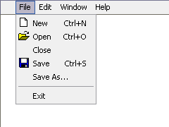
In user interface design, a menu is a list of options or commands presented to the user of a computer or embedded system. A menu may either be a system's entire user interface, or only part of a more complex one.
Point and click are the actions of a computer user moving a pointer to a certain location on a screen (pointing) and then pressing a button on a mouse, usually the left button (click), or other pointing device. An example of point and click is in hypermedia, where users click on hyperlinks to navigate from document to document.
The Taskbar is a graphical user interface element that has been part of Microsoft Windows since Windows 95, displaying and facilitating switching between running programs. The Taskbar and the associated Start Menu were created and named in 1993 by Daniel Oran, a program manager at Microsoft who had previously collaborated on Great ape language research with the behavioral psychologist B.F. Skinner at Harvard.
A graphical widget in a graphical user interface is an element of interaction, such as a button or a scroll bar. Controls are software components that a computer user interacts with through direct manipulation to read or edit information about an application. User interface libraries such as Windows Presentation Foundation, Qt, GTK, and Cocoa, contain a collection of controls and the logic to render these.
In computing, the X Window System is a network-transparent windowing system for bitmap displays. This article details the protocols and technical structure of X11.
Outlook on the web is a personal information manager web app from Microsoft. It includes a web-based email client, a calendar tool, a contact manager, and a task manager. It also includes add-in integration, Skype on the web, and alerts as well as unified themes that span across all the web apps. It is included in Exchange Server 2016, and Exchange Online
GNOME Terminal is a terminal emulator for the GNOME desktop environment written by Havoc Pennington and others. Terminal emulators allow users to access a UNIX shell while remaining on their graphical desktop.
A webform, web form or HTML form on a web page allows a user to enter data that is sent to a server for processing. Forms can resemble paper or database forms because web users fill out the forms using checkboxes, radio buttons, or text fields. For example, forms can be used to enter shipping or credit card data to order a product, or can be used to retrieve search results from a search engine.
The Windows shell is the graphical user interface for the Microsoft Windows operating system. Its readily identifiable elements consist of the desktop, the taskbar, the Start menu, the task switcher and the AutoPlay feature. On some versions of Windows, it also includes Flip 3D and the charms. In Windows 10, the Windows Shell Experience Host interface drives visuals like the Start Menu, Action Center, Taskbar, and Task View/Timeline. However, the Windows shell also implements a shell namespace that enables computer programs running on Windows to access the computer's resources via the hierarchy of shell objects. "Desktop" is the top object of the hierarchy; below it there are a number of files and folders stored on the disk, as well as a number of special folders whose contents are either virtual or dynamically created. Recycle Bin, Libraries, Control Panel, This PC and Network are examples of such shell objects.
A color picker is a graphical user interface widget, usually found within graphics software or online, used to select colors and, in some cases, to create color schemes. Operating systems such as Microsoft Windows or macOS have a system color picker, which can be used by third-party programs.
Workbench is the desktop environment and graphical file manager of AmigaOS developed by Commodore International for their Amiga line of computers. Workbench provides the user with a graphical interface to work with file systems and launch applications. It uses a workbench metaphor for representing file system organisation.
This article details features of the Opera web browser.
In software engineering, graphical user interface testing is the process of testing a product's graphical user interface (GUI) to ensure it meets its specifications. This is normally done through the use of a variety of test cases.
A software widget is a relatively simple and easy-to-use software application or component made for one or more different software platforms.
The Samsung Behold II is a touch-screen, 3G- compatible smartphone with a 5.0-megapixel camera. The Samsung Behold II is powered by the Android OS, making it the fourth Android powered phone by T-Mobile USA. Other Android powered phones by T-Mobile are the G1, myTouch 3G, and the Motorola CLIQ. It was released on November 18, 2009. On May 27, 2010, Samsung announced that Android 1.6 "Donut" would be the final firmware release for the device.
Calendar is a personal calendar application made by Microsoft for Microsoft Windows. It offers synchronization of calendars using Microsoft Exchange Server, Outlook.com Apple's iCloud calendar service, and Google Calendar. It supports the popular iCalendar 2.0 format.
This page is based on this Wikipedia article Text is available under the CC BY-SA 4.0 license; additional terms may apply. Images, videos and audio are available under their respective licenses.


