Related Research Articles

Graphic design is a profession, academic discipline and applied art whose activity consists in projecting visual communications intended to transmit specific messages to social groups, with specific objectives. Graphic design is an interdisciplinary branch of design and of the fine arts. Its practice involves creativity, innovation and lateral thinking using manual or digital tools, where it is usual to use text and graphics to communicate visually.

Typography is the art and technique of arranging type to make written language legible, readable and appealing when displayed. The arrangement of type involves selecting typefaces, point sizes, line lengths, line spacing, letter spacing, and spaces between pairs of letters. The term typography is also applied to the style, arrangement, and appearance of the letters, numbers, and symbols created by the process. Type design is a closely related craft, sometimes considered part of typography; most typographers do not design typefaces, and some type designers do not consider themselves typographers. Typography also may be used as an ornamental and decorative device, unrelated to the communication of information.

Emigre, Inc., doing business as Emigre Fonts, is a digital type foundry based in Berkeley, California, that was founded in 1985 by husband-and-wife team Rudy VanderLans and Zuzana Licko. The type foundry grew out of Emigre magazine, a publication founded by VanderLans and two Dutch friends who met in San Francisco, CA in 1984. Note that unlike the word émigré, Emigre is officially spelled without accents.
Zuzana Licko is a Slovak-born American type designer and visual artist known for co-founding Emigre Fonts, a digital type foundry in Berkeley, CA. She has designed and produced numerous digital typefaces including the popular Mrs Eaves, Modula, Filosofia, and Matrix. As a corresponding interest she also creates ceramic sculptures and jacquard weavings.

Josef Müller-Brockmann was a Swiss graphic designer, author, and educator, he was a Principal at Muller-Brockmann & Co. design firm. He was a pioneer of the International Typographic Style. One of the main masters of Swiss design. Müller-Brockmann is recognized for his simple designs and his clean use of typography, shapes and colors which inspire many graphic designers in the 21st century.

Neville Stanley Brody is an English graphic designer, typographer and art director. He is known for his work on The Face magazine (1981–1986), Arena magazine (1987–1990), and designing record covers for artists such as Clock DVA, Cabaret Voltaire, The Bongos, 23 Skidoo and Depeche Mode. He created the company Research Studios in 1994 and is a founding member of Fontworks. His work is included in the permanent collection of the Museum of Modern Art (MoMA). He was the Dean of the School of Communication at the Royal College of Art, London until September 2018. He is now Professor of Communication.

April Greiman is an American designer widely recognized as one of the first designers to embrace computer technology as a design tool. Greiman is also credited, along with early collaborator Jayme Odgers, with helping to import the European New Wave design style to the US during the late 70s and early 80s." According to design historian Steven Heller, "April Greiman was a bridge between the modern and postmodern, the analog and the digital." "She is a pivotal proponent of the 'new typography' and new wave that defined late twentieth-century graphic design." Her art combines her Swiss design training with West Coast postmodernism.

The International Typographic Style is a systemic approach to graphic design that emerged during the 1930s–1950s but continued to develop internationally. It is considered the basis of the Swiss style. It expanded on and formalized the modernist typographic innovations of the 1920s that emerged in part out of art movements such as Constructivism (Russia), De Stijl and at the Bauhaus (Germany). The International Typographic Style has had profound influence on graphic design as a part of the modernist movement, impacting many design-related fields including architecture and art. It emphasizes simplicity, clarity, readability, and objectivity. Hallmarks of the style are asymmetric layouts, use of a grid, sans-serif typefaces like Akzidenz Grotesk and Helvetica, and flush left, ragged right text. The style is also associated with a preference for photography in place of illustrations or drawings. Many of the early International Typographic Style works featured typography as a primary design element in addition to its use in text, and it is for this that the style is named. The influences of this graphic movement can still be seen in design strategy and theory to this day.
In design, New Wave or Swiss Punk Typography refers to an approach to typography that defies strict grid-based arrangement conventions. Characteristics include inconsistent letterspacing, varying typeweights within single words and type set at non-right angles.
Rick Poynor is an English writer on design, graphic design, typography, and visual culture.

Philippe Apeloig is a French graphic designer and typographer.

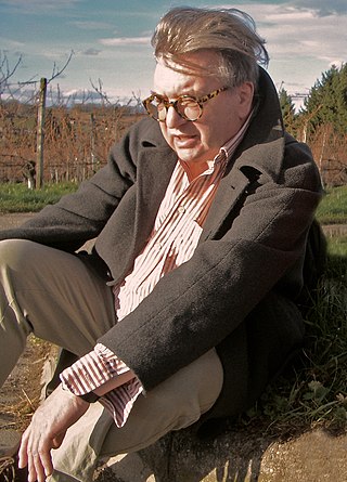
Wolfgang Weingart was an internationally known graphic designer and typographer. His work was categorized as Swiss typography and he was credited as "the father" of New Wave or Swiss Punk typography.
Ikko Tanaka was a Japanese graphic designer.
Bruno Monguzzi is a Swiss graphic designer.

Louise Fili is an American graphic designer known for her use of typography. Her artistic inspiration derives from modernism and European art deco styles, and she blends historic typography with contemporary colors and compositions. Commencing her career in the publishing industry, Fili crafted nearly 2,000 book jackets during her time with Random House. Upon establishing her own design studio, she has directed her focus towards restaurant identity, food-related logos, and packaging.
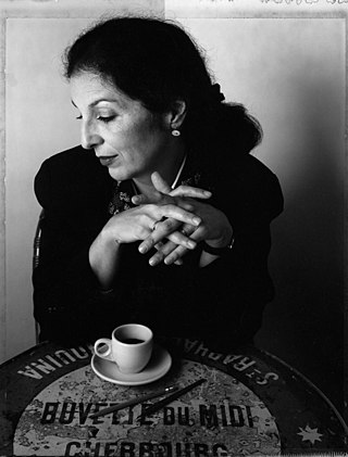
Catherine Zask is a French graphic designer, typographer and artist.

Jacqueline S. Casey was a graphic designer best known for the posters and other graphic art she created for the Massachusetts Institute of Technology (MIT). While practicing a functional Modernism, Jacqueline S. Casey was a graphic designer in the Office of Publications from 1955 to 1989, and was appointed director in 1972. In discussing her design, Casey stated, "My work combines two cultures: The American interest in visual metaphor on the one hand, and the Swiss fascination with planning, fastidiousness, and control over technical execution on the other."

Dirk Cornelis "Dick" Elffers was a Dutch artist.

Erik van Blokland is a Dutch typeface designer, educator and computer programmer. He is the head of the Type Media Master of Design program in Typeface Design at the Royal Academy of Art, The Hague in the Netherlands.

Alan Kitching RDI AGI Hon FRCA is a practitioner of letterpress typographic design and printmaking. Kitching exhibits and lectures across the globe, and is known for his expressive use of wood and metal letterforms in commissions and limited-edition prints.
References
- ↑ Grandjean, Emmanuel (27 May 2016), "Vivre avec le design", Le Temps
- 1 2 3 4 Nussbaum, Virginie (26 June 2017), "Demian Conrad, le design 2.0", Le Temps (in French).
- ↑ "Demian Conrad. Biography". Journal of art & design, HEAD– Genève. Retrieved 8 November 2021.
- 1 2 Moya, Denis (November 2012), "Demian Conrad -Interview", Ligature (in French), archived from the original on 11 May 2021, retrieved 12 June 2021
- ↑ Moya, Denis; Baehler, Tiffany (September 2014), "DADADUM, Swiss design brand launched by the graphic designer and entrepreneur Demian Conrad", Ligature, archived from the original on 9 May 2021, retrieved 13 June 2021.
- ↑ "ED Awards European Design". europeandesign.org. Archived from the original on 22 April 2021. Retrieved 8 November 2021.
- 1 2 3 4 5 6 7 8 9 10 11 12 "Les mystérieux ronds dorés collés à Lausanne, c'était eux", 24heures (in French), 17 May 2017
- 1 2 "Demian Conrad". HEAD Genève. Retrieved 8 November 2021.
- 1 2 3 4 5 6 7 Angelos, Ayla (25 January 2021), "Automatico studio updates its design ethos to one that succumbs to 'simplicity, reduction and calm'", It’s Nice That.
- ↑ "The ADC Annual Awards". oneclub.org. Retrieved 8 November 2021.
- ↑ "Demian Conrad, Alliance Graphique Internationale". a-g-i.org. Retrieved 8 November 2021.
- 1 2 "Demian Conrad. Guest Interview". YouTube. 12 July 2020. Retrieved 8 November 2021.
- ↑ Bovay, Valérie; Frochaux, Marc (8 September 2020), "La mise en page comme tectonique, entretien avec Demian Conrad", Espazium (in French).
- 1 2 3 "Demian Conrad, designer, Gutenberg, Bubble Jet et LCD". Design Viral. 2019. Retrieved 8 November 2021.
- 1 2 3 Graphic design meets printmaking. School of Design RMIT University (Thesis). 2018.
- ↑ "Demian Conrad: Visualisation Of Rarity". TEDx Geneva. 2010. Retrieved 8 November 2021.
- ↑ "Face à l'IA, 'l'artiste reste clairement le créateur'". RTS (in French). 20 March 2019..
- 1 2 3 4 5 6 7 Jametti Greiner, Monique (2012), "Centenary of the Swiss Civil Code", Focus on Stamps. The Collector's Magazine: 18-19.
- 1 2 3 4 Aldérson, Rob (21 May 2014), "Graphic Design: Demian Conrad builds festival identity by interfering with printing process", It’s Nice That.
- ↑ "LUFF". LUFF 12. 2013. Retrieved 8 November 2021.
- ↑ "Luff 13-Damien Conrad", Crap is Good, 13 January 2014
- 1 2 3 4 5 6 Boddington, Ruby (26 October 2017), "Automatico's augmented, responsive typeface for Artists & Robots", It’s Nice That.
- ↑ Elbaz, Talia (17 May 2018), "Artists and Robots at the Grand Palais", Whitewall.
- 1 2 Périer, Marie (21 April 2018), "Artists and Robots, the new immersive exhibition to see at the Grand Palais", Vogue.
- ↑ "Collection". Museum of Design Zurich. Retrieved 8 November 2021.
- ↑ "The hand of graphic designer", Abitare, 2011.
- ↑ "100 Jahre Schweizer Grafik". Museum für Gestaltung. Retrieved 8 November 2021.
- ↑ "Un/Limited". Museum of Fine Arts, Le Locle. Retrieved 8 November 2021.
- ↑ "Schweiz – Japan". Weltformat Graphic Design Festival. Retrieved 8 November 2021..
- ↑ "Swiss Graphic Design Exhibition". Pro Helvetia. Retrieved 8 November 2021..
- ↑ "Who the hell is Mr Brockmann?". Swiss Cultural Fund. Retrieved 8 November 2021..
- ↑ "Art imprimé" (PDF). Triennal of Contemporary Prints. Retrieved 8 November 2021..
- ↑ "Millennials – New Millennium Design". Porto Design Biennial. Retrieved 8 November 2021..
- ↑ "Code/Poésie". Lyrical Valley. Retrieved 8 November 2021..
- ↑ "Demian Conrad". personal website. Archived from the original on 14 May 2021. Retrieved 8 November 2021..
- ↑ "Rock Me Baby". Centre d'Art Contemporain. Archived from the original on 21 April 2021. Retrieved 8 November 2021..