Emigre was a quarterly magazine published from 1984 until 2005 in Berkeley, California, dedicated to visual communication, graphic design, typography, and design criticism.
Produced, edited, and designed by Rudy VanderLans and typeset by Zuzana Licko using a Macintosh computer,[1]Emigre pioneered desktop publishing and set the standard for the first digitally designed layouts and typeface designs.[2][3][4][5] At the time, its use of experimentation and disregard for conventions followed by then-prevalent modernist designers made Emigre both a controversial and a highly influential voice in graphic design.[6][1][7]
Exposure to Licko's typefaces through the magazine lead to the creation of Emigre Fonts in 1985.[8]
History
1984–1988
Emigre was a graphic design magazine founded by fellow Dutchmen Marc Susan, Menno Meyjes, and Rudy VanderLans who met in San Francisco. The first four issues were edited by Susan and art directed by VanderLans, with Meyes mostly in an associate publisher role. By issue 6 (1986) Susan and Meyes had left, and all subsequent issues were edited and art directed by VanderLans. In 1985, VanderLans started incorporating the bitmap typefaces designed by Zuzana Licko in his layouts. Licko’s type designs became a prominent feature of the magazine for its entire run. By 1986, Emigre began selling commercial licenses of its digital fonts under the name Emigre Fonts.[9]
The magazine was always self-funded, initially through commercial design work performed by VanderLans and Licko under the name Emigre Graphics which became Emigre Fonts. Additional income came from sporadic advertisement sales and subscriptions. Later issues were funded primarily by licensing of digital typefaces.[9]
When the magazine began in 1984, it featured work by and topics important to émigré artists. The first eight issues were concerned with boundaries, international culture, travel accounts, and alienation (as the issues' titles suggest). These eight issues also incorporated a dynamic aesthetic that caught the attention of other designers.
1989–1994
As the publication grew in popularity (and sometimes notoriety) it gained collaborators. VanderLans invited guests such as Gail Swanlund, Anne Burdick, Andrew Blauvelt, and Experimental Jetset to edit dedicated issues, and readers began to recognize Jeffery Keedy, Kenneth FitzGerald, Lorraine Wild, and Diane Gromala as recurring contributors.
A notable content shift started with issue 9, which featured the art of Vaughan Oliver at 4AD. About this time, Emigre's articles began to explore contemporary design practice more intentionally, catalyzing the magazine as a kind of analog discussion forum. Later issues would be devoted to Cranbrook, the Macintosh, type design, and occasionally individual graphic designers. Increasingly, Emigre's content centered around design writing and critical essays.
1995–2005
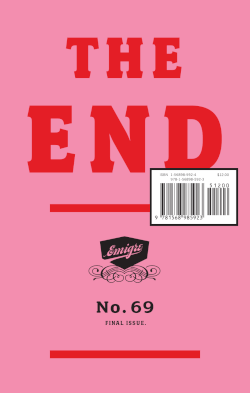
Design discourse became primary to Emigre's publications by 1994, and the magazine transitioned in 1995 from its oversized layout to a text-friendlier format that debuted with issue 33. The magazine remained this size until issue 60, released in 2001. Issues 60–63 were accompanied by additional media: three compact discs (featuring the music of Honey Barbara, The Grassy Knoll and Scenic) and one DVD (Catfish, an experimental documentary film on the work of designer and performance artist Elliott Earls). In its fourth and final incarnation, the last six issues of Emigre (64–69) were co-published by Princeton Architectural Press as small softcover books. The last issue, The End, was published in 2005.
Reputation and legacy
Emigre was one of the first publications to be designed on Macintosh computers, and their work heavily influenced other graphic designers in the early digital era.[1] Its variety of layouts, use of guest designers, and opinionated articles broke away from traditional design practices, making Emigre leaders in Postmodern design and landing them squarely in the middle of controversy. They were equally lauded and criticized for this work. Licko's response that "You read best what you read most," to an interview question about the legibility of her experimental bitmap fonts published in issue 15 (1990) incited what would later be known as the "Legibility Wars."[10][11] Her statement indicated that fonts such as Helvetica and Times New Roman are not intrinsically legible but become so through repeated use, and it was not entirely well received.
In 1991, the prominent New York designer Massimo Vignelli criticized Emigre's work, calling it "garbage" and "an aberration of culture" in an interview published by Print magazine. This brought much attention to their work and sealed Emigre's reputation as design radicals.[12]
Six years later Licko and VanderLans were named AIGA medalists[13] and the San Francisco Museum of Modern Art staged a solo exhibition of Emigre's work. In 2007, the Museum of Modern Art (New York) exhibited all 69 issues of Emigre as part of the exhibition "Digitally Mastered."[14]
Formats
The magazine changed formats several times. It was originally published quarterly in a large format where each page measures 285mm × 425mm (slightly shorter than 11 × 17" or US ledger/tabloid size). Starting with issue 33, each page was about 8.5 × 11" (US letter size). It changed into a multimedia format (a booklet where each page was 133 × 210mm, plus a CD or DVD) starting with issue 60. And finally, starting with issue 64, the magazine became a book format, published semi-annually, where each page measured 133 × 210mm. The issues in the book format were co-published by Princeton Architectural Press.
Issues 1–32: US tabloid size, approximately 11 x 17 in (285 x 425mm) — 32–40 pages
Issues 33–59: US letter size, 8.5 x 11 in (216 x 279mm) — 64–80 pages
Issues 60–63: 5.25 x 8.25 in (133 x 210mm) — 64-page booklet + CD or DVD in cardboard wallet
Issues 64–69: 5.25 x 8.25 in (133 x 210mm) — 144 pages
Books
Emigre: Graphic Design into the Digital Realm, New York, NY: Van Nostrand Reinhold; John Wiley & Sons, 1993
Departures: Five Milestone Font Families by Emigre, Berkeley, CA: Emigre, 2011
Emigre Fonts: Type Specimens 1986–2016, Berkeley, CA: Gingko Press, 2016
Emigre Music
Inspired by the flourishing DIY culture in music, and the success and growing reach of Emigre's publishing and mail order business, Emigre Music was launched in 1990. A total of 22 albums and compilations were released in CD and cassette formats. The final three CDs were included in issues of Emigre magazine.
Museum of Modern Art in New York holds a complete set of Emigre magazine, and five digital fonts from the Emigre Fonts library in its permanent collection
Museum of Modern Art in San Francisco holds a complete set of Emigre magazine in its permanent collection
1 2 3 Inglis, Theo (2023). Graphic Design Bible: The Definitive Guide to Contemporary and Historical Graphic Design for Designers and Creatives. Prestel Verlag. p.59. ISBN978-3-7913-8990-5.
1 2 VanderLans, Rudy (1993). Emigre: graphic design into the digital realm. Zuzana Licko, Mary E. Gray, Jeffery Keedy. New York: Wiley. ISBN0-471-28547-1. OCLC43679755.
↑ Kinross, Robin (2004). Modern typography: an essay in critical history (2nded.). London: Hyphen Press. ISBN0-907259-18-9. OCLC56603246.
Bouvet, Michel, East Coast West Coast: Graphistes aux États-unis, Paris, France, Les Éditions Textuel, 2002. Essay on history of Emigre.
Dawson, Peter, The Field Guide to Typography: Typefaces in the Urban Landscape, New York, NY, Prestel, 2013. Interview with Rudy VanderLans & Zuzana Licko.
Eskilson, Stephen J., Graphic Design: A New History, London, UK, Laurence King Publishing, 2007. Essay on Emigre in chapter on “Postmodern Typography.”
Heller, Steven, Merz to Emigre and Beyond: Avant-Garde Magazine Design of the Twentieth Century. Phaidon, 2003.
Heller, Stephen, ed., Design Literacy: Understanding Graphic Design. New York, NY, Allworth Press with School of Visual Arts, 2014. Essay on Emigre in chapter on "Mass Media.”
Lupton, Ellen, Mixing Messages: Graphic Design in Contemporary Culture, New York, NY, Princeton Architectural Press, 1996. Short profile of Emigre and Zuzana Licko’s typefaces. Book published in conjunction with exhibit at Cooper-Hewitt National Design Museum.
McCarthy, Steven, The Designer as Author, Producer, Activist, Entrepreneur, Curator & Collaborator: New Models for Communicating, Amsterdam, Netherlands, BIS, 2013. Emigre referenced throughout, and short profile of Emigre in chapter on “Typographic Design Authorship.”
Meggs, Philip B., ed., A History of Graphic Design, New York, NY, John Wiley & Sons, 1998. Profile of Emigre in chapter on “Pioneers of Digital Graphic Design.”
Poynor, Rick, Design Without Boundaries: Visual Communication in Transition, London, UK, Booth-Clibborn Editions, 1998. Emigre referenced in essay “Cult of the Ugly,” and one essay, “Into the Digital Realm,” on Emigre.
Poynor, Rick, No More Rules: Graphic Design and Postmodernism, New Haven, CT, Yale University Press, 2003. Emigre referenced throughout.
Shaughnessy, Adrian, How to be a Graphic Designer, Without Losing Your Soul, London, UK, Laurence King Publishing, 2005. Interview with Rudy VanderLans
This page is based on this Wikipedia article Text is available under the CC BY-SA 4.0 license; additional terms may apply. Images, videos and audio are available under their respective licenses.