Climate spiral

Last updated

5 9 16 Andrea TempSpiralEdHawkins.gif
An early Ed Hawkins climate spiral portrays global warming, [Note 1] the spiral's growing radius indicating how temperature has increased since 1850. [1]
20171231 Climate spiral (HadCRUT4.6 1850- ) 2017 SCREENSHOT - Ed Hawkins.png
Final frame of a climate spiral [2] [Note 1]

A climate spiral (sometimes referred to as a temperature spiral [3] [4] ) is an animated data visualization graphic designed as a "simple and effective demonstration of the progression of global warming", especially for general audiences. [5]

Contents

The original climate spiral was published on 9 May 2016 by British climate scientist Ed Hawkins to portray global average temperature anomaly (change) since 1850. [6] The visualization graphic has since been expanded to represent other time-varying quantities such as atmospheric CO2 concentration, [3] carbon budget, [3] and arctic sea ice volume. [7] [8]

Background

Before climate spirals: A non-animated, non-spiral line chart (April 2016) depicts the same data as the first climate spiral graphic that was published the following month. (Horizontal axis shows months; changing line colours denote the passing years.) Brad Plumer wrote in Vox that the graph "makes clear how staggeringly, anomalously warm 2015 and 2016" had been, a phenomenon reflected in the spiral graphic where it "appears to burst outward toward the end of the animation". 20160411 Global warming line chart (1850-2016) - Ed Hawkins.png
Before climate spirals: A non-animated, non-spiral line chart (April 2016) depicts the same data as the first climate spiral graphic that was published the following month. (Horizontal axis shows months; changing line colours denote the passing years.) Brad Plumer wrote in Vox that the graph "makes clear how staggeringly, anomalously warm 2015 and 2016" had been, a phenomenon reflected in the spiral graphic where it "appears to burst outward toward the end of the animation".

Hawkins credited a "Friday afternoon" email from Norwegian climatologist Jan Fuglestvedt for the idea of converting a conventional coloured line chart into a spiral, and thanked Fuglestvedt's wife, Taran Fæhn, for having suggested it to Fuglestvedt. [7] Fæhn, a researcher for Statistics Norway and the Oslo Centre for Research on Environmentally Friendly Energy, had suggested that connecting December to the following January would show temperature evolution in a more dynamic way. [11] Ensuing email discussions refined the design of the climate spiral, [11] which Hawkins published on Monday 9 May 2016. [12] [6]

Dissemination

Expecting "only some vague interest", Hawkins later wrote that his tweet of the new graphic had been viewed 3.4 million times in its first year. [7] The tweeted graphic is widely described as having gone viral. [1] [13] [14] Within a day, Climate Central writer Andrea Thompson remarked in The Guardian that the "metaphoric spiral" of the planet spiraling toward catastrophic consequences "has become a literal one". [15] Initially, Hawkins posited that the graphic resonated because it "doesn’t require any complex interpretation". [1]

In a 2019 paper, Hawkins et al. further surmised that the design and communication aspects of the graphic resonated with viewers for a variety of reasons, including: [11]

The paper further noted that sharing the graphic on social media allowed it to be "consumed within the social media bubble rather than requiring a journey to another website", allowing it to be "subsequently amplified by journalists, the media, and highly popular accounts". [11]

Content

"The animated spiral presents global temperature change in a visually appealing and straightforward way. The pace of change is immediately obvious, especially over the past few decades. The relationship between current global temperatures and the internationally discussed target limits is also clear without much complex interpretation needed."

Ed Hawkins, 9 May 2016 [16]

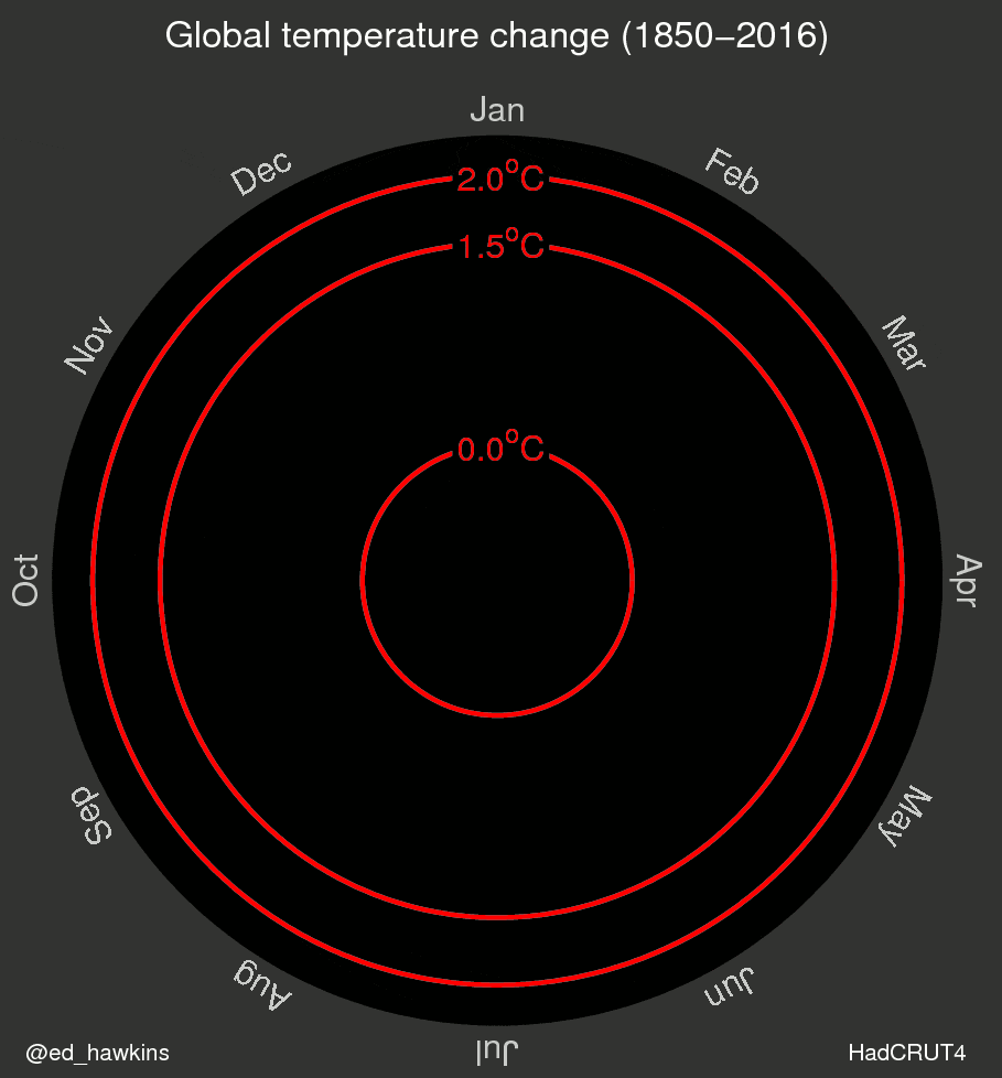
Climate spirals use changing distance from a center point to represent change of a dependent variable (archetypically, global average temperature). [1] The independent variable, time, is broken down into months (represented by constantly changing rotational angle about the center point) and years (line colour that evolves as years pass). [1] [12]

Hawkins explained that in his implementation, colours represent time: purple for early years, through blue, green to yellow for most recent years. [12] He made the graphics in MATLAB and used the "viridis" colour scale, [12] conscious of choosing a colour scale that makes the graphics legible to colour blind viewers. [1]

As the graphic includes red concentric circles denoting temperature changes of 1.5°C and 2.0°C, [1] Hawkins explained that "the relationship between current global temperatures and the internationally discussed target limits is also clear without much complex interpretation needed". [17] Ria Misra wrote in Gizmodo that the graphic "lets the noise of tiny variations fade into the background while still showcasing, very simply, the undeniable trend". [17]

Describing how global warming "appears to burst outward toward the end of the animation", Hawkins described how sulfate aerosols no longer counteracted the warming effect greenhouse gases after the 1970s, and noted how strong El Niño events in 1998 and 2016 lead to higher temperature plateaus more recently. [1] [10]

The first climate spiral portrayed data from HadCRUT4.4 from January 1850 – March 2016, graphing relative to the 1850-1900 mean temperature, [12] the same pre-industrial global average used in the IPCC Fifth Assessment Report. [16]

Applications and influence

Arctic sea ice volume progression since1979 animation.gif
Climate spiral of Earth's arctic sea ice volume. [18] The curve, "lopsided" due to winter-summer variations, spirals inward to reflect reduction in sea ice volume.
1850-2100 Climate spiral of global temperature - RCP 8.5 - USGS Jay Alder.gif
In May 2016, the USGS produced this graphic of simulated global average temperature changes to 2100, predicted under an RCP 8.5 (worst case) scenario. [19] [Note 1]
Atmospheric CO2 spiral since1958 animation.gif
Climate spiral of Earth's atmospheric CO2 concentration, starting in 1958. As expected, the curve CO2 expands more smoothly than curves for temperature change.

Three days after the first climate spiral was published, it was the subject of an article on the U.S Department of State's ShareAmerica website, noting the "compelling" graphic "shows just how fast" "world temperatures are spiraling upward". [20]

A climate spiral was featured in the opening ceremony of the August 2016 Summer Olympics. [21]

The design was on the shortlist for the Kantar Information is Beautiful Awards 2016. [22]

In January 2017, "Spiraling Global Temperatures" was nominated for the Shorty Awards GIF of the Year. [23]

In January 2017, the spiral was tweeted by Bernie Sanders [24] and the U.S. National Park Service, [25] both conveying how almost all recorded warmest years have been recent years.

Extensions of the climate spiral concept

In May 2016 United States Geological Survey scientist Jay Alder extended Hawkins' historical spiral to the year 2100, creating a predictive spiral graphic showing a possible future trajectory of global warming given the then-current carbon emission trend. [4] [19] Hawkins extended his two-dimensional spiral design to a three-dimensional version in which the graphic appears as an expanding cone-shaped structure. [8] Hawkins' original climate spiral application (global average temperature change) has been expanded to represent other time-varying quantities such as atmospheric CO2 concentration, [3] carbon budget, [3] and arctic sea ice volume. [7] [8]

Critical response

► Video: NASA appended a simulated three-dimensional visualization to this climate spiral (last 13 seconds) to portray global warming. [26]

The day of the climate spiral's first publication (9 May 2016), Brad Plumer wrote in Vox that the "mesmerizing" GIF was "one of the clearest visualizations of global warming" he had ever seen. [10] The following day (10 May), Jason Samenow wrote in The Washington Post that the spiral graph was "the most compelling global warming visualization ever made", [27] and, likewise, former Climate Central senior science writer Andrew Freedman wrote in Mashable that it was "the most compelling climate change visualization we’ve ever seen". [28] Michael E. Mann, creator of the hockey stick graph, said that the spiral graphic was "an interesting and worthwhile approach to representing the data graphically", [15] and PRI's Timothy McGrath wrote that the spiral was "a simple, elegant illustration of a dark history and a potentially terrifying future". [16] In BusinessGreen, environmental journalist James Murray praised the graphic's "elegant simplicity", asserting that "the mistakes, misinterpretations, and misinformation contained in so many climate sceptic arguments are steamrollered by the straightforward force of this spiral". [29]

On 11 May, Chris Mooney wrote in The Washington Post that, with his "startling animation" Hawkins had "hit a grand slam—and not through some clever turn of phrase or some new metaphor or framing, but rather, through viral data visualization". [1] Sarah Rense, first writing in Esquire that "climate science is unpalatable" and "depressing data", characterized the new graphic as being "as mesmerizing as it is depressing", "a cool GIF with pretty colours (to which) people will pay attention". [30] In late May 2016, Brian Kahn, communications coordinator at the International Research Institute for Climate and Society, wrote that the spiral was a "revolutionary new way to look at global temperatures" and posited that the graphic's popularity "can be attributed in part to its hypnotic nature and the visceral way it shows the present predicament of climate change". [4] In July 2016, freelance journalist Chelsea Harvey wrote in The Washington Post that, "at a time when climate science communication efforts are often viewed as dense or difficult for general audiences to understand, these types of striking graphics may help climate scientists connect with the public in a way that is both clear and attention-grabbing". [5]

Two years later, in May 2018 Jason Samenow commented that, though many Hawkins visualizations had "resonated among science communicators", climate spirals were the scientist's best-known visualizations. [31]

After his 2016 development of the climate spiral, Hawkins received the Royal Meteorological Society’s 2017 Climate Science Communication Prize. [32] After developing the warming stripes graphic in May 2018, Hawkins, a lead author for the IPCC 6th Assessment Report, received the Royal Society's 2018 Kavli Medal "for significant contributions to understanding and quantifying natural climate variability and long-term climate change, and for actively communicating climate science and its various implications with broad audiences". [32]

In a 2019 paper, Hawkins et al. acknowledged that a "possible scientific criticism" of the design was that uncertainty in the temperature data is not visualized. [11] Also, viewers might interpret the area of the 1.5°C and 2.0°C circles as representing the temperature change rather than the radius of the graphed line itself, though noting the temperature limit circles are clearly labeled. [11] In May 2017 Hawkins responded to a criticism that the human eye might incorrectly interpret the change in area within the spiral rather than the change in radius by noting that the radii are clearly labeled. [7]

Informally, climate spirals have been referred to as spirographs. [17]

See also

Notes

  1. 1 2 3 This spiral portrays temperature anomalies rather than temperatures per se. A temperature anomaly is simply a deviation, or change, from a baseline temperature that is usually calculated as the average temperature over a chosen reference period. A spiral portraying "absolute" temperature would be "lopsided" due to repeated winter-summer variations, a phenomenon analogous to that seen in the graphic of arctic sea ice volume.

Related Research Articles

<span class="mw-page-title-main">Attribution of recent climate change</span> Effort to scientifically ascertain mechanisms responsible for recent global warming

Efforts to scientifically ascertain and attribute mechanisms responsible for recent global warming and related climate changes on Earth have found that the main driver is elevated levels of greenhouse gases produced by human activities, with natural forces adding variability. The likely range of human-induced surface-level air warming by 2010–2019 compared to levels in 1850–1900 is 0.8 °C to 1.3 °C, with a best estimate of 1.07 °C. This is close to the observed overall warming during that time of 0.9 °C to 1.2 °C, while temperature changes during that time were likely only ±0.1 °C due to natural forcings and ±0.2 °C due to variability in the climate.

The global warming controversy concerns past or present public debates over certain aspects of climate change: whether it is occurring, how much has occurred in modern times, what has caused it, what its effects will be, whether action should be taken to curb it now or later, and so forth. In the scientific literature, there is a very strong consensus that global surface temperatures have increased in recent decades and that the trend is caused by human-induced emissions of greenhouse gases.

<span class="mw-page-title-main">Instrumental temperature record</span> In situ measurements that provide the temperature of Earths climate system

The instrumental temperature record is a record of temperatures within Earth's climate based on direct measurement of air temperature and ocean temperature, using thermometers and other thermometry devices. Instrumental temperature records are distinguished from indirect reconstructions using climate proxy data such as from tree rings and ocean sediments. Instrument-based data are collected from thousands of meteorological stations, buoys and ships around the globe. Whilst many heavily-populated areas have a high density of measurements, observations are more widely spread in sparsely populated areas such as polar regions and deserts, as well as over many parts of Africa and South America. Measurements were historically made using mercury or alcohol thermometers which were read manually, but are increasingly made using electronic sensors which transmit data automatically. Records of global average surface temperature are usually presented as anomalies rather than as absolute temperatures. A temperature anomaly is measured against a reference value. For example, a commonly used baseline period is the time period 1951-1980.

<span class="mw-page-title-main">Michael E. Mann</span> American physicist and climatologist

Michael Evan Mann is an American climatologist and geophysicist. He is the director of the Center for Science, Sustainability & the Media at the University of Pennsylvania. Mann has contributed to the scientific understanding of historic climate change based on the temperature record of the past thousand years. He has pioneered techniques to find patterns in past climate change and to isolate climate signals from noisy data.

<span class="mw-page-title-main">IPCC Third Assessment Report</span> Assessment of available scientific and socio-economic information on climate change by the IPCC

The IPCC Third Assessment Report (TAR), Climate Change 2001, is an assessment of available scientific and socio-economic information on climate change by the IPCC. Statements of the IPCC or information from the TAR were often used as a reference showing a scientific consensus on the subject of global warming. The Third Assessment Report (TAR) was completed in 2001 and consists of four reports, three of them from its Working Groups: Working Group I: The Scientific Basis; Working Group II: Impacts, Adaptation and Vulnerability; Working Group III: Mitigation; Synthesis Report. A number of the TAR's conclusions are given quantitative estimates of how probable it is that they are correct, e.g., greater than 66% probability of being correct. These are "Bayesian" probabilities, which are based on an expert assessment of all the available evidence.

<span class="mw-page-title-main">Richard A. Muller</span> American physicist

Richard A. Muller is an American physicist and emeritus professor of physics at the University of California, Berkeley. He was also a faculty senior scientist at the Lawrence Berkeley National Laboratory. In early 2010, Muller and his daughter Elizabeth Muller founded the group Berkeley Earth, an independent 501(c)(3) non-profit aimed at addressing some of the major concerns of the climate change skeptics, in particular the global surface temperature record. In 2016, Richard and Elizabeth Muller co-founded Deep Isolation, a private company seeking to dispose of nuclear waste in deep boreholes.

<span class="mw-page-title-main">Data and information visualization</span> Visual representation of data

Data and information visualization is the practice of designing and creating easy-to-communicate and easy-to-understand graphic or visual representations of a large amount of complex quantitative and qualitative data and information with the help of static, dynamic or interactive visual items. Typically based on data and information collected from a certain domain of expertise, these visualizations are intended for a broader audience to help them visually explore and discover, quickly understand, interpret and gain important insights into otherwise difficult-to-identify structures, relationships, correlations, local and global patterns, trends, variations, constancy, clusters, outliers and unusual groupings within data. When intended for the general public to convey a concise version of known, specific information in a clear and engaging manner, it is typically called information graphics.

<span class="mw-page-title-main">Hockey stick graph (global temperature)</span> Graph in climate science

Hockey stick graphs present the global or hemispherical mean temperature record of the past 500 to 2000 years as shown by quantitative climate reconstructions based on climate proxy records. These reconstructions have consistently shown a slow long term cooling trend changing into relatively rapid warming in the 20th century, with the instrumental temperature record by 2000 exceeding earlier temperatures.

David Russell Legates is a former professor of geography at the University of Delaware. He is the former Director of the Center for Climatic Research at the same university and a former Delaware state climatologist. In September 2020, the Trump administration appointed him as deputy assistant secretary of commerce for observation and prediction at the National Oceanic and Atmospheric Administration.

<i>The Great Global Warming Swindle</i> British TV series or programme

The Great Global Warming Swindle is a 2007 British polemical documentary film directed by Martin Durkin. The film denies the scientific consensus about the reality and causes of climate change, justifying this by suggesting that climatology is influenced by funding and political factors. The program was formally criticised by Ofcom, the UK broadcasting regulatory agency, which ruled the film failed to uphold due impartiality and upheld complaints of misrepresentation made by David King, who appeared in the film.

<span class="mw-page-title-main">Climate change denial</span> Denial of the scientific consensus on climate change

Climate change denial is the pseudoscientific dismissal or unwarranted doubt that contradicts the scientific consensus on climate change. Those promoting denial commonly use rhetorical tactics to give the appearance of a scientific controversy where there is none. Climate change denial includes doubts to the extent of how much climate change is caused by humans, its effects on nature and human society, and the potential of adaptation to global warming by human actions. To a lesser extent, climate change denial can also be implicit when people accept the science but fail to reconcile it with their belief or action. Several social science studies have analyzed these positions as forms of denialism, pseudoscience, or propaganda.

<span class="mw-page-title-main">Anthony Watts (blogger)</span> American blogger (born 1958)

Willard Anthony Watts is an American blogger who runs Watts Up With That?, a climate change denial blog that opposes the scientific consensus on climate change. A former television meteorologist and current radio meteorologist, he is also founder of the Surface Stations project, a volunteer initiative to document the condition of U.S. weather stations. The Heartland Institute helped fund some of Watts' projects, including publishing a report on the Surface Stations project, and invited him to be a paid speaker at its International Conference on Climate Change from 2008 to 2014.

<span class="mw-page-title-main">Climate crisis</span> Term used to refer to anthropogenic climate change

Climate crisis is a term describing global warming and climate change, and their impacts. This term and the term climate emergency have been used to describe the threat of global warming to humanity and the planet, and to urge aggressive climate change mitigation. In the scientific journal BioScience, a January 2020 article, endorsed by over 11,000 scientists worldwide, stated that "the climate crisis has arrived" and that an "immense increase of scale in endeavors to conserve our biosphere is needed to avoid untold suffering due to the climate crisis."

The Climatic Research Unit email controversy began in November 2009 with the hacking of a server at the Climatic Research Unit (CRU) at the University of East Anglia (UEA) by an external attacker, copying thousands of emails and computer files to various internet locations several weeks before the Copenhagen Summit on climate change.

Watts Up With That? (WUWT) is a blog promoting climate change denial that was created by Anthony Watts in 2006.

<i>The Hockey Stick Illusion</i> 2010 book by Andrew Montford

The Hockey Stick Illusion: Climategate and the Corruption of Science is a book written by Andrew Montford and published by Stacey International in 2010, which promotes climate change denial.

<span class="mw-page-title-main">The Tempestry Project</span> Arts project promoting climate change awareness

The Tempestry Project is a collaborative fiber arts project that presents global warming data in visual form through knitted or crocheted artwork. The project is part of a larger "data art" movement and the developing field of climate change art, which seeks to exploit the human tendency to value personal experience over data by creating accessible experiential representations of the data.

Climate change art is art inspired by climate change and global warming, generally intended to overcome humans' hardwired tendency to value personal experience over data and to disengage from data-based representations by making the data "vivid and accessible". One of the goal of climate change art is to "raise awareness of the crisis", as well as engage viewers politically and environmentally.

<span class="mw-page-title-main">Warming stripes</span> Data visualization graphics of long-term trends of annual temperature anomalies

Warming stripes are data visualization graphics that use a series of coloured stripes chronologically ordered to visually portray long-term temperature trends. Warming stripes reflect a "minimalist" style, conceived to use colour alone to avoid technical distractions to intuitively convey global warming trends to non-scientists.

<span class="mw-page-title-main">Ed Hawkins (climatologist)</span> British climate scientist known for data visualization graphics

Edward Hawkins is a British climate scientist who is Professor of climate science at the University of Reading, principal research scientist at the National Centre for Atmospheric Science (NCAS), editor of Climate Lab Book blog and lead scientist for the Weather Rescue citizen science project. He is known for his data visualizations of climate change for the general public such as warming stripes and climate spirals.

References

  1. 1 2 3 4 5 6 7 8 9 10 Mooney, Chris (11 May 2016). "This scientist just changed how we think about climate change with one GIF". The Washington Post. Archived from the original on 6 February 2019.
  2. Hawkins, Ed (2018). "Climate spirals / Global temperature change (1805-2017)". Climate Lab Book. Archived from the original on 27 July 2019. (Direct link to animated GIF).
  3. 1 2 3 4 5 "Climate Spirals". OpenClimateData.net. Archived from the original on 25 July 2019. Retrieved 23 August 2019.
  4. 1 2 3 Kahn, Brian (31 May 2016). "Watch global warming spiral out of control". Grist. Archived from the original on 26 June 2017.
  5. 1 2 Harvey, Chelsea (28 July 2016). "Scientists have found a perfect illustration of how the climate is spiraling 'out of control'". The Washington Post. Archived from the original on 11 July 2019.
  6. 1 2 "Global Temperature Change (1850-2016)". University of Reading Weblogs. May 2016. Archived from the original on 5 April 2019. (Animated GIF.)
  7. 1 2 3 4 5 Hawkins, Ed (9 May 2017). "Spiral birthday". Climate Lab Book. Archived from the original on 29 June 2017.
  8. 1 2 3 Mason, Betsy (8 January 2017). "11 Ways to See How Climate Change Is Imperiling the Arctic". National Geographic. Archived from the original on 25 August 2019.
  9. Hawkins, Ed (11 April 2016). "Global temperature changes since 1850". Climate Lab Book. Archived from the original on 22 August 2019.
  10. 1 2 3 Plumer, Brad (10 May 2016). "This viral climate GIF offers an incredibly clear view of rising temperatures". Vox. Archived from the original on 27 July 2019.
  11. 1 2 3 4 5 6 7 Hawkins, Ed; Fæhn, Taran; Fuglestvedt, Jan (2019). "The Climate Spiral Demonstrates the Power of Sharing Creative Ideas". Bulletin of the American Meteorological Society. 100 (5): 753–756. Bibcode:2019BAMS..100..753H. doi:10.1175/BAMS-D-18-0228.1. hdl: 11250/2641997 . S2CID   127018318.
  12. 1 2 3 4 5 Hawkins, Ed (9 May 2016). "Spiralling global temperatures". Climate Lab Book. Archived from the original on 16 August 2019.
  13. Staff, Science AF (25 May 2018). "This Has Got to Be One of The Most Beautiful And Powerful Climate Change Visuals We've Ever Seen". Science Alert. Archived from the original on 28 June 2019.
  14. Meduna, Veronika (17 September 2018). "The climate visualisations that leave no room for doubt or denial". The Spinoff. New Zealand. Archived from the original on 17 May 2019.
  15. 1 2 Thompson, Andrea (10 May 2016). "See Earth's temperature spiral toward 2C rise - graphic". The Guardian. Archived from the original on 16 August 2019.
  16. 1 2 3 McGrath, Timothy (10 May 2016). "This global warming GIF shows how hot Earth has gotten over the past 165 years". Public Radio International (PRI). Archived from the original on 20 May 2019.
  17. 1 2 3 Misra, Ria (10 May 2016). "One of the Most Convincing Climate Change Visualizations We've Ever Seen". Gizmodo. Archived from the original on 13 July 2019.
  18. Hawkins, Ed (May 2017). "Climate spirals". Climate Lab Book. Archived from the original on 19 August 2019. (Direct link to animated GIF)
  19. 1 2 Alder, Jay (26 May 2016). "Simulated global temperature change". usgs.gov. United States Geological Survey (USGS). Archived from the original on 23 August 2019.
  20. Buchanan, Michael (12 May 2016). "You haven't seen climate change like this before". ShareAmerica (U.S Department of State, Bureau of Global Public Affairs). Archived from the original on 7 November 2017.
  21. Irfan, Umair (30 May 2019). "Why this climate change data is on flip-flops, leggings, and cars / Warming stripes keep showing up on clothes and crafts". Vox. Archived from the original on 24 June 2019.
  22. "Climate spirals". informationisbeautifulawards.com. KANTAR Information is Beautiful. October 2016. Archived from the original on 23 August 2019.
  23. "The Ninth Annual Shorty Awards / Influencer Nominees / Content of the Year / GIF of the Year Presented by Watchable / Spiraling Global Temperatures". Shorty Awards. January 2017. Archived from the original on 12 July 2019.
  24. Sanders, Bernie (26 January 2017). "16 of the 17 warmest years on record have occurred since 2001. That's not an alternative fact. That is the truth. #climatefacts". twitter.com/SenSanders. Archived from the original on 11 April 2018. Retrieved 25 August 2019.
  25. "2016 was the hottest year on record for the 3rd year in a row. Check out this @NASA & @NOAA report". twitter.com/GoldenGateNPS. National Park Service (Golden Gate Park). 23 January 2017. Archived from the original on 18 August 2019. Retrieved 25 August 2019.
  26. SubbaRao, Mark (7 March 2022). "GISTEMP Climate Spiral". svs.gsfc.NASA.gov. NASA (Scientific Visualization Studio, Goddard Space Flight Center). Archived from the original on 8 March 2022. Credits: Mark SubbaRao (NASA/GSFC): Lead Visualizer; Ed Hawkins (National Centre for Atmospheric Science, University of Reading): Visualizer; Laurence Schuler (ADNET): Technical Support; Ian Jones (ADNET): Technical Support.
  27. Samenow, Jason (10 May 2016). "Unraveling spiral: The most compelling global warming visualization ever made". The Washington Post. Archived from the original on 22 February 2019.
  28. Freeman, Andrew (10 May 2016). "This is the most compelling climate change visualization we've ever seen". Mashable. Archived from the original on 6 December 2018.
  29. Murray, James (10 May 2016). "The spiralling climate crisis GIF every business leader should see". BusinessGreen. Archived from the original on 11 May 2016.
  30. Rense, Sarah (11 May 2016). "This Global Warming GIF Is as Mesmerizing as It Is Depressing / That's...good? I guess?". Esquire. Archived from the original on 20 January 2018.
  31. Samenow, Jason (24 May 2018). "Climate change in the United States presented in 123 red, white and blue stripes". The Washington Post. Archived from the original on 24 May 2018.
  32. 1 2 "Our changing climate: learning from the past to inform future choices / Prize lecture". London: Royal Society. 30 April 2019. Archived from the original on 14 May 2019. Retrieved 23 August 2019. Hawkins described his spiral graph and warming stripes in his Kavli prize lecture (video embedded in reference).

Further reading