Emigre (type foundry)

Last updated
Emigre fonts logo.jpg

Emigre Fonts is a digital type foundry based in Berkeley, California, that was founded in 1985 by husband-and-wife team Rudy VanderLans and Zuzana Licko. [1] The type foundry grew out of Emigre magazine, a publication founded by VanderLans and two Dutch friends who met in San Francisco, CA in 1984. Note that unlike the word émigré , Emigre is officially spelled without accents.

Contents

History

Emigre Fonts was founded as an independent foundry in 1985 quickly following the release of the first issue of Emigre magazine in 1984.

In a 2002 interview with Rhonda Rubinstein for Eye Magazine, Licko recalled the early days of her type design and the important relationship between the magazine and the foundry:

“When I started building Macintosh bitmap fonts in 1984, it was a purely experimental endeavour. I didn’t have a client for these fonts, nor did I plan to start a type foundry. It was Emigre magazine that opened up these options. Rudy had started it (with two Dutch artists) as a showcase for émigré artists. Issue #3 was the turning point for my typeface experiments and for the magazine, as it was typeset entirely using my first Lo-Res fonts. We had a lot of inquiries about the availability of these typefaces that no one had seen before. It was the start of Emigre Fonts." [2]

Coinciding with the advent of the Macintosh computer, Emigre took advantage of the new medium to design digital typefaces without requiring the equipment or manufacturing infrastructure of a traditional type foundry. Rather than adhering to the aesthetics of metal type optimized for letterpress printing, Licko began designing fonts that embraced the limitations of bitmap graphics endemic to early PCs and the idiosyncrasies of dot matrix printing. [3] Robin Kinross analyzed these fonts in a 1992 article for Eye Magazine: "The early productions were rationalised by reference to the requirements of low-memory computing and low-resolution screen display and printer output, and show considerate ingenuity in juggling with a heavily reduced formal repertoire, to make coherent sets of characters." [4] Continuing to embrace advances in technology, Licko later produced vector-based design. [5]

In addition to being one of the first companies to design original fonts made on and for a computer, [6] Emigre Fonts was the first to sell licenses and transfer digital fonts online. Created by long-time Emigre collaborator, Tim Starback, [1] the original system — called "Now Serving" — was built using FirstClass. Downloads could take up to one hour, requiring four to six modems (phone lines) to handle the demand. In time, a 56K "digital" connection to the Internet was added, which allowed customers all over the world to connect without long distance rates. Starback recalls those early days:

"Eventually we figured out how to get the web server to talk to our database and then authorize a credit card, still done with a dial-up modem. At that point, we had an automated system that could process orders and give the customer access to the font automatically. All the tech stuff was new to everyone, so we were all learning together." [7]

In the process, Emigre created the "perfect model of an autonomous foundry run by designers. Many designers followed Emigre's lead, joining their library or launching their own foundries." [7]

Emigre Fonts developed or released some of the most cutting-edge typefaces of the late 1980s and 1990s. Their success as pioneers in the digital type industry is in no small part credited to their eager adoption of new technologies and ability to recognize skill in contemporary designers, as expressed in a 2016 interview of Licko by Sally Kerrigan for Adobe Typekit:

“Each of our font families exudes a certain quality that is either tied to the technology of the time, the level of craftsmanship of the designer, or the prevailing aesthetic preferences of the time. Because the Emigre library developed over the past 30 years, alongside and in reaction to evolving technologies, each typeface is like a snapshot in time.” [8]

During this early digital period when design professionals were combining analog and digital production methods, Emigre’s print magazine (known for featuring graphic design criticism and experimental layouts) doubled as an advertising venue for Emigre’s typefaces by showcasing their fonts in use off-screen. [9] [6] Though many of Emigre's fonts are considered icons of Postmodern design, Emigre didn’t limit themselves. Licko’s popular revivals, Mrs Eaves (based on Baskerville) and Filosofia (based on Bodoni), were a departure from this style.

In an interview in Emigre No. 15, in response to a question about the legibility of her experimental bitmap fonts, Licko stated that "You read best what you read most," indicating that fonts such as Helvetica and Times Roman are not intrinsically legible but become so through repeated use. [10] This was a highly contested opinion within the world of type design that generated heated discussion in the pages of Emigre magazine and elsewhere. This was later referred to as the “Legibility wars” [11] — a term coined in 2004 by Robin Kinross in his book Modern Typography: an Essay in Critical History. [12]

Emigre was often criticized for rejecting Modernist design rules. Massimo Vignelli, a prominent designer and voice in the graphic design field, was highly critical of the foundry. Vignelli famously called Emigre a “typographic garbage factory,” insinuating that they were either a threat to the dominant graphic design ideals or insignificant as an “aberration of culture” in a typography panel discussion reported on in a 1991 issue of Print Magazine. [13] [14] This sparked an intense debate in the industry for much of the 1990s. To Vignelli's later collaboration with Emigre to directly promote the release of Licko’s Filosofia typeface by designing the poster to announce the release, Licko responded: “Massimo’s willingness to collaborate on our announcement reflects Emigre’s ability to bridge different approaches.” [15]

In 2011, The Museum of Modern Art in New York acquired five Emigre typeface families. The digital fonts are Keedy Sans by Mr. Keedy, Mason Serif by Jonathan Barnbrook, Template Gothic by Barry Deck, Oakland (a.k.a Lo-Res) by Zuzana Licko, and Dead History by P. Scott Makela. They were added to the Architecture and Design Collection as part of a selection of 23 digital typefaces documenting milestone designs covering the twentieth century. The acquisition followed in the footsteps of the Museum's first ever typeface acquisition, a case of 36-point Helvetica Bold lead type designed by Max Miedinger and Eduard Hoffman in 1957 for the Haas type foundry in Münchenstein, Switzerland. The typefaces were on display as part of the exhibit “Standard Deviations: Types and Families in Contemporary Design. [16]

Emigre remained faithful to their belief that legibility is a byproduct of exposure or practice. “People read best what they read most,” was a manifesto that encouraged VanderLans and Licko to continue exploring new designs. [14] The idea that new typefaces or layouts could become not just more legible but better for their intended uses and technologies than old ones gave birth to a full library of new designs for a new digital era. Refusing to waver in the wake of criticism, Licko and VanderLans forged their own path, revolutionizing design aesthetics and becoming one of the most influential digital type foundries. [15]

Books

Typefaces

Most typefaces in the Emigre Fonts library were designed and produced by Zuzana Licko. Over the years Emigre also licensed fonts from an international group of designers. All Emigre fonts are for retail and sold by licensing agreement to users worldwide. [1]

In addition to licensing fonts directly to users through the Emigre Fonts website, in 2016 Emigre licensed the entire Emigre Fonts library to Adobe Fonts [17] to make its fonts available through Adobe’s Creative Cloud service. The annual subscription to Creative Cloud includes single user desktop licenses and Web font hosting services for all Emigre Fonts. [18]

The company's type library features fonts by Mark Andresen, Bob Aufuldish, Jonathan Barnbrook, Rodrigo Cavazos, Barry Deck, Eric Donelan, John Downer, Elliott Peter Earls, Edward Fella, Sibylle Hagmann, Frank Heine, John Hersey, Jeffery Keedy, Zuzana Licko, P. Scott Makela, Conor Mangat, Nancy Mazzei, Brian Kelly, Miles Newlyn, Claudio Piccinini, Just van Rossum, Christian Schwartz and Rudy VanderLans. [19] See full font library and specimens type specimens available on Emigre's website.

Awards

Museum exhibits

Solo exhibitions

General exhibitions

Permanent collections

Related Research Articles

Typography Art and the craft of printing and the arranging of layouts

Typography is the art and technique of arranging type to make written language legible, readable and appealing when displayed. The arrangement of type involves selecting typefaces, point sizes, line lengths, line-spacing (leading), and letter-spacing (tracking), as well as adjusting the space between pairs of letters (kerning). The term typography is also applied to the style, arrangement, and appearance of the letters, numbers, and symbols created by the process. Type design is a closely related craft, sometimes considered part of typography; most typographers do not design typefaces, and some type designers do not consider themselves typographers. Typography also may be used as an ornamental and decorative device, unrelated to the communication of information.

Matthew Carter British type designer

Matthew Carter is a British type designer. A 2005 New Yorker profile described him as 'the most widely read man in the world' by considering the amount of text set in his commonly used fonts.
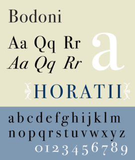
Bodoni

Bodoni is the name given to the serif typefaces first designed by Giambattista Bodoni (1740–1813) in the late eighteenth century and frequently revived since. Bodoni's typefaces are classified as Didone or modern. Bodoni followed the ideas of John Baskerville, as found in the printing type Baskerville—increased stroke contrast reflecting developing printing technology and a more vertical axis—but he took them to a more extreme conclusion. Bodoni had a long career and his designs changed and varied, ending with a typeface of a slightly condensed underlying structure with flat, unbracketed serifs, extreme contrast between thick and thin strokes, and an overall geometric construction.

The First Things First 2000 manifesto, launched by Adbusters magazine in 1999, was an updated version of the earlier First Things First manifesto written and published in 1964 by Ken Garland, a British designer.
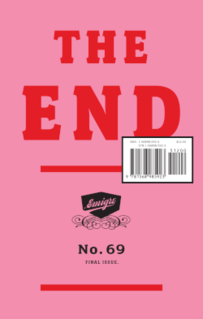
<i>Emigre</i> (magazine) US graphic design magazine published from 1984 to 2005

Emigre was an award-winning (mostly) quarterly magazine published from 1984 until 2005 in Berkeley, California, dedicated to visual communication, graphic design, typography, and design criticism. Produced by Rudy VanderLans and Zuzana Licko, Emigre was known for creating some of the very first digital layouts and typeface designs. Exposure to Licko's typefaces through the magazine lead to the creation of Emigre Fonts in 1985.

Zuzana Licko is a Slovak-born American type designer and visual artist known for co-founding Emigre Fonts, a digital type foundry in Berkeley, CA. She has designed and produced numerous digital typefaces including the popular Mrs Eaves, Modula, Filosofia, and Matrix. As a corresponding interest she also creates ceramic sculptures, textile prints and jacquard weavings.

Wim Crouwel

Willem Hendrik "Wim" Crouwel was a Dutch graphic designer, type designer, and typographer.

Rudy VanderLans is a Dutch graphic designer, photographer, and the co-founder of Emigre Fonts with his wife Zuzana Licko. Emigre Fonts is an independent type foundry in Berkeley, CA. He was also the art director and editor of Emigre magazine, the legendary journal devoted to visual communications from 1984 to 2005. Since arriving in California in 1981, he has been photographing his adoptive Golden State as an ongoing side project. He has authored a total of 11 photo books on the topic, and staged two solo exhibits at Gallery 16 in San Francisco.
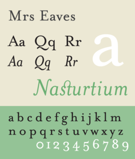
Mrs Eaves Transitional serif typeface designed by Zuzana Licko

Mrs Eaves is a transitional serif typeface designed by Zuzana Licko in 1996. It is a variant of Baskerville, which was designed in Birmingham, England, in the 1750s. Mrs Eaves adapts Baskerville for use in display contexts, such as headings and book blurbs, through the use of a low x-height and a range of unusual combined characters or ligatures.
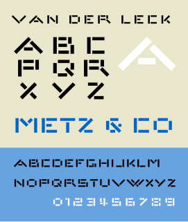
Architype van der Leck

Architype van der Leck is a geometric sans-serif typeface, based upon the 1941 typeface designed by Bart van der Leck for the Dutch magazine Flax, a journal of the De Stijl art movement.

Architype Van Doesburg

Architype Van Doesburg is a geometric sans-serif typeface based upon a 1919 alphabet designed by Theo van Doesburg, a cofounder of the De Stijl art movement. The digital revival shown at right was produced by Freda Sack and David Quay of The Foundry.

Peter Biľak Slovak graphic and typeface designer

Peter Biľak is a Slovak graphic and typeface designer, based in The Hague, The Netherlands. He works in the field of editorial, graphic, and type design, teaches typeface design at the postgraduate course Type&Media at the KABK, Royal Academy of Art. He started Typotheque in 1999, Dot Dot Dot in 2000, Indian Type Foundry in 2009, Works That Work magazine in 2012, and Fontstand, in 2015. He is a member of AGI and lectures on his work internationally. He is a writer for numerous design magazines and frequently contributes writing and design to books and publications that include Print, Emigre, Eye (magazine), Items, tipoGrafica, Idea (magazine), Abitare and Page.

P. Scott Makela was a graphic designer, multimedia designer and type designer. Among other work, he was especially noted for the design of Dead History, a postmodern typeface that combined features of a rounded sans serif typeface and a crisp neo-classical serif typeface. With the emergence of the personal computer in the mid-1980s, Makela was among the first to explore digital programs such as Photoshop and Adobe Illustrator. As a result, he created an idiosyncratic, original and highly controversial design aesthetic. In particular, his disregard for clean, modernist, problem-solving design agendas—synonymous with contemporary corporate graphic design—caused much debate among powerful, old-guard designers such as Massimo Vignelli, Paul Rand, and Henry Wolf.

Edward Fella is an American graphic designer, artist and educator. He created the OutWest typeface in 1993. His work is held in the collection of the Cooper-Hewitt, National Design Museum, the Brauer Museum of Art, and the Museum of Modern Art. He was the recipient of the 2007 AIGA Medal. He was also the recipient of a Chrysler Award in 1997. Curt Cloninger called Fella "the contemporary master of hand-drawn typography."

Jeffery Keedy, born 1957, is an American graphic designer, type designer, writer and educator. He is notable as an essayist and contributor to books and periodicals on graphic design. He is also notable for the design of Keedy Sans, a typeface acquired in the permanent collection of the Museum of Modern Art in 2011.

Jonathan Barnbrook

Jonathan Barnbrook, is a British graphic designer, film maker and typographer. He trained at Saint Martin's School of Art and at the Royal College of Art, both in London.

Martin Majoor Dutch type designer and graphic designer (born 1960)

Martin Majoor is a Dutch type designer and graphic designer. As of 2006, he had worked since 1997 in both Arnhem, Netherlands, and Warsaw, Poland.
Triplex (typeface)

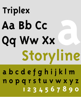
The Triplex type font style is a typeface designed by Zuzana Licko and John Downer in 1985 and 1989. It is distributed by Emigre. It is used by Avex & Prezi for its logo. It was also used as the typeface for Disney Channel from 1997-2002. It has both Sans-serif and Serif variation.

Template Gothic

Template Gothic is an experimental, sans-serif typeface designed by Barry Deck in 1989. It was not commercially released until type designer Rudy VanderLans was exposed to the font, when Deck's California Institute of the Arts graduate class visited his studio. In 1991, it was released by Emigre, a type foundry, of which VanderLans was a co-founder. In 1992, Deck developed a serif variation of the font. Template Gothic is considered one of the most defining fonts of the 1990s grunge aesthetic.
Filosofia Serif typeface

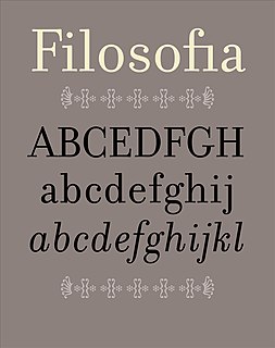
Filosofia is a serif typeface designed by Zuzana Licko and released by Emigre Fonts in 1996. It is a revival of Italian type designer Giambattista Bodoni's late eighteenth century typeface, Bodoni.

References

  1. 1 2 3 4 "About Emigre". www.emigre.com.
  2. "Eye Magazine | Feature | Reputations: Zuzana Licko". eyemagazine.com. Retrieved 2021-03-14.
  3. "Emigre Fonts: Interview with Zuzana Licko". www.emigre.com.
  4. "Eye Magazine | Feature | The digital wave". eyemagazine.com. Retrieved 2021-03-18.
  5. Bringhurst, Robert. The Elements of Typographic Style, Hartley & Marks (2004), page 134: "Licko has exploited the harsh economies of digital plotting routines, slicing from control point to control point not with a knife, file or chisel but with digitized straight lines."
  6. 1 2 "Type Master: An Interview with Emigre's Rudy VanderLans". 15 July 2010.
  7. 1 2 "Type Foundries Today & the Typographica Census". Typographica. Retrieved 2021-03-18.
  8. "The Typekit Blog | Emigre adds fonts to Typekit, plus an interview with Zuzana Licko". blog.typekit.com. Retrieved 2021-03-14.
  9. Heller, Steven and Fili, Louise. Stylepedia: A Guide to Graphic Design Mannerisms, Quirks, and Conceits, Chronicle Books (2006), page 121: "What Emigre initiated was co-opted by the new mainstream -- from fashion magazines to MTV. Stylistically Emigre was not just the standard bearer, it was the bearer of standards for experimental digital typography."
  10. "Emigre: Essays - Emigre No. 15". www.emigre.com. Retrieved 2021-03-21.
  11. "The Legibility Wars of the '80s and '90s". PRINT. 2016-12-05. Retrieved 2021-03-21.
  12. Kinross, Robin (2004). Modern typography : an essay in critical history (2nd ed.). London: Hyphen Press. ISBN   0-907259-18-9. OCLC   56603246.
  13. "Massimo Vignelli: Creator of Timeless Design and Fearless Critic of "Junk"". PRINT. 2014-05-28. Retrieved 2021-03-14.
  14. 1 2 "Emigre: Essays - Critical Conditions:Zuzana Licko, Rudy V..." www.emigre.com. Retrieved 2021-03-14.
  15. 1 2 Dooley, Michael (September 1, 1997). "Zuzana Licko and Rudy VanderLans". AIGA. Retrieved 2021-03-14.
  16. "Standard Deviations: Types and Families in Contemporary Design | MoMA". The Museum of Modern Art. Retrieved 2021-03-21.
  17. "Emigre: News". www.emigre.com. Retrieved 2021-03-21.
  18. "Emigre | Adobe Fonts". fonts.adobe.com. Retrieved 2021-03-21.
  19. "Emigre « MyFonts".
  20. Friedman, Mildred S.; Giovannini, Joseph; Heller, Steven (1989). Graphic design in America : a visual language history. Internet Archive. Minneapolis : Walker Art Center ; New York : Abrams. pp. 237, 257. ISBN   978-0-8109-1036-2.
  21. "Mixing Messages — ellenlupton". ellenlupton.com. Retrieved 2021-03-16.

Additional online resources

Additional print resources