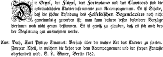
Typography is the art and technique of arranging type to make written language legible, readable, and appealing when displayed. The arrangement of type involves selecting typefaces, point sizes, line lengths, line-spacing (leading), and letter-spacing (tracking), and adjusting the space between pairs of letters (kerning). The term typography is also applied to the style, arrangement, and appearance of the letters, numbers, and symbols created by the process. Type design is a closely related craft, sometimes considered part of typography; most typographers do not design typefaces, and some type designers do not consider themselves typographers. Typography also may be used as a decorative device, unrelated to communication of information.

In typography, emphasis is the strengthening of words in a text with a font in a different style from the rest of the text, to highlight them. It is the equivalent of prosodic stress in speech.
In typography, leading refers to the distance between adjacent lines of type; however, the exact definition has become confused. In the days of hand-typesetting, it referred to the thin strips of lead that were inserted into the forms to increase the vertical distance between lines of type; in this case, the leading would be defined as the difference between 2 quantities: the size of the type and the distance from one baseline to the next. For instance, given a type size of 10 points and a distance between baselines of 12 points, the leading would be 2 points; put another way, a leading of 2 points means there is a distance of 2 points from the bottom of the high line of type to the top of the low line of type. In modern times, though, there seems to be widespread use of "leading" to refer instead to just the distance from one baseline to the next, probably because modern layout software tracks that quantity instead of a virtual strip of lead.

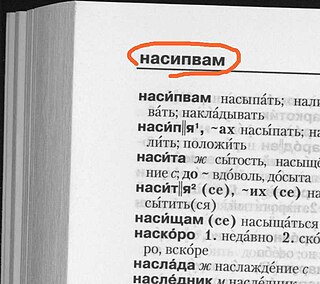
In typography and word processing, a page header is text that is separated from the body text and appears at the top of a printed page. Word-processing programs usually allow for the configuration of page headers, which are typically identical throughout a work except in aspects such as page numbers.
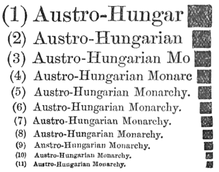
In typography, the point is the smallest unit of measure. It is used for measuring font size, leading, and other items on a printed page. The size of the point has varied throughout the history of printing. Since the 18th century, the point's size has varied from 0.18 to 0.4 millimeters. Following the advent of desktop publishing in the 1980s and 1990s, digital printing has largely supplanted the letterpress printing and has established the DTP point as the de facto standard. The DTP point is defined as 1⁄72 of an international inch and, as with earlier American point sizes, is considered to be 1⁄12 of a pica.

A catchword is a word placed at the foot of a handwritten or printed page that is meant to be bound along with other pages in a book. The word anticipates the first word of the following page. It was meant to help the bookbinder or printer make sure that the leaves were bound in the right order or that the pages were set up in the press in the right order. Catchwords appear in some medieval manuscripts, and appear again in printed books late in the fifteenth century. The practice became widespread in the mid sixteenth century, and prevailed until the arrival of industrial printing techniques late in the eighteenth century.

A rubric is a word or section of text that is traditionally written or printed in red ink for emphasis. The word derives from the Latin: rubrica, meaning red ochre or red chalk, and originates in Medieval illuminated manuscripts from the 13th century or earlier. In these, red letters were used to highlight initial capitals, section headings and names of religious significance, a practice known as rubrication, which was a separate stage in the production of a manuscript.

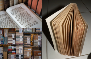
A page is one side of a leaf of paper, parchment or other material in a book, magazine, newspaper, or other collection of sheets, on which text or illustrations can be printed, written or drawn, to create documents. It can be used as a measure of communicating general quantity of information or more specific quantity

Book design is the art of incorporating the content, style, format, design, and sequence of the various components and elements of a book into a coherent unit. In the words of the renowned typographer Jan Tschichold (1902–1974), book design, "though largely forgotten today, [relies upon] methods and rules upon which it is impossible to improve, [and which] have been developed over centuries. To produce perfect books, these rules have to be brought back to life and applied". Richard Hendel describes book design as "an arcane subject", and refers to the need for a context to understand what that means.

Bookman or Bookman Old Style, is a serif typeface. A wide, legible design that is slightly bolder than most body text faces, Bookman has been used for both display typography and for printing at small sizes such as in trade printing, and less commonly for body text. In advertising use it is particularly associated with the graphic design of the 1960s and 1970s, when revivals of it were very popular.
Sentence spacing is the space between sentences in typeset text. It is a matter of typographical convention. Since the introduction of movable-type printing in Europe, various sentence spacing conventions have been used in languages with a Latin alphabet. These include a normal word space, a single enlarged space, and two full spaces.

In typography, a margin is the area between the main content of a page and the page edges. The margin helps to define where a line of text begins and ends. When a page is justified the text is spread out to be flush with the left and right margins. When two pages of content are combined next to each other, the space between the two pages is known as the gutter. The top and bottom margins of a page are also called "head" and "foot", respectively. The term "margin" can also be used to describe the edge of internal content, such as the right or left edge of a column of text.

The De Vinne Press Building, located at 393-399 Lafayette Street at the corner of East 4th Street, in the NoHo district of lower Manhattan, New York City, is a brick structure, built in 1885-1886 and designed by the firm of Babb, Cook & Willard in Romanesque Revival style. An addition was made to the building in 1892.
The dash is a punctuation mark that is similar in appearance to U+002D-HYPHEN-MINUS and U+2212−MINUS SIGN, but differs from these symbols in both length and height. The most common versions of the dash are the en dash (–), equal to half the height of the font; the em dash (—), twice as long as the en dash; and the horizontal bar (―), whose length varies across typefaces.

The history of sentence spacing is the evolution of sentence spacing conventions from the introduction of movable type in Europe by Johannes Gutenberg to the present day.

Century is a family of serif type faces particularly intended for body text. The family originates from a first design, Century Roman cut by American Type Founders designer Linn Boyd Benton in 1894 for master printer Theodore Low De Vinne, for use in The Century Magazine. ATF rapidly expanded it into a very large family, first by Linn Boyd and later by his son Morris.

Fonts originally consisted of a set of moveable type letterpunches purchased from a type foundry. As early as 1600, the sizes of these types—their "bodies"—acquired traditional names in English, French, German, and Dutch, usually from their principal early uses. These names were used relative to the others and their exact length would vary over time, from country to country, and from foundry to foundry. For example, "agate" and "ruby" used to be a single size "agate ruby" of about 5 points; metal type known as "agate" later ranged from 5 to 5.8 points. The sizes were gradually standardized as described above. Modern Chinese typography uses the following names in general preference to stating the number of points. In ambiguous contexts, the word hào is added to the end of the size name to clarify the meaning.

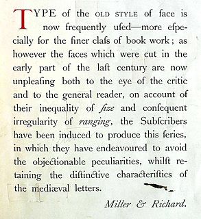
Old Style or Modernised Old Style was the name given to a series of serif typefaces cut from the mid-nineteenth century and sold by the type foundry Miller & Richard, of Edinburgh in Scotland, as well as many derivatives and copies.
Anthony Bessemer was a British engineer and industrialist, who spent large portions of his life in the Netherlands and France before returning to live in London and Hertfordshire. His son was Sir Henry Bessemer, the inventor of the Bessemer process for steel manufacture.

