| Emblem of the Association of Southeast Asian Nations | |
|---|---|
| | |
| Alternative name | The ASEAN Emblem |
| Adopted | 1979 (original emblem) 1997 (current iteration) |
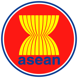
| Shield | Set upon a red circle background, ten yellow paddy or rice stalks are drawn in the middle. Under the rice stalks the organisation name abbreviation "asean" is written in lower case Helvetica font in blue. The red circle is drawn with a white and blue circumference. |
The Emblem of the Association of Southeast Asian Nations, also known as the ASEAN Emblem or ASEAN Logo, is the emblem of ASEAN adopted in 1979.
The current iteration was adopted on 31 May 1997 together with the ASEAN flag. [1]
The ASEAN emblem traces its roots from the logo designed by Mohammad Radzi Hanif of Malaysia. That logo was a winning entry of a design competition held from 1977 to 1978, when Hanif was still a design student at the MARA Institute of Technology (now Universiti Teknologi MARA) in Shah Alam, Selangor. ASEAN at the time still had five members. [2] The ASEAN logo was adopted in 1979. [3]
The logo was based on a sheaf of paddy, or specifically the result of the practice of farmers of reaping and binding called segemal padi in Malay. [2]
The current logo was adopted on 31 May 1997 alongside the current flag, the same year which Laos and Myanmar became ASEAN members. [4] [5] Priorly, a design competition was held for a new logo with five winning entries picked among 3,000 entries. However, ASEAN opted to just increase the number of stalks in the emblem to ten. [6]
Set upon a red circle background, ten yellow paddy or rice stalks are drawn in the middle. Under the rice stalks the organisation name abbreviation 'asean' is written in lowercase bold Helvetica font in blue. The red circle is drawn with a white and blue circumference.
The colours of the emblem are specified as follows:
| Scheme | Blue | Red | Yellow | White |
|---|---|---|---|---|
| Pantone | Pantone 286 | Pantone Red 032 | Pantone Process Yellow | Plain White |
| RGB Approx. | #0032A0 [7] | #EF3340 [8] | #F8E600 [9] | #FFFFFF |
| CMYK Approx. | 100, 80, 0, 12 [7] | 0, 90, 76, 0 [8] | 0, 0, 100, 0 [9] | 0, 0, 0, 0 |
As per the ASEAN Guidelines adopted in 2010 set at the 6th Meeting of the ASEAN Coordinating Council (ACC), the ASEAN emblem represents a stable, peaceful, united and dynamic ASEAN. [10]
The paddy stalk as originally designed by Mohammad Radzi Hanif represents ASEAN unity and was used as a motif since rice is a major staple in Southeast Asia. The logo originally designed in yellow ochre evokes "mature paddy" envisioning that ASEAN member states can only grow by depending on each other. [2]
The 5 members of the Association of South-east Asian Nations (Asean) picked this logo to represent their group. Designed by Malaysian Mohamed Radzi Hanif, 25, a Mara Institute of Technology graduate, it won an Asean-wide contest in 1979.(subscription required)