Multivariate map

Last updated
Bivariate choropleth map comparing the Black (blue) and Hispanic (red) populations in the United States, 2010 census; shades of purple show significant proportions of both groups. Black Hispanic Bivariate Map.png
Bivariate choropleth map comparing the Black (blue) and Hispanic (red) populations in the United States, 2010 census; shades of purple show significant proportions of both groups.

A bivariate map or multivariate map is a type of thematic map that displays two or more variables on a single map by combining different sets of symbols. [1] Each of the variables is represented using a standard thematic map technique, such as choropleth, cartogram, or proportional symbols. They may be the same type or different types, and they may be on separate layers of the map, or they may be combined into a single multivariate symbol.

Contents

The typical objective of a multivariate map is to visualize any statistical or geographic relationship between the variables. It has potential to reveal relationships between variables more effectively than a side-by-side comparison of the corresponding univariate maps, but also has the danger of Cognitive overload when the symbols and patterns are too complex to easily understand. [2] :331

History

An 1858 multivariate map by Charles Joseph Minard, using a nominal choropleth to represent departments that supplied meat to be consumed in Paris, proportional circles to represent significant volumes of that meat, combined with pie charts dividing it into relative proportions of beef (black), veal (red), and mutton (green). Minard-carte-viande-1858.png
An 1858 multivariate map by Charles Joseph Minard, using a nominal choropleth to represent departments that supplied meat to be consumed in Paris, proportional circles to represent significant volumes of that meat, combined with pie charts dividing it into relative proportions of beef (black), veal (red), and mutton (green).

The first multivariate maps appeared in the early Industrial era (1830-1860), at the same time that thematic maps in general were starting to appear. An 1838 booklet of maps produced by Henry Drury Harness for a report on Irish railroads included one that simultaneously showed city populations as proportional symbols and railroad traffic volume as a Flow map. [3] [4]

Charles Joseph Minard became a master at creating visualizations that combined multiple variables during the 1850s and 1860s, often mixing choropleth, flow lines, proportional symbols, and statistical charts to tell complex stories visually. [5]

Multivariate thematic maps found a resurgence starting in the middle of the 20th Century, coinciding with the scientific turn in geography. George F. Jenks introduced the bivariate dot density map in 1953. [6] The first modern bivariate choropleth maps were published by the U.S. Census Bureau in the 1970s. [7] Their often complex patterns of multiple colors has drawn acclaim and criticism ever since, [8] but has also led to research to discover effective design techniques. [9] [10]

Starting in the 1980s, computer software, including the Geographic information system (GIS) facilitated the design and production of multivariate maps. [11] In fact, a tool for automatically generating bivariate choropleth maps was introduced in Esri's ArcGIS Pro in 2020.

Methods

There are a variety of ways in which separate variables can be mapped simultaneously, which generally fall into a few approaches:

A multi-layered thematic map, displaying minority proportion as a choropleth, and family size as a proportional symbol Bivariate.png
A multi-layered thematic map, displaying minority proportion as a choropleth, and family size as a proportional symbol

Advantages and criticisms

A multivariate symbol map of the 2016 U.S. presidential election, using a combination proportional and chart symbol 2016 US Presidential Election Pie Charts.png
A multivariate symbol map of the 2016 U.S. presidential election, using a combination proportional and chart symbol
A bivariate dot density map showing the distribution of the African American (blue) and Latino (red) populations in the contiguous United States in 2010. Dot map black hispanic.png
A bivariate dot density map showing the distribution of the African American (blue) and Latino (red) populations in the contiguous United States in 2010.

Multivariate thematic maps can be a very effective tool for discovering intricate geographic patterns in complex data. [1] If executed well, related patterns between variables can be recognized easier in a multivariate map than by comparing separate thematic maps.

The technique works best when the variables happen to have a clear geographic pattern, such as a high degree of spatial autocorrelation, so that there are large regions of similar appearance with gradual changes between them, or a generally strong correlation between the two variables. If there is no clear pattern, the map can become an overwhelming mix of random symbols.

A second problem occurs when the symbols do not harmonize well. In keeping with Gestalt psychology, a multivariate map will work best when map readers can isolate patterns in each variable independently, as well as comparing them to each other. This occurs when the map symbols follow the gestalt principles of grouping. Conversely, it is possible to select thematic symbol strategies that are effective on their own, but do not work together well, such as a proportional point symbol that obscures the choropleth map underneath, or a bivariate choropleth map using base colors that create unintuitive mixed colors.

A third issue arises when a map, or even a single symbol, is overloaded with too many variables that cannot be efficiently interpreted. [16] Chernoff faces have often been criticized for this effect.

Thus, many multivariate maps turn out to be technically impressive, but practically unusable. [12] This means that the cartographer must be able to critically evaluate whether a multivariate map she has designed is actually effective. It has also been suggested that in some cases, a map might not be the best tool for studying a particular multivariate dataset, and other analytical methods may be more enlightening, such as cluster analysis. [2] :344

See also

Related Research Articles

<span class="mw-page-title-main">Map</span> Symbolic depiction of relationships

A map is a symbolic depiction emphasizing relationships between elements of some space, such as objects, regions, or themes.

<span class="mw-page-title-main">Cartogram</span> Map distorting size to show another value

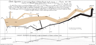
A cartogram is a thematic map of a set of features, in which their geographic size is altered to be directly proportional to a selected variable, such as travel time, population, or Gross National Product. Geographic space itself is thus warped, sometimes extremely, in order to visualize the distribution of the variable. It is one of the most abstract types of map; in fact, some forms may more properly be called diagrams. They are primarily used to display emphasis and for analysis as nomographs.

<span class="mw-page-title-main">Infographic</span> Graphic visual representation of information

Infographics are graphic visual representations of information, data, or knowledge intended to present information quickly and clearly. They can improve cognition by using graphics to enhance the human visual system's ability to see patterns and trends. Similar pursuits are information visualization, data visualization, statistical graphics, information design, or information architecture. Infographics have evolved in recent years to be for mass communication, and thus are designed with fewer assumptions about the readers' knowledge base than other types of visualizations. Isotypes are an early example of infographics conveying information quickly and easily to the masses.

<span class="mw-page-title-main">Choropleth map</span> Type of data visualization for geographic regions

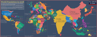
A choropleth map is a type of statistical thematic map that uses pseudocolor, meaning color corresponding with an aggregate summary of a geographic characteristic within spatial enumeration units, such as population density or per-capita income.

In color theory, a color scheme is a combination of 2 or more colors used in aesthetic or practical design. Aesthetic color schemes are used to create style and appeal. Colors that create a harmonious feeling when viewed together are often used together in aesthetic color schemes. Practical color schemes are used to inhibit or facilitate color tasks, such as camouflage color schemes or high visibility color schemes. Qualitative and quantitative color schemes are used to encode unordered categorical data and ordered data, respectively. Color schemes are often described in terms of logical combinations of colors on a color wheel or within a color space.

<span class="mw-page-title-main">Dasymetric map</span> Hybrid type of thematic map

A dasymetric map is a type of thematic map that uses areal symbols to visualize a geographic field by refining a choropleth map with ancillary information about the distribution of the variable. The name refers to the fact that the most common variable mapped using this technique has generally been population density. The dasymetric map is a hybrid product combining the strengths and weaknesses of choropleth and isarithmic maps.

<span class="mw-page-title-main">Heat map</span> Data visualization technique

A heat map is a 2-dimensional data visualization technique that represents the magnitude of individual values within a dataset as a color. The variation in color may be by hue or intensity.

<span class="mw-page-title-main">Map coloring</span> Differentiating different features of a map using different colours.

In cartographic design, map coloring is the act of choosing colors as a form of map symbol to be used on a map.

<span class="mw-page-title-main">Thematic map</span> Type of map that visualizes data

A thematic map is a type of map that portrays the geographic pattern of a particular subject matter (theme) in a geographic area. This usually involves the use of map symbols to visualize selected properties of geographic features that are not naturally visible, such as temperature, language, or population. In this, they contrast with general reference maps, which focus on the location of a diverse set of physical features, such as rivers, roads, and buildings. Alternative names have been suggested for this class, such as special-subject or special-purpose maps, statistical maps, or distribution maps, but these have generally fallen out of common usage. Thematic mapping is closely allied with the field of Geovisualization.

<span class="mw-page-title-main">Field (geography)</span> Property that varies over space

In the context of spatial analysis, geographic information systems, and geographic information science, a field is a property that fills space, and varies over space, such as temperature or density. This use of the term has been adopted from physics and mathematics, due to their similarity to physical fields (vector or scalar) such as the electromagnetic field or gravitational field. Synonymous terms include spatially dependent variable (geostatistics), statistical surface ( thematic mapping), and intensive property (physics and chemistry) and crossbreeding between these disciplines is common. The simplest formal model for a field is the function, which yields a single value given a point in space (i.e., t = f(x, y, z) )

<span class="mw-page-title-main">Flow map</span> Thematic map visualizing linear flow

A flow map is a type of thematic map that uses linear symbols to represent movement. It may thus be considered a hybrid of a map and a flow diagram. The movement being mapped may be that of anything, including people, highway traffic, trade goods, water, ideas, telecommunications data, etc. The wide variety of moving material, and the variety of geographic networks through they move, has led to many different design strategies. Some cartographers have expanded this term to any thematic map of a linear network, while others restrict its use to maps that specifically show movement of some kind.

Borden D. Dent (1938–2000) was an American geographer and cartographer who served as professor emeritus and chairman of the Department of Geography and Anthropology at Georgia State University. His textbook, Cartography: Thematic Map Design, is one of the seminal texts in the field, and its sixth edition was reissued in 2009.

The Jenks optimization method, also called the Jenks natural breaks classification method, is a data clustering method designed to determine the best arrangement of values into different classes. This is done by seeking to minimize each class's average deviation from the class mean, while maximizing each class's deviation from the means of the other classes. In other words, the method seeks to reduce the variance within classes and maximize the variance between classes.

<span class="mw-page-title-main">Dot distribution map</span> Thematic map using dots to visualize distribution

A dot distribution map is a type of thematic map that uses a point symbol to visualize the geographic distribution of a large number of related phenomena. Dot maps are a type of unit visualizations that rely on a visual scatter to show spatial patterns, especially variances in density. The dots may represent the actual locations of individual phenomena, or be randomly placed in aggregation districts to represent a number of individuals. Although these two procedures, and their underlying models, are very different, the general effect is the same.

<span class="mw-page-title-main">Map symbol</span> Graphic depiction of a geographic phenomenon

A map symbol or cartographic symbol is a graphical device used to visually represent a real-world feature on a map, working in the same fashion as other forms of symbols. Map symbols may include point markers, lines, regions, continuous fields, or text; these can be designed visually in their shape, size, color, pattern, and other graphic variables to represent a variety of information about each phenomenon being represented.

James Ralph Beniger was an American historian and sociologist and Professor of Communications and Sociology at the Annenberg School for Communication at the University of Southern California, particularly known for his early work on the history of quantitative graphics in statistics, and his later work on the technological and economic origins of the information society.

<span class="mw-page-title-main">Chorochromatic map</span> Thematic map visualizing a discrete field

A Chorochromatic map, also known as an area-class, qualitative area, or mosaic map, is a type of thematic map that portray regions of categorical or nominal data using variations in color symbols. Chorochromatic maps are typically used to represent discrete fields, also known as categorical coverages. Chorochromatic maps differ from choropleth maps in that chorochromatic maps are mapped according to data-driven boundaries instead of trying to make the data fit within existing, sometimes arbitrary units such as political boundaries.

A visual variable, in cartographic design, graphic design, and data visualization, is an aspect of a graphical object that can visually differentiate it from other objects, and can be controlled during the design process. The concept was first systematized by Jacques Bertin, a French cartographer and graphic designer, and published in his 1967 book, Sémiologie Graphique. Bertin identified a basic set of these variables and provided guidance for their usage; the concept and the set of variables has since been expanded, especially in cartography, where it has become a core principle of education and practice.

<span class="mw-page-title-main">Cartographic design</span> Process of designing maps

Cartographic design or map design is the process of crafting the appearance of a map, applying the principles of design and knowledge of how maps are used to create a map that has both aesthetic appeal and practical function. It shares this dual goal with almost all forms of design; it also shares with other design, especially graphic design, the three skill sets of artistic talent, scientific reasoning, and technology. As a discipline, it integrates design, geography, and geographic information science.

<span class="mw-page-title-main">Proportional symbol map</span> Thematic map based on symbol size

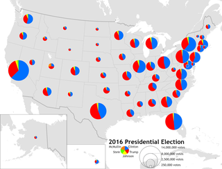
A proportional symbol map or proportional point symbol map is a type of thematic map that uses map symbols that vary in size to represent a quantitative variable. For example, circles may be used to show the location of cities within the map, with the size of each circle sized proportionally to the population of the city. Typically, the size of each symbol is calculated so that its area is mathematically proportional to the variable, but more indirect methods are also used.

References

  1. 1 2 3 Nelson, J. (2020). Multivariate Mapping. The Geographic Information Science & Technology Body of Knowledge (1st Quarter 2020 Edition), John P. Wilson (ed.). DOI: 10.22224/gistbok/2020.1.5
  2. 1 2 3 T. Slocum, R. McMaster, F. Kessler, H. Howard (2009). Thematic Cartography and Geovisualization, Third Edn. Pearson Prentice Hall: Upper Saddle River, NJ.
  3. Robinson, Arthur H. (Dec 1955). "The 1837 Maps of Henry Drury Harness". The Geographical Journal. 121 (4): 440–450.
  4. Griffith, Richard John; Harness, Henry Drury (1838). Atlas to Accompany 2nd Report of the Railway Commissioners. Ireland.
  5. Tufte, Edward (2006). Beautiful Evidence. Graphics Press.
  6. 1 2 Jenks, George F. (1953). ""Pointillism" as a Cartographic Technique". The Professional Geographer. 5 (5): 4–6. doi:10.1111/j.0033-0124.1953.055_4.x.
  7. Meyer, Morton A.; Broome, Frederick R.; Schweitzer, Richard H. Jr. (1975). "Color Statistical Mapping by the U.S. Bureau of the Census". The American Cartographer. 2 (2): 101–117. doi:10.1559/152304075784313250.
  8. Wainer, Howard; Francolini, Carl M. (1980). "An Empirical Inquiry concerning Human Understanding of Two-Variable Color Maps". The American Statistician. 34 (2): 81–93. doi:10.1080/00031305.1980.10483006.
  9. 1 2 Olson, Judy M. (1981). "Spectrally encoded two-variable maps". Annals of the Association of American Geographers. 71 (2): 259–276.
  10. 1 2 Trumbo, Bruce E. (1981). "A Theory for Coloring Bivariate Statistical Maps". The American Statistician. 35 (4): 220–226. doi:10.1080/00031305.1981.10479360.
  11. Dunn R., (1989). A dynamic approach to two-variable color mapping. The American Statistician, Vol. 43, No. 4, pp. 245–252
  12. 1 2 3 Nelson, E.S., and P. Gilmartin. 1996. ‘‘An Evaluation of Multivariate, Quantitative Point Symbols for Maps.’’ In Cartographic Design: Theoretical and Practical Perspectives, ed. C.H. Wood, and C.P. Keller. Chichester, UK: Wiley. 199–210.
  13. Wainer, H. (1979). "Graphic Experiment in Display of Nine Variables Uses Faces to Show Multiple Properties of States". Newsletter of the Bureau of Social Sciences Research. 13: 2–3.
  14. Nelson, Elisabeth S. (2007). "The Face Symbol: Research Issues and Cartographic Potential". Cartographica. 42 (1): 53.
  15. Tufte, Edward (1990). Envisioning Information. Graphics Press. p.  67. ISBN   978-0961392116.
  16. Dent, Borden D.; Torguson, Jeffrey S.; Hodler, Thomas W. (2009). Cartography: Thematic Map Design. McGraw-Hill. p. 147. ISBN   978-0-07-294382-5.

Other Literature