Flow map

Last updated
Charles Joseph Minard map of the 1812 French invasion of Russia. Minard.png
Charles Joseph Minard map of the 1812 French invasion of Russia.

A flow map is a type of thematic map that uses linear symbols to represent movement between locations. [1] It may thus be considered a hybrid of a map and a flow diagram. The movement being mapped may be that of anything, including people, highway traffic, trade goods, water, ideas, telecommunications data, etc. [2] The wide variety of moving material, and the variety of geographic networks through they move, has led to many different design strategies. Some cartographers have expanded this term to any thematic map of a linear network, while others restrict its use to maps that specifically show movement of some kind.

Contents

Many flow maps use line width proportional to the amount of flow, making them similar to other maps that use proportional size, including cartograms (altering region area), and proportional point symbols.

History

1838 map of pre-railroad cargo traffic in Ireland, one of the first thematic maps to use proportional symbols. Harness Ireland Railroad Map 1838.png
1838 map of pre-railroad cargo traffic in Ireland, one of the first thematic maps to use proportional symbols.

The earliest known map to visually represent the volume of flow were two maps by engineer Henry Drury Harness, published in 1838 as part of a report on the potential for railroad construction in Ireland, showing the quantity of cargo traffic by road and canal. [3] [4] In subsequent years, others experimented with the technique in Europe, until it was mastered by Charles Joseph Minard. [5]

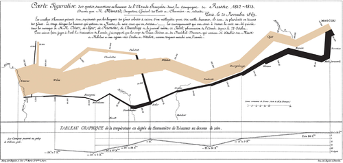
During the 1850s and 1860s, Minard published forty-two flow maps on a wide variety of topics among his cartes figuratives. Among these is his 1869 map of the French invasion of Russia in 1812-1813, which has been called "the best statistical graphic ever drawn." [6] [7] Many of Minard's maps use design techniques that have yet to be improved upon, even in the age of computer graphics.

During the 1980s, Waldo Tobler conducted experiments to create flow maps by computer. [8] [9] Early computer-generated maps were not up to Minard standards, but Geographic information system (GIS) and graphics software has improved in the ability to design flow maps.[ citation needed ]

Flow phenomena

A wide variety of flow maps have been created since the 1830s, showing movement in many forms. According to Eduard Imhof, a flow map may represent several different aspects of the phenomena that are moving and the networks along which they move; he listed the following: [10] :94–95

These are not distinct types of maps; a flow map may portray any of all of these aspects simultaneously.

The types of phenomena that have been the subject of flow maps are varied. Topics relating to human geography include: migration, travel, international trade, logistics, public utilities (water, sewer, electricity, telecommunications), and traffic, among others. Others relate to physical geography: streamflow, wind, wildlife migration, etc.

Types of flow maps

Origin-destination flow map of all commercial passenger airline routes as of 2014. Brighter yellow represents higher density of air routes. World Air Routes.png
Origin-destination flow map of all commercial passenger airline routes as of 2014. Brighter yellow represents higher density of air routes.

The variance of flow maps in subject matter, and the relative importance of Imhof's aspects of flow, has led to a number of design strategies. In a 1987 thesis, Mary Parks identified several distinct types of flow maps, [13] which has been widely cited although her list was not comprehensive and more are included here. These types are prototypical; actual maps can combine some aspects of several types.

Origin-destination map

In this type, the primary intent is to show the existence of a connection between two places, often accompanied by a representation of the volume of flow and/or direction. [12] The route is generally not important to the audience, so connecting lines are often straight or slightly curved. A common example of this form is the airline route map. Parks distinguished radial maps (emanating from a single origin or destination) from network maps (interconnecting a number of nodes), but this is a difference in the geographic pattern; the design is very similar for both types.

Origin-destination maps have a unique design focus on the schematic shape of the connecting lines. Straight lines are easy to draw, but can cause issues, especially when longer lines and shorter lines are collinear, obscuring each other and their destinations. They can also have a haphazard look. For these reasons, curved lines, typically circular arcs, are preferred as more aesthetically pleasing. They also have the ability to be adjusted to avoid intervening lines and points. [14] Early automated line generation algorithms were typically straight lines, [9] but recent algorithms have been successful at creating curved lines. [15]

Distribution map

Charles Joseph Minard's map of French wine exports for 1864, an early example of a distribution flow map. Minard's map of French wine exports for 1864.jpg
Charles Joseph Minard’s map of French wine exports for 1864, an early example of a distribution flow map.

This type is exemplified by a balanced focus on origin-destination nodes, the routes of travel between them (usually highly generalized), and the volume of flow. The most common example, dating back to Minard, is a map showing shipping between a set of node regions or port cities, along common sea lanes. In a distribution map, paths leave the origin with a width proportional to the total of several destinations, then divide as routes "distribute" toward each destination.

Designing distribution maps requires some care and craft in drafting the flow lines so they divide with proper widths, and at smooth curving angles. Computation experiments have shown the potential for generating these automatically, [2] but today most are drawn semi-manually using GIS and graphics software. [12]

Network route map

A typical schematic transit map is a simple form of network route map, with the focus on the highly generalized transit routes Wash-dc-metro-map.png
A typical schematic transit map is a simple form of network route map, with the focus on the highly generalized transit routes

This type of flow map originally dates back to the Harness map of Ireland. [4] It focuses more on the routes of the network than its origin/destination nodes. The routes may be precise or highly generalized (as in many transit maps), and may or may not represent amount or speed of flow. A common example is a map of highway traffic.

Continuous/Mass flow map

A 1943 map of ocean currents using the streamline technique. Note the use of color to distinguish hot and cold currents. Ocean currents 1943 (borderless)3.png
A 1943 map of ocean currents using the streamline technique. Note the use of color to distinguish hot and cold currents.

Not all flow occurs along linear networks; two- and three-dimensional masses can also flow, especially water (e.g., ocean current) and air (wind). Their movement can be modeled as a vector field, in which the magnitude and direction of movement could be measured at any point in space. [10] :149 In Imhof's list above, a map that visualizes this, often called a mass flow map or continuous flow map, [16] focuses on direction and speed of flow, while other aspects such as origin/destination and route of travel are largely meaningless.

In 1688, Edmund Halley mapped the trade winds using an array of short line segments oriented in the direction of air flow. [5] :69 In early 20th Century weather maps, this technique was elaborated into wind barbs, complex symbols used to indicate wind speed as well as direction. Unit vectors and streamlets have been proposed as a general term for point-based flow symbols, but neither is in wide usage. [17] These can be readily generated by computer algorithms, especially using raster GIS data or sample point data (e.g., weather stations). [18] This approach is more akin to proportional point symbols than a typical flow map.

Another visualization option for vector fields is to draw streamlines, which connect points that would flow into each other; this has been commonly used to represent ocean currents since the early 19th Century. [5] :82 Among Tobler's 1981 computer algorithms were models of vector fields to generate "streaklines," and subsequent work has improved results. [8] [17]

Weight scaling

The most common technique to visualize the amount or speed of flow is through the visual variable of size, specifically line weight (usually measured in points or millimeters). That said, size is much more intuitive for total amount, so other visual variables (such as color hue or color value) may also be considered for speed. The following methods for determining line weights is very similar to the scaling methods for proportional symbol maps. [12]

The most common method is to calculate the weight of a given line w in direct proportion to amount value v, based on an arbitrarily selected weight w0 for a selected base value v0 (often but not necessarily the minimum value):

This helps readers make intuitive judgements about relative value ratios based on relative weights; a line that is twice as thick as another represents twice the value. However, when there is a very high level of variation between the highest and lowest values (generally, more than 25:1, although this depends on the geography of the flow network and the design), the resultant map can be problematic, with overwhelming thick lines and almost invisible thin lines. An alternative in this case is to set the minimum and maximum weights (wmax and wmin) and perform linear interpolation between them, even though this eliminates the ability to intuitively judge weight ratios:

A third alternative is to simply use ordinal weights (thick, medium, thin, etc.) to represent an ordinal variable or a quantitative variable that has been classified (often called range grading in this context). This also loses the ability of readers to intuitively judge value differences, but has the advantage of overall simplicity.

For all of these types of scaling, the legend typically shows a sample set of line weights with their respective values, in a fashion similar to the legend of a proportional symbol map.

Other types of flow diagrams

A non-cartographic flow map showing the relative percentages of cardiac output delivered to major organ systems Sankey diagram human circulatory system.svg
A non-cartographic flow map showing the relative percentages of cardiac output delivered to major organ systems

Beside the flow maps in cartography there are several other methods for visualizing non-geographic flow:

See also

Related Research Articles

<span class="mw-page-title-main">Map</span> Symbolic depiction of relationships

A map is a symbolic depiction emphasizing relationships between elements of some space, such as objects, regions, or themes.

<span class="mw-page-title-main">Contour line</span> Curve along which a 3-D surface is at equal elevation

A contour line of a function of two variables is a curve along which the function has a constant value, so that the curve joins points of equal value. It is a plane section of the three-dimensional graph of the function parallel to the -plane. More generally, a contour line for a function of two variables is a curve connecting points where the function has the same particular value.

<span class="mw-page-title-main">Cartogram</span> Map distorting size to show another value

A cartogram is a thematic map of a set of features, in which their geographic size is altered to be directly proportional to a selected variable, such as travel time, population, or Gross National Product. Geographic space itself is thus warped, sometimes extremely, in order to visualize the distribution of the variable. It is one of the most abstract types of map; in fact, some forms may more properly be called diagrams. They are primarily used to display emphasis and for analysis as nomographs.

<span class="mw-page-title-main">Waldo R. Tobler</span> American geographer

Waldo Rudolph Tobler was an American-Swiss geographer and cartographer. Tobler is regarded as one of the most influential geographers and cartographers of the late 20th century and early 21st century. He is most well known for coining what has come to be referred to as Tobler's first law of geography. He also coined what has come to be referred to as Tobler's second law of geography.

Animated mapping is the application of animation, either a computer or video, to add a temporal component to a map displaying change in some dimension. Most commonly the change is shown over time, generally at a greatly changed scale. An example would be the animation produced after the 2004 tsunami showing how the waves spread across the Indian Ocean.

<span class="mw-page-title-main">Choropleth map</span> Type of data visualization for geographic regions

A choropleth map is a type of statistical thematic map that uses pseudocolor, meaning color corresponding with an aggregate summary of a geographic characteristic within spatial enumeration units, such as population density or per-capita income.

<span class="mw-page-title-main">Dasymetric map</span> Hybrid type of thematic map

A dasymetric map is a type of thematic map that uses areal symbols to visualize a geographic field by refining a choropleth map with ancillary information about the distribution of the variable. The name refers to the fact that the most common variable mapped using this technique has generally been population density. The dasymetric map is a hybrid product combining the strengths and weaknesses of choropleth and isarithmic maps.

<span class="mw-page-title-main">Thematic map</span> Type of map that visualizes data

A thematic map is a type of map that portrays the geographic pattern of a particular subject matter (theme) in a geographic area. This usually involves the use of map symbols to visualize selected properties of geographic features that are not naturally visible, such as temperature, language, or population. In this, they contrast with general reference maps, which focus on the location of a diverse set of physical features, such as rivers, roads, and buildings. Alternative names have been suggested for this class, such as special-subject or special-purpose maps, statistical maps, or distribution maps, but these have generally fallen out of common usage. Thematic mapping is closely allied with the field of Geovisualization.

<span class="mw-page-title-main">Field (geography)</span> Property that varies over space

In the context of spatial analysis, geographic information systems, and geographic information science, a field is a property that fills space, and varies over space, such as temperature or density. This use of the term has been adopted from physics and mathematics, due to their similarity to physical fields (vector or scalar) such as the electromagnetic field or gravitational field. Synonymous terms include spatially dependent variable (geostatistics), statistical surface ( thematic mapping), and intensive property (physics and chemistry) and crossbreeding between these disciplines is common. The simplest formal model for a field is the function, which yields a single value given a point in space (i.e., t = f(x, y, z) )

<span class="mw-page-title-main">Multivariate map</span> Thematic map visualizing multiple variables

A bivariate map or multivariate map is a type of thematic map that displays two or more variables on a single map by combining different sets of symbols. Each of the variables is represented using a standard thematic map technique, such as choropleth, cartogram, or proportional symbols. They may be the same type or different types, and they may be on separate layers of the map, or they may be combined into a single multivariate symbol.

MacChoro was a computer program for choropleth mapping developed for early versions of the Apple Macintosh computer. A choropleth map shades areas, such as states or counties, to represent values and is mainly used for the mapping of statistical data. Released in 1986, MacChoro was the first computer mapping program to implement Macintosh's point-and-click user interface for the analysis and production of thematic maps. MacChoro II, released in 1988, was the first program to incorporate interaction in animated mapping.

Cartographic generalization, or map generalization, includes all changes in a map that are made when one derives a smaller-scale map from a larger-scale map or map data. It is a core part of cartographic design. Whether done manually by a cartographer or by a computer or set of algorithms, generalization seeks to abstract spatial information at a high level of detail to information that can be rendered on a map at a lower level of detail.

<span class="mw-page-title-main">Computer cartography</span> Compiling data to create a visual image

Computer cartography is the art, science, and technology of making and using maps with a computer. This technology represents a paradigm shift in how maps are produced, but is still fundamentally a subset of traditional cartography. The primary function of this technology is to produce maps, including creation of accurate representations of a particular area such as, detailing major road arteries and other points of interest for navigation, and in the creation of thematic maps. Computer cartography is one of the main functions of geographic information systems (GIS), however, GIS is not necessary to facilitate computer cartography and has functions beyond just making maps. The first peer-reviewed publications on using computers to help in the cartographic process predate the introduction of full GIS by several years.

<span class="mw-page-title-main">Dot distribution map</span> Thematic map using dots to visualize distribution

A dot distribution map is a type of thematic map that uses a point symbol to visualize the geographic distribution of a large number of related phenomena. Dot maps are a type of unit visualizations that rely on a visual scatter to show spatial patterns, especially variances in density. The dots may represent the actual locations of individual phenomena, or be randomly placed in aggregation districts to represent a number of individuals. Although these two procedures, and their underlying models, are very different, the general effect is the same.

<span class="mw-page-title-main">Map symbol</span> Graphic depiction of a geographic phenomenon

A map symbol or cartographic symbol is a graphical device used to visually represent a real-world feature on a map, working in the same fashion as other forms of symbols. Map symbols may include point markers, lines, regions, continuous fields, or text; these can be designed visually in their shape, size, color, pattern, and other graphic variables to represent a variety of information about each phenomenon being represented.

<span class="mw-page-title-main">Chorochromatic map</span> Thematic map visualizing a discrete field

A Chorochromatic map, also known as an area-class, qualitative area, or mosaic map, is a type of thematic map that portray regions of categorical or nominal data using variations in color symbols. Chorochromatic maps are typically used to represent discrete fields, also known as categorical coverages. Chorochromatic maps differ from choropleth maps in that chorochromatic maps are mapped according to data-driven boundaries instead of trying to make the data fit within existing, sometimes arbitrary units such as political boundaries.

A visual variable, in cartographic design, graphic design, and data visualization, is an aspect of a graphical object that can visually differentiate it from other objects, and can be controlled during the design process. The concept was first systematized by Jacques Bertin, a French cartographer and graphic designer, and published in his 1967 book, Sémiologie Graphique. Bertin identified a basic set of these variables and provided guidance for their usage; the concept and the set of variables has since been expanded, especially in cartography, where it has become a core principle of education and practice.

<span class="mw-page-title-main">Cartographic design</span> Process of designing maps

Cartographic design or map design is the process of crafting the appearance of a map, applying the principles of design and knowledge of how maps are used to create a map that has both aesthetic appeal and practical function. It shares this dual goal with almost all forms of design; it also shares with other design, especially graphic design, the three skill sets of artistic talent, scientific reasoning, and technology. As a discipline, it integrates design, geography, and geographic information science.

<span class="mw-page-title-main">Typography (cartography)</span> Text used to label maps

Typography, as an aspect of cartographic design, is the craft of designing and placing text on a map in support of the map symbols, together representing geographic features and their properties. It is also often called map labeling or lettering, but typography is more in line with the general usage of typography. Throughout the history of maps to the present, their labeling has been dependent on the general techniques and technologies of typography.

<span class="mw-page-title-main">Proportional symbol map</span> Thematic map based on symbol size

A proportional symbol map or proportional point symbol map is a type of thematic map that uses map symbols that vary in size to represent a quantitative variable. For example, circles may be used to show the location of cities within the map, with the size of each circle sized proportionally to the population of the city. Typically, the size of each symbol is calculated so that its area is mathematically proportional to the variable, but more indirect methods are also used.

References

  1. Koylu, Caglar; Tian, Geng; Windsor, Mary (2023). "Flowmapper.org: a web-based framework for designing origin–destination flow maps". Journal of Maps. 19 (1). arXiv: 2110.03662 . doi:10.1080/17445647.2021.1996479 . Retrieved 14 February 2024.
  2. 1 2 Phan, Doantam; Xiao, Ling; Yeh, Ron; Hanrahan, Pat; Winograd, Terry (2005). "Flow map layout". IEEE Symposium on Information Visualization, 2005. INFOVIS 2005. pp. 219–224. doi:10.1109/INFVIS.2005.1532150. ISBN   0-7803-9464-X.
  3. Robinson, Arthur H. (Dec 1955). "The 1837 Maps of Henry Drury Harness". The Geographical Journal. 121 (4): 440–450. doi:10.2307/1791753. JSTOR   1791753.
  4. 1 2 Griffith, Richard John; Harness, Henry Drury (1838). Atlas to Accompany 2nd Report of the Railway Commissioners. Ireland.
  5. 1 2 3 Robinson, Arthur H. (1982). Early Thematic Mapping in the History of Cartography. University of Chicago Press. pp. 147–154.
  6. Tufte, Edward (2006). Beautiful Evidence. Graphics Press. Bibcode:2006beev.book.....T.
  7. Jacobs, Frank (23 July 2010). "The Minard Map - "The best statistical graphic ever drawn"". Big Think. Retrieved 13 November 2020.
  8. 1 2 Tobler, Waldo R. (January 1981). "A Model of Geographic Movement". Geographical Analysis. 13 (1): 1–20. doi: 10.1111/j.1538-4632.1981.tb00711.x .
  9. 1 2 Tobler, Waldo R. (1987). "Experiments in Migration Mapping by Computer". The American Cartographer. 14 (2): 155–163. doi:10.1559/152304087783875273. S2CID   1363699.
  10. 1 2 Imhof, Eduard (1972). Thematische Kartographie. Berlin: De Gruyter.
  11. Robinson, Arthur H., Elements of Cartography, 2nd Edition, New York: Wiley, 1960.
  12. 1 2 3 4 Dent, Borden D.; Torguson, Jeffrey S.; Hodler, Thomas W. (2009). Cartography: Thematic Map Design (6th ed.). McGraw-Hill. pp. 188–201.
  13. Parks, Mary J. (1987). American flow mapping: A survey of the flow maps found in twentieth century geography textbooks, including a classification of the various flow map designs. Georgia State University: Unpublished M.A. thesis.
  14. Jenny, Bernhard; Stephen, Daniel M.; Muehlenhaus, Ian; Marston, Brook E.; Sharma, Ritesh; Zhang, Eugene; Jenny, Helen (2018). "Design principles for origin-destination flow maps". Cartography and Geographic Information Science. 45 (1): 62–75. doi:10.1080/15230406.2016.1262280. S2CID   36668445.
  15. Jenny, Bernhard; Stephen, Daniel M.; Muehlenhaus, Ian; Marston, Brooke E.; Sharma, Ritesh; Zhang, Eugene; Jenny, Helen (2017). "Force-directed layout of origin-destination flow maps". International Journal of Geographical Information Science. 31 (8): 1521–1540. doi:10.1080/13658816.2017.1307378. S2CID   205794904.
  16. T. Slocum, R. McMaster, F. Kessler, H. Howard (2009). Thematic Cartography and Geovisualization, Third Edn, page 252. Pearson Prentice Hall: Upper Saddle River, NJ., pp.360-369.
  17. 1 2 Turk, G.; Banks, D. (August 1996). "Image-guided streamline placement". Proceedings of the 23rd annual conference on Computer graphics and interactive techniques. pp. 453–460. doi: 10.1145/237170.237285 . ISBN   0897917464. S2CID   2310527.
  18. Lavin, S.J.; Cerveny, R.S. (1987). "Unit-vector density mapping". The Cartographic Journal. 24 (2): 131–141. doi:10.1179/caj.1987.24.2.131.