The Cyrillic script, Slavonic script or simply Slavic script is a writing system used for various languages across Eurasia. It is the designated national script in various Slavic, Turkic, Mongolic, Uralic, Caucasian and Iranic-speaking countries in Southeastern Europe, Eastern Europe, the Caucasus, Central Asia, North Asia, and East Asia, and used by many other minority languages.

Palatino is an old-style serif typeface designed by Hermann Zapf, initially released in 1949 by the Stempel foundry and later by other companies, most notably the Mergenthaler Linotype Company.

Ll/ll is a digraph that occurs in several languages.

In writing and typography, a ligature occurs where two or more graphemes or letters are joined to form a single glyph. Examples are the characters ⟨æ⟩ and ⟨œ⟩ used in English and French, in which the letters ⟨a⟩ and ⟨e⟩ are joined for the first ligature and the letters ⟨o⟩ and ⟨e⟩ are joined for the second ligature. For stylistic and legibility reasons, ⟨f⟩ and ⟨i⟩ are often merged to create ⟨fi⟩ ; the same is true of ⟨s⟩ and ⟨t⟩ to create ⟨st⟩. The common ampersand, ⟨&⟩, developed from a ligature in which the handwritten Latin letters ⟨e⟩ and ⟨t⟩ were combined.

Letter case is the distinction between the letters that are in larger uppercase or capitals and smaller lowercase in the written representation of certain languages. The writing systems that distinguish between the upper- and lowercase have two parallel sets of letters: each in the majuscule set has a counterpart in the minuscule set. Some counterpart letters have the same shape, and differ only in size, but for others the shapes are different. The two case variants are alternative representations of the same letter: they have the same name and pronunciation and are typically treated identically when sorting in alphabetical order.

De is a letter of the Cyrillic script. It commonly represents the voiced dental stop, like the pronunciation of ⟨d⟩ in "door", except closer to the teeth. De is usually Romanized using the Latin letter D.
In typography and handwriting, a descender is the portion of a letter that extends below the baseline of a font.

The r rotunda ⟨ ꝛ ⟩, "rounded r", is a historical calligraphic variant of the minuscule (lowercase) letter Latin r used in full script-like typefaces, especially blackletters.

In typography, small caps are characters typeset with glyphs that resemble uppercase letters but reduced in height and weight close to the surrounding lowercase letters or text figures. This is technically not a case-transformation, but a substitution of glyphs, although the effect is often approximated by case-transformation and scaling. Small caps are used in running text as a form of emphasis that is less dominant than all uppercase text, and as a method of emphasis or distinctiveness for text alongside or instead of italics, or when boldface is inappropriate. For example, the text "Text in small caps" appears as Text in small caps in small caps. Small caps can be used to draw attention to the opening phrase or line of a new section of text, or to provide an additional style in a dictionary entry where many parts must be typographically differentiated.

In typography, the x-height, or corpus size, is the distance between the baseline and the mean line of lowercase letters in a typeface. Typically, this is the height of the letter x in the font, as well as the letters v, w, and z. One of the most important dimensions of a font, x-height defines how high lowercase letters without ascenders are compared to the cap height of uppercase letters.

Trebuchet MS is a humanist sans-serif typeface that Vincent Connare designed for Microsoft Corporation in 1996. Trebuchet MS was the font used for the window titles in the Windows XP default theme, succeeding MS Sans Serif and Tahoma. Released free of charge by Microsoft as part of their core fonts for the Web package, it remained one of the most popular body text fonts on webpages as of 2009.

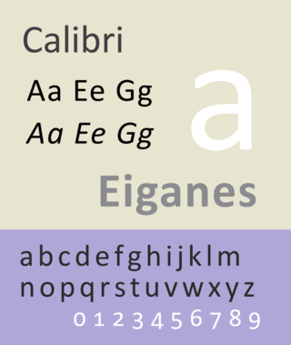
Calibri is a digital sans-serif typeface family in the humanist or modern style. It was designed by Luc(as) de Groot in 2002–2004 and released to the general public in 2007, with Microsoft Office 2007 and Windows Vista. In Office 2007, it replaced Times New Roman as the default typeface in Word and replaced Arial as the default in PowerPoint, Excel, Outlook, and WordPad. De Groot described its subtly rounded design as having "a warm and soft character". In January 2024, the font was replaced by Microsoft's new bespoke font, Aptos, as the new default Microsoft Office font, after 17 years.

Consolas is a monospaced typeface designed by Luc(as) de Groot. It is a part of the ClearType Font Collection, a suite of fonts that take advantage of Microsoft's ClearType font rendering technology. It has been included with Windows since Windows Vista, Microsoft Office 2007 and Microsoft Visual Studio 2010, and is available for download from Microsoft. It is the only standard Windows Vista font with a slash through the zero character. It is the default font for Microsoft Notepad as of Windows 8.

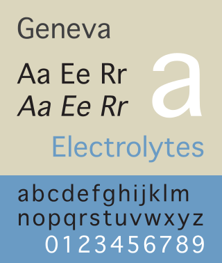
Geneva is a neo-grotesque or "industrial" sans-serif typeface designed by Susan Kare for Apple Computer. It is one of the oldest fonts shipped with Macintosh operating systems. The original version was a bitmap font, but later versions were converted to TrueType when that technology became available on the Macintosh platform. Because this Macintosh font is not commonly available on other platforms, many users find Verdana, Microsoft Sans Serif or Arial to be an acceptable substitute.
A unicase or unicameral alphabet has just one case for its letters. Arabic, Brahmic scripts like Telugu, Kannada, Malayalam, Tamil, Old Hungarian, Hebrew, Iberian, Georgian, and Hangul are unicase writing systems, while modern Latin, Greek, Cyrillic, and Armenian are bicameral, as they have two cases for each letter, e.g. B and b, Β and β, or Բ and բ. Individual characters can also be called unicameral if they are used as letters with a generally bicameral alphabet but have only one form for both cases; for example, the ʻokina as used in Polynesian languages and the glottal stop as used in Nuu-chah-nulth are unicameral.
Segoe is a typeface, or family of fonts, that is best known for its use by Microsoft. The company uses Segoe in its online and printed marketing materials, including recent logos for a number of products. Additionally, the Segoe UI font sub-family is used by numerous Microsoft applications, and may be installed by applications. It was adopted as Microsoft's default operating system font, and is also used on Outlook.com, Microsoft's web-based email service. On August 23, 2012, Microsoft unveiled its new corporate logo typeset in Segoe, replacing the logo it had used for the previous 25 years.

In metal typesetting, a font or fount is a particular size, weight and style of a typeface. Each font is a matched set of type, with a piece for each glyph. A typeface consists of various fonts that share an overall design.

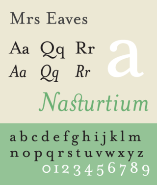
Mrs Eaves is a transitional serif typeface designed by Zuzana Licko in 1996. It is a variant of Baskerville, which was designed in Birmingham, England, in the 1750s. Mrs Eaves adapts Baskerville for use in display contexts, such as headings and book blurbs, through the use of a low x-height and a range of unusual combined characters or ligatures.
The ISO basic Latin alphabet is an international standard for a Latin-script alphabet that consists of two sets of 26 letters, codified in various national and international standards and used widely in international communication. They are the same letters that comprise the current English alphabet. Since medieval times, they are also the same letters of the modern Latin alphabet. The order is also important for sorting words into alphabetical order.

Aptos, originally named Bierstadt, is a sans-serif typeface in the neo-grotesque style developed by Steve Matteson. It was released in 2023 as the new default font for the Microsoft Office suite, replacing the previously used Calibri font.


