Typography is the art and technique of arranging type to make written language legible, readable and appealing when displayed. The arrangement of type involves selecting typefaces, point sizes, line lengths, line spacing, letter spacing, and spaces between pairs of letters. The term typography is also applied to the style, arrangement, and appearance of the letters, numbers, and symbols created by the process. Type design is a closely related craft, sometimes considered part of typography; most typographers do not design typefaces, and some type designers do not consider themselves typographers. Typography also may be used as an ornamental and decorative device, unrelated to the communication of information.

Arthur Eric Rowton Gill was an English sculptor, letter cutter, typeface designer, and printmaker. Although the Oxford Dictionary of National Biography describes Gill as "the greatest artist-craftsman of the twentieth century: a letter-cutter and type designer of genius", he is also a figure of considerable controversy following the revelations of his sexual abuse of two of his daughters and of his pet dog.

Gill Sans is a humanist sans-serif typeface designed by Eric Gill and released by the British branch of Monotype from 1928 onwards.

Stone carving is an activity where pieces of rough natural stone are shaped by the controlled removal of stone. Owing to the permanence of the material, stone work has survived which was created during our prehistory or past time.

Roman square capitals, also called capitalis monumentalis, inscriptional capitals, elegant capitals and capitalis quadrata, are an ancient Roman form of writing, and the basis for modern capital letters. Square capitals are characterized by sharp, straight lines, supple curves, thick and thin strokes, angled stressing and incised serifs. When written in documents this style is known as Latin book hand.

Rail Alphabet is a neo-grotesque sans-serif typeface designed by Jock Kinneir and Margaret Calvert for signage on the British Rail network. First used at Liverpool Street station, it was then adopted by the Design Research Unit (DRU) as part of their comprehensive 1965 rebranding of the company.

Rudolf Koch was a German type designer, professor, and a master of lettering, calligraphy, typography and illustration. Commonly known for his typefaces created for the Klingspor Type Foundry, his most widely used typefaces include Neuland and Kabel.

Perpetua is a serif typeface that was designed by the English sculptor and stonemason Eric Gill for the British Monotype Corporation. Perpetua was commissioned at the request of Stanley Morison, an influential historian of printing and adviser to Monotype around 1925, when Gill's reputation as a leading artist-craftsman was high. Perpetua was intended as a crisp, contemporary design that did not follow any specific historic model, with a structure influenced by Gill's experience of carving lettering for monuments and memorials. Perpetua is commonly used for covers and headings and also sometimes for body text and has been particularly popular in fine book printing. Perpetua was released with characters for the Greek alphabet and a matching set of titling capitals for headings.
Trajan is a serif typeface designed in 1989 by Carol Twombly for Adobe.
The Guild of St Joseph and St Dominic was a Roman Catholic community of artists and craftspeople founded in 1920 in Ditchling, East Sussex, England. It was part of the Arts and Crafts movement and its legacy led to the creation of the Ditchling Museum of Art + Craft.
Alan Reynolds Stone, CBE, RDI was an English wood engraver, engraver, designer, typographer and painter.
Michael Harvey MBE was an English lettering artist, teacher and writer specialising in lettering, type design and letter cutting. His work appears in many English cathedrals and on the National Gallery, London.

David Guy Barnabas Kindersley MBE was a British stone letter-carver and typeface designer, and the founder of the Kindersley Workshop. His carved plaques and inscriptions in stone and slate can be seen on many churches and public buildings in the United Kingdom. Kindersley was a designer of the Octavian font for Monotype Imaging in 1961, and he and his third wife Lida Lopes Cardozo designed the main gates for the British Library.

(Herbert) Joseph Cribb (1892–1967) was a British sculptor, carver and letter-cutter.

Nicholas Waite "Nick" Benson is a third generation American stone carver, stone letterer and owner of The John Stevens Shop in Newport, Rhode Island. He was named a 2010 MacArthur Fellow.
Ralph Alexander Beyer was a German letter-cutter, sculptor and teacher. He was most noted for his work on Basil Spence's new Coventry Cathedral where Beyer carved Tablets of the Words.
Richard Kindersley is a British typeface designer, stone letter carver and sculptor.
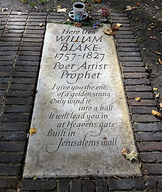
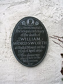
Lida Lopes Cardozo Kindersley, also known as Lida Lopes Cardozo and Lida Cardozo Kindersley, is a letter-cutter, typeface designer, author and publisher and runs the Cardozo Kindersley Workshop in Cambridge. She is considered the foremost letter-cutter currently working in the United Kingdom and is "dedicated to the increase of good lettering in the world". Her work in slate, stone and other media includes carved memorials, plaques, inscriptions and sundials which can be seen at many public locations in the United Kingdom and beyond. Her works include the ledger stone for the grave of William Blake at Bunhill Fields. With her first husband David Kindersley she also designed the main gates for the British Library.

Bryant Olcher Fedden was a self-taught letter-cutter, glass engraver and sculptor who developed his craft in a workshop environment with craftspeople whom he taught and supported. He was a member of the Gloucestershire Guild of Craftsmen for more than forty years. He was a founder member of the Letter Exchange, a professional organisation promoting lettering in all its forms. Bryant Fedden has work in the Victoria and Albert Museum Collections.
Roman lettering or Trajan lettering refers to the use by artists and signwriters of Roman capitals in modern lettering, particularly in Britain.