A pedestrian crossing is a place designated for pedestrians to cross a road, street or avenue. The term "pedestrian crossing" is also used in the Vienna and Geneva Conventions, both of which pertain to road signs and road traffic.

Traffic lights, traffic signals, or stoplights – also known as robots in South Africa, Zambia, and Namibia – are signaling devices positioned at road intersections, pedestrian crossings, and other locations in order to control the flow of traffic.

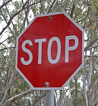
A stop sign is a traffic sign designed to notify drivers that they must come to a complete stop and make sure the intersection is safely clear of vehicles and pedestrians before continuing past the sign. In many countries, the sign is a red octagon with the word STOP, in either English, the national language of that particular country, or both, displayed in white or yellow. The Vienna Convention on Road Signs and Signals also allows an alternative version: a red circle with a red inverted triangle with either a white or yellow background, and a black or dark blue STOP. Some countries may also use other types, such as Japan's inverted red triangle stop sign. Particular regulations regarding appearance, installation, and compliance with the signs vary by some jurisdictions.

The Manual on Uniform Traffic Control Devices for Streets and Highways is a document issued by the Federal Highway Administration (FHWA) of the United States Department of Transportation (USDOT) to specify the standards by which traffic signs, road surface markings, and signals are designed, installed, and used. In the United States, all traffic control devices must legally conform to these standards. The manual is used by state and local agencies as well as private construction firms to ensure that the traffic control devices they use conform to the national standard. While some state agencies have developed their own sets of standards, including their own MUTCDs, these must substantially conform to the federal MUTCD.
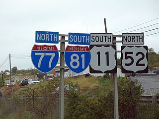
The U.S. Route shield is the highway marker used for United States Numbered Highways. Since the first U.S. Route signs were installed in 1926, the general idea has remained the same, but many changes have been made in the details. Originally, the shield included the name of the state in which the sign was erected and the letters "U S" on a shield-shaped sign. Over time, the shield has been simplified to consist of a white shield outline on a black square background, containing only a black route number. However, because each state is responsible for the production and maintenance of U.S. Route shields, several variants of the shield have existed over the years.

Clearview, also known as Clearview Hwy, is the name of a humanist sans-serif typeface family for guide signs used on roads in the United States, Canada, Indonesia, the Philippines, Israel, Brazil and Sri Lanka. It was developed by independent researchers with the help of the Texas A&M Transportation Institute and the Pennsylvania Transportation Institute, under the supervision of the Federal Highway Administration (FHWA). It was once expected to replace the FHWA typefaces in many applications, although newer studies of its effectiveness have called its benefits into question.

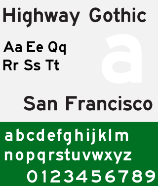
The Standard Alphabets For Traffic Control Devices,, is a sans-serif typeface developed by the United States Federal Highway Administration (FHWA). The font is used for road signage in the United States and many other countries around the world. The typefaces were developed to maximize legibility at a distance and at high speed. The typeface has 6 fonts, from narrow to wider strokes:

Road signs in Malaysia are standardised road signs similar to those used in Europe but with certain distinctions. Until the early 1980s, Malaysia closely practice in road sign design, with diamond-shaped warning signs and circular restrictive signs to regulate traffic. Signs usually use the Transport Heavy font on non-tolled roads and highways. Tolled expressways signs use a font specially designed for the Malaysian Highway Authority (LLM) which is LLM Lettering. It has two type of typefaces, LLM Narrow and LLM Normal. Older road signs used the FHWA Series fonts typeface also used in the United States, Canada, and Australia. Most road signs in Melaka and speed limit signs use Arial.

A highway shield or route marker is a sign denoting the route number of a highway, usually in the form of a symbolic shape with the route number enclosed. As the focus of the sign, the route number is usually the sign's largest element, with other items on the sign rendered in smaller sizes or contrasting colors. Highway shields are used by travellers, commuters, and all levels of government for identifying, navigating, and organising routes within a given jurisdiction. Simplified highway shields often appear on maps.

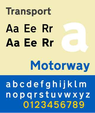
Transport is a sans serif typeface first designed for road signs in the United Kingdom. It was created between 1957 and 1963 by Jock Kinneir and Margaret Calvert as part of their work as designers for the Department of Transport's Anderson and Worboys committees.

In traffic engineering, there are regional and national variations in traffic light operation. This may be in the standard traffic light sequence or by the use of special signals.

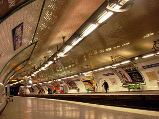
From the original plain white tilework and Art Nouveau entrances, the architecture of Paris Métro stations has evolved with successive waves of building and renovation.

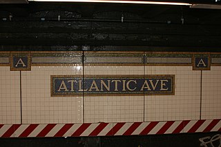
Many New York City Subway stations are decorated with colorful ceramic plaques and tile mosaics. Of these, many take the form of signs, identifying the station's location. Much of this ceramic work was in place when the subway system originally opened on October 27, 1904. Newer work continues to be installed each year, much of it cheerful and fanciful.

A radar speed sign or speed feedback sign is an interactive sign comprising a speed-measuring device and a message sign generally constructed of a series of LEDs, which displays vehicle speed of approaching motorists. The purpose of radar speed signs is to slow cars down by making drivers aware when they are driving at speeds above the posted limits. They are used as a traffic calming device in addition to or instead of physical devices such as speed bumps and rumble strips.

In the United States, road signs are, for the most part, standardized by federal regulations, most notably in the Manual on Uniform Traffic Control Devices (MUTCD) and its companion volume the Standard Highway Signs (SHS).

In Japan, road signs are standardized by the "Order on Road Sign, Road Line, and Road Surface Marking (道路標識、区画線及び道路標示に関する命令)" established in 1968 with origins from the Tokyo Metropolitan Police Department's "Order on Standardization of Road Sign" of 1934 and the Home Ministry of Japan's "Order on Road Signs" of 1942. The previous designs have been used since 1986 after several amendments of order.
Road traffic control devices are markers, signs and signal devices used to inform, guide and control traffic, including pedestrians, motor vehicle drivers and bicyclists. These devices are usually placed adjacent, over or along the highways, roads, traffic facilities and other public areas that require traffic control.

Road signs used by countries in the Americas are significantly influenced by the Manual on Uniform Traffic Control Devices (MUTCD), first released in 1935, reflecting the influence of the United States throughout the region. Other non-American countries using road signs similar to the MUTCD include Australia, Indonesia, Ireland, Japan, Malaysia, New Zealand, and Thailand. They, along with the US Virgin Islands, are also the only countries listed here which drive on the left—with the exception of Liberia and the Philippines, both of which drive on the right.

Street name signs in Chicago are green with white text. They are traditionally written in all capital letters, but newer signs can also be written with lowercase letters. All signs contain not only the name of the street, but also its directional position and abbreviated suffix. Larger signs, located at intersections with stoplights, also include the street's numerical position within Chicago's grid system.
This article is a summary of traffic signs used in each country.


