
The color khaki is a light shade of tan with a slight yellowish tinge.
In computing, on the X Window System, X11 color names are represented in a simple text file, which maps certain strings to RGB color values. It was traditionally shipped with every X11 installation, hence the name, and is usually located in <X11root>/lib/X11/rgb.txt. The web colors list is descended from it but differs for certain color names.

Azure is the color between cyan and blue on the spectrum of visible light. It is often described as the color of the sky on a clear day.

Lavender is a light shade of purple or violet. It applies particularly to the color of the flower of the same name. The web color called lavender is displayed adjacent—it matches the color of the palest part of the flower; however, the more saturated color shown as floral lavender more closely matches the average color of the lavender flower as shown in the picture and is the tone of lavender historically and traditionally considered lavender by average people as opposed to website designers. The color lavender might be described as a medium purple, a pale bluish purple, or a light pinkish-purple. The term lavender may be used in general to apply to a wide range of pale, light, or grayish-purples, but only on the blue side; lilac is pale purple on the pink side. In paints, the color lavender is made by mixing purple and white paint.
The color cerulean or caerulean, is a variety of the hue of blue that may range from a light azure blue to a more intense sky blue, and may be mixed as well with the hue of green. The first recorded use of cerulean as a color name in English was in 1590. The word is derived from the Latin word caeruleus, "dark blue, blue, or blue-green", which in turn probably derives from caerulum, diminutive of caelum, "heaven, sky".

Cobalt blue is a blue pigment made by sintering cobalt(II) oxide with aluminium(III) oxide (alumina) at 1200 °C. Chemically, cobalt blue pigment is cobalt(II) oxide-aluminium oxide, or cobalt(II) aluminate, CoAl2O4. Cobalt blue is lighter and less intense than the (iron-cyanide based) pigment Prussian blue. It is extremely stable and historically has been used as a coloring agent in ceramics (especially Chinese porcelain), jewelry, and paint. Transparent glasses are tinted with the silica-based cobalt pigment "smalt".
Spring green is a color that was traditionally considered to be on the yellow side of green, but in modern computer systems based on the RGB color model is halfway between cyan and green on the color wheel.
In optics, orange has a wavelength between approximately 585 and 620 nm and a hue of 30° in HSV color space. In the RGB color space it is a secondary color numerically halfway between gamma-compressed red and yellow, as can be seen in the RGB color wheel. The complementary color of orange is azure. Orange pigments are largely in the ochre or cadmium families, and absorb mostly blue light.

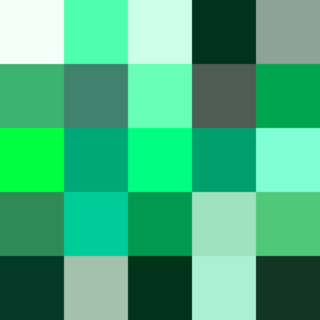
Varieties of the color green may differ in hue, chroma or lightness, or in two or three of these qualities. Variations in value are also called tints and shades, a tint being a green or other hue mixed with white, a shade being mixed with black. A large selection of these various colors is shown below.

Varieties of the color red may differ in hue, chroma, lightness, or in two or three of these qualities. Variations in value are also called tints and shades, a tint being a red or other hue mixed with white, a shade being mixed with black. A large selection of these various colors are shown below.

Pink colors are usually light or desaturated shades of reds, roses, and magentas which are created on computer and television screens using the RGB color model and in printing with the CMYK color model. As such, it is an arbitrary classification of color.

The color magenta has notable tints and shades. These various colors are shown below.
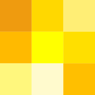
Varieties of the color yellow may differ in hue, chroma or lightness, or in two or three of these qualities. Variations in value are also called tints and shades, a tint being a yellow or other hue mixed with white, a shade being mixed with black. A large selection of these various colors is shown below.

Varieties of the color blue may differ in hue, chroma, or lightness, or in two or three of these qualities. Variations in value are also called tints and shades, a tint being a blue or other hue mixed with white, a shade being mixed with black. A large selection of these colors is shown below.

Shades of white are colors that differ only slightly from pure white. Variations of white include what are commonly termed off-white colors, which may be considered part of a neutral color scheme.

Variations of gray or grey include achromatic grayscale shades, which lie exactly between white and black, and nearby colors with low colorfulness. A selection of a number of these various colors is shown below.
Violet is a color term derived from the flower of the same name. There are numerous variations of the color violet, a sampling of which are shown below.
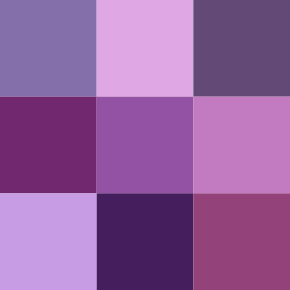
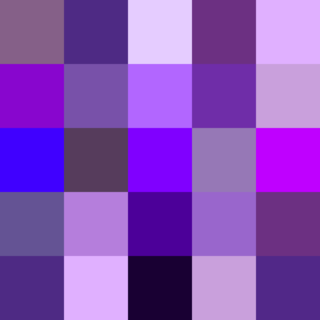
There are numerous variations of the color purple, a sampling of which is shown below.
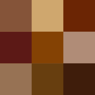
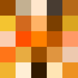
Shades of brown can be produced by combining red, yellow, and black pigments, or by a combination of orange and black—illustrated in the color box. The RGB color model, that generates all colors on computer and television screens, makes brown by combining red and green light at different intensities. Brown color names are often imprecise, and some shades, such as beige, can refer to lighter rather than darker shades of yellow and red. Such colors are less saturated than colors perceived to be orange. Browns are usually described as light or dark, reddish, yellowish, or gray-brown. There are no standardized names for shades of brown; the same shade may have different names on different color lists, and sometimes one name can refer to several very different colors. The X11 color list of web colors has seventeen different shades of brown, but the complete list of browns is much longer.

Shades of chartreuse are listed below. Chartreuse is a color between yellow and green, so named because of its resemblance to the color of the French liqueur green chartreuse.
