blue |
cerulean |
teal |
Cerulean | |
---|---|
Color coordinates | |
Hex triplet | #007BA7 |
sRGB B (r, g, b) | (0, 123, 167) |
HSV (h, s, v) | (196°, 100%, 65%) |
CIELChuv (L, C, h) | (48, 56, 234°) |
Source | Maerz and Paul [1] |
ISCC–NBS descriptor | Strong greenish blue |
B: Normalized to [0–255] (byte) |
Cerulean (RGB) | |
---|---|
Color coordinates | |
Hex triplet | #0040FF |
sRGB B (r, g, b) | (0, 64, 255) |
HSV (h, s, v) | (225°, 100%, 100%) |
CIELChuv (L, C, h) | (39, 134, 264°) |
Source | [Unsourced] |
ISCC–NBS descriptor | Vivid blue |
B: Normalized to [0–255] (byte) |
The color cerulean (American English) or caerulean (British English, Commonwealth English), is a variety of the hue of blue that may range from a light azure blue to a more intense sky blue, and may be mixed as well with the hue of green. The first recorded use of cerulean as a color name in English was in 1590. [1] The word is derived from the Latin word caeruleus (Latin: [kae̯ˈru.le.us] ), "dark blue, blue, or blue-green", which in turn probably derives from caerulum, diminutive of caelum, "heaven, sky". [2]
"Cerulean blue" is the name of a blue-green pigment consisting of cobalt stannate (Co
2SnO
4). The pigment was first synthesized in the late eighteenth century by Albrecht Höpfner, a Swiss chemist, and it was known as Höpfner blue during the first half of the nineteenth century. Art suppliers began referring to cobalt stannate as cerulean in the second half of the nineteenth century. It was not widely used by artists until the 1870s when it became available in oil paint. [3]
Cerulean Blue | |
---|---|
Color coordinates | |
Hex triplet | #2A52BE |
sRGB B (r, g, b) | (42, 82, 190) |
HSV (h, s, v) | (224°, 78%, 75%) |
CIELChuv (L, C, h) | (38, 90, 260°) |
Source | Maerz and Paul [4] |
ISCC–NBS descriptor | Vivid blue |
B: Normalized to [0–255] (byte) |
The primary chemical constituent of the pigment is cobalt(II) stannate (Co
2SnO
4). [5] [6] [7] The pigment is a greenish-blue color. In watercolor, it has a slight chalkiness. When used in oil paint, it loses this quality. [8]
Today, cobalt chromate is sometimes marketed under the cerulean blue name but is darker and greener [a] than the cobalt stannate version. [b] The chromate makes excellent turquoise colors and is identified by Rex Art and some other manufacturers as "cobalt turquoise". [9] [10]
Cerulean is inert with good light resistance, and it exhibits a high degree of stability in both watercolor and acrylic paint. [11]
Cobalt stannate pigment was first synthesized in 1789 by the Swiss chemist Albrecht Höpfner by heating roasted cobalt and tin oxides together. [12] [13] Subsequently, there was limited German production under the name of Cölinblau.[ citation needed ] It was generally known as Höpfner blue from the late eighteenth century until the middle of the nineteenth century. [3]
In the late 1850s, art suppliers begin referring to the pigment as "ceruleum" blue. The London Times of 28 December 1859 had an advertisement for "Caeruleum, a new permanent color prepared for the use of artists." Ure's Dictionary of Arts from 1875 describes the pigment as "Caeruleum . . . consisting of stannate of protoxide of cobalt, mixed with stannic acid and sulphate of lime." Cerulean was also referred to as coeurleum, cerulium, bleu céleste (celestial blue). Other nineteenth century English pigment names included "ceruleum blue" and "corruleum blue". By 1935, Max Doerner referred to the pigment as cerulean, as do most modern sources, though ceruleum is still used. [3]
Some sources claim that cerulean blue was first marketed in the United Kingdom by colourman George Rowney, as "coeruleum" in the early 1860s. However, the British firm of Roberson was buying "Blue No. 58 (Cerulium)" from a German firm of Frauenknecht and Stotz prior to Rowney. [3] Cerulean blue was only available as a watercolor in the 1860s and was not widely adopted until the 1870s when it was used in oil paint. It was popular with artists including Claude Monet, Paul Signac, and Picasso. Van Gogh created his own approximation of cerulean blue using a mixture of cobalt blue, cadmium yellow, and white. [14]
In 1877, Monet had added the pigment to his palette, using it in a painting from his series La Gare Saint-Lazare (now in the National Gallery, London). The blues in the painting include cobalt and cerulean blue, with some areas of ultramarine. Laboratory analysis conducted by the National Gallery identified a relatively pure example of cerulean blue pigment in the shadows of the station's canopy. Researchers at the National Gallery suggested that "cerulean probably offered a pigment of sufficiently greenish tone to displace Prussian blue, which may not have been popular by this time." [15]
Berthe Morisot painted the blue coat of the woman in her Summer's Day , 1879 in cerulean blue in conjunction with artificial ultramarine and cobalt blue. [16]
When the United Nations was formed at the end of World War II, they adopted cerulean blue for their emblem. The designer Oliver Lundquist stated that he chose the color because it was "the opposite of red, the color of war." [17]
In the Catholic Church, cerulean vestments are permitted on certain Marian feast days, primarily the Immaculate Conception in diocese currently or formerly under the Spanish Crown. [18]
Cerulean (Pantone) | |
---|---|
Color coordinates | |
Hex triplet | #98B4D4 |
sRGB B (r, g, b) | (152, 180, 212) |
HSV (h, s, v) | (212°, 28%, 83%) |
CIELChuv (L, C, h) | (72, 33, 242°) |
Source | Pantone TPX [19] |
ISCC–NBS descriptor | Pale blue |
B: Normalized to [0–255] (byte) |
Pantone, in a press release, declared the pale hue of cerulean at right, which they call cerulean, as the "color of the millennium". [20]
The source of this color is the "Pantone Textile Paper eXtended (TPX)" color list, color #15-4020 TPX—Cerulean. [21]
Cerulean (Crayola) | |
---|---|
Color coordinates | |
Hex triplet | #1DACD6 |
sRGB B (r, g, b) | (29, 172, 214) |
HSV (h, s, v) | (194°, 86%, 84%) |
CIELChuv (L, C, h) | (65, 64, 226°) |
Source | Crayola |
ISCC–NBS descriptor | Brilliant greenish blue |
B: Normalized to [0–255] (byte) |
This bright tone of cerulean is the color called cerulean by Crayola crayons.
Cerulean Frost | |
---|---|
Color coordinates | |
Hex triplet | #6D9BC3 |
sRGB B (r, g, b) | (109, 155, 195) |
HSV (h, s, v) | (208°, 44%, 76%) |
CIELChuv (L, C, h) | (62, 45, 240°) |
Source | Crayola |
ISCC–NBS descriptor | Light blue |
B: Normalized to [0–255] (byte) |
At right is displayed the color cerulean frost.
Cerulean frost is one of the colors in the special set of metallic colored Crayola crayons called Silver Swirls, the colors of which were formulated by Crayola in 1990.
Curious Blue | |
---|---|
Color coordinates | |
Hex triplet | #269DCE |
sRGB B (r, g, b) | (38, 157, 206) |
HSV (h, s, v) | (198°, 82%, 81%) |
CIELChuv (L, C, h) | (61, 65, 233°) |
Source | |
ISCC–NBS descriptor | Moderate cerulean |
B: Normalized to [0–255] (byte) |
Curious Blue is one of the brighter-toned colors of cerulean.
Umber is a natural earth pigment consisting of iron oxide and manganese oxide; it has a brownish color that can vary among shades of yellow, red, and green. Umber is considered one of the oldest pigments known to humans, first seen in Ajanta Caves in 200 BC – 600 AD. Umber's advantages are its highly versatile color, warm tone, and quick drying abilities. While some sources indicate that umber's name comes from its geographic origin in Umbria, other scholars suggest that it derives from the Latin word umbra, which means "shadow". The belief that its name derives from the word for shadow is fitting, as the color helps create shadows. The color is primarily produced in Cyprus. Umber is typically mined from open pits or underground mines and ground into a fine powder that is washed to remove impurities. In the 20th century, the rise of synthetic dyes decreased the demand for natural pigments such as umber.
Powder blue is a pale shade of blue. As with most colours, there is no absolute definition of its exact hue. Originally, powder blue, in the 1650s, was powdered smalt used in laundering and dyeing applications, and it then came to be used as a colour name from 1894.
Lemon or lemon-color is a vivid yellow color characteristic of the lemon fruit. Shades of "lemon" may vary significantly from the fruit's actual color, including fluorescent tones and creamy hues reflective of lemon pies and confections.
Orchid is a bright rich purple color that resembles the color which various orchids often exhibit.
Viridian is a blue-green pigment, a hydrated chromium(III) oxide, of medium saturation and relatively dark in value. It is composed of a majority of green, followed by blue. The first recorded use of viridian as a color name in English was in the 1860s. Viridian takes its name from the Latin viridis, meaning "green". The pigment was first prepared in mid-19th-century Paris and remains available from several US manufacturers as prepared artists' colors in all media.
Red-violet refers to a rich color of high medium saturation about 3/4 of the way between red and magenta, closer to magenta than to red. In American English, this color term is sometimes used in color theory as one of the purple colors—a non-spectral color between red and violet that is a deep version of a color on the line of purples on the CIE chromaticity diagram.
Carmine color is the general term for some deep red colors that are very slightly purplish but are generally slightly closer to red than the color crimson is. Some rubies are colored the color shown below as rich carmine. The deep dark red color shown at right as carmine is the color of the raw unprocessed pigment, but lighter, richer, or brighter colors are produced when the raw pigment is processed, some of which are shown below.
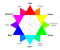
Spring green is a color that was traditionally considered to be on the yellow side of green, but in modern computer systems based on the RGB color model is halfway between cyan and green on the color wheel.
Blue-green is the color between blue and green. It belongs to the cyan family.
In optics, orange has a wavelength between approximately 585 and 620 nm and a hue of 30° in HSV color space. In the RGB color space it is a secondary color numerically halfway between gamma-compressed red and yellow, as can be seen in the RGB color wheel. The complementary color of orange is azure. Orange pigments are largely in the ochre or cadmium families, and absorb mostly blue light.
Varieties of the color green may differ in hue, chroma or lightness, or in two or three of these qualities. Variations in value are also called tints and shades, a tint being a green or other hue mixed with white, a shade being mixed with black. A large selection of these various colors is shown below.
Varieties of the color red may differ in hue, chroma, lightness, or in two or three of these qualities. Variations in value are also called tints and shades, a tint being a red or other hue mixed with white, a shade being mixed with black. A large selection of these various colors are shown below.
Pink colors are usually light or desaturated shades of reds, roses, and magentas which are created on computer and television screens using the RGB color model and in printing with the CMYK color model. As such, it is an arbitrary classification of color.
The color magenta has notable tints and shades. These various colors are shown below.
Varieties of the color yellow may differ in hue, chroma or lightness, or in two or three of these qualities. Variations in value are also called tints and shades, a tint being a yellow or other hue mixed with white, a shade being mixed with black. A large selection of these various colors is shown below.
Varieties of the color blue may differ in hue, chroma, or lightness, or in two or three of these qualities. Variations in value are also called tints and shades, a tint being a blue or other hue mixed with white, a shade being mixed with black. A large selection of these colors is shown below.
Violet is a color term derived from the flower of the same name. There are numerous variations of the color violet, a sampling of which are shown below.
Shades of black, or off-black colors, are colors that differ only slightly from pure black. These colors have a low lightness. From a photometric point of view, a color which differs slightly from black always has low relative luminance. Colors often considered "shades of black" include onyx, black olive, charcoal, and jet.
Rose is the color halfway between red and magenta on the HSV color wheel, also known as the RGB color wheel.
Blue pigments are natural or synthetic materials, usually made from minerals and insoluble with water, used to make the blue colors in painting and other arts. The raw material of the earliest blue pigment was lapis lazuli from mines in Afghanistan, that was refined into the pigment ultramarine. Since the late 18th and 19th century, blue pigments are largely synthetic, manufactured in laboratories and factories.