Moral Emblems is a collection of poems by Robert Louis Stevenson, illustrated by the author. It originally consisted of two small booklets of poetry and engravings, both published in limited copies in Davos in 1882. Stevenson was both the author and the illustrator, the engraver, and, in collaboration with his stepson Lloyd Osbourne, then aged thirteen, the editor. The title Moral Emblems was reused for a posthumous collective edition published in 1921, which gathered several of Stevenson's booklets, most of which he illustrated and originally printed in Davos between 1881 and 1882 by Lloyd Osbourne. The original editions of Moral Emblems are highly sought after and appreciated for their graphic and literary qualities and playful dimensions.
Samuel Lloyd Osbourne,[n 1] born in San Francisco in 1868, was the second child of Samuel Osbourne, an American military officer, and his wife, Fanny, born in 1840.[n 2] Samuel Osbourne was considered a "womanizer,"[2] and his wife Fanny left him in 1875 and moved to Europe with her three children, "partly to escape as much as possible from unpleasant associations and partly to give her daughter the advantage of an education in foreign art schools."[3]
After a stop in Antwerp, they settled in Paris, where Fanny and Isobel attended classes at the Académie Julian.[4] In April 1876, Hervey, Lloyd’s younger brother, died in Paris from an illness probably identified as a form of tuberculosis.[n 3] Warned that Lloyd’s health was also in danger, Fanny decided to take her surviving children away from city life by moving them to Grez-sur-Loing, a village in the Gâtinais region frequented by many painters.[7] It was there that they met Stevenson.[8] Lloyd was eight years old, and Robert-Louis was twenty-six.[9]
If the story of Robert Louis falling in love with Fanny[10][11] during the summer of 1876, through the open window of the hotel in Grez-sur-Loing, is perhaps just an "absurd" family legend,[8] the young Lloyd was charmed:
I was very flattered to be taken so seriously — R. L. S. always complimented children for being serious, however mischievous the gleam in his bright brown eyes — and I instantly held him in high regard.[9]
The affection the child had for the one he called "Luly" grew alongside his mother's feelings:
I developed a love for Luly Stevenson, as I called him; he had taken to reading The Pilgrim's Progress and Tales of a Grandfather to me, as well as telling me stories 'out of his brain'; he gave me a sense of protection and warmth and, although I was far too shy to say it aloud, he seemed to me to resemble so much Mr. Greatheart, the character in the book [by Bunyan], that it became his secret name for me.[9]
In January 1880, Samuel and Fanny Osbourne divorced;[12] in May 1880, Fanny married Robert-Louis Stevenson in San Francisco.[13] Lloyd accompanied them on their honeymoon trip to Calistoga and then to Silverado, during which Stevenson made some "unenthusiastic and futile" attempts[14] to teach him geometry and Latin. However, as Lloyd Osbourne noted in 1922 in his introduction to Treasure Island, "What intrigued me most of all was that he was as fond as I was of Mayne Reid, Fenimore Cooper, Jules Verne, and Marryat [...] This idolized stepfather was the most wonderful, the most stimulating playmate."[15]
When Stevenson traveled to Davos with Fanny and Lloyd during the winter of 1880–1881, he had yet to publish a novel or achieve any literary success.[n 4] He released An Inland Voyage in 1878 and Travels with a Donkey in the Cévennes in 1879. The partial publication—under the pseudonym “Captain George North”—of Treasure Island in the children’s magazine Young Folks between October 1881 and January 1882 coincided with his second stay in Davos and the creation of Moral Emblems. During this time, Stevenson was also rewriting Treasure Island for publication as a book, intending for it to be illustrated.[17]
Stevenson’s experiments with illustration in Moral Emblems reflected his particular interest in the relationship between image and text, with “visual arts influencing his literary production.”[18] This dynamic manifested in several ways:
While staying in Braemar in 1881, Stevenson drew the map that inspired his first published novel, Treasure Island.[19][20] The second version of this map, recreated from memory after the original was lost, became a key component of the book: “It is part of the narrative (literally—it is the source and key to the plot) [...] it frames both the production and reception of the story.”[18]
This central role of images paralleled the rise of a new form of children’s literature in Britain: albums illustrated in chromoxylography. These works redistributed narrative information between text and image.[21][22] Stevenson, following these developments closely, sought collaborations with prominent illustrators of such albums,[18] like Walter Crane, who created frontispieces for An Inland Voyage and Travels with a Donkey in the Cévennes, and Randolph Caldecott, whom Stevenson unsuccessfully approached for a future project.[23]
One of the anonymous illustrations from The Pilgrim's Progress commented on by Stevenson in his Magazine of Art article.
In private correspondence, Stevenson lamented the lack of illustrations[24] in the serialized version of Treasure Island published in Young Folks, which otherwise attracted “not the slightest attention.”[25][n 5] He envisioned an illustrated edition from Routledge, the publisher of Crane and Caldecott, specializing in children’s picture books.[18][22]
In 1882, Stevenson published two articles in the Magazine of Art, where his friend William Ernest Henley had been the editor-in-chief for a few months,[27] on the relationship between text and illustration. The first article examines the anonymous illustrations of an 1845 edition of The Pilgrim’s Progress, which follow Bunyan's text in a manner described as "literal to the brink of madness" and share with it the same "disregard for style," the same clarity, and an "almost comical simplicity."[28] The second article focuses on two illustrated versions of the story of the 47 rōnin. Stevenson, who shared with William Crane an appreciation for the synthetic vision of reality found in Japanese prints,[18][22] particularly notes how the illustrator seeks "the maximum effect with the minimum of detail."[29]
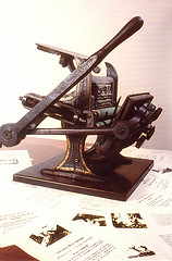
In 1880, shortly before his twelfth birthday, Lloyd Osbourne—still called Sam, like his father—received a small hand press as a gift.[30] While family tradition attributes the gift to Stevenson, it is not certain whether this much-appreciated present truly came from Robert Louis, who may have wanted to welcome the child into his future family but was quite penniless at the time, or from Sam Osbourne, Lloyd's father, who was about to lose custody of a son he was deeply attached to due to ongoing divorce proceedings.[31]
First issue of The Surprise (1880).
Small presses of this kind were popular among American youth at the time.[32] According to an article published by The Young Californian in 1872, San Francisco could then “boast seven amateur newspapers; five of them had eight pages, and the other two had four.”[33] The popularity of these machines grew in the United States starting in 1872 when William Kelsey introduced the Excelsior, a lever-operated tabletop press designed for small-format printing and targeting “amateurs, especially young amateurs.” This model was quickly imitated by over twenty manufacturers in the United States and England.[34]
In an article published in The Scotsman in 1932, W. Dods Hogg specified that Lloyd Osbourne’s press was not merely a toy: “It is too solidly constructed to have been designed solely as a child’s plaything [...] In skilled hands, it can produce results that are nothing to be ashamed of,” though it was limited to a maximum format of 10 × 15cm.[35]
According to Victoria Ford Smith, while such presses were not strictly toys, they often played a role in either a “father-son relationship, intended to strengthen familial bonds o [...] demonstrate paternal authority,” or as a means of learning collaborative work through amateur newspaper projects.[36]
In keeping with the practices of the time, young Osbourne also began publishing a newspaper, The Surprise, while attending Locust Grove School, located near Sonoma.[37] After a brief attempt at daily publication under the title Daily Surprise, he settled on a biweekly schedule.
In the first issue of this new format, published on March 6, 1880, he announced that he had “secured” (misspelled as sucured) the collaboration of a “special” (misspelled as spechial) artist—his stepbrother Joseph Dwight Strong—and anonymously published the first stanza[n 6] of Not I!, a poem by his future stepfather, though he occasionally diverged from the manuscript’s punctuation. As compensation for this contribution, Stevenson humorously suggested in a letter to the editor a “68.005 percent discount” on his “usual” fee of half a doughnut per column.[38]
Early publications in Davos
Photochrome of Davos in 1880.Chalet Am Stein, Davos, behind the English chapel.
In the summer of 1880, accompanied by Fanny and Lloyd, Stevenson returned to Scotland. After a tuberculosis diagnosis, doctors recommended the “new Alpine cure”[39] and referred him to Dr. Karl Rüedi,[40] a well-known figure in Britain and the primary physician for the English community in Davos.[41] Robert Louis, his wife, and his stepson arrived in Davos in November 1880 and settled at the Hotel Belvedere.[42]
Stevenson wrote little during this “entirely boring and unprofitable” winter.[39][43] Instead, he became absorbed in a Kriegsspiel involving hundreds of toy soldiers, with increasingly complex rules, which he played with Lloyd.[44] In November 1880, Lloyd printed 24 copies of a one-sided leaflet[45][46] titled Martial Elegy for Some Lead Soldiers, selling them to spa guests for a penny each.[47][48]
During the summer of 1881, the family returned to Scotland. Lloyd visited the printer R. & R. Clark—who would later publish several of Stevenson’s works[n 7]—and improved his technical skills.[49][50]
Osbourne & Co advertisement (circa 1881-1882).
In November 1881, Robert Louis, Fanny, and Lloyd returned to Davos. This time, they rented the chalet Am Steinn,[n 8] which had a spacious attic perfect for spreading out their Kriegsspiel.[43] That winter proved productive for Stevenson: he completed Treasure Island, wrote The Silverado Squatters and The New Arabian Nights, and outlined Prince Otto.[52][53]
Meanwhile, Lloyd continued doing small printing jobs, later claiming that this was his way of contributing to a structurally unbalanced family budget, partly due to the costs of his education—particularly the German lessons given by a "dying Prussian" who would, according to Lloyd, use "a pocketknife pointed at my throat to ensure I got the accent right."[54]
Black Canyon
Advertisement for Black Canyon (1881).
In 1881, Lloyd Osbourne published a short eight-page novel in Davos, bound in a small in-twenty-four format (7.9 x 12.1cm),[56][57] titled Black Canyon, subtitled Wild Adventures in the Far West: A Tale of Instruction and Amusement for the Young. Claiming authorship, Lloyd priced the book at six pence.
An advertisement he printed for the book included glowing reviews from imaginary journalists, as well as praise from Stevenson himself: “A very remarkable work. Every page makes an impression. The ending is as peculiar as the beginning. I have never seen anything like it.”[55]
In a letter dated March 16, 1882, to which he attached the advertisement, Stevenson described the work as “a grand joke, but the author’s attitude is even funnier. There isn’t a single incident that aligns with another from start to finish, but every time I spot a new inconsistency, Sam is the first to laugh, with a sort of proud humor, at the absurdity of it all.”[58][n 9]
The secret message leading to the treasure in Black Canyon.
Although Lloyd Osbourne later claimed authorship of Black Canyon, asserting that “both the spelling and the subject matter were entirely original,”[60] James Hart questioned this claim. Hart noted that the spelling was not poor and that the text differed significantly from Lloyd’s earlier works.[61] He suggested that the story bore similarities to The Squaw Men; or the Wild West, a Western project Stevenson had undertaken “to amuse young Lloyd in Davos”[24] but had abandoned.[53] Hart also observed that the plot, like Treasure Island, revolved around the search for hidden treasure and a clue provided by a piece of paper. Furthermore, the method by which “the story conformed to the illustrations, rather than the illustrations conforming to the text,”[62] seemed more attributable to Stevenson.[61]
Regardless of its authorship, “the sale was immediate and gratifying. The little boy discovered there was far more money to be made printing a book than a dozen programs.”[62]
Not I! andother poems
Title page of Not I! and other Poems (1882).
Lloyd Osbourne’s next publication was Not I! and Other Poems, again an eight-page booklet in in-twenty-four format (7.6 x 11.7cm).[63][57] Priced at sixpence, the print run was limited to 50 copies. The back of the title page carried a dedication to Messrs. R. & R. Clark, Stevenson’s printer, whom Lloyd had visited in the summer of 1881.[n 10][57] The colophon stated that the work was “begun in Feb. and finished in Oct. 1881.”[64] James Hart dated the publication to October 24, 1881.[65]
The booklet included Not I!, now expanded by one stanza compared to the 1880 version (though one stanza was still missing), along with three unpublished poems reflecting the conditions of its production. According to Hart, the design was cleaner and more restrained than Lloyd’s earlier efforts, with improved printing, especially in the ornaments, minimal typographical errors, and nearly all letters legible.[66]
In his preface to the 1921 edition, Lloyd Osbourne did not mention that the manuscript for Not I! had been given to him by Stevenson not in 1881 at Davos, but a year earlier in California. However, he recalled that the Davos publication succeeded, with the entire 50-copy print run selling out.[67]
Publication of Moral Emblems in Davos
The next publication by Osbourne & Co. was Moral Emblems, released in two series and featuring illustrations engraved by Stevenson.
First series
Title page of the first series of Moral Emblems (Davos, 1882).
The first series of Moral Emblems, subtitled Collection of Cuts and Verses, was published in Davos, likely in early 1882.
It consisted of a small, 12-page stitched booklet in in-twenty-four format (8.3 x 12.7cm),[68] with a print run of 90 copies sold at sixpence each.[69][64] It contained five poems and five “rough woodcuts,”[69] described by Herbert Slater,[69] all engraved by Stevenson.
In February 1882, Stevenson sent two of his engravings to his parents, writing: “These are moral emblems; one represents anger, the other pride scorning poverty. They will appear with others, accompanied by verses, in a new work published by S. L. Osbourne.”[70] To his mother, he added: “I am mad about wood engraving. I am made for life. I finally have a hobby.”[70][n 11]
Last page of advertising for the first series of Moral Emblems (Davos, 1882). Not I! is “a volume of enchanting poetry”; Black Canyon, “a beautiful gift book”; and Moral Emblems “need only be seen to be admired”.
In March 1882, Stevenson sent the book’s advertisement to Edmund Gosse, describing it humorously:
[I am sending] an advertisement for my new endeavor as a poet (or bard, rather) and wood hartis [artist?]. The engraving depicts the Hero and the Eagle, emblematic of Cortés first gazing upon the Pacific Ocean, which (according to the bard Keats) occurred at Darien. The engraving is much admired for its sense of discovery, the virile proportions of the traveler, and the tropical scenery’s VOID of the unknown, so aptly rendered by the hartis.[76]
Stevenson adds: "I received one penny per engraving and half a penny per set of verses [...] and a single proof copy." These details are confirmed in a letter to William Ernest Henley from the same month:
Now that I am illustrating my books, I can always offer you a place in our society — S. L. Osbourne and Co. An author receiving half a penny per set of verses and an artist one penny per engraving, perhaps a proofreader could receive a few books per year.[77][n 12]
In April, he informed Alexander Japp that the elephant in the engravings was Fanny’s work.[79] To his cousin Bob, he enthusiastically declared:
I’m sending you all my artistic works; they are engravings—I carve them with a penknife on wooden panels. I am a wood engraver. I aaaam a wooood engraveeer. Sam prints them afterward: aren’t they funny? I adore them. In my next project, I will print in color; it will be very laborious, requiring six blocks to engrave for each image, but the result will be tremendous.[80]
The first engraving completed illustrates the poem Reader, your soul upraise to see. Stevenson first engraved a small square from a sheet of wood using a pocketknife.[81] The engraved wood sheet was then mounted, as a test, onto a woodblock to bring it to the same height as the type.[81] After adjustments using cigarette paper sheets, the result was thrilling: “The little boy, delighted beyond measure, printed copy after copy for the sheer pleasure of seeing the wet ink magically reproduce the block.”[82] The original engraved sheet was later transferred onto a block for printing, a task undertaken by a “tubercular Swiss man who made a living carving bears.”[83]
In 1921, Lloyd Osbourne retrospectively described the publication's success as “sensational”: “Wealthy clients of the Belvedere Hotel [sic] bought up to three copies, and friends in England wrote asking for more.”[84]
Title page of the second series of Moral Emblems (Davos, 1882).
A few weeks after the publication of the first series, a second one was released. The format was essentially the same: a sewn booklet of twelve unnumbered pages in twenty-fourmo format (8.9 x 12.1cm),[68] consisting of five engravings on the left pages and five poems on the right, again printed in a run of 90 copies.[69][87] However, there were two notable differences:
Advertising for the second series of Moral Emblems (Davos, 1882).
First, on the title page listing Stevenson’s previously published works, in addition to Travels with a Donkey and Not I! and Other Poems, the mention of The Blue Scalper—a work otherwise unknown in Stevenson's bibliographies[n 14]—and Treasure Island was replaced with New Arabian Nights, a collection of short stories published by Chatto & Windus in 1882.
Although Lloyd Osbourne later claimed the selling price remained unchanged at nine pence,[89] the booklet was published in two versions: a “luxury edition, on tall, extra fine paper,” sold for 10 pence, and a “popular edition for the masses, on smaller paper, with slightly uneven engravings,” sold for 8 pence.
The advertisement reproduced here, adorned at the bottom with the arms of Scotland[69] and reputedly published on the same day as this second edition, helps date it. A copy of the advertisement in question was printed on the back of a program created by Lloyd for a concert held on April 4, 1882, at the Belvedere Hotel, during which Mrs. Reed and Miss Constance performed Haydn pieces, ending with God Save the Queen.[90]
The five engravings were all by Stevenson and showed more refined craftsmanship than those in the first series. Fanny had provided Robert Louis with pearwood blocks, easier to engrave, and proper engraving tools.[91] Some separate prints of certain engravings still exist, which, according to Walter Hill, are proofs.[92]
According to Osbourne’s recollections, “the public received [this second series] as warmly as the first, and the little boy became so prosperous that he amassed over five pounds.”[89]
In April 1882, Stevenson’s improved health and Fanny’s declining health led to their permanent departure from Davos.[93][94] Several engravings created in Davos, alongside those included in the two series of Moral Emblems, remained unpublished there. Some would later appear in the collection The Graver and the Pen, while others would only be published posthumously.
The Graver and the Pen
Title page for The Graver and the Pen (Kingussie, 1882).
In July 1882, Stevenson spent a few weeks[95] in Kingussie, Scotland, on the advice of Dr. Clark, where he reunited with Lloyd, who had since been sent to an English boarding school.[96]
Advertisement for The Graver and the Pen (Kingussie, 1882).
They resumed their publishing activities, with Osbourne noting in the preface to the 1921 collected edition that “the stepfather having made much more progress in engraving than the stepson had in Latin,” the blocks and poems for The Graver and the Pen were already prepared.[97] However, Lloyd’s press had since broken and could not be repaired.[n 15] The work was eventually printed in Kingussie by a certain Crerar, “a kind old gentleman” who “insisted on doing far too much himself, despite being paid only a nominal fee for the use of the press,” resulting in what Osbourne would later call in 1921 “an almost regrettable perfection.”[97]
The Graver and the Pen, subtitled Scenes from Nature with Appropriate Verses, was a small portfolio in sixteenmo format (11.6 x 14.5cm) comprising 24 unnumbered pages and five separate engravings, printed in a run of 100 copies and sold for nine pence.[98][99][100]
Around the same time, or shortly before the booklet’s release,[98] an advertisement (see reproduction) described the illustrations as “striking” and the verses as “so delightful that the booklet, taken up to be read, is finished before being set down.”
In the first stanza of a prefatory poem titled Proem, following what is likely a typographical error,[101] Stevenson declares:
I have two strings to my bow, And wield both graver and pen with Equal ease and dexterity.[85]
In the preface to the 1921 collected edition, Lloyd Osbourne introduces the two poems comprising Moral Tales: Robin and Ben, or the Pirate and the Apothecary and The Builder’s Doom, as previously unpublished. “The Pirate and the Apothecary was planned; three superb illustrations were engraved,[n 16] but it never saw more light than could shine from a typewriter. The Builder’s Doom remained a manuscript [until 1921]. No illustrations were drawn or engraved for this poem.”[103]
The first publication of Moral Tales dates back to 1898, in the twenty-eighth and final volume of the so-called Edinburgh edition of Stevenson’s collected works, edited by Sidney Colvin and published by Chatto & Windus from 1894 to 1898.[104] In his preface, Sidney Colvin describes Robin and Ben, or the Pirate and the Apothecary as “half-childish like the rest [of the productions of Osbourne & Co.], only in form, but in substance a satire, not without Swiftian touches, of commercial morality.”[105] Colvin also mentions that Stevenson had planned a collection of poems and illustrations titled Moral Tales, which would have been a sequel to Moral Emblems, but only the two poems above were written. He further clarifies that the verses written from the three illustrations of Robin and Ben exceeded the printing capabilities of Lloyd’s press.[86]
Herbert Slater notes the separate printing of the three engravings illustrating Robin and Ben, or the Pirate and the Apothecary at Davos.[106]
Engravings of Robin and Ben, or the Pirate and the Apothecary
Osbourne publisher's emblem. 4.1 x 5.8 cm. Davos, 1882.
Apart from the illustrations for the above works, Stevenson also executed an engraving in Davos intended to be Lloyd Osbourne's publisher emblem, which Hart supposes was meant to be used as the frontispiece for The Graver and the Pen.[96]
Title page from Spiritual Conceits by William Harry Rogers (1862).
This image, “full of symbolism” for Hart[107] and “heavily borrowed” for Manning,[108] combines a motto, Labor Crux Corona (Labor, cross, crown), with a “sort of acrostic”[96] mixing the words “typo” and “Osb,” the beginning of Lloyd’s name. According to Karl Joseph Höltgen, Stevenson was inspired for this engraving by the title page of Spiritual Conceits (1862) by William Harry Rogers, a well-known English engraver at the time,[109] and his motto, No cross, no crown.[108]
According to Sidney Colvin, the Map represents “the imaginary land of one of the battles that [Stevenson] and his stepson were accustomed to wage with lead soldiers.”[86]
The Daisy, engraved on the back of the block for the Map,[86] was printed by Lloyd and sent jointly by him and Stevenson to Stevenson’s mother for her birthday, on February 11, 1882. It was a family joke about Stevenson’s mother’s name, Daisy, the illustration is accompanied by a “verse” from Stevenson’s father, Thomas Stevenson, reading, “Lawks! What a beautiful flower!!” which was supposed to be the only verse ever written by him.[110]
Lord Nelson and the Sailor, or Lord Nelson Pointing to the Sea, engraved and printed at Davos,[111] was chosen by Joseph Pennell to illustrate the article he wrote in 1896 about Stevenson’s work as an illustrator. According to Pennell, “The atmosphere of the wet stones on which the figures of Lord Nelson stand is remarkably well rendered, as is the great expanse of the sea, and the bottle—unless it is a buoy—that floats calmly on the ocean floor.”[112] After Pennell, Arthur Ransome saw in this engraving a “beautiful study” of Nelson looking into the distance at a boat and a floating bottle of champagne.[113]
The various booklets written and illustrated by Stevenson in Davos and printed by Lloyd Osbourne, including Moral Emblems, were reprinted several times.
The first reprint, in facsimile, was published as part of the so-called Edinburgh edition of the collected works, published from 1894 to 1898. A twenty-eighth and final volume, published in 1898 and reserved for subscribers, who received it as a “bonus,”[116] marked the conclusion of this edition.[117] In its July 11, 1898 issue, The Scotsman announced this publication:
In recognition of the support they received in completing their work, Mr. Stevenson’s executor and his publisher—his widow and Mr. Sidney Colvin—have added for free, as volume twenty-eight, a ‘small additional volume or appendix as a bonus’ [...] The most remarkable and probably most appreciated part of the contents of this volume is the facsimile reproductions of Moral Emblems, written ‘like a child’s play and for leisure’ by Stevenson in Davos between 1880 and 1882, with picturesque illustrations drawn and engraved by the author himself, then printed by his young stepson, who became well-known as Mr. Lloyd Osbourne. An ingenious binding system was devised to incorporate these little publications without damaging them or distorting the book. The Emblems are written in a humorous and vacation-like vein. Satirical remarks appear here and there; and there are even more in Robin the Sailor and Ben the Apothecary and The Builder’s Doom, two of the poems from the projected collection titled Moral Tales, of which only these two parts were written and are now published for the first time.[118]
On its part, The Times, in an article from August 4, 1898, presents this twenty-eighth volume as the publisher’s response to the readers' desire for unpublished works, describing it as follows:
These small booklets, printed at Davos, were written, illustrated, and printed by ‘R. L.S.’ and his stepson, Mr. Lloyd Osbourne, to amuse the family; and they are amusing. Although their main aim was to please an intelligent child, one can imagine that Stevenson, with his wonderful sense of childlike play, took great pleasure in these Moral Tales and Moral Emblems, with their marvelous engravings and burlesque poetry. The Pirate and the Apothecary is a blood-curdling tale, with frightening black-and-white illustrations, and a lesson to be imparted: it is better to be a ferocious pirate and commit crimes like a gentleman than to stay home and get rich by deceiving the poor. Needless to say, such a theme could only appeal to the creator of so many fascinating buccaneers![119]
This “bonus” was republished separately in 1899 under the title A Stevenson Medley, with some additions, including engravings not featured in the 1898 edition.[120][121]
The first collective edition, with a preface by Lloyd Osbourne, was published in 1921.[122]
The first French translation was published in 1994.[85]
New French translations were published in 2020[123] and 2021.[124]
Since the content of these editions varies slightly, the following table shows their correspondence.
The publication in 2001 by Alberto Manguel of a short fiction Stevenson under the Palms, illustrated with four engravings by Stevenson and accompanied by a brief note on these engravings,[125] followed by the 2012 publication by Henning Wagenbreth(fr) of a comic-book version of Robin and Ben, or The Pirate and the Apothecary, translated into French in 2013,[126][127] contribute to the rediscovery of these works by Stevenson.[128][129]
Reactions from contemporaries
Testimonies from Stevenson’s friends
Martial Elegy for some lead Soldiers dedicated to Edmund Gosse (1880).
Edmund Gosse, in an article published in 1887 in Longman's Magazine and devoted to Stevenson as a poet, refers to the growing popularity of publications from the "Davos Press," assuming that his complete collection of these booklets must have stirred a “diabolical passion” in other collectors.[130] He considers these publications as “decidedly occult”[130] and notes that “a man can build a reputation as a sage on them, but not as a poet,” given their “severe morality.” He concludes:
These are books that no one can read without becoming better for it; but as mere verse, they leave much to be desired. Non ragionar di lor, ma guarda, if you have the good fortune to possess them, and pass on.[n 17][130]
John Manning, who notes that Gosse was the recipient of all the publications from Lloyd, calls his comments “perfect nonsense” and emphasizes that at the time, Osbourne & Co.’s productions were so rare that Gosse had little chance of being contradicted. According to Manning, this is a “spurious distortion,” deliberately crafted to exclude these works from any serious consideration.[132]
This endeavor was not, however, crowned with success. In an article published in 1888 by the Fort Worth Daily Gazette, American poet and critic Louise Chandler Moulton expresses her desire to own the Davos booklets, about which she knew nothing before being inspired by Gosse's article.[133]
Soon, these original editions with small print runs became highly sought after.[134][135]
In a memoir dedicated to Stevenson, published in 1905, Alexander Hay Japp, one of the recipients of the original editions, describes them as:
Ineffably picturesque, grotesque, a kind of literary farce, blending overflowing and shady genius with innocent, childlike Rabelaisian cheerfulness.[136]
Popularization by Joseph Pennell
Drawing by Stevenson during his trip to the Cévennes (Le Monestier, 1878).
Joseph Pennell was the first[137][138] to "reveal to the world"[139] Stevenson’s “undiscovered” work[140] as an illustrator, reproducing some examples, two years after Stevenson’s death but two years before facsimiles were published in the last volume of the Edinburgh edition, in an article published in 1896 in The Studio Magazine.[n 18] Pennell also points out the rarity of the original editions of these works, which he regards as "among the greatest curiosities of modern English literature,"[141] noting that the British Museum itself only possesses two,[142] adding that he knows no one who has managed to obtain a complete collection.[143]
Unlike Gosse, who sees in the Moral Emblems the expression of a “severe morality” reminiscent of the Westminster Catechism,[130] Pennell appreciates the dimension of enjoyment and humor in Stevenson’s project, which, in his view, is “neither serious, nor pompous, nor heavy, nor pretentious, but, like all his work, cheerful, bright, full of life and energy, and honest.”[142] Pennell emphasizes Stevenson’s ongoing interest in illustration. He believes the engraving works from Davos are “closely related”[144] to the drawings Stevenson made during his 1878 journey through the Cévennes: he finds the same “attentive and intelligent” observation of nature and highlights similarities between the treatment of rocks and trees in the 1878 drawings and the engravings of 1882.[143]
For Pennell, certain details, such as the choice of black frames, indicate Stevenson’s familiarity with the prevailing fashion in illustration at the time.[112] He adds that Stevenson had a “remarkable eye for form, though unpracticed,” and that “every line of his engravings is full of meaning and character.”[112] He gives as an example the second scene of Robin and Ben, where “the sky is remarkably bright and engraved with surprising skill,” the engraving of Nelson mentioned above, or the sky in The Beggars; he finds these three engravings far superior to most of the wood engravings from France or England made during the same period.[112]
Illustration and "skeltism"
That Terrific Abduction Piece, an engraving by Skelt illustrating “A single at a penny, and a color, at two pennies” (1884).
In 1884, Stevenson published an article in The Magazine of Arts titled “A Penny Plain, and a Two-penny Colored,”[145] about paper theaters, particularly focusing on Skelt, a London printer who produced, between 1830 and 1850, cut-out boards for paper theaters that Stevenson, as a child, had collected. These were sold either in black-and-white to be colored, the “penny plains,” or already colored, the “two-penny coloreds.” The images depicted characters and sets from successful plays, sometimes with instructions for children.[146] From the name Skelt, which “always seemed to be an integral part of the charm of his productions,”[147] Stevenson coined the term skeltism to describe the qualities he found in them:
Skeltism, therefore, is a quality common to many arts. It can even be found, with all due respect, among the works of nature. The ‘scenic’ is its generic name.[148]
Engraving printed by Skelt around 1840, reproduced in “Un simple à un sou, et un couleurs, à deux sous” (1884).
Pennell suggests a parallel between the Davos engravings and Skelt’s paper theater:
It seems likely that Stevenson’s main sources of inspiration as an illustrator were the penny plates from his childhood. Didn’t he hiite that he was ‘just a puppet in Skelt’s hands’?[149] And it’s clear that the illustrations from these later years borrowed something from the landscapes of skeltism. ‘Ah, how the roads wandered, how the castle stood atop the hill, how the sun shone behind the cloud, how the clouds themselves rolled up, as stiff as bolster pillows!’[149] When he wrote this, could he have been describing his own creations, even though he certainly added his own original quality to the interpretation of these childhood models?[142]
In an essay devoted to Stevenson in 1927, G. K. Chesterton took up the same idea, emphasizing what he called “the primal character of Stevenson’s imagery,” the fact that “all his images have sharp outlines and are, so to speak, nothing but edges.”[n 19] He adds:
It is this something in him that must have drawn him to the sharp, dry black-and-white of wood engravings. One can see it early on in the way his 18th-century silhouettes cut against the horizon, with their boarding sabers and cocked hats.[152]
He gives as an example in Treasure Island “that unforgettable chip or notch that Billy Bones’ sword made in the wooden sign of the ‘Admiral Benbow.’ This sharp cut in the block of wood remains as a symbolic form, expressing the type of literary attack Stevenson embodied,”[152] which constitutes a remarkable articulation between engraving and writing, a characteristic of British literature since Charles Dickens.[153] In turn, Chesterton emphasizes the importance of Skelt in Stevenson’s aesthetic choices: “All this came to him from the mysterious Mr. Skelt of the Drama of Youth, that is to say, his little theater for children, which, of all toys, had the most magical effect on his mind.”[154] According to Chesterton:
[The Skelt vignettes] spoke to Stevenson’s soul through their rounded solidity or their angular bravado. And it’s hardly an exaggeration to say that he spent his life teaching the world what he learned from [them]... Moreover, he expressed his morals in a series of Moral Emblems, which were not unrelated to [their] sharp outlines and these provocative postures; and there was never any other name for this than the one he himself gave it: Skeltism.[155]
Subsequent analyses
Moral emblems and the book of emblems
Bis dat qui citò dat, an emblem by Geoffrey Whitney (1586).Beneficio grato, an emblem by Gabriele Simoni (1559).
Marc Porée places the Moral Emblems “in the great tradition of the emblem book, born in the 16th century and still alive in the 18th century,”[126] noting that John Manning highlights how it is common for these works to target — or seem to target — a child audience.[157] Several authors place the Moral Emblems in the context of a resurgence of interest, during the Victorian era, in the emblem book,[158][159][160] and Karl Josef Höltgen specifies that, while most Victorian “emblematic verses” have little relation to the original sense of the emblem — that is, a set consisting of three parts: a motto (lemma or inscriptio), an image (pictura), and an explanatory text (subscriptio)[161] — Stevenson’s Moral Emblems are “undoubtedly” an emblem book.[162] For Manning, “Stevenson draws from a repository of images, themes, and rhetorical strategies characteristic of emblematic literature. The figures of paradox, personification, periphrasis, and even the playful choice of rhetorically licentious rhymes are markers of the emblem’s verbal style.”[108] He notes, for example, that a “beggar by the roadside” like the one in Reader, your soul upraise to see appears under the motto “Bis dat qui cito dat” (he who gives quickly gives twice) in A Choice of Emblemes by Geoffrey Whitney (Leiden, 1586).[163] In Whitney’s work, one can also find a quarrelsome pine,[164] a “frail skiff,”[165] and several pirates.[166][167] The “adventurous Cortez” from A Peak in Darien is in line with the classical celebration in the emblem book of the heroic acts of kings and generals.[168]
However, Stevenson’s morality takes a “funny turn”: the “unfortunate effects of rage” are nothing more than indigestion, and the example given for a worthy retreat is that of an “industrious pirate.”[108] The humor and self-mockery that surface are closely tied to a constant sense of the precariousness of life. In the Martial Elegy, death “brought down each of these leaden heroes”; it watches the “dandy” who “turns his head from the unfortunate” and leaves only a “memory of [...] a broken body.” In Stevenson’s emblems, the reader encounters an abbé struck by a javelin, a dead explorer who “lies on the road,” and Ben, the pirate, who evokes “the dead abandoned under the sun.”[169] Robin Raybould notes that the Moral Emblems reflect Stevenson’s “bitter cynicism towards the moral values of the middle class.”[170]
The emblems of the book
For Humphrey Carpenter and Mari Richard, the “ridiculously crude” aspect of the engravings in the Moral Emblems shows that it is an “ingenious parody” of children's books.[171] In a detailed analysis of both series of these emblems, Wendy Katz highlights the “special relationship” they maintain with the children’s literature of the late 19th century:
By pushing the reader to look beneath the surface, Stevenson’s emblems, along with other parodies of didactic literature, lead a more experienced reader, one aware of the different layers of meaning, to incongruity, antithesis, euphemism, and exaggeration. They discourage authoritative interpretations of the text, which may be their most subversive aspect.”[172]
Wendy Katz also emphasizes the tonal shift between the two series of emblems, paralleling the technical improvement in the illustrations from one series to the next, with the “parodic fire” only igniting at the end of the first series.[173] She notes a change in tone in the second series, parallel to the graphic evolution of the engravings, likely due to the use of better-suited engraving tools: the verses are more “oblique,” inviting the reader to see “both the ridiculous and the despicable.”[174]
Analysis of the first series
Manuscript of John Keats's poem, On First Looking into Chapman's Homer (1816).
See how the children in the print in the first emblem of the first series establish what Wendy Katz calls a “pedagogical relationship”[173] with the reader, who is invited to “put into practice”[175] the “wise lessons”[175] of the book.
Reader, your soul upraise to see, the second emblem of the first series, gives the first moral lesson: “Punishment waits pride.”[173]
The fourth emblem, the shortest, is simply “moved by whim.”[179] It depicts an elephant “tying its trunk like a tie”[179] to grab a hat while an ibis, evocative of ancient Egypt, “delights”[179] in the spectacle, though the emblem does not seek to share any “inner vision”[174] with the reader.
Mark, printed on the opposite page, the fifth emblem, which, according to Wendy Katz, is the most “disturbing”[174] of the first series: it represents a murder, the punishment for which is of “perverse triviality,”[174] emphasized by the last two rhymes: the “mangled body”[180] has as its consequence only a “ruined evening toddy.”[180]
Analysis of the second series
In the first emblem of the second series, With storms a-weather, rocks a-lee, the lesson of the emblem does not come from the text, but from the image itself. It depicts a “dancing skiff,”[181] the risk of which capsizing “frightens” the observer. But the engraving “limits the danger it represents,”[182] as it is “nullified by the unreality of the fiction.” The reader is thus invited to see “the reality of the illusion, not its artifice”:[182]
And if the sea swallows the sailors, My engraving will perpetuate their memory.[183]
The second emblem, The careful angler chose his nook, features an unexpected ending that contradicts its “pious spirituality”[184] at the start: beginning in a reverent atmosphere with the mention of a “romantic shore,”[183] it ends with an unexpected triviality,[184] accentuated by the last two rhymes, where “full of fish”[183] responds to “pious wish.”[183]
The last three emblems of the second series end with a rhymed motto in italics, which Wendy Katz interprets as an “apparent attempt by Stevenson to reproduce the motto of an emblem.”[184]
The motto of the third emblem, The Abbot for a walk went out, attests, according to Wendy Katz, to the “triumph of adolescent disorder”:[184]
Where one learns that abbés Should never walk in the woods.[185]
The fourth emblem, The frozen peaks he once explored, returns to the theme of heroism, “or rather anti-heroism,”[184] which is now illustrated by an engraving of “frightening inertia,”[184] where the character turns his back on the peaks of the first verse, on a path bordered by a fallen tree and another with a broken branch, with a motto that Wendy Katz notes for its “ironic cynicism”:[172]
To stay alive, near your friends, Never do anything gratuitous.[186]
The “industrious pirate” of the fifth and final emblem offers “a variation on the 19th-century theme of the work ethic” and “reminds us of the many references to sight and vision in the emblems”;[172] however, he seeks neither enlightenment nor spiritual direction, but, “in a satirical jab at respectability,”[172] only enrichment, as the motto suggests:
You also scan the horizon of your life So that nothing escapes your gaze.[187]
The foolhardy geographer (1882).
Evanghélia Stead considers that Wendy Katz’s analyses show that
[T]he idyllic and balanced world [of the Moral Emblems] is deeply affected by duality, paradox, and ambiguity. Stevenson’s ironic humor punctures the clichés of contemporary children’s literature. It speaks to a sophisticated reader, aware of artifice, incongruity, and the layering of meanings, and discourages formalized interpretations of the text.[188]
She believes that the same techniques are at work in The Graver and the Pen, notably in The foolhardy geographer, which draws its conclusion from a flaw in the engraving that illustrates it:
A flaw appears in the engraving; It has cost much blood and tears. The gouge too quick has slipped, So eager was the artist's passion! And now the confused poet Calls for forgiveness for his companion.[189]
The relationship between Stevenson and Osbourne
Manuscript of Not I! Letter from Stevenson to Lloyd (1880).
The author-editor relationship between Stevenson and Osbourne began in California with the first publication of Not I!, proposed by Robert Louis to Lloyd:
My usual rate is half a doughnut per column. But for a gentleman of your singular insight, and for the pleasure of being published in a magazine that is, if I may say so, the focal point of literary circles, I am pleased to offer you a discount of 68.005 percent off the terms above. I look forward to the settlement of this fraction, being poor though honest, and my mother having recommended that I tie my hair and lace my blue bodice.[38][190]
This partnership does not conform to the usual relationships associated with small presses of the time, such as the parent-child or professional-apprentice dynamic, and is not entirely a game.[191]
According to Victoria Ford Smith, the choice of the title Not I!, which would later become the title of the first booklet published by Osbourne & Co in Davos, suggests Stevenson’s interest in the collaborative dimension, his rejection of the singular "I" in favor of a plural "we," an imaginative and nuanced game to which Stevenson brings his knowledge of the publishing world and his contributions, but without overstepping his role as author, while Osbourne handles the printing, distribution, and sales.[191] As Osbourne would later mention, the experience of publishing Not I! was mutually beneficial:
The publisher was delighted, and the author was also jubilant, saying it was the only book he had written that ever had any success, and tossing his three francs of royalties into the air with an expression that made the little boy burst into laughter with delighted pride.[67]
However, Victoria Ford Smith emphasizes that this collaboration also has a potentially "contentious" dimension,[191] humorously discussed in the letter to Gosse from March 1882 (quoted above), where Stevenson apologizes for not sending him a copy of Not I! by declaring himself "ruined" and blaming the "editor with a heart of stone," from whom he had only received a single proof copy.[76][n 21] According to Victoria Ford Smith, even though the conflict of interest between author and editor is framed here as a game, these were obstacles Stevenson faced in the literary world, especially in the early 1880s.
The toy press compresses, both physically and temporally, the otherwise important and longer publication process, thus creating a miniature model of the professional book trade. It allows Stevenson to experiment with different levels of cooperation and collaboration between author and editor.[192][n 22]
The three poems accompanying the title poem of Not I! evoke, from the conditions of production of the publication, the relationship between author and editor.
The first is about format:
We offer here to your eyes, [...] A book that is not a book, A pamphlet by its appearance, Not by its content.[194]
And the author "confesses"
The smallness of the page, The smallness of the printer.[194]
The second of these poems specifies:
And the printer and the poet In Davos without a press, Demand their reward of six pennies.[195]
The third adds:
The pamphlet you hold Has been designed and printed By a printer of fortune, A poet whom all despise. [...] Admire the chosen paper, The perfect typography.[16]
According to Victoria Ford Smith, the "confession" in the second of these poems, regarding the smallness of the printer, "represents in a playful mode the forces that inhibit the author's creativity."[196] The first and third present the editor-printer as a co-creator, a collaboration illustrated by the ornament chosen by Osbourne for the last page of the book, which depicts a handshake (see image).
The fruitful collaboration that began with Not I! and continued with Moral Emblems ends with The Graver and the Pen, as the Moral Tales project was never completed. According to Victoria Ford Smith, this interruption is not only due to the breakdown of Lloyd's press. She sees in The Graver and the Pen signs of a deterioration in the relationship between the author and his editor, who was fourteen years old at the time.
Victoria Ford Smith notes that the first illustrated poem of The Graver and the Pen, The precarious mill, is about a construction:
where she sees a metaphor for the relationship between adult and child. She analyzes the second poem, The disputatious pines, as a "barely veiled portrait of the more contentious aspects of the partnership between Stevenson and Osbourne,"[198] with Stevenson appearing as the old pine who asserts:
Victoria Ford Smith emphasizes that Lloyd Osbourne himself refers to the evolution of his relationship with Stevenson, even though he never explicitly mentions any antagonism with his stepfather, when he writes in the 1921 preface that "new standards were forming imperceptibly." This evolution in the relationship between Stevenson and his stepson is compared by Ford Smith to their collaboration on the map of Treasure Island. While Stevenson always explained that he was the author of the map, Lloyd, for his part, disputed this version of events.[200] According to Victoria Ford Smith, these divergent accounts express "personal ambitions"[201] but both suggest that the map and the story that emerged from it could not have been created without "the contribution of both the experienced author and the creative pupil, of both the adult and the child."[202]
↑Below, Lloyd, to avoid confusion with his father, although Stevenson most often uses his first name to refer to him in his correspondence from the time.
↑His older sister, Isobel Osbourne, is ten years older than him. His younger brother, Hervey Osbourne, born in 1871, died of tuberculosis in 1876.[2]
↑Although "scrofulous tuberculosis" was diagnosed, the direct cause of Hervey’s death could have been malnutrition.[5][6]
↑In one of the poems from the collection Not I!, the author describes himself as a "poet whom all despise."[16]
↑The poem consists of three stanzas. The first two will be reprinted in Not I!and other poems, published by Lloyd Osbourne in Davos in 1882.
↑Among them, in 1882 Familiar Studies of Men and Books, published by Chatto & Windus.
↑The chalet is also called Buol because it is located near the hotel of the same name.
↑As noted by Timothy Hayes, Stevenson was interested in the psychology of children’s play, especially in an 1878 essay, Child’s Play, in which he writes: "Nothing can shake a child’s faith. It accepts the clumsiest substitutes and can swallow the most glaring incongruity."[59]
↑Alan Sandison compares this enjoyment to that which Paul Gauguin, who would, ten years later, be Stevenson’s "neighbor" in the Pacific,[71] found in wood engravings made in Tahiti, "for fun with any wood."[72] For Gauguin, these engravings, "made on whatever boards and with increasingly poor eyes... are imperfect, but they are... interesting as Art."[73] He adds: "It is precisely because this engraving returns to the primitive times of engraving that it is interesting, as wood engraving, like illustration, increasingly resembles photogravure, which is disgusting."[74] Sandison, highlighting that this attraction for vitality, clarity, and the "nakedness" of primitive art is precisely what makes Gauguin a precursor of Expressionism,[75] notes that Stevenson shares this same attraction for the same reasons and sees it as a confirmation of the Scottish author’s modernism.[75]
↑In an article published in 1901 by the Pittsburgh Daily Post, Henley, who played the role of Stevenson’s volunteer literary agent during the stay in Davos,[27] refers to his relations with the Osbourne & Co. firm: "I come to Not I! and Moral Emblems... For these works, I had received six and eight pence, respectively, which I diverted; for I never paid the engraver-poet for his efforts nor fulfilled the work for which I intervened as agent."[78]
1234567891011Dimensions (width by height) according to the 1899 facsimile edition, A Stevenson Medley, whose editor, Sidney Colvin, specifies that all impressions were made from the original woods, except for The Abbot for a walk went out, The frozen peaks he once explored, and Mark, printed on the opposite page, for which, as the originals were lost, reproductions were used.[86]
↑An 1898 article from the New York Times, which is somewhat misinformed, mentions Le Scalpeur bleu in a list of "chapbooks" produced in Davos by Osbourne & Co. and offered to the Boston Public Library by Fanny.[88]
↑In a study published in 1910, Arthur Ransome, who discovered the engravings of the Moral Emblems thanks to Pennell's article, finds some "good in the old manner" and deems it impossible not to find "their rawness delightful." After discussing, following Pennell, the sketches from the Cévennes, which he suggests may be "an offering to the gods of his love," he adds that the wood engravings are "of another nature, a more joyful pleasure, though serious, like all of Stevenson’s games, serious as a child is, like the game of war, which, with engraving, took all the time that was not devoted to finishing Treasure Island, working on Prince Otho, or writing The Garden of Poems for a Child."[113]
↑In a chapter of Spicilège (1896) dedicated to Stevenson’s fiction, Marcel Schwob provides an analysis of his images that converges with that of Chesterton:
They are images stronger than real images... I don’t know if you would find elsewhere images that, without the help of words, are more violent than real images. They are romantic images, since they are intended to enhance the brilliance of the action through the setting; they are unreal images, since no human eye could see them in the world we know. Yet they are, strictly speaking, the quintessence of reality.[150]
He clarifies that this unreality is because Stevenson’s image "is too vivid and too singular, or it is tied to the costume, to a play of light, to a theatrical accessory, one could say."[151]
↑After Alfred Tennyson in 1868, English critics have speculated about a possible confusion by Keats of Cortez with Balboa, who discovered the Pacific.[177]
↑In the letter to Japp of April 1, 1882, Stevenson returns to the subject to complain about "having to buy his own works."
↑The author-editor relationship is the subject of an essay by Stevenson, Authors and Editors, written between 1888 and 1894. In it, he considers that authors and editors are not autonomous but "interdependent," "like fleas on each other’s backs."[193]
He was leaning forward, staring at Fanny Osbourne with a kind of surprised admiration. Years later, he told me that it was in that place and at that moment that he fell in love with her.
↑Aldington, Richard (1957). Portrait of a Rebel: The Life and Work of Robert Louis Stevenson. Evans Brothers. p.116.
12345Hill, Richard (2010). "Robert Louis Stevenson's Davos Studio: Author and Art in 1882". Scottish Literary Review. 2 (2).
↑Hardesty, William H; Mann, David D (1982). "Stevenson's Method in Treasure Island: The Old Romance, Retold". Essays in Literature. 9 (2).
↑Byrd, Max (2009). "This Is Not a Map". The Wilson Quarterly. 33 (3): 26–32. JSTOR40261857.
↑Nières-Chevrel, Isabelle (2006). "Les derniers géants: album ou livre illustré?" [The last giants: album or illustrated book?]. Revue des livres pour enfants (in French) (228).
123Fièvre, François (2012). "L'œuvre de Walter Crane, Kate Greenaway et Randolph Caldecott, une piste pour une définition de l'album" [The work of Walter Crane, Kate Greenaway and Randolph Caldecott, an avenue for album definition]. Strenae (in French). 3.
I drew a map of an island. It was very carefully and (or so I thought) beautifully colored. Its shape, in particular, captured my imagination beyond expression. There were coves and harbors there that enchanted me as much as sonnets, and with the unconsciousness of the predestined I christened my work Treasure Island [...] It was in this way, as I absorbed myself in the contemplation of my Treasure Island, that I gradually saw the future characters of the book emerge from the imaginary woods [...] The map was an essential element of my plot.
↑Cohen, Lara Langer (2013). "The Emancipation of Boyhood". Common-Place: The Interactive Journal of Early American Life. 14 (1). Archived from the original on March 20, 2015.
↑Hayes, Timothy S (2009). "Colonialism in R. L. Stevenson's South Seas fiction: 'Child's Play' in the Pacific". English Literature in Transition, 1880–1920. 52 (2). doi:10.2487/elt.52.2(2009)0036.
12Letter from Stevenson to Gosse. 1882. I would send you the book, but I declare I'm ruined. I got a penny a cut and a halfpenny a set of verses from the flint-hearted publisher, and only one specimen copy, as I'm a sinner.
↑McKay, George L (1956). A Stevenson library: a catalogue of a collection of writings by and about Robert Louis Stevenson formed by Edwin J. Beinecke. Vol.6. Yale University Press. p.1051.
↑Stevenson, Robert Louis (2020). Emblèmes moraux[Moral Emblems] (in French). Translated by Vallotton, Jean-Pierre. Mont-de-Laval: Atelier du grand Tétras.
↑Stevenson, Robert Louis; Osbourne, Lloyd (2021). Emblèmes moraux et autres poèmes ainsi que dix-neuf gravures sur bois de R. L. Stevenson publiés et imprimés par Lloyd Osbourne en 1882[Moral Emblems and Other Poems and Nineteen Wood Engravings by R. L. Stevenson Published and Printed by Lloyd Osbourne in 1882] (in French). Translated by Mouze, Benjamin. Visan: Harpo &.
12Stevenson, Robert-Louis (2013). Le pirate et l'apothicaire: une histoire édifiante[The pirate and the apothecary: a cautionary tale] (in French). Translated by Porée, Marc. Illustrated by Henning Wagenbreth. Paris: Les Grandes Personnes. ISBN978-2-36193-243-5.
↑Schwab, Sylvia (September 4, 2012). "Stevenson - ganz neu!"[Stevenson - brand new!]. Deutschlandradio Kultur (in German). Archived from the original on February 7, 2016.
↑Keats, John (1910). Poèmes et poésies[Poems and poetry] (in French). Translated by Gallimard, Paul. Gallimard. p.58.
↑Rzepka, Charles J (2002). ""Cortez: Or Balboa, or Somebody like That": Form, Fact, and Forgetting in Keats's "Chapman's Homer" Sonnet". Keats-Shelley Journal. 51: 35–75. JSTOR30213306.
Stevenson, Robert Louis (2007). Essais sur l'art de la fiction[Essays on the art of fiction]. Petite bibliothèque Payot (in French). Translated by Le Bris, Michel; Watkins, France-Marie. Paris: Payot. ISBN978-2-228-90230-4.
Ford Smith, Victoria (2010). "Toy Presses and Treasure Maps: Robert Louis Stevenson and Lloyd Osbourne as Collaborators". Children's Literature Association Quarterly. 5 (1): 26–54. doi:10.1353/chq.0.1946.
Harman, Claire (2005). Robert Louis Stevenson: A Biography. Harper Collins. ISBN978-0-00-711321-7.
Hart, James D (1966). The Private Press Ventures of Samuel Lloyd Osbourne and R. L. S. with Facsimiles of Their Publications. Book Club of California. ISBN978-0-00-711321-7.
This page is based on this Wikipedia article Text is available under the CC BY-SA 4.0 license; additional terms may apply. Images, videos and audio are available under their respective licenses.