
Verdana is a humanist sans-serif typeface designed by Matthew Carter for Microsoft Corporation, with hand-hinting done by Thomas Rickner, then at Monotype. Demand for such a typeface was recognized by Virginia Howlett of Microsoft's typography group and commissioned by Steve Ballmer. The name "Verdana" is derived from "verdant" (green) and "Ana".

In typography and lettering, a sans-serif, sans serif, gothic, or simply sans letterform is one that does not have extending features called "serifs" at the end of strokes. Sans-serif typefaces tend to have less stroke width variation than serif typefaces. They are often used to convey simplicity and modernity or minimalism. For the purposes of type classification, sans-serif designs are usually divided into these major groups: § Grotesque and § Neo-grotesque, § Geometric, § Humanist and § Other or mixed.
In typography, a serif is a small line or stroke regularly attached to the end of a larger stroke in a letter or symbol within a particular font or family of fonts. A typeface or "font family" making use of serifs is called a serif typeface, and a typeface that does not include them is sans-serif. Some typography sources refer to sans-serif typefaces as "grotesque" or "Gothic" and serif typefaces as "roman".

A typeface is a design of letters, numbers and other symbols, to be used in printing or for electronic display. Most typefaces include variations in size, weight, slope, width, and so on. Each of these variations of the typeface is a font.

Frutiger is a series of typefaces named after its Swiss designer, Adrian Frutiger. Frutiger is a humanist sans-serif typeface, intended to be clear and highly legible at a distance or at small text sizes. A popular design worldwide, type designer Steve Matteson described its structure as "the best choice for legibility in pretty much any situation" at small text sizes, while Erik Spiekermann named it as "the best general typeface ever".

Arial is a sans-serif typeface and set of computer fonts in the neo-grotesque style. Fonts from the Arial family are included with all versions of Microsoft Windows after Windows 3.1, as well as in other Microsoft programs, Apple's macOS, and many PostScript 3 printers.

Futura is a geometric sans-serif typeface designed by Paul Renner and released in 1927. It was designed as a contribution on the New Frankfurt-project. It is based on geometric shapes, especially the circle, similar in spirit to the Bauhaus design style of the period. It was developed as a typeface by the Bauer Type Foundry, in competition with Ludwig & Mayer's seminal Erbar typeface of 1926.

Gill Sans is a humanist sans-serif typeface designed by Eric Gill and released by the British branch of Monotype from 1928 onwards.

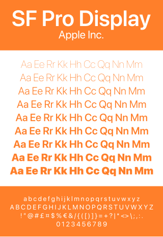
Apple Inc. uses a large variety of typefaces in its marketing, operating systems, and industrial design with each product cycle. These change throughout the years with Apple's change of style in their products. This is evident in the design and marketing of the company. The current logo is a white apple with a bite out of it, which was first utilized in 2013.

Myriad is a humanist sans-serif typeface designed by Robert Slimbach and Carol Twombly for Adobe Systems. Myriad was intended as a neutral, general-purpose typeface that could fulfill a range of uses and have a form easily expandable by computer-aided design to a large range of weights and widths.

Lucida Grande is a humanist sans-serif typeface. It is a member of the Lucida family of typefaces designed by Charles Bigelow and Kris Holmes. It is best known for its implementation throughout the macOS user interface from 1999 to 2014, as well as in other Apple software like Safari for Windows. As of OS X Yosemite, the system font was changed from Lucida Grande to Helvetica Neue. In OS X El Capitan the system font changed again, this time to San Francisco.

In metal typesetting, a font is a particular size, weight and style of a typeface. Each font is a matched set of type, with a piece for each glyph. A typeface consists of various fonts that share an overall design.

Syntax comprises a family of fonts designed by Swiss typeface designer Hans Eduard Meier. Originally just a sans-serif font, it was extended with additional serif designs.
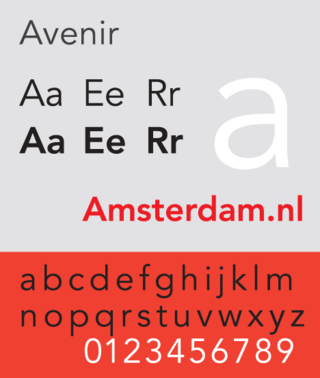
Avenir is a geometric sans-serif typeface designed by Adrian Frutiger in 1987 and released in 1988 by Linotype GmbH.

Droid is a font family first released in 2007 and created by Ascender Corporation for use by the Open Handset Alliance platform Android and licensed under the Apache License. The fonts are intended for use on the small screens of mobile handsets and were designed by Steve Matteson of Ascender Corporation. The name was derived from the Open Handset Alliance platform named Android.
San Francisco is a neo-grotesque typeface made by Apple Inc. It was first released to developers on November 18, 2014. It is the first new typeface designed at Apple in nearly twenty years and has been inspired by Helvetica and DIN.
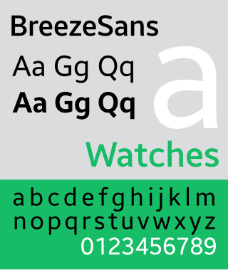
Breeze Sans is a humanist sans-serif typeface for the Latin, Greek, and Cyrillic writing systems designed by Dalton Maag for Samsung. It is the user interface font of the Tizen operating system and the Samsung Galaxy Watch.

The Stephenson Blake Grotesque fonts are a series of sans-serif typefaces created by the type foundry Stephenson Blake of Sheffield, England, mostly around the beginning of the twentieth century.
Arabic typography is the typography of letters, graphemes, characters or text in Arabic script, for example for writing Arabic, Persian, or Urdu. 16th century Arabic typography was a by-product of Latin typography with Syriac and Latin proportions and aesthetics. It lacked expertise in the three core aspects of Arabic writing: calligraphy, style and system. Calligraphy requires aesthetically skilled writing in a chosen canonical style such as naskh, nastaʿlīq or ruqʿah. System denotes the script grammar covering such rules as horizontality and stretching.
