The graphical user interface is a form of user interface that allows users to interact with electronic devices through graphical icons and audio indicator such as primary notation, instead of text-based user interfaces, typed command labels or text navigation. GUIs were introduced in reaction to the perceived steep learning curve of command-line interfaces (CLIs), which require commands to be typed on a computer keyboard.

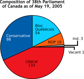
A chart is a graphical representation of data, in which "the data is represented by symbols, such as bars in a bar chart, lines in a line chart, or slices in a pie chart". A chart can represent tabular numeric data, functions or some kinds of quality structure and provides different info.

OpenDX stands for Open Data Explorer and is IBM's scientific data visualization software. It can handle complex domains along with measured or computed data. The data may be scalar, vector or tensor fields at different points of the object. The points at which data is measured don't have to be equally spaced, and not need to be homogeneously spaced. The project started in 1991 as Visualization Data Explorer.
Graphics are visual images or designs on some surface, such as a wall, canvas, screen, paper, or stone to inform, illustrate, or entertain. In contemporary usage, it includes a pictorial representation of data, as in c manufacture, in typesetting and the graphic arts, and in educational and recreational software. Images that are generated by a computer are called computer graphics.

A scatter plot is a type of plot or mathematical diagram using Cartesian coordinates to display values for typically two variables for a set of data. If the points are coded (color/shape/size), one additional variable can be displayed. The data are displayed as a collection of points, each having the value of one variable determining the position on the horizontal axis and the value of the other variable determining the position on the vertical axis.
In statistics, exploratory data analysis is an approach to analyzing data sets to summarize their main characteristics, often with visual methods. A statistical model can be used or not, but primarily EDA is for seeing what the data can tell us beyond the formal modeling or hypothesis testing task. Exploratory data analysis was promoted by John Tukey to encourage statisticians to explore the data, and possibly formulate hypotheses that could lead to new data collection and experiments. EDA is different from initial data analysis (IDA), which focuses more narrowly on checking assumptions required for model fitting and hypothesis testing, and handling missing values and making transformations of variables as needed. EDA encompasses IDA.
IDL, short for Interactive Data Language, is a programming language used for data analysis. It is popular in particular areas of science, such as astronomy, atmospheric physics and medical imaging. IDL shares a common syntax with PV-Wave and originated from the same codebase, though the languages have subsequently diverged in detail. There are also free or costless implementations, such as GNU Data Language (GDL) and Fawlty Language (FL).

Scientific visualization is an interdisciplinary branch of science concerned with the visualization of scientific phenomena. It is also considered a subset of computer graphics, a branch of computer science. The purpose of scientific visualization is to graphically illustrate scientific data to enable scientists to understand, illustrate, and glean insight from their data.

Infographics are graphic visual representations of information, data, or knowledge intended to present information quickly and clearly. They can improve cognition by utilizing graphics to enhance the human visual system's ability to see patterns and trends. Similar pursuits are information visualization, data visualization, statistical graphics, information design, or information architecture. Infographics have evolved in recent years to be for mass communication, and thus are designed with fewer assumptions about the readers' knowledge base than other types of visualizations. Isotypes are an early example of infographics conveying information quickly and easily to the masses.
PSTricks is a set of macros that allow the inclusion of PostScript drawings directly inside TeX or LaTeX code. It was originally written by Timothy Van Zandt and has been maintained in recent years by Denis Girou, Sebastian Rahtz and Herbert Voss (de).

Data visualization is an interdisciplinary field that deals with the graphic representation of data. It is a particularly efficient way of communicating when the data is numerous as for example a Time Series. From an academic point of view, this representation can be considered as a mapping between the original data and graphic elements. The mapping determines how the attributes of these elements vary according to the data. In this light, a bar chart is a mapping of the length of a bar to a magnitude of a variable. Since the graphic design of the mapping can adversely affect the readability of a chart, mapping is a core competency of Data visualization. Data visualization has its roots in the field of Statistics and is therefore generally considered a branch of Descriptive Statistics. However, because both design skills and statistical and computing skills are required to visualize effectively, it is argued by some authors that it is both an Art and a Science.

A heat map is a data visualization technique that shows magnitude of a phenomenon as color in two dimensions. The variation in color may be by hue or intensity, giving obvious visual cues to the reader about how the phenomenon is clustered or varies over space. There are two fundamentally different categories of heat maps: the cluster heat map and the spatial heat map. In a cluster heat map, magnitudes are laid out into a matrix of fixed cell size whose rows and columns are discrete phenomena and categories, and the sorting of rows and columns is intentional and somewhat arbitrary, with the goal of suggesting clusters or portraying them as discovered via statistical analysis. The size of the cell is arbitrary but large enough to be clearly visible. By contrast, the position of a magnitude in a spatial heat map is forced by the location of the magnitude in that space, and there is no notion of cells; the phenomenon is considered to vary continuously.
GGobi is a free statistical software tool for interactive data visualization. GGobi allows extensive exploration of the data with Interactive dynamic graphics. It is also a tool for looking at multivariate data. R can be used in sync with GGobi. The GGobi software can be embedded as a library in other programs and program packages using an application programming interface (API) or as an add-on to existing languages and scripting environments, e.g., with the R command line or from a Perl or Python scripts. GGobi prides itself on its ability to link multiple graphs together.
Statistical graphics, also known as graphical techniques, are graphics in the field of statistics used to visualize quantitative data.

A plot is a graphical technique for representing a data set, usually as a graph showing the relationship between two or more variables. The plot can be drawn by hand or by a computer. In the past, sometimes mechanical or electronic plotters were used. Graphs are a visual representation of the relationship between variables, which are very useful for humans who can then quickly derive an understanding which may not have come from lists of values. Given a scale or ruler, graphs can also be used to read off the value of an unknown variable plotted as a function of a known one, but this can also be done with data presented in tabular form. Graphs of functions are used in mathematics, sciences, engineering, technology, finance, and other areas.
Mondrian is a general-purpose statistical data-visualization system, for interactive data visualization. All plots in Mondrian are fully linked, and offer various interactions and queries. Any case selected in a plot in Mondrian is highlighted in all other plots.

A motion chart is a dynamic bubble chart which allows efficient and interactive exploration and visualization of longitudinal multivariate Data. Motion charts provide mechanisms for mapping ordinal, nominal and quantitative variables onto time, 2D coordinate axes, size, colors, glyphs and appearance characteristics, which facilitate the interactive display of multidimensional and temporal data.

ggplot2 is a data visualization package for the statistical programming language R. Created by Hadley Wickham in 2005, ggplot2 is an implementation of Leland Wilkinson's Grammar of Graphics—a general scheme for data visualization which breaks up graphs into semantic components such as scales and layers. ggplot2 can serve as a replacement for the base graphics in R and contains a number of defaults for web and print display of common scales. Since 2005, ggplot2 has grown in use to become one of the most popular R packages. It is licensed under GNU GPL v2.
Interactive Visual Analysis (IVA) is a set of techniques for combining the computational power of computers with the perceptive and cognitive capabilities of humans, in order to extract knowledge from large and complex datasets. The techniques rely heavily on user interaction and the human visual system, and exist in the intersection between visual analytics and big data. It is a branch of data visualization. IVA is a suitable technique for analyzing high-dimensional data that has a large number of data points, where simple graphing and non-interactive techniques give an insufficient understanding of the information.


