Thaitone

Last updated

Thaitone is a color scheme designed to follow colors used in traditional Thai art. It was compiled by Pairoj Pittayamatee, and is the result of ten years study about the traditional color making and using in Thailand art history for his master's and doctoral degrees at Silpakorn University. The identity of Thai color is a hundred percent made by natural ingredients, plants and minerals that can be found in Thailand. [1] The shade is soft and not too vivid. The problem is the color will not be exactly the same color in each time of making because it is the handmade product. To make the use of Thaitone color scheme universal, Professor Pairoj set the aim of the study to research and compare Thai's color scheme with CMYK color model by using Pantone color system and collected them as a database for everyone especially for Thai designers who can adapt the Thaitone color to use in design world nowadays. [2] Now (Jan 2017), there are 156 colors identified in CMYK color standard. [3] Thaitone color has become one of Thailand's cultural identities by reflecting the beauty, belief and characteristics of Thailand. [4]

Contents

Primary colors in Thaitone

Same as universal primary color standard, Thaitone primary color consists of red, yellow and blue. The colors are called, Chard (red), Rong (yellow) and Kraam (blue). [5] However, the tone of the color is not the same as the standard.

Chard

Chard is vermillion. [4] It is considered as the most important color in Thai art as the red color represents the auspicious thing and heaven in Thai belief. [3] [4]

Rong

Rong is gamboge tint. [4] The word rong is from Rong Thong tree (Gracinia Hanbury Hook) which is the tree that can be easily found along the seaside province of the Gulf of Thailand. [5]

Kraam

Kraam is indigo color from the color pigment of Indigo's stem and leaves. [4] Kraam could be considered as the most familiar Thaitone color for Thai people according to the color is very popular in traditional Thai's dyeing. [5]

Benjarong - Five primary colors in Thaitone

These five primary colors consist of the three of primary colors in Thaitone which are Chard, Rong, Kraam and other two colors are black and white. [4] Benjarong color was used popularly in traditional Thai's mural art and in Thai's traditional porcelain painting.

Ten groups of Thaitone

These ten groups of Thaitone colors consist of five primary colors (Benjarong) that are Chard, Rong, Kraam, black, white and other five colors which are created from the mixing between colors in Benjarong color groups that are orange, green, violet, brown and gold. [4]

Ingredients for making color in Thai's color making

[4] [6]

IngredientsColor
Adenanthera pavonina Red
Lac Red, purple-red
Sappan treeRed, orange
Red iron oxideDark red
Cinnabar Chard
Red lead Light red
Saffron Yellow
Gracinia hanbury hookRong
TurquoiseAqua
TurmericYellow
Green bronzeGreen
MalachiteVivid green
IndigoKraam
Yellow soilDark yellow
White leadIvory
Lapis lazuli Gold, white, blue

Thaitone color nowadays

The use of Thaitone color is now supported by Thailand's Ministry of Culture to promote Thailand's identity. [4] From the study of Professor Pairoj, he can identify 156 colors. He gave the Thai name to each color and used Pantone color analysing program to find the CMYK code so that it can be used worldwide. [3] There are new colors being discovered continuously so Professor Pairoj is still working on the project to identify more CMYK codes. He has also done the copyright for the name "THAITONE" even though the percentage of color ratio, color name, graphic of Thaitone color are allowed to use freely to be the reference of color in design work as long as the users give credit to THAITONE Color System.

Colors

Thaitone
ColorNameCMYKCode
Keabbuac5 m30 y10 k0T0060
Dangdokchabac5 m90 y80 k0T1170
Sangdadduadc10 m70 y70 k0T1550
Khayanc30 m90 y70 k20T1600
Daoroungc0 m30 y100 k0T3220
Srok-jangc30 m5 y35 k0T4272

Related Research Articles

<span class="mw-page-title-main">Cyan</span> Color visible between blue and green on the visible spectrum; subtractive (CMY) primary color

Cyan is the color between blue and green on the visible spectrum of light. It is evoked by light with a predominant wavelength between 490 and 520 nm, between the wavelengths of green and blue.

<span class="mw-page-title-main">CMYK color model</span> Subtractive color model, used in color printing

The CMYK color model is a subtractive color model, based on the CMY color model, used in color printing, and is also used to describe the printing process itself. The abbreviation CMYK refers to the four ink plates used: cyan, magenta, yellow, and key (black).

Pantone LLC is an American limited liability company headquartered in Carlstadt, New Jersey. The company is best known for its Pantone Matching System (PMS), a proprietary color space used in a variety of industries, notably graphic design, fashion design, product design, printing, and manufacturing and supporting the management of color from design to production, in physical and digital formats, among coated and uncoated materials, cotton, polyester, nylon and plastics.

<span class="mw-page-title-main">Flag of Thailand</span> National flag

The flag of Thailand shows five horizontal stripes in the colours red, white, blue, white and red, with the central blue stripe being twice as wide as each of the other four. The design was adopted on 28 September 1917, according to the royal decree issued by Rama VI. Since 2016, that day is a national day of importance in Thailand celebrating the flag.

<span class="mw-page-title-main">Gold (color)</span> Color

Gold, also called golden, is a color tone resembling the gold chemical element.

<span class="mw-page-title-main">Spot color</span> Type of ink or pigment used in printing

In offset printing, a spot color or solid color is any color generated by an ink that is printed using a single run, whereas a process color is produced by printing a series of dots of different colors.

Color printing or colour printing is the reproduction of an image or text in color.

<span class="mw-page-title-main">Lavender (color)</span> Light shade of purple derived from the lavender plant

Lavender is a light shade of purple or violet. It applies particularly to the color of the flower of the same name. The web color called lavender is displayed adjacent—it matches the color of the palest part of the lavender flower; however, the more saturated color shown as floral lavender more closely matches the average color of the lavender flower as shown in the picture and is the tone of lavender historically and traditionally considered lavender by the average person as opposed to those who are website designers. The color lavender might be described as a medium purple or a light pinkish-purple. The term lavender may be used in general to apply to a wide range of pale, light, or grayish-purples, but only on the blue side; lilac is pale purple on the pink side. In paints, the color lavender is made by mixing purple and white paint.

<span class="mw-page-title-main">Spectral color</span> Color evoked by a single wavelength of light in the visible spectrum

A spectral color is a color that is evoked by monochromatic light, i.e. either a spectral line with a single wavelength or frequency of light in the visible spectrum, or a relatively narrow spectral band. Every wave of visible light is perceived as a spectral color; when viewed as a continuous spectrum, these colors are seen as the familiar rainbow. Non-spectral colors are evoked by a combination of spectral colors.

<span class="mw-page-title-main">Spring green</span> Color

Spring green is a color that was traditionally considered to be on the yellow side of green, but in modern computer systems based on the RGB color model is halfway between cyan and green on the color wheel.

<span class="mw-page-title-main">Tertiary color</span> Color made by mixing either one primary color with one secondary color

A tertiary color or intermediate color is a color made by mixing one part of a primary color with half part of another primary, and none of any other primary color, in a given color space such as RGB, CMYK or RYB (traditional).

<span class="mw-page-title-main">Carolina blue</span> One of the official colors of the University of North Carolina

Carolina blue is the shade of blue used as one of the official school colors of the University of North Carolina. The name is derived from the popular usage of "Carolina" to refer to the university. For clarity in branding and marketing, UNC Creative has defined the color as Pantone 542 and declared that the CMYK representation is Cyan 60%, Magenta 19%, Yellow 1%, and Black 4%. This CMYK results in a Hex code of  #62C6F2 . However, the university has chosen the hex value of  #4B9CD3  as their web safe Carolina Blue due to contrast issues and Section 508 web requirements. None of the colors match the selected Pantone 542 which would be a hex value of  #6699C2 , RGB of (102,153,194), and a CMYK value of 47,21,0,24.

<span class="mw-page-title-main">Shades of green</span> Varieties of the color green

Varieties of the color green may differ in hue, chroma or lightness, or in two or three of these qualities. Variations in value are also called tints and shades, a tint being a green or other hue mixed with white, a shade being mixed with black. A large selection of these various colors is shown below.

<span class="mw-page-title-main">Shades of red</span> Varieties of the color red

Varieties of the color red may differ in hue, chroma or lightness, or in two or three of these qualities. Variations in value are also called tints and shades, a tint being a red or other hue mixed with white, a shade being mixed with black. A large selection of these various colors are shown below.

<span class="mw-page-title-main">Shades of magenta</span> Varieties of the color magenta

The color magenta has notable tints and shades. These various colors are shown below.

<span class="mw-page-title-main">Color space</span> Standard that defines a specific range of colors

A color space is a specific organization of colors. In combination with color profiling supported by various physical devices, it supports reproducible representations of color – whether such representation entails an analog or a digital representation. A color space may be arbitrary, i.e. with physically realized colors assigned to a set of physical color swatches with corresponding assigned color names, or structured with mathematical rigor. A "color space" is a useful conceptual tool for understanding the color capabilities of a particular device or digital file. When trying to reproduce color on another device, color spaces can show whether shadow/highlight detail and color saturation can be retained, and by how much either will be compromised.

<span class="mw-page-title-main">Shades of yellow</span> Overview about the shades of yellow

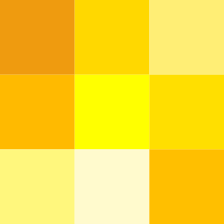
Varieties of the color yellow may differ in hue, chroma or lightness, or in two or three of these qualities. Variations in value are also called tints and shades, a tint being a yellow or other hue mixed with white, a shade being mixed with black. A large selection of these various colors is shown below.

<span class="mw-page-title-main">Shades of blue</span> Variety of the color blue

Varieties of the color blue may differ in hue, chroma, or lightness, or in two or three of these qualities. Variations in value are also called tints and shades, a tint being a blue or other hue mixed with white, a shade being mixed with black. A large selection of these colors are shown below.

<span class="mw-page-title-main">Shades of violet</span> Varieties of the color violet

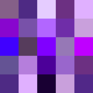
Violet is a color term derived from the flower of the same name. There are numerous variations of the color violet, a sampling of which are shown below.

References

  1. Pholdhampalit, Khetsirin (21 February 2016). "The true colours of Thailand". The Nation. Retrieved 21 March 2017.
  2. Room. "THAITONE โทนสีไทย โดย ไพโรจน์ พิทยเมธี", บ้านและสวน, 14 Jan 2016. Retrieved on 27 January 2017.
  3. 1 2 3 "ไทยโทน" เสน่ห์ของเฉดสีไทย 2017, television program, พิกัดข่าวเช้านี้ต้องรู้, NOW26, Bangkok, 27 January.
  4. 1 2 3 4 5 6 7 8 9 ศูนย์บันดาลไทย กระทรวงวัฒนธรรม. (2015). “สีไทยโทน” เสน่ห์ไทยเพิ่มมูลค่าธุรกิจ [PDF file]. กรุงเทพฯ: กระทรวงวัฒนธรรม. Retrieved from http://www.bundanthai.com/uploads/news/document/20151102150902hM2W6DC.pdf
  5. 1 2 3 กระเป๋าแฟชั่น. "THAITONE อัตลักษณ์ไทย สู่ Tropical Color", BLOG GALLERY Lifestyle, 25 July 2016. Retrieved on 27 January 2017.
  6. สีจากธรรมชาติ. (n.d.). Retrieved from http://fieldtrip.ipst.ac.th/intro_sub_content.php?content_id=28&content_folder_id=281