A market trend is a perceived tendency of the financial markets to move in a particular direction over time. Analysts classify these trends as secular for long time-frames, primary for medium time-frames, and secondary for short time-frames. Traders attempt to identify market trends using technical analysis, a framework which characterizes market trends as predictable price tendencies within the market when price reaches support and resistance levels, varying over time.
In finance, technical analysis is an analysis methodology for analysing and forecasting the direction of prices through the study of past market data, primarily price and volume. As a type of active management, it stands in contradiction to much of modern portfolio theory. The efficacy of technical analysis is disputed by the efficient-market hypothesis, which states that stock market prices are essentially unpredictable, and research on whether technical analysis offers any benefit has produced mixed results. It is distinguished from fundamental analysis, which considers a company's financial statements, health, and the overall state of the market and economy.

Day trading is a form of speculation in securities in which a trader buys and sells a financial instrument within the same trading day, so that all positions are closed before the market closes for the trading day to avoid unmanageable risks and negative price gaps between one day's close and the next day's price at the open. Traders who trade in this capacity are generally classified as speculators. Day trading contrasts with the long-term trades underlying buy-and-hold and value investing strategies. Day trading may require fast trade execution, sometimes as fast as milli-seconds in scalping, therefore direct-access day trading software is often needed.
The Elliott wave principle, or Elliott wave theory, is a form of technical analysis that helps financial traders analyze market cycles and forecast market trends by identifying extremes in investor psychology and price levels, such as highs and lows, by looking for patterns in prices. Ralph Nelson Elliott (1871–1948), an American accountant, developed a model for the underlying social principles of financial markets by studying their price movements, and developed a set of analytical tools in the 1930s. He proposed that market prices unfold in specific patterns, which practitioners today call Elliott waves, or simply waves. Elliott published his theory of market behavior in the book The Wave Principle in 1938, summarized it in a series of articles in Financial World magazine in 1939, and covered it most comprehensively in his final major work Nature's Laws: The Secret of the Universe in 1946. Elliott stated that "because man is subject to rhythmical procedure, calculations having to do with his activities can be projected far into the future with a justification and certainty heretofore unattainable".

In finance, a dead cat bounce is a small, brief recovery in the price of a declining stock. Derived from the idea that "even a dead cat will bounce if it falls from a great height", the phrase is also popularly applied to any case where a subject experiences a brief resurgence during or following a severe decline. This may also be known as a "sucker rally".
Point and figure (P&F) is a charting technique used in technical analysis. Point and figure charting does not plot price against time as time-based charts do. Instead it plots price against changes in direction by plotting a column of Xs as the price rises and a column of Os as the price falls.
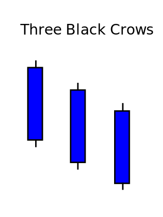
Three crows is a term used by stock market analysts to describe a market downturn. It appears on a candlestick chart in the financial markets. It unfolds across three trading sessions, and consists of three long candlesticks that trend downward like a staircase. Each candle should open below the previous day's open, ideally in the middle price range of that previous day. Each candlestick should also close progressively downward to establish a new near-term low. The pattern indicates a strong price reversal from a bull market to a bear market.
CAN SLIM is an acronym developed by the American investor William O'Neil, intended to represent the seven characteristics that top-performing stocks often share before making their biggest price gains.
On the technical analysis chart, the head and shoulders formation occurs when a market trend is in the process of reversal either from a bullish or bearish trend; a characteristic pattern takes shape and is recognized as reversal formation.
From the mid-1980s to September 2003, the inflation adjusted price of a barrel of crude oil on NYMEX was generally under $25/barrel. Then, during 2004, the price rose above $40, and then $60. A series of events led the price to exceed $60 by August 11, 2005, leading to a record-speed hike that reached $75 by the middle of 2006. Prices then dropped back to $60/barrel by the early part of 2007 before rising steeply again to $92/barrel by October 2007, and $99.29/barrel for December futures in New York on November 21, 2007. Throughout the first half of 2008, oil regularly reached record high prices. Prices on June 27, 2008, touched $141.71/barrel, for August delivery in the New York Mercantile Exchange, amid Libya's threat to cut output, and OPEC's president predicted prices may reach $170 by the Northern summer. The highest recorded price per barrel maximum of $147.02 was reached on July 11, 2008. After falling below $100 in the late summer of 2008, prices rose again in late September. On September 22, oil rose over $25 to $130 before settling again to $120.92, marking a record one-day gain of $16.37. Electronic crude oil trading was temporarily halted by NYMEX when the daily price rise limit of $10 was reached, but the limit was reset seconds later and trading resumed. By October 16, prices had fallen again to below $70, and on November 6 oil closed below $60. Then in 2009, prices went slightly higher, although not to the extent of the 2005–2007 crisis, exceeding $100 in 2011 and most of 2012. Since late 2013 the oil price has fallen below the $100 mark, plummeting below the $50 mark one year later.
On the technical analysis chart, a wedge pattern is a market trend commonly found in traded assets. The pattern is characterized by a contracting range in prices coupled with an upward trend in prices or a downward trend in prices.
The flag and pennant patterns are commonly found patterns in the price charts of financially traded assets. The patterns are characterized by a clear direction of the price trend, followed by a consolidation and rangebound movement, which is then followed by a resumption of the trend. They are continuation patterns and form when the asset prices rally or fall sharply.

The Morning Star is a pattern seen in a candlestick chart, a popular type of a chart used by technical analysts to anticipate or predict price action of a security, derivative, or currency over a short period of time.
Broadening top is technical analysis chart pattern describing trends of stocks, commodities, currencies, and other assets. Broadening Top formation appears much more frequently at tops than at bottoms. Its formation usually has bearish implications.
Triple top and triple bottom are reversal chart patterns used in the technical analysis of stocks, commodities, currencies, and other assets.
Double top and double bottom are reversal chart patterns observed in the technical analysis of financial trading markets of stocks, commodities, currencies, and other assets.

In both stock trading and financial technical analysis, an island reversal is a candlestick pattern with compact trading activity within a range of prices, separated from the move preceding it. A "candlestick pattern" is a movement in prices shown graphically on a candlestick chart. This separation shown on the chart, is said to be caused by an exhaustion gap and the subsequent move in the opposite direction occurs as a result of a breakaway gap.

Three white soldiers is a candlestick chart pattern in the financial markets. It unfolds across three trading sessions and represents a strong price reversal from a bear market to a bull market. The pattern consists of three long candlesticks that trend upward like a staircase; each should open above the previous day's open, ideally in the middle price range of that previous day. Each candlestick should also close progressively upward to establish a new near-term high.
An economic calendar is used by investors to monitor market-moving events, such as economic indicators and monetary policy decisions. Market-moving events, which are typically announced or released in a report, have a high probability of impacting the financial markets.

A Renko chart is a type of financial chart of Japanese origin used in technical analysis that measures and plots price changes. A renko chart consists of bricks, which proponents say more clearly show market trends and increase the signal-to-noise ratio compared to typical candlestick charts.
