In finance, technical analysis is an analysis methodology for analysing and forecasting the direction of prices through the study of past market data, primarily price and volume. As a type of active management, it stands in contradiction to much of modern portfolio theory. The efficacy of technical analysis is disputed by the efficient-market hypothesis, which states that stock market prices are essentially unpredictable, and research on whether technical analysis offers any benefit has produced mixed results. It is distinguished from fundamental analysis, which considers a company's financial statements, health, and the overall state of the market and economy.

In finance, a dead cat bounce is a small, brief recovery in the price of a declining stock. Derived from the idea that "even a dead cat will bounce if it falls from a great height", the phrase is also popularly applied to any case where a subject experiences a brief resurgence during or following a severe decline. This may also be known as a "sucker rally".
Stock valuation is the method of calculating theoretical values of companies and their stocks. The main use of these methods is to predict future market prices, or more generally, potential market prices, and thus to profit from price movement – stocks that are judged undervalued are bought, while stocks that are judged overvalued are sold, in the expectation that undervalued stocks will overall rise in value, while overvalued stocks will generally decrease in value. A target price is a price at which an analyst believes a stock to be fairly valued relative to its projected and historical earnings.
Financial risk management is the practice of protecting economic value in a firm by managing exposure to financial risk - principally operational risk, credit risk and market risk, with more specific variants as listed aside. As for risk management more generally, financial risk management requires identifying the sources of risk, measuring these, and crafting plans to mitigate them. See Finance § Risk management for an overview.
A chart pattern or price pattern is a pattern within a chart when prices are graphed. In stock and commodity markets trading, chart pattern studies play a large role during technical analysis. When data is plotted there is usually a pattern which naturally occurs and repeats over a period. Chart patterns are used as either reversal or continuation signals.

The Kagi chart is a chart used for tracking price movements and to make decisions on purchasing stock. It differs from traditional stock charts such as the Candlestick chart by being mostly independent of time. This feature aids in producing a chart that reduces random noise.

In financial markets, a pivot point is a price level that is used by traders as a possible indicator of market movement. A pivot point is calculated as an average of significant prices from the performance of a market in the prior trading period. If the market in the following period trades above the pivot point it is usually evaluated as a bullish sentiment, whereas trading below the pivot point is seen as bearish.

Financial statement analysis is the process of reviewing and analyzing a company's financial statements to make better economic decisions to earn income in future. These statements include the income statement, balance sheet, statement of cash flows, notes to accounts and a statement of changes in equity. Financial statement analysis is a method or process involving specific techniques for evaluating risks, performance, valuation, financial health, and future prospects of an organization.
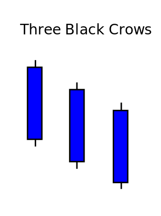
Three crows is a term used by stock market analysts to describe a market downturn. It appears on a candlestick chart in the financial markets. It unfolds across three trading sessions, and consists of three long candlesticks that trend downward like a staircase. Each candle should open below the previous day's open, ideally in the middle price range of that previous day. Each candlestick should also close progressively downward to establish a new near-term low. The pattern indicates a strong price reversal from a bull market to a bear market.
In technical analysis of securities trading, the stochastic oscillator is a momentum indicator that uses support and resistance levels. George Lane developed this indicator in the late 1950s. The term stochastic refers to the point of a current price in relation to its price range over a period of time. This method attempts to predict price turning points by comparing the closing price of a security to its price range.
On the technical analysis chart, the head and shoulders formation occurs when a market trend is in the process of reversal either from a bullish or bearish trend; a characteristic pattern takes shape and is recognized as reversal formation.

The Morning Star is a pattern seen in a candlestick chart, a popular type of a chart used by technical analysts to anticipate or predict price action of a security, derivative, or currency over a short period of time.
Broadening top is technical analysis chart pattern describing trends of stocks, commodities, currencies, and other assets. Broadening Top formation appears much more frequently at tops than at bottoms. Its formation usually has bearish implications.
Triple top and triple bottom are reversal chart patterns used in the technical analysis of stocks, commodities, currencies, and other assets.

In both stock trading and financial technical analysis, an island reversal is a candlestick pattern with compact trading activity within a range of prices, separated from the move preceding it. A "candlestick pattern" is a movement in prices shown graphically on a candlestick chart. This separation shown on the chart, is said to be caused by an exhaustion gap and the subsequent move in the opposite direction occurs as a result of a breakaway gap.

Ichimoku Kinko Hyo (IKH) (Japanese: 一目均衡表, Hepburn: Ichimoku Kinkō Hyō), usually shortened to "Ichimoku", is a technical analysis method that builds on candlestick charting to improve the accuracy of forecast price moves.

Three white soldiers is a candlestick chart pattern in the financial markets. It unfolds across three trading sessions and represents a strong price reversal from a bear market to a bull market. The pattern consists of three long candlesticks that trend upward like a staircase; each should open above the previous day's open, ideally in the middle price range of that previous day. Each candlestick should also close progressively upward to establish a new near-term high.
Price action is a method of analysis of the basic price movements to generate trade entry and exit signals that is considered reliable while not requiring the use of indicators. It is a form of technical analysis, as it ignores the fundamental factors of a security and looks primarily at the security's price history. However, this method is different from other forms of technical analysis, as it focuses on the relation of the security's current price to its price history, which consists of all price movements, as opposed to values derived from the price history.

A Renko chart is a type of financial chart of Japanese origin used in technical analysis that measures and plots price changes. A renko chart consists of bricks, which proponents say more clearly show market trends and increase the signal-to-noise ratio compared to typical candlestick charts.

Volume Analysis is an example of a type of technical analysis that examines the volume of traded securities to confirm and predict price trends. Volume is a measure of the number of shares of an asset that are traded in a given period of time. As one of the oldest market indicators used for analysis, sudden changes in volume are often the result of news-related events. Commonly used by chartists and technical analysts, volume analysis is centered on the following ideas:
