A computer mouse is a hand-held pointing device that detects two-dimensional motion relative to a surface. This motion is typically translated into the motion of the pointer on a display, which allows a smooth control of the graphical user interface of a computer.

A context menu is a menu in a graphical user interface (GUI) that appears upon user interaction, such as a right-click mouse operation. A context menu offers a limited set of choices that are available in the current state, or context, of the operating system or application to which the menu belongs. Usually the available choices are actions related to the selected object. From a technical point of view, such a context menu is a graphical control element.
A widget toolkit, widget library, GUI toolkit, or UX library is a library or a collection of libraries containing a set of graphical control elements used to construct the graphical user interface (GUI) of programs.

Swing is a GUI widget toolkit for Java. It is part of Oracle's Java Foundation Classes (JFC) – an API for providing a graphical user interface (GUI) for Java programs.
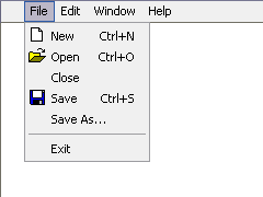
In user interface design, a menu is a list of options presented to the user.

A checkbox is a graphical widget that allows the user to make a binary choice, i.e. a choice between one of two possible mutually exclusive options. For example, the user may have to answer 'yes' (checked) or 'no' on a simple yes/no question.
The taskbar is a graphical user interface element that has been part of Microsoft Windows since Windows 95, displaying and facilitating switching between running programs. The taskbar and the associated Start Menu were created and named in 1993 by Daniel Oran, a program manager at Microsoft who had previously collaborated on great ape language research with the behavioral psychologist B.F. Skinner at Harvard.

Aqua is the graphical user interface, design language and visual theme of Apple's macOS and iOS operating systems. It was originally based on the theme of water, with droplet-like components and a liberal use of reflection effects and translucency. Its goal is to "incorporate color, depth, translucence, and complex textures into a visually appealing interface" in macOS applications. At its introduction, Steve Jobs noted that "... it's liquid, one of the design goals was when you saw it you wanted to lick it".

Code or text folding, or less commonly holophrasting, is a feature of some graphical user interfaces that allows the user to selectively hide ("fold") or display ("unfold") parts of a document. This allows the user to manage large amounts of text while viewing only those subsections that are currently of interest. It is typically used with documents which have a natural tree structure consisting of nested elements. Other names for these features include expand and collapse, code hiding, and outlining. In Microsoft Word, the feature is called "collapsible outlining".
A graphical widget in a graphical user interface is an element of interaction, such as a button or a scroll bar. Controls are software components that a computer user interacts with through direct manipulation to read or edit information about an application. User interface libraries such as Windows Presentation Foundation, Qt, GTK, and Cocoa, contain a collection of controls and the logic to render these.
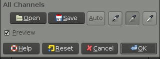
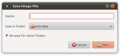
In computing, a button is a graphical control element that provides the user a simple way to trigger an event, like searching for a query at a search engine, or to interact with dialog boxes, like confirming an action.
Progressive disclosure is an interaction design pattern used to make applications easier to learn and less error-prone. It does so by deferring some advanced or rarely-used features to a secondary screen and designing workflows where information is revealed when it becomes relevant to the current task.

GNOME Terminal is a terminal emulator for the GNOME desktop environment written by Havoc Pennington and others. Terminal emulators allow users to access a UNIX shell while remaining on their graphical desktop.

Tkinter is a Python binding to the Tk GUI toolkit. It is the standard Python interface to the Tk GUI toolkit, and is Python's de facto standard GUI. Tkinter is included with standard Linux, Microsoft Windows and macOS installs of Python.
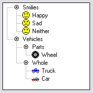
A tree view is a graphical widget within a graphical user interface (GUI) in which users can navigate and interact intuitively with concise, hierarchical data presented as nodes in a tree-like format. It can also be called an outline view.
A compositing manager, or compositor, is software that provides applications with an off-screen buffer for each window. The compositing manager composites the window buffers into an image representing the screen and writes the result into the display memory. A compositing window manager is a window manager that is also a compositing manager.
The Windows shell is the graphical user interface for the Microsoft Windows operating system. Its readily identifiable elements consist of the desktop, the taskbar, the Start menu, the task switcher and the AutoPlay feature. On some versions of Windows, it also includes Flip 3D and the charms. In Windows 10, the Windows Shell Experience Host interface drives visuals like the Start Menu, Action Center, Taskbar, and Task View/Timeline. However, the Windows shell also implements a shell namespace that enables computer programs running on Windows to access the computer's resources via the hierarchy of shell objects. "Desktop" is the top object of the hierarchy; below it there are a number of files and folders stored on the disk, as well as a number of special folders whose contents are either virtual or dynamically created. Recycle Bin, Libraries, Control Panel, This PC and Network are examples of such shell objects.
A software widget is a relatively simple and easy-to-use software application or component made for one or more different software platforms.

The hamburger button, so named for its unintentional resemblance to a hamburger, is a button typically placed in a top corner of a graphical user interface. Its function is to toggle a menu or navigation bar between being collapsed behind the button or displayed on the screen. The icon which is associated with this widget, consisting of three horizontal bars, is also known as the collapsed menu icon.