A widget toolkit, widget library, GUI toolkit, or UX library is a library or a collection of libraries containing a set of graphical control elements used to construct the graphical user interface (GUI) of programs.
In user interface design, a modal window is a graphical control element subordinate to an application's main window.
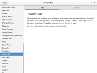
A graphical widget in a graphical user interface is an element of interaction, such as a button or a scroll bar. Controls are software components that a computer user interacts with through direct manipulation to read or edit information about an application. User interface libraries such as Windows Presentation Foundation, Qt, GTK, and Cocoa, contain a collection of controls and the logic to render these.

In computing, a file dialog is a dialog box-type graphical control element that allows users to choose a file from the file system. They differ from file managers as they are not intended for file management, although some offer simple operations such as folder creation and renaming. Rather they are intended for the opening and saving of files.
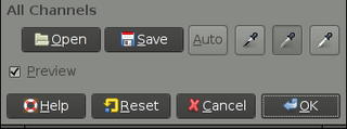
In computing, a button is a graphical control element that provides the user a simple way to trigger an event, like searching for a query at a search engine, or to interact with dialog boxes, like confirming an action.
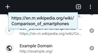
The tooltip, also known as infotip or hint, is a common graphical user interface (GUI) element in which, when hovering over a screen element or component, a text box displays information about that element, such as a description of a button's function, what an abbreviation stands for, or the exact absolute time stamp over a relative time. In common practice, the tooltip is displayed continuously as long as the user hovers over the element or the text box provided by the tool. It is sometimes possible for the mouse to hover within the text box provided to activate a nested tooltip, and this can continue to any depth, often with multiple text boxes overlapped.

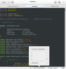
A graphical user interface builder, also known as GUI designer or sometimes RAD IDE, is a software development tool that simplifies the creation of GUIs by allowing the designer to arrange graphical control elements using a drag-and-drop WYSIWYG editor. Without a GUI builder, a GUI must be built by manually specifying each widget's parameters in the source code, with no visual feedback until the program is run. Such tools are usually called the term RAD IDE.
A user interface markup language is a markup language that renders and describes graphical user interfaces and controls. Many of these markup languages are dialects of XML and are dependent upon a pre-existing scripting language engine, usually a JavaScript engine, for rendering of controls and extra scriptability.

A grid view or a datagrid is a graphical control element that presents a tabular view of data. A typical grid view also supports some or all of the following:
gtkmm is the official C++ interface for the popular GUI library GTK. gtkmm is free software distributed under the GNU Lesser General Public License (LGPL).

In software engineering, a class diagram in the Unified Modeling Language (UML) is a type of static structure diagram that describes the structure of a system by showing the system's classes, their attributes, operations, and the relationships among objects.
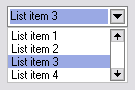
A drop-down list (DDL), drop-down menu or just drop-down – also known as a drop menu, pull-down list, picklist – is a graphical control element, similar to a list box, that allows the user to choose one value from a list either by clicking or hovering over the menu. When a drop-down list is inactive, it displays a single value. When activated, it displays a list of values, from which the user may select one. When the user selects a new value, the control reverts to its inactive state, displaying the selected value. It is often used in the design of graphical user interfaces, including web design.
Resolution independence is where elements on a computer screen are rendered at sizes independent from the pixel grid, resulting in a graphical user interface that is displayed at a consistent physical size, regardless of the resolution of the screen.
The IUP Portable User Interface is a computer software development kit that provides a portable, scriptable toolkit to build graphical user interfaces (GUIs) using the programming languages C, Perl, Lua, Nim and Zig, among others. This allows rapid, zero-compile prototyping and refinement of deployable GUI applications.
The graphical control element inspector window is a type of dialog window that shows a list of the current attributes of a selected object and allows these parameters to be changed on the fly. A common use is in Integrated Development Environments, where the window shows the changing values of variables associated to an object during a debugging session.

Hildon is an application framework originally developed for mobile devices running the Linux operating system as well as the Symbian operating system. The Symbian variant of Hildon was discontinued with the cancellation of Series 90. It was developed by Nokia for the Maemo operating system. It focuses on providing a finger-friendly interface. It is primarily a set of GTK extensions that provide mobile-device–oriented functionality, but also provides a desktop environment that includes a task navigator for opening and switching between programs, a control panel for user settings, and status bar, task bar and home applets. It is standard on the Maemo platform used by the Nokia Internet Tablets and the Nokia N900 smartphone.
In computer science and visualization, a canvas is a container that holds various drawing elements. It takes its name from the canvas used in visual arts. It is sometimes called a scene graph because it arranges the logical representation of a user interface or graphical scene. Some implementations also define the spatial representation and allow the user to interact with the elements via a graphical user interface.

GTK Scene Graph Kit (GSK) is the rendering and scene graph API for GTK introduced with version 3.90. GSK lies between the graphical control elements (widgets) and the rendering.
Client-side decoration (CSD) is the concept of allowing a graphical application software to be responsible for drawing its own window decorations, historically the responsibility of the window manager.