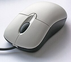
In the field of computing and web design, a mouseover, is an event occurring when the user moves the cursor over a specified point on a computer monitor using a computer mouse. Also called a hover effect, mouseovers are graphical controls that respond when a user moves their mouse pointer over a designated area. This area can be a button, image, or hyperlink. This simple action can trigger different responses. The element's color or appearance can change. Additional information or interactive content can be displayed. The mouseover effect is an essential part of user interaction. It adds layers of interactivity and responsiveness to websites and applications. [1] [2]
A mouseover is essentially an event that occurs when a user hovers their mouse pointer over a specific area on a digital interface. The user does not need to click or do any other input. Just placing the pointer over the element is enough to trigger the effect. In technical terms, a mouseover is an event. Web developers can use this event to create dynamic, responsive web experiences. Using HTML, CSS, and JavaScript, designers can define what happens when a user hovers over an element. This could be a visual change, displaying additional content, or even activating complex animations. [3]
Mouseover effects are important for improving user interface (UI) and user experience (UX) design. They provide immediate visual feedback to users, indicating that an element is interactive and can be engaged with. This feedback helps guide users through a website or application, letting them know which elements are clickable or interactive without having to click first. From a UX perspective, mouseover effects contribute to a more intuitive and engaging experience. They make interfaces feel more dynamic and responsive, which can lead to higher user satisfaction and better overall interaction with the site. For example, a button that changes color when hovered over feels more alive and interactive than a static one, encouraging users to click and explore further. Mouseover effects can also be used to reveal additional information without cluttering the interface. For instance, tooltips—small text boxes that appear when hovering over an element—can provide helpful hints, definitions, or additional context without taking up permanent space on the screen. This ability to present information on demand is especially valuable in complex interfaces, where screen real estate is limited. [4]
Mouseover effects are often used in web design. They are created using HTML and CSS. These technologies make it easy and efficient to make web elements more interactive and responsive. One of the key tools for creating mouseover effects in CSS is the :hover
pseudo-class.
The :hover pseudo-class in CSS allows developers to define the styles that should be applied to an element. The styles are applied when the user hovers their mouse pointer over the element. Unlike static CSS properties, the :hover pseudo-class targets an element only when a specific condition (hovering) is met. The styles are not applied at all times. The :hover pseudo-class can be applied to almost any HTML element. This includes text, images, buttons, and links. By using :hover, the appearance of these elements change dynamically. This creates a more engaging and interactive user experience. For example, :hover can be used to change the background color of a button when a user hovers over the button. Another example is to add a shadow to an image when it's hovered over. The possibilities with :hover are vast, and the implementation is simple. [5]
1. Changing background color on hover:
<!DOCTYPE html><htmllang="en"><head><metacharset="UTF-8"><metaname="viewport"content="width=device-width, initial-scale=1.0"><title>Hover Background Color</title><style>.hover-button{background-color:blue;color:white;padding:10px20px;border:none;cursor:pointer;transition:background-color0.3sease;}.hover-button:hover{background-color:green;}</style></head><body><buttonclass="hover-button">Hover Me</button></body></html>
2. Changing text color on hover:
<!DOCTYPE html><htmllang="en"><head><metacharset="UTF-8"><metaname="viewport"content="width=device-width, initial-scale=1.0"><title>Hover Text Color</title><style>.hover-text{color:black;font-size:18px;text-decoration:none;transition:color0.3sease;}.hover-text:hover{color:red;}</style></head><body><ahref="#"class="hover-text">Hover over this text</a></body></html>
3. Adding shadow on hover
<!DOCTYPE html><htmllang="en"><head><metacharset="UTF-8"><metaname="viewport"content="width=device-width, initial-scale=1.0"><title>Hover Shadow</title><style>.hover-box{width:200px;height:200px;background-color:lightblue;margin:50px;transition:box-shadow0.3sease;}.hover-box:hover{box-shadow:0015pxrgba(0,0,0,0.5);}</style></head><body><divclass="hover-box"></div></body></html>
CSS is good for making simple and effective hover effects. JavaScript allows more complex and dynamic behaviors when a user hovers over an element. JavaScript can control exactly what happens when a mouseover event occurs. This includes displaying tooltips, changing content, or triggering animations and transitions that are beyond what CSS can do. This is done using event listeners, particularly onmouseover
and onmouseout
.
Event listeners: onmouseover
and onmouseout
JavaScript event listeners help developers run code when specific events happen. The onmouseover event listener runs code when a user's mouse pointer enters an element. The onmouseout event listener runs code when the mouse pointer leaves that element. These events can be added to HTML elements to make very interactive web pages.
onmouseover
: Triggers a function when the mouse pointer enters an element.onmouseout
: Triggers a function when the mouse pointer leaves an element. [6] 1. Displaying a tooltip on hover
<!DOCTYPE html><htmllang="en"><head><metacharset="UTF-8"><metaname="viewport"content="width=device-width, initial-scale=1.0"><title>Tooltip on Hover</title><style>.tooltip{display:none;position:absolute;background-color:black;color:white;padding:5px;border-radius:3px;font-size:12px;}</style></head><body><divid="hover-element"style="display:inline-block; padding:10px; background-color:lightblue; cursor:pointer;"> Hover over me </div><divid="tooltip"class="tooltip">This is a tooltip!</div><script>consthoverElement=document.getElementById('hover-element');consttooltip=document.getElementById('tooltip');hoverElement.addEventListener('mouseover',function(event){tooltip.style.display='block';tooltip.style.left=event.pageX+10+'px';tooltip.style.top=event.pageY+10+'px';});hoverElement.addEventListener('mouseout',function(){tooltip.style.display='none';});hoverElement.addEventListener('mousemove',function(event){tooltip.style.left=event.pageX+10+'px';tooltip.style.top=event.pageY+10+'px';});</script></body></html>
2. Changing content dynamically on hover
<!DOCTYPE html><htmllang="en"><head><metacharset="UTF-8"><metaname="viewport"content="width=device-width, initial-scale=1.0"><title>Dynamic Content Change</title><style>#hover-box{width:300px;height:200px;background-color:lightcoral;text-align:center;line-height:200px;font-size:20px;color:white;cursor:pointer;transition:background-color0.3sease;}</style></head><body><divid="hover-box">Hover over me</div><script>consthoverBox=document.getElementById('hover-box');hoverBox.addEventListener('mouseover',function(){hoverBox.style.backgroundColor='darkslateblue';hoverBox.textContent='You are hovering!';});hoverBox.addEventListener('mouseout',function(){hoverBox.style.backgroundColor='lightcoral';hoverBox.textContent='Hover over me';});</script></body></html>
Mouseover effects are important to modern web design. They improve interactivity and user engagement in different ways. These effects allow designers to provide more information, improve navigation, and create visually appealing experiences without overwhelming users. I will now examine some of the most common uses of mouseover effects in web design.
Tooltips are small, informative pop-ups. They appear when a user hovers over an element. The elements can be icons, buttons, or text. The primary purpose of tooltips is to provide additional information or context. This helps avoid cluttering the interface. Tooltips are an excellent solution. They can deliver helpful hints, explanations, or details. These details might be too cumbersome to display directly on the page. For example, in a complex web application. It has numerous icons or buttons. Tooltips can explain the function of each element. This reduces the learning curve for new users. Tooltips only appear when needed. This keeps the interface clean and focused. Users can access extra information on demand. Tooltips are commonly found in forms. They can offer guidance on how to fill out specific fields. For instance, hovering over a question mark icon next to a form field. A tooltip could display an explanation. It could explain what information is required or provide an example of valid input.
Example:
Tooltips provide additional information when users hover over elements. Here is a simple example using HTML, CSS, and JavaScript.
<!DOCTYPE html><htmllang="en"><head><metacharset="UTF-8"><metaname="viewport"content="width=device-width, initial-scale=1.0"><title>Tooltip Example</title><style>.tooltip{position:relative;display:inline-block;cursor:pointer;}.tooltip.tooltip-text{visibility:hidden;width:120px;background-color:black;color:#fff;text-align:center;border-radius:5px;padding:5px;position:absolute;z-index:1;bottom:125%;/* Position the tooltip above the text */left:50%;margin-left:-60px;opacity:0;transition:opacity0.3s;}.tooltip:hover.tooltip-text{visibility:visible;opacity:1;}</style></head><body><divclass="tooltip">Hover over me <divclass="tooltip-text">Tooltip text</div></div></body></html>
Navigation menus are a crucial part of any website. They guide users to different sections or pages. Mouseover effects play an important role in enhancing the usability and functionality of navigation menus. This is particularly true for dropdown menus. A dropdown menu is a type of navigation menu. It reveals additional links or options when a user hovers over a main menu item. This allows users to explore subcategories or related pages without needing to click. This makes the navigation process smoother and more efficient. Mouseover effects in dropdown menus improve the overall user experience. They provide instant visual feedback. For example, when a user hovers over a menu item, the background color might change. Or an arrow might appear, indicating that more options are available. This makes it clear to the user that the item is interactive and will reveal further choices. Dropdown menus can be particularly useful on websites with a large amount of content. This includes e-commerce sites, where organizing products into categories and subcategories is essential for easy navigation.
Example:
Dropdown navigation menus are a common use of mouseover effects. Here is an example:
<!DOCTYPE html><htmllang="en"><head><metacharset="UTF-8"><metaname="viewport"content="width=device-width, initial-scale=1.0"><title>Dropdown Menu Example</title><style>ul{list-style-type:none;margin:0;padding:0;overflow:hidden;background-color:#333;}li{float:left;}lia,.dropdown-btn{display:inline-block;color:white;text-align:center;padding:14px16px;text-decoration:none;}lia:hover,.dropdown:hover.dropdown-btn{background-color:#111;}li.dropdown{display:inline-block;}.dropdown-content{display:none;position:absolute;background-color:#f9f9f9;min-width:160px;box-shadow:0px8px16px0pxrgba(0,0,0,0.2);z-index:1;}.dropdown-contenta{color:black;padding:12px16px;text-decoration:none;display:block;text-align:left;}.dropdown-contenta:hover{background-color:#f1f1f1;}.dropdown:hover.dropdown-content{display:block;}</style></head><body><ul><li><ahref="#home">Home</a></li><liclass="dropdown"><ahref="#"class="dropdown-btn">Dropdown</a><divclass="dropdown-content"><ahref="#link1">Link 1</a><ahref="#link2">Link 2</a><ahref="#link3">Link 3</a></div></li></ul></body></html>
Image galleries are a popular feature on many websites. They are often used in portfolios, e-commerce sites, and photography blogs. Mouseover effects can improve the user experience in image galleries. These effects add interactive elements. They engage users and encourage them to explore more content. One common use of mouseover in image galleries is the zoom effect. When a user hovers over a thumbnail or image, the image might zoom in slightly. This gives the user a closer look at the details. This effect can be particularly useful in product galleries. Users want to inspect the quality or features of an item before making a purchase. Another use of mouseover in image galleries is to display additional information or previews. For example, hovering over an image could reveal the image's title, description, or even a short animation. This can make the gallery more informative and interactive. It offers users a richer experience. Mouseover effects can also be used to create slideshow-like transitions. Hovering over an image can change it to another version or angle. This gives users a dynamic view of the content without requiring clicks.
Example:
Mouseover effects can enhance image galleries, for example, by zooming in on an image when hovered.
<!DOCTYPE html><htmllang="en"><head><metacharset="UTF-8"><metaname="viewport"content="width=device-width, initial-scale=1.0"><title>Image Gallery Zoom Example</title><style>.gallery{display:flex;justify-content:space-around;flex-wrap:wrap;}.galleryimg{width:300px;height:200px;transition:transform0.3sease;}.galleryimg:hover{transform:scale(1.1);}</style></head><body><divclass="gallery"><imgsrc="https://via.placeholder.com/300x200"alt="Sample Image 1"><imgsrc="https://via.placeholder.com/300x200"alt="Sample Image 2"><imgsrc="https://via.placeholder.com/300x200"alt="Sample Image 3"></div></body></html>
Buttons are essential in web design. They allow users to take actions like submitting forms, making purchases, or navigating to different pages. Using mouseover effects on buttons can make them more interactive and responsive. This enhances the overall user experience. When a user hovers over a button, the button's appearance changes. For example, the color may change, a shadow may be added, or the button may become slightly larger. This visual feedback tells the user that the button is active and ready to be clicked. This feedback is crucial for usability. It shows users which elements are interactive and encourages them to engage with the buttons. Buttons with mouseover effects also add sophistication to the design. For instance, a subtle animation that makes the button "lift" or "glow" when hovered over can make the website feel more dynamic and polished. Beyond visual effects, buttons can trigger other actions on hover. These actions can include displaying a tooltip with additional information, revealing hidden content, or playing a short animation or sound effect. These enhancements can make the interactions more enjoyable and intuitive.
Example: Mouseover effects can make buttons more interactive by changing their appearance dynamically.
<!DOCTYPE html><htmllang="en"><head><metacharset="UTF-8"><metaname="viewport"content="width=device-width, initial-scale=1.0"><title>Interactive Button Example</title><style>.interactive-button{background-color:#008CBA;border:none;color:white;padding:15px32px;text-align:center;text-decoration:none;display:inline-block;font-size:16px;margin:4px2px;transition:background-color0.3sease,transform0.3sease;cursor:pointer;}.interactive-button:hover{background-color:#005f73;transform:translateY(-3px);}</style></head><body><buttonclass="interactive-button">Hover Over Me</button></body></html>
Dynamic HTML, or DHTML, is a term which was used by some browser vendors to describe the combination of HTML, style sheets and client-side scripts that enabled the creation of interactive and animated documents. The application of DHTML was introduced by Microsoft with the release of Internet Explorer 4 in 1997.
Hypertext Markup Language (HTML) is the standard markup language for documents designed to be displayed in a web browser. It defines the content and structure of web content. It is often assisted by technologies such as Cascading Style Sheets (CSS) and scripting languages such as JavaScript.
deepcat:"Wikipedia guidelines"
A graphical widget in a graphical user interface is an element of interaction, such as a button or a scroll bar. Controls are software components that a computer user interacts with through direct manipulation to read or edit information about an application. User interface libraries such as Windows Presentation Foundation, Qt, GTK, and Cocoa, contain a collection of controls and the logic to render these.
In computing, a button is a graphical control element that provides the user a simple way to trigger an event, like searching for a query at a search engine, or to interact with dialog boxes, like confirming an action.
The tooltip, also known as infotip or hint, is a common graphical user interface (GUI) element in which, when hovering over a screen element or component, a text box displays information about that element, such as a description of a button's function, what an abbreviation stands for, or the exact absolute time stamp over a relative time. In common practice, the tooltip is displayed continuously as long as the user hovers over the element or the text box provided by the tool. It is sometimes possible for the mouse to hover within the text box provided to activate a nested tooltip, and this can continue to any depth, often with multiple text boxes overlapped.
The data URI scheme is a uniform resource identifier (URI) scheme that provides a way to include data in-line in Web pages as if they were external resources. It is a form of file literal or here document. This technique allows normally separate elements such as images and style sheets to be fetched in a single Hypertext Transfer Protocol (HTTP) request, which may be more efficient than multiple HTTP requests, and used by several browser extensions to package images as well as other multimedia content in a single HTML file for page saving. As of 2024, data URIs are fully supported by all major browsers.
DOM Events are a signal that something has occurred, or is occurring, and can be triggered by user interactions or by the browser. Client-side scripting languages like JavaScript, JScript, VBScript, and Java can register various event handlers or listeners on the element nodes inside a DOM tree, such as in HTML, XHTML, XUL, and SVG documents.
In human–computer interaction, a cursor is an indicator used to show the current position on a computer monitor or other display device that will respond to input, such as a text cursor or a mouse pointer.
The marquee tag is a non-standard HTML element which causes text to scroll up, down, left or right automatically. The tag was first introduced in early versions of Microsoft's Internet Explorer, and was compared to Netscape's blink element, as a proprietary non-standard extension to the HTML standard with usability problems. The W3C advises against its use in HTML documents.
The Yahoo! User Interface Library (YUI) is a discontinued open-source JavaScript library for building richly interactive web applications using techniques such as Ajax, DHTML, and DOM scripting. YUI includes several cores CSS resources. It is available under a BSD License. Development on YUI began in 2005 and Yahoo! properties such as My Yahoo! and the Yahoo! front page began using YUI in the summer of that year. YUI was released for public use in February 2006. It was actively developed by a core team of Yahoo! engineers.
Haml is a templating system that is designed to avoid writing inline code in a web document and make the HTML cleaner. Similar to other template systems like eRuby, Haml also embeds some code that gets executed during runtime and generates HTML code in order to provide some dynamic content. In order to run Haml code, files need to have a .haml extension. These files are similar to .erb or .eRuby files, which also help embed Ruby code while developing a web application.
EPUB is an e-book file format that uses the ".epub" file extension. The term is short for electronic publication and is sometimes stylized as ePUB. EPUB is supported by many e-readers, and compatible software is available for most smartphones, tablets, and computers. EPUB is a technical standard published by the International Digital Publishing Forum (IDPF). It became an official standard of the IDPF in September 2007, superseding the older Open eBook (OEB) standard.
Cascading Style Sheets (CSS) is a style sheet language used for specifying the presentation and styling of a document written in a markup language such as HTML or XML. CSS is a cornerstone technology of the World Wide Web, alongside HTML and JavaScript.
XFrames was an XML format draft for embedding HTML pages into one page which handles the layout without the problems of HTML Frames. This technique has been especially popular for navigation bars. While HTML Frames are still supported for legacy websites, today websites combine the page on the server instead.
A hoverbox is a popup window that is neither a tooltip nor a traditional popup, but is a popup that appears when the mouse is placed over an icon on the screen for a short period of time, without clicking. The hoverbox provides a web annotation tool which allows the reader of a web page to preview information outside of that webpage.
HTML attributes are special words used inside the opening tag to control the element's behaviour. HTML attributes are a modifier of a HTML element type. An attribute either modifies the default functionality of an element type or provides functionality to certain element types unable to function correctly without them. In HTML syntax, an attribute is added to a HTML start tag.
XHTML+RDFa is an extended version of the XHTML markup language for supporting RDF through a collection of attributes and processing rules in the form of well-formed XML documents. XHTML+RDFa is one of the techniques used to develop Semantic Web content by embedding rich semantic markup. Version 1.1 of the language is a superset of XHTML 1.1, integrating the attributes according to RDFa Core 1.1. In other words, it is an RDFa support through XHTML Modularization.
Web navigation refers to the process of navigating a network of information resources in the World Wide Web, which is organized as hypertext or hypermedia. The user interface that is used to do so is called a web browser.
jQuery Mobile is a touch-optimized web framework, specifically a JavaScript library, developed by the jQuery project team. The development focuses on creating a framework compatible with many smartphones and tablet computers, made necessary by the growing but heterogeneous tablet and smartphone market. The jQuery Mobile framework is consistent with other mobile app frameworks and platforms such as PhoneGap, Worklight, etc.
Media related to Mouse hovering at Wikimedia Commons