XUL, which stands for XML User Interface Language, is a user interface markup language developed by Mozilla. XUL is an XML dialect for writing graphical user interfaces, enabling developers to write user interface elements in a manner similar to web pages.
In computing, a window is a graphical control element. It consists of a visual area containing some of the graphical user interface of the program it belongs to and is framed by a window decoration. It usually has a rectangular shape that can overlap with the area of other windows. It displays the output of and may allow input to one or more processes.
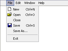
In user interface design, a menu is a list of options presented to the user.

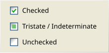
A radio button or option button is a graphical control element that allows the user to choose only one of a predefined set of mutually exclusive options. The singular property of a radio button makes it distinct from checkboxes, where the user can select and unselect any number of items.
In computer graphical user interfaces, drag and drop is a pointing device gesture in which the user selects a virtual object by "grabbing" it and dragging it to a different location or onto another virtual object. In general, it can be used to invoke many kinds of actions, or create various types of associations between two abstract objects.

File Explorer, previously known as Windows Explorer, is a file manager application and default desktop environment that is included with releases of the Microsoft Windows operating system from Windows 95 onwards. It provides a graphical user interface for accessing the file systems, as well as user interface elements such as the taskbar and desktop.
The taskbar is a graphical user interface element that has been part of Microsoft Windows since Windows 95, displaying and facilitating switching between running programs. The taskbar and the associated Start Menu were created and named in 1993 by Daniel Oran, a program manager at Microsoft who had previously collaborated on great ape language research with the behavioral psychologist B.F. Skinner at Harvard.

Aqua is the graphical user interface, design language and visual theme of Apple's macOS and iOS operating systems. It was originally based on the theme of water, with droplet-like components and a liberal use of reflection effects and translucency. Its goal is to "incorporate color, depth, translucence, and complex textures into a visually appealing interface" in macOS applications. At its introduction, Steve Jobs noted that "... it's liquid, one of the design goals was when you saw it you wanted to lick it".
A graphical widget in a graphical user interface is an element of interaction, such as a button or a scroll bar. Controls are software components that a computer user interacts with through direct manipulation to read or edit information about an application. User interface libraries such as Windows Presentation Foundation, Qt, GTK, and Cocoa, contain a collection of controls and the logic to render these.
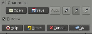
In computing, a button is a graphical control element that provides the user a simple way to trigger an event, like searching for a query at a search engine, or to interact with dialog boxes, like confirming an action.
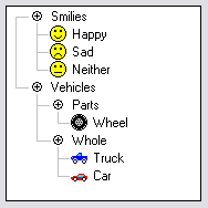
A tree view is a graphical widget within a graphical user interface (GUI) in which users can navigate and interact intuitively with concise, hierarchical data presented as nodes in a tree-like format. It can also be called an outline view.
A webform, web form or HTML form on a web page allows a user to enter data that is sent to a server for processing. Forms can resemble paper or database forms because web users fill out the forms using checkboxes, radio buttons, or text fields. For example, forms can be used to enter shipping or credit card data to order a product, or can be used to retrieve search results from a search engine.
Dialog Control Language (DCL) is a high-level description language and interpreter within AutoCAD for creating simple graphical dialogs. AutoLISP extensions use it to interact with the user in the AutoCAD environment.
The Windows shell is the graphical user interface for the Microsoft Windows operating system. Its readily identifiable elements consist of the desktop, the taskbar, the Start menu, the task switcher and the AutoPlay feature. On some versions of Windows, it also includes Flip 3D and the charms. In Windows 10, the Windows Shell Experience Host interface drives visuals like the Start Menu, Action Center, Taskbar, and Task View/Timeline. However, the Windows shell also implements a shell namespace that enables computer programs running on Windows to access the computer's resources via the hierarchy of shell objects. "Desktop" is the top object of the hierarchy; below it there are a number of files and folders stored on the disk, as well as a number of special folders whose contents are either virtual or dynamically created. Recycle Bin, Libraries, Control Panel, This PC and Network are examples of such shell objects.

Microsoft InfoPath is a software application for designing, distributing, filling and submitting electronic forms containing structured data. Microsoft initially released InfoPath as part of the Microsoft Office 2003 family. The product features a WYSIWYG form designer in which the various controls are bound to data, represented separately as a hierarchical tree view of folders and data fields.

Workbench is the desktop environment and graphical file manager of AmigaOS developed by Commodore International for their Amiga line of computers. Workbench provides the user with a graphical interface to work with file systems and launch applications. It uses a workbench metaphor for representing file system organisation.

This article details features of the Opera web browser.
A cycle button or toggle button is a graphical control element that allows the user to choose one from a predefined set of options. It is used as a button, the content of which changes with each click and cycles between two or more values; the currently displayed value is the user's choice.
Bundesverband der Verbraucherzentralen und Verbraucherverbände — Verbraucherzentrale Bundesverband eV v Planet49 GmbH (2019) Case C‑673/17 is a decision of the Court of Justice of the European Union on the consent requirement for the placement of cookies under Article 2(f) and Article 5(3) of Directive 2002/58/EC concerning the processing of personal data and the protection of privacy in the electronic communications sector (‘ePrivacy-Directive’), as amended by Directive 2009/136/EC.
