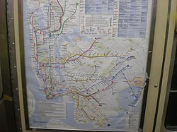
Many transit maps for the New York City Subway have been designed since the subway's inception in 1904. Because the subway was originally built by three separate companies, an official map for all subway lines was not created until 1940, when the three companies were consolidated under a single operator. Since then, the official map has undergone several complete revisions, with intervening periods of comparative stability.
The current iteration of the New York City Subway map dates from a design first published in 1979. The official map has evolved gradually under the control of the Marketing and Corporate Communications Department of the Metropolitan Transportation Authority (MTA). The 1979 design was created by the MTA Subway Map Committee, chaired by John Tauranac, which outsourced the graphic design of the map to Michael Hertz Associates.
The MTA released an interactive version of the map for digital devices in 2020, designed and built by Work & Co. [1] The Live Subway Map combines elements from the Massimo Vignelli’s diagram and the design by Hertz, and connects to a live database for real-time service updates. [2]
Original maps for the privately opened Interborough Rapid Transit Company (IRT), which opened in 1904, showed subway routes as well as elevated routes. [3] However, IRT maps did not show Brooklyn–Manhattan Transit Corporation (BMT) routes; conversely, BMT maps did not show IRT routes, even after the Dual Contracts between the IRT and BMT. [4] In fact, even in 1939, the year before the unification of the IRT, BMT, and Independent Subway System (IND) into one entity, [5] maps by private businesses were still being printed showing only the routes of one company. [4] The three subway companies also published their own maps, showing their own routes. [6]
Routes were not distinguished from each other on subway maps until 1958. [4] The first route maps were aesthetically pleasing, but had the perception of being more geographically inaccurate than the diagrams today. The design of the subway map by Massimo Vignelli, published by the MTA between 1972 and 1979, has since become recognized in design circles as a modern classic. However, the MTA deemed the map flawed due to its placement of geographical elements, specifically in the sense that elements only ran horizontally, vertically, or diagonally. By contrast, the Hertz map, which replaced the Vignelli design in 1979, contained elements that were more curved and "organic looking" while clarifying the nuances and complexities of the three former systems. The Hertz design, first created by Michael Hertz, remains in use with some stylistic differences and updates reflecting subway expansions since then. [7] [8]
In 1985, with the subway's elimination of double-lettered routes, the map also drastically changed; routes on the maps became less straight and more circular, a design that persists today. "Trunk lines" were rearranged to be one color, rather than the multicolored routes shown on the former Vignelli maps. [4]
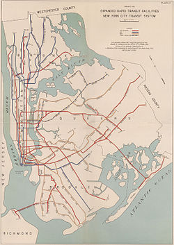
Two maps were drawn that showed routes for a never-built proposed expansion of the New York City Subway: one in 1929 and one in 1939. [9] A subway map was also drawn up in the 1970s to illustrate planned service patterns for an expanded subway system. This map showed possible service patterns upon the completion of several subway lines proposed in the 1968 Program for Action. [10]
After the subway operating companies were taken over by the Board of Transportation in July 1940, maps continued to be issued until 1942 in the characteristic style of the individual companies. Thus the IRT Division issued maps in the style of the former IRT company, and the BMT Division issue maps in the style of the former BMT company. [11] In order to have an integrated design, however, the Board brought in externally produced maps. From 1943 to 1952, the Board purchased stocks of Andrew Hagstrom's maps, overprinted with the Board's service information, and issued them as de facto official maps from token booths (e.g. 1948 [12] ).
In 1953, the New York City Transit Authority (NYCTA) took over the subway from the Board of Transportation. [13] They continued to issue Hagstrom maps as official maps until 1956, but instituted two changes. First: from 1954 onwards, they acquired stocks of subway maps designed by Stephen Voorhies and printed with promotional material for the Union Dime Bank. This was done to save money, as the Voorhies map was free, while Hagstrom charged for theirs. To keep the publications valid, the NYCTA periodically sent updated service information to both Hagstrom and Voorhies to be printed in service tables and, where necessary, incorporated into the map. Second: the NYCTA solicited proposals to create an in-house map design to save money and have more control of the map.
In 1955, George Salomon submitted a proposal to the NYCTA to redesign not only the map but the entire system of nomenclature. [14] Salomon was a German émigré, and his proposed system of route names and colors mirrored that of the Berlin U-Bahn. He had also spent a year studying under Eric Gill in England and expressed admiration for the London Underground map. His map adopted the same modernist style as Harry Beck's London map, and was the first map of the New York City Subway to follow a systematic visual language in diagrammatic form. The NYCTA rejected his systematic revision of nomenclature but did use his diagram of lines as its official map from 1958 to 1967. [15]
After delivering his map in 1958, Salomon had no further control of it, and disliked the NYCTA's addition of touristic information to his minimalist design, [16] such as the map of 1964. [17]
To relieve bottlenecks in the subway system, a series of major works were carried out in the 1960s. One of them, the 2-mile (3.2 km) Chrystie Street Connection in Chinatown, Manhattan, had a major impact on the subway map, as it unified the BMT and IND divisions of the subway, thereby rendering obsolete the three-colored network maps that been used since the 1930s. The Transit Authority had to devise a new map design by the time the Chrystie Street Connection opened, so in 1964, they opened the Subway Map Competition to the general public. There were three winners; one of them, R. Raleigh D'Adamo, submitted an explanatory report with his map, which detailed his innovative proposal to color-code the subway by individual routes rather than by historic operating company. This concept was implemented by Dr. Stanley Goldstein of Hofstra University, working as a consultant to the TA, and by Dante Calise, art director at Diamond Packaging, the firm that printed the subway map. On November 26, 1967, when the new connections opened, the new map came into use. [4] There was also a map to explain all the newly rerouted services. [18]
The TA's new map, released in 1967, used Raleigh D'Adamo's principle of color-coding for the first time, but it suffered from what Vignelli called "fragmentation" and was not well received. The following year, the parent body Metropolitan Transportation Authority (MTA) was formed over the TA, chaired by William J. Ronan, who wanted to create a modern brand image for this new body. While the Unimark signage project was still being finished up with the creation of the New York City Transit Authority Graphics Standards Manual, Vignelli went to Ronan with a mock-up of part of the map for Lower Manhattan. [19] Ronan approved it, and in July 1970 the TA awarded Unimark a contract to design a new system map.
The map was put together in the Unimark Office by Joan Charysyn under Vignelli's design direction. In April 1971, Vignelli left Unimark to set up Vignelli Associates with his wife and business partner, Lella Vignelli, also a partner in Unimark. By this time, the map was almost complete, but was subject to corrections and modifications requested by Raleigh D'Adamo, who was now Head of the Office of Inspection and Review at the MTA. These changes were carried out by Charysyn, who also oversaw the printing of the map. Unimark's liaison with the MTA during this project was handled by Norbert Oehler. The map was unveiled by Ronan on August 4, 1972 at a ceremony in the station at 57th Street and Sixth Avenue. Starting the following weekend, the maps began to be installed in stations and in subway cars. The maps became available at token booths for riders on August 7. [20] It cost $105,000 to produce. Along with the map, a subway directory was unveiled. This specific one showed how to get from 57th Street to the other subway stations in the system in an alphabetical listing. [21]
Though critically acclaimed, the subway map proved to be unpopular with many riders. [22] In 1974, William Ronan was replaced by David Yunich as chairman of the MTA. Yunich was formerly an executive at Macy's department store, and brought an explicit intention to 'sell' the subway to riders. He brought over from Macy's Fred Wilkinson who in 1975 formed the Subway Map Committee to design a new map to replace Vignelli's.
At the end of 1976, Wilkinson was assigned from Transit to be Executive Officer of Surface operations and stepped down from the Subway Map Committee. [23] For half a year, the committee did not meet; and then in the summer of 1977, John Tauranac was assigned chair of the committee and meetings resumed. [24] The committee, working with the design firm Michael Hertz Associates, experimented with designs and in February 1978 Tauranac organized an exhibition entitled "The Good, The Bad ... The Better? A New York City Subway Map Retrospective" at the Cityana Gallery run by Benjamin Blom, exhibiting the committee's latest prototype map and offering a questionnaire for testing public reaction. [25] Visitors said they liked the geographic information but disliked the use of a single color for all subway lines. [26] In response, Tauranac then prepared a version with two colors, blue for the former IRT lines and red for the former BMT and IND lines. This was exhibited at the Cooper Union in April, when Tauranac debated with Massimo Vignelli in a public battle between the two schools of map-making. [27] The final design used a trunk-colored scheme, in which services running on a common main line, or "trunk" line, share the same color. [28] [29]
Tauranac led the 12-person Subway Map Committee, which comprised TA staff and members of the public and three staff at Michael Hertz Associates. [30] [31] [32] Everybody contributed to the final design, and the map cannot be said to be designed by one individual. [33] According to The New York Times, the sculptor and painter Nobuyuki "Nobu" Siraisi drew sketches for the new version of the map, while psychologist Arline Bronzaft conducted studies to determine riders' responses to the old and new maps. [34] Siraisi rode all of the routes with his eyes closed in order to feel each track curve, which he then drew in a sketchbook. The curves in Siraisi's drawings helped to alleviate a feeling of disorientation that many riders felt when looking at the straight lines of the Vignelli map, as had been observed in Bronzaft's studies. [29] The final assignment of colors was made by Tauranac. [35]
In September 1978, Tauranac met with Phyllis Cerf Wagner, head of the MTA Aesthetics Committee, and told her that the map project was "dead in the water" because he could not make the map he wanted, since there was no funding to change to signage to match the change in the map. Cerf Wagner was subsequently able to secure the funds. [36] In June 1979 the finished subway map was published in time for the Diamond Jubilee, the subway's 75-year anniversary. [37] Paul Goldberger praised the map as "the clearest and most usable map the subway system has had in years", and one of the bright spots of the subway system, which was then in poor condition. [38] A New York Times editorial said, "Not all the news about New York's subways is bad", praising the production of a "readable subway map". [39] After the Subway Map Committee was disbanded, Tauranac continued to privately improve his design. In a 2024 interview, Tauranac said that MTA's official subway map depicted Manhattan too unrealistically, lacked details about station amenities, and prioritized street names (rather than neighborhood names and local landmarks) in station names. [40]
Initially, there was only an English-language version of the map. In 1991, a multilingual version of the map was printed in six languages commonly used by tourists: English, Spanish, French, German, Italian, and Japanese. [41] Additionally, Staten Island was initially not shown on the map except for a small corner inset. In 1998, a map of the Staten Island Railway was added to that inset. That year, the map was digitized so that it could be edited via computer: in this edition, incongruous small details were removed or revised. [29] Despite the revisions made to the 1998 map, several errors persisted through the 21st century: for instance, the intersection of Broadway and West End Avenue in the Upper West Side was depicted as being several blocks away from its true location. [42] A special-edition map was released in 2004 to mark the restoration of service on the Manhattan Bridge following the conclusion of the Manhattan Bridge subway closures, which had required construction on the bridge's subway tracks for 18 years. [43]
The latest major revision to the official subway map, which took effect on June 27, 2010, makes Manhattan bigger and Staten Island smaller. [44] [45] [46] Several smaller streets were also removed. [47] A late night-only version of the map was introduced on January 30, 2012. [48]
The current official map of the subway system, based on the Tauranac redesign, incorporates a complex cartography to explain the subway's nomenclature. Different services that share a "trunk line" were assigned the same color; the trunk lines comprised all of the main lines within lower and midtown Manhattan, as well as the IND Crosstown Line, a trunk line that does not go into Manhattan. Express services were denoted with a separate stroke that bypassed all of the local stops. Transfers between stations were denoted by a thinner black stroke. [29]
The official map is not geographically accurate due to the complexity of the system. For example, since Lower Manhattan and Downtown Brooklyn contain high densities of subway stations, these areas are shown as larger than they actually are. Likewise, Staten Island is shown in an inset because it does not have any subway stations, only the Staten Island Railway. Nevertheless, the map is known to help tourists navigate the city, as major city streets are shown alongside the subway stations serving them. [29]
The New York City Subway map is an anomaly among subway maps around the world, in that it shows city streets, parks, and neighborhoods juxtaposed among curved subway lines, whereas other subway maps (like the London Underground map) do not show such aboveground features and show subway lines as straight and at 45- or 90-degree angles. [49] However, only ten buildings are actually shown on the map: four are in Staten Island, while a fifth is the New York Transit Museum in Brooklyn. The current map, significantly changed from Tauranac's original redesign, uses over 20 font styles. [29]
In October 2020, the MTA launched a digital version of the map showing real-time service patterns and service changes, designed by Work & Co. [50] [51] The real-time map uses a variation of the Vignelli map, with each route being depicted on its own band rather than being grouped by their trunk color. For instance, the 4, 5, and 6 trains would be shown as three bands, despite sharing the IRT Lexington Avenue Line, which would be depicted as a single band on the Tauranac/Hertz map. The real-time map also uses geographical landmarks, as the Tauranac/Hertz map does. In the beta version of the map, the bands were not necessarily correlated to their real-life locations. [51]
There are several privately produced schematics that are available either online or in published form—such as KickMap, a hybrid diagram subway map that shows each route on its own line segments plus New York's parks, streets and neighborhoods; [52] and Bullet Map, a map that shows bus and rail connections in more complexity. [53] Additionally, the New York City Subway map has served as the subject of artistic endeavors. Among these are works by Fadeout Design and by Alexander Chen. [54] [55] In the past, companies such as Hagstrom Map had also published New York City Subway maps. [7]
There are other subway map spinoffs as well, such as New York City Subway track schematics. [56] [57] In 2014 an augmented reality subway map was made available for the subway. [58] Additionally, "On The Go! Travel Stations" are electronic maps located in stations that make use of touchscreen technology to help subway patrons plan trips. [59] Google Maps and Apple Maps also give transit directions, with the locations of stations laid over an actual street grid. Such maps have been increasingly prevalent. [60]
On the real-time map, the MTA uses its existing data feeds to show the locations of trains, depicted by darker bars moving along each respective subway route. Clicking on a station would also give information on the status of escalators and elevators in a station. [51]
Unlike similar apps, the real-time map does not use the Google Maps platform. [51] Manhattan's street grid is oriented 29 degrees clockwise from true north, [61] and the real-time map uses an orientation that follows Manhattan's street grid rather than the cardinal directions. However, the mobile version of Google Maps would not allow map rotation. [51]
In 2011, the MTA began to look at ways of displaying service disruptions due to weekend engineering works in a visual format. They invited Vignelli Associates (comprising at that time Massimo Vignelli, Yoshiki Waterhouse, and Beatriz Cifuentes) to develop a digital version of the 2008 map. On September 16, 2011, the MTA introduced a Vignelli Associates interactive subway map, called "The Weekender", [62] to its website. [63] As the title suggests, [64] it is a way for riders to get information about any planned work, from late Friday night to early Monday morning, that is going on either on a service(s) or station(s) of the subway during the weekend only. [65] [66] On June 11, 2012, the MTA duplicated "The Weekender" site as a free mobile app download for iOS. [67] [68] On November 29, 2012, an Android version of the app was released. [69] The Weekender, however, is only available as an online version, because it changes every week. [48] The map design was inspired by Massimo Vignelli's 1972 subway map. [70]
A night-service map, created by Charles Gordanier of the MTA, was first released in January 2012. [48] [71] [72] The maps come in printed versions or as an online PDF file. Formerly, the maps were only available online or at certain stations, but as of October 2014 [update] , the maps started to be issued at all stations in the New York City Subway and Staten Island Railway systems. [73]
A special transit map was designed by Yoshiki Waterhouse at Vignelli Associates for Super Bowl XLVIII, the "Mass Transit Super Bowl". The game was played on February 2, 2014, at MetLife Stadium at the Meadowlands Sports Complex in East Rutherford, New Jersey. It was the first Super Bowl played outdoors in a cold-weather city.
Called the "Regional Transit Diagram", the map was initially produced specifically for Super Bowl XLVIII, and according to the MTA, "shows all inter-connections between the regional transit services, and highlights with a football icon those areas where Super Bowl related events will occur on both sides of the Hudson River. The diagram will appear on all transit provider websites, as well as on Super Bowl websites, guides, publications, mobile apps, and folding pocket maps." Since private cars were not allowed to park at the stadium, the use of public transportation had correspondingly been increased. With 400,000 visitors expected to the area and 80,000 attendees expected at the game itself, the MTA decided to work with New Jersey Transit (NJT), Amtrak, and NY Waterway to produce a special-purpose Regional Transit Map and create the Mass Transit Super Bowl plan. [74]
The map is based on a New York City Subway map originally designed by Vignelli in 1972. The map shows all the commuter rail, subway, PATH, and light rail operations in urban northeastern New Jersey and Midtown and Lower Manhattan highlighting Super Bowl Boulevard, Prudential Center, MetLife Stadium and Jersey City. [75] [76] [77]
The map brought in several innovations:
As of September 2018 [update] , the diagram is still updated online and remains accessible on the MTA's website. [79]
In September 2015, a map detailing the number of calories burnt walking between adjacent subway stops was developed by Treated.com and featured on the websites of Gothamist [80] and Time Out . [81]
A "beer map" was created to show the best bars that are close to each station. [82] The website Thrillist also created a "judgmental map" of each station in Manhattan. [83]
In May 2017, Brooklyn resident Andrew Lynch created a geographically accurate map of the system's tracks, which was featured on Gothamist. [84]
In 2020, the MTA displayed several new map concepts at the 86th Street station on the BMT Fourth Avenue Line following a renovation project. [85] Six maps were displayed:
The MTA solicited feedback from the public on these new maps through an online survey. [94] [95] [87] This test expanded in 2021 to include several other stations including 116th Street, Fulton Street, Nostrand Avenue, Times Square and in-car maps on the 42nd Street Shuttle. [96] The station diagrams were no longer part of the project, while the four other concepts (the Vignelli map, area bus map, geographically accurate subway map, and flat station diagram) remain. [96] The MTA hopes these maps would be better than the current Hertz map to show how the subway operates. [97] The MTA reported in October 2021 that it had received positive feedback, [95] prompting the agency to gradually install the four concepts systemwide in the coming months. [97]
From 1904 to 1967, subway routes on the official subway map were drawn either in a single color or in three colors, which corresponded to the company that the route operated on — the IRT, BMT, or IND. [98] Still, after the 1940 unification of the three companies' routes under the umbrella of a Board of Transportation—later the New York City Transit Authority (NYCTA)—the three networks continued to operate separately and were generally referred to by their old names. [99] Both maps and the station signage continued to refer to the historical IRT, BMT, and IND. In 1964, a major review of wayfinding was triggered by the combination of two things: the large influx of visitors for the 1964 New York World's Fair, which made the subway and bus maps confusing to some visitors; and the connection of the BMT and IND networks through the 60th Street Tunnel Connection and the soon-to-be-opened Chrystie Street Connection, which rendered the three-color scheme unworkable.
In 1964, the NYCTA launched the Subway Map Competition to get public input on redesigning the subway map, and in 1966 it engaged Unimark International to advise on signage and on the results of the Subway Map Competition. The winners of the competition were R. Raleigh D’Adamo, [100] Harris Schechtman, and Mary & John Condon. [101] The TA forwarded D’Adamo's report [102] on his competition map to Professor Stanley Goldstein of Hofstra University, who was engaged to develop prototype maps. Goldstein reported in June 1965, [103] and two of his prototype maps were combined by the TA Designs Division, and the result passed to Diamond Packaging, who refined the design and printed the NYCTA's first route-colored subway map in November 1967. To coordinate with the new color scheme in the map, the NYCTA began to roll out new station and car signage based on a design by Vignelli and Robert Noorda of Unimark International, using the route markers derived from those specified in D’Adamo's report.
The biggest innovation in this redevelopment of the map was the introduction of color-coding by subway route, which D’Adamo recommended in his report to replace the outdated three-color scheme. After some experimentation, D’Adamo found a set of colors for subway lines that avoided clashes; Goldstein used D’Adamo's concept but invented his own color allocation; and finally Dante Calise at Diamond Packaging devised the color assignment that was used in the published map of 1967. Those colors were inherited by Unimark International and used in the famous 1972 Vignelli map. [104] [105] That color scheme was rearranged by Tauranac in 1979 to create a trunk-colored map.
The colors used to denote services in the current iteration of the subway map are as follows:
Primary Trunk line | Color [106] [107] | Pantone [108] | Hexadecimal | Service bullets |
---|---|---|---|---|
IND Eighth Avenue Line | Blue | PMS 286 | #0039a6 | |
IND Sixth Avenue Line | Orange | PMS 165 | #ff6319 | |
IND Crosstown Line | Lime | PMS 376 | #6cbe45 | |
BMT Canarsie Line | Light slate gray | 50% black | #a7a9ac | |
BMT Nassau Street Line | Brown | PMS 154 | #996633 | |
BMT Broadway Line | Yellow | PMS 116 | #fccc0a | |
IRT Broadway–Seventh Avenue Line | Red | PMS 185 | #ee352e | |
IRT Lexington Avenue Line | Green | PMS 355 | #00933c | |
IRT Flushing Line | Purple | PMS Purple | #b933ad | |
IND Second Avenue Line | Turquoise | PMS 638 | #00add0 | |
Shuttles | Dark slate gray | 70% black | #808183 |
This is a table of when each service has existed (and been signed for the public). Shuttles were SS until 1985, when they became S (which had been used for specials). See here for the colors used for shuttles in 1967; in 1968 all six became green, and in 1979 all shuttles became dark gray. The maps were adjusted according to the service letters, numbers, and colors used at the time.
Before the 1960s, service colors were disregarded, as maps usually showed all subway routes of one company in the same color, using only three colors for the lines of the three companies.
The accessibility of this October 2024 is in question. Relevant discussion may be found on the talk page. |
The New York City Subway is a rapid transit system in New York City serving the boroughs of Manhattan, Brooklyn, Queens, and the Bronx. It is owned by the government of New York City and leased to the New York City Transit Authority, an affiliate agency of the state-run Metropolitan Transportation Authority (MTA). Opened on October 27, 1904, the New York City Subway is one of the world's oldest public transit systems, one of the most-used, and the one with the most stations, with 472 stations in operation.
The New York City Transit Authority is a public-benefit corporation in the U.S. state of New York that operates public transportation in New York City. Part of the Metropolitan Transportation Authority, the busiest and largest transit system in North America, the NYCTA has a daily ridership of 8 million trips.
The 7 Flushing Local and <7> Flushing Express are two rapid transit services in the A Division of the New York City Subway, providing local and express services along the full length of the IRT Flushing Line. Their route emblems, or "bullets", are colored purple, since they serve the Flushing Line.
The Mets–Willets Point station is a rapid transit station on the IRT Flushing Line of the New York City Subway. Located near the Citi Field baseball stadium, it is served by the 7 train at all times and by the express <7> train during rush hours in the peak direction or after sporting events. This station is located near Flushing Meadows–Corona Park in Willets Point, Queens, on Roosevelt Avenue between 114th and 126th Streets.
The 111th Street station is a local station on the IRT Flushing Line of the New York City Subway, located at the intersection of 111th Street and Roosevelt Avenue. It is served by the 7 train at all times.
The Junction Boulevard station is an express station on the IRT Flushing Line of the New York City Subway, located at the intersection of Junction Boulevard and Roosevelt Avenue in Corona, Queens. It is served by the 7 train at all times and by rush hour peak-direction <7> express service.
The 61st Street–Woodside station is an express station on the IRT Flushing Line of the New York City Subway located at 61st Street and Roosevelt Avenue in Woodside, Queens. It is served by the 7 train, with additional peak-direction <7> service during rush hours.
The Queensboro Plaza station is an elevated New York City Subway station at Queens Plaza in the Long Island City neighborhood of Queens. It is near the east end of the Queensboro Bridge, with Queens Boulevard running east from the plaza. The station is served by the 7 and N trains at all times, the W train on weekdays, and the <7> train rush hours in the peak direction.
The 82nd Street–Jackson Heights station is a local station on the IRT Flushing Line of the New York City Subway, located at the intersection of 82nd Street and Roosevelt Avenue in Jackson Heights, Queens. It is served by the 7 train at all times.
The 33rd Street–Rawson Street station is a local station on the IRT Flushing Line of the New York City Subway. It is located over Queens Boulevard on a concrete viaduct. It is served by the 7 train at all times.
The New York City Subway is a rapid transit system that serves four of the five boroughs of New York City, New York: the Bronx, Brooklyn, Manhattan, and Queens. Its operator is the New York City Transit Authority, which is itself controlled by the Metropolitan Transportation Authority of New York. In 2015, an average of 5.65 million passengers used the system daily, making it the busiest rapid transit system in the United States and the 11th busiest in the world.
The B Sixth Avenue Express is a rapid transit service in the B Division of the New York City Subway. Its route emblem, or "bullet", is colored orange, since it uses the IND Sixth Avenue Line in Manhattan.
New York City Subway nomenclature is the terminology used in the New York City Subway system as derived from railroading practice, historical origins of the system, and engineering, publicity, and legal usage. Important terms include lines, or individual sections of subway, like the BMT Brighton Line; services, like the B, which is a single train route along several lines; and stations, such as Coney Island–Stillwell Avenue, which connects multiple lines and services.
The New York City Subway is a rapid transit system that serves four of the five boroughs of New York City, New York: the Bronx, Brooklyn, Manhattan, and Queens. Its operator is the New York City Transit Authority (NYCTA), which is controlled by the Metropolitan Transportation Authority (MTA) of New York. In 2016, an average of 5.66 million passengers used the system daily, making it the busiest rapid transit system in the United States and the seventh busiest in the world.
John Tauranac writes on New York City history and architecture, teaches the subject and gives tours of the city, and designs city maps and transit maps.
Massimo Vignelli was an Italian designer who worked in a number of areas including packaging, houseware, furniture, public signage, and showroom design. He was the co-founder of Vignelli Associates, with his wife, Lella. His motto was, "If you can design one thing, you can design everything," which the broad range of his work reflects.
The Lexington Avenue/59th Street station is a New York City Subway station complex shared by the IRT Lexington Avenue Line and the BMT Broadway Line. It is located at Lexington Avenue between 59th and 60th Streets, on the border of Midtown and the Upper East Side of Manhattan. The station complex is the fourteenth-busiest in the system, with over 21 million passengers in 2016.
The New York City Board of Transportation or the Board of Transportation of the City of New York was a city transit commission and operator in New York City, consisting of three members appointed by the mayor. It was created in 1924 to control city-owned and operated public transportation service within the New York City Transit System. The agency oversaw the construction and operation of the municipal Independent Subway System (IND), which was constructed shortly after the Board was chartered. The BOT later presided over the major transfers of public transit from private control to municipal control that took place in the 1940s, including the unification of the New York City Subway in 1940. In 1953, the Board was dissolved and replaced by the state-operated New York City Transit Authority, now part of the Metropolitan Transportation Authority (MTA).
Since the late 20th century, the Metropolitan Transportation Authority has started several projects to maintain and improve the New York City Subway. Some of these projects, such as subway line automation, proposed platform screen doors, the FASTRACK maintenance program, and infrastructural improvements proposed in 2015–2019 Capital Program, contribute toward improving the system's efficiency. Others, such as train-arrival "countdown clocks", "Help Point" station intercoms, "On the Go! Travel Station" passenger kiosks, wireless and cellular network connections in stations, MetroCard fare payment alternatives, and digital ads, are meant to benefit individual passengers. Yet others, including the various methods of subway construction, do not directly impact the passenger interface, but are used to make subway operations efficient.
Official maps
Unofficial maps