Ming typefaces

Last updated
Ming typefaces
Chinese name
Traditional Chinese 明體
Simplified Chinese 明体
Literal meaning Ming typeface
Transcriptions
Standard Mandarin
Hanyu Pinyin míng tǐ
Bopomofo ㄇㄧㄥˊ ㄊㄧˇ
Wade–Giles ming2 ti3
Yue: Cantonese
Jyutping ming4 tai2
Southern Min
Tâi-lô bîng-thé

Ming or Song is a category of typefaces used to display Chinese characters, which are used in the Chinese, Japanese and Korean languages. They are currently the most common style of type in print for Chinese and Japanese. For Japanese and Korean text, they are commonly called Mincho and Myeongjo typefaces respectively.

Contents

Name

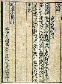
The names Song (or Sung) and Ming correspond to the Song dynasty when a distinctive printed style of regular script was developed, and the Ming dynasty during which that style developed into the Ming typeface style. [1] In Mainland China, the most common name is Song (the Mainland Chinese standardized Ming typeface in Microsoft Windows being named SimSun). In Hong Kong, Taiwan, Japan and Korea, Ming is prevalent. In Hong Kong and Taiwan, "Song typeface" (宋体) has been traditionally used, but "Ming typeface" (明體) has gained popularity since the advent of desktop publishing (the Traditional Chinese standardized Ming typeface in Microsoft Windows being named MingLiU). Some type foundries [2] use "Song" to refer to this style of typeface that follows a standard such as the Standard Form of National Characters, and "Ming" to refer to typefaces that resemble forms found in the Kangxi Dictionary .

Characteristics

Characteristics of Ming typefaces include the following:

Possessing variable line weight and characteristic decorations at the end of lines similar to serifs, this type style is comparable to Western serif typefaces, as opposed to East Asian gothic typefaces which are comparable to Western sans-serif.

Variations

Often there are different ways to write the same Chinese character; these are collectively referred to as variant Chinese characters. Some of the differences are caused by character simplification, while others are purely orthographic differences such as stroke styling. The styling of the strokes used in old Ming typefaces came from the style used in the Kangxi Dictionary .[ citation needed ]

In mainland China, the modern standardized character forms are specified in the List of Commonly Used Characters in Modern Chinese . Some characters in the list differ from the Kangxi forms solely because they are Simplified while others differ because they use a different variant or orthography.

In Taiwan, the Standard Form of National Characters specifies the modern standardized forms. Unlike the mainland standard, the Taiwan standard uses mostly preexisting character forms but reference back to the style of regular script and reform Ming typefaces based on regular script style extensively, which had attracted criticism from many peoples. [3] [4]

After the postwar kanji reforms in Japan, most of the Kangxi style characters were called kyūjitai (old style), while the reformed characters were called shinjitai , causing newer dictionaries to either incorporate both styles or omit the Kangxi styles. In Korea, most typefaces use the Kangxi forms.

There are differences between print and script forms of many Chinese characters, just as there are differences between copperplate and most people's handwriting. Some of these differences are persistent and specific to a style, but others may be no more significant than variations between individual typefaces. None of these variations usually hinder reading.

History

China

The printing industry from the Tang dynasty reached an apex in the Song dynasty, [1] during which there were three major areas of production:

When Song lost control of northern China to the Jin (金) dynasty, its capital was moved to Lin'an (modern Hangzhou), where there was a revival of printing, especially literature from Tang left in what was conquered by the Jin dynasty. Many publishers were established in Lin'an, including Chén zhái shūjí pù (陳宅書籍鋪) established by Chen Qi (Chinese :陳起), [1] from which publications used a distinct style of regular script with orderly, straight strokes. Modern typefaces of this style are classified as imitation Song typefaces (simplified Chinese :仿宋体; traditional Chinese :仿宋體). In the Ming dynasty, the straightening of strokes in a reprint of a publication from Lin'an started a shift to what became the basis of the Ming style. [1]

Japan

The characters Ming Zhao Ti 
(Minchotai), literally "Ming Dynasty form", in a reimpression of old Ming typeface in 1912 by Tsukiji Type Foundry Mintyotai.svg
The characters 明朝體 (Minchōtai), literally "Ming Dynasty form", in a reimpression of old Ming typeface in 1912 by Tsukiji Type Foundry

Ming typefaces (明朝, Minchō, lit. "Ming Dynasty") are the most commonly used style in print in Japan. There are several variations in use, such as the textbook style and the newspaper style.

The creator of modern Japanese movable-type printing, Motoki Shōzō (or Motogi), modeled his sets of type after those prevailing in China, having learned an electrolytic method of type manufacturing from the American William Gamble in 1869. Motoki then created, based on Gamble's frequency studies of characters in the Chinese Bible, a full set of type with added Japanese characters; in addition to Chinese and Latin characters, Japanese text uses the syllabaries hiragana and katakana.

Korea

In Korean, a similar category of typefaces for the Korean alphabet hangul was called myeongjo (the Korean reading for the same Chinese characters "明朝") until recently, influenced by the Japanese term. A Ministry of Culture-sponsored standardization of typography terms in 1993 replaced myeongjo with batang ("바탕"), the Korean word for "foundation" or "ground" (as opposed to "figure"), and is the current term for the typeface.

Ming typefaces in computing

Technically, only Chinese characters can be printed in a Ming typeface. However, most modern typefaces (that is, digital typefaces) often also include kana glyphs in a matching style, usually in a precise style resembling handwriting with a brush. Modern Ming typefaces also incorporate Roman type glyphs for Latin characters, letterlike symbols, and numbers. In its modern role comparable to that of western serif typefaces, both kana and Latin characters are usually part of a complete typeface.

Ming typefaces are used officially by the governments of China, Japan, and Korea.

See also

Related Research Articles

<span class="mw-page-title-main">Calligraphy</span> Visual art related to writing

Calligraphy is a visual art related to writing. It is the design and execution of lettering with a pen, ink brush, or other writing instrument. Contemporary calligraphic practice can be defined as "the art of giving form to signs in an expressive, harmonious, and skillful manner".

In typography, a serif is a small line or stroke regularly attached to the end of a larger stroke in a letter or symbol within a particular font or family of fonts. A typeface or "font family" making use of serifs is called a serif typeface, and a typeface that does not include them is sans-serif. Some typography sources refer to sans-serif typefaces as "grotesque" or "Gothic" and serif typefaces as "roman".

<span class="mw-page-title-main">Typeface</span> Set of characters that share common design features

A typeface is a design of letters, numbers and other symbols, to be used in printing or for electronic display. Most typefaces include variations in size, weight, slope, width, and so on. Each of these variations of the typeface is a font.

<span class="mw-page-title-main">Regular script</span> Style for writing Chinese characters

The regular script is the newest of the major Chinese script styles, emerging during the Three Kingdoms period c. 230 CE, and stylistically mature by the 7th century. It is the most common style used in modern text. In its traditional form it is the third-most common in publishing after the Ming and Gothic types used exclusively in print.

<span class="mw-page-title-main">East Asian Gothic typeface</span> Font design for CJK characters

In the East Asian writing system, gothic typefaces are a type style characterized by strokes of even thickness and lack of decorations, akin to sans serif styles in Western typography. It is the second most commonly used style in East Asian typography, after Ming.

<span class="mw-page-title-main">Chinese calligraphy</span> Calligraphy with Chinese script

Chinese calligraphy is the writing of Chinese characters as an art form, combining purely visual art and interpretation of the literary meaning. This type of expression has been widely practiced in China and has been generally held in high esteem across East Asia. Calligraphy is considered one of the four most-sought skills and hobbies of ancient Chinese literati, along with playing stringed musical instruments, the board game "Go", and painting. There are some general standardizations of the various styles of calligraphy in this tradition. Chinese calligraphy and ink and wash painting are closely related: they are accomplished using similar tools and techniques, and have a long history of shared artistry. Distinguishing features of Chinese painting and calligraphy include an emphasis on motion charged with dynamic life. According to Stanley-Baker, "Calligraphy is sheer life experienced through energy in motion that is registered as traces on silk or paper, with time and rhythm in shifting space its main ingredients." Calligraphy has also led to the development of many forms of art in China, including seal carving, ornate paperweights, and inkstones.

<span class="mw-page-title-main">Variant Chinese characters</span> Chinese characters outside of a standard

Chinese characters may have several variant forms—visually distinct glyphs that represent the same underlying meaning and pronunciation. Variants of a given character are allographs of one another, and many are directly analogous to allographs present in the English alphabet, such as the double-storey ⟨a⟩ and single-storey ⟨ɑ⟩ variants of the letter A, with the latter more commonly appearing in handwriting. Some contexts require usage of specific variants.

<span class="mw-page-title-main">Radical 8</span> Chinese character radical

Radical 8 or radical lid (亠部), whose meaning as an independent word is unknown, but is often interpreted to be a "lid" when used as a radical, is radical 23 of the 214 Kangxi radicals and consists of two strokes.

<span class="mw-page-title-main">Radical 11</span> Chinese character radical

Radical 11 or radical enter (入部) meaning "enter", "come in (to)", "join" is one of 23 of the 214 Kangxi radicals that are composed of 2 strokes.

Fangsong is a style of typeface for Chinese characters modeled after that used in Lin'an during the Southern Song dynasty. Fangsong is a type of regular script typeface, and the standard used in official documents produced by the Chinese government, and civil drawings in both China and Taiwan.
<span class="mw-page-title-main">Radical 52</span> Chinese character radical

Radical 52 or radical short thread (幺部) meaning "short" or "tiny" is one of the 31 Kangxi radicals composed of three strokes.

<span class="mw-page-title-main">Radical 87</span> Chinese character radical

Radical 87 or radical claw (爪部) meaning "claw", "nail" or "talon" is one of the 34 Kangxi radicals composed of 4 strokes.

<span class="mw-page-title-main">Radical 95</span> Chinese character radical

Radical 95 or radical profound (玄部) meaning "dark" or "profound" is one of the 23 Kangxi radicals composed of 5 strokes.

<span class="mw-page-title-main">Radical 120</span> Chinese character radical

Radical 120 or radical silk (糸部) meaning "silk" is one of the 29 Kangxi radicals composed of 6 strokes.
<span class="mw-page-title-main">Radical 174</span> Chinese character radical

Radical 174 or radical blue (靑部/青部) meaning "blue" or "green" or "black" is one of the 9 Kangxi radicals composed of 8 strokes. It is also the character representing the color ao in Japanese, a general term covering both blue and green.

The xin zixing are a set of standardized Chinese character forms. It is based on the 1964 "List of character forms of Common Chinese characters for Publishing" as compared to jiu zixing. The standard is based on regular script and popular characters, and changes are made to the printed version of Song (Ming) typefaces. This standard covers the simplified and traditional characters, which separates it from other standards. SimSun font uses this standard, which shows variation with other regional standards such as MingLiU and Taiwan's KaiU, and with the regular script version of SimKai, which is the written character standard for China.

<span class="mw-page-title-main">Source Han Serif</span> Open-source serif CJK typeface

Source Han Serif is a serif Song/Ming typeface created by Adobe and Google.

Jiu zixing, also known as inherited glyph form, or traditional glyph form, not to be confused with Traditional Chinese, is a traditional orthography of Chinese characters which uses the orthodox character forms, especially the character forms used in print after the development of movable type printing, but before reformation by national standardization. Jiu zixing formed in the Ming Dynasty, and is also known as Kyūjitai in Japan.

East Asian typography is the application of typography to the writing systems used for the Chinese, Japanese, Korean, and Vietnamese languages. Scripts represented in East Asian typography include Chinese characters, kana, and hangul.

References

  1. 1 2 3 4 5 6 7 "漢字書体の歴史" [History of Kanji Typefaces]. Kinkido Type Laboratory (in Japanese). Archived from the original on 2023-11-30. Retrieved 2024-02-20.
  2. DynaComware typeface list which calls standardized Ming typefaces "Song" and other Ming typefaces "Ming"
  3. "說文:臺標之害 [刻石錄]". founder.acgvlyric.org. Retrieved 2020-06-20.
  4. "為甚麼不推薦新細明體 | 許瀚文 | 立場新聞". 立場新聞 Stand News. Retrieved 2020-06-20.