
Type design is the art and process of designing typefaces. This involves drawing each letterform using a consistent style. The basic concepts and design variables are described below.

Helvetica, also known by its original name Neue Haas Grotesk, is a widely used sans-serif typeface developed in 1957 by Swiss typeface designer Max Miedinger and Eduard Hoffmann.

Frutiger is a series of typefaces named after its Swiss designer, Adrian Frutiger. Frutiger is a humanist sans-serif typeface, intended to be clear and highly legible at a distance or at small text sizes. A popular design worldwide, type designer Steve Matteson described its structure as "the best choice for legibility in pretty much any situation" at small text sizes, while Erik Spiekermann named it as "the best general typeface ever".

In typography, emphasis is the strengthening of words in a text with a font in a different style from the rest of the text, to highlight them. It is the equivalent of prosody stress in speech.
Ming or Song is a category of typefaces used to display Chinese characters, which are used in the Chinese, Japanese and Korean languages. They are currently the most common style of type in print for Chinese and Japanese. For Japanese text, they are commonly called Mincho typefaces.

Johnston is a sans-serif typeface designed by and named after Edward Johnston. The typeface was commissioned in 1913 by Frank Pick, commercial manager of the Underground Electric Railways Company of London, as part of his plan to strengthen the company's corporate identity. Johnston was originally created for printing, but it rapidly became used for the enamel station signs of the Underground system as well.

Myriad is a humanist sans-serif typeface designed by Robert Slimbach and Carol Twombly for Adobe Systems. Myriad was intended as a neutral, general-purpose typeface that could fulfill a range of uses and have a form easily expandable by computer-aided design to a large range of weights and widths.

In orthography and typography, a homoglyph is one of two or more graphemes, characters, or glyphs with shapes that appear identical or very similar but may have differing meaning. The designation is also applied to sequences of characters sharing these properties.
A unicase or unicameral alphabet has just one case for its letters. Arabic, Brahmic scripts like Telugu, Kannada, Malayalam, Tamil, Old Hungarian, Hebrew, Iberian, Georgian, and Hangul are unicase writing systems, while modern Latin, Greek, Cyrillic, and Armenian are bicameral, as they have two cases for each letter, e.g. B and b, Β and β, or Բ and բ. Individual characters can also be called unicameral if they are used as letters with a generally bicameral alphabet but have only one form for both cases; for example, the ʻokina as used in Polynesian languages and the glottal stop as used in Nuu-chah-nulth are unicameral.

In metal typesetting, a font is a particular size, weight and style of a typeface. Each font is a matched set of type, with a piece for each glyph. A typeface consists of various fonts that share an overall design.
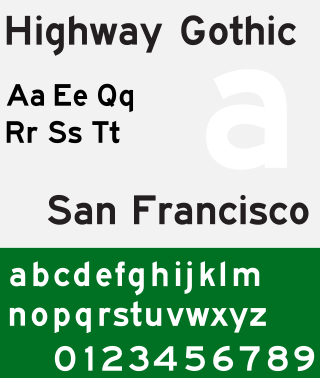
Highway Gothic is a sans-serif typeface developed by the United States Federal Highway Administration (FHWA) and used for road signage in the Americas, including the U.S., Canada, Latin America and some Caribbean countries, as well as in Asian countries influenced by American signage practices, including the Philippines, China, Taiwan, Malaysia, Indonesia and Thailand.
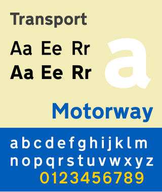
Transport is a sans serif typeface first designed for road signs in the United Kingdom. It was created between 1957 and 1963 by Jock Kinneir and Margaret Calvert as part of their work as designers for the Department of Transport's Anderson and Worboys committees.
New Gulim (새굴림/SaeGulRim) is a sans-serif type Unicode font designed especially for the Korean-language script, designed by HanYang System Co., Limited. It is an expanded version of Hanyang Gulrim.

DIN 1451 is a sans-serif typeface that is widely used for traffic, administrative and technical applications.

European traffic signs present relevant differences between countries despite an apparent uniformity and standardisation. Most European countries refer to the 1968 Vienna Convention on Road Signs and Signals. The convention has been adopted by the following countries : Albania, Armenia, Austria, Belarus, Belgium, Bosnia and Herzegovina, Bulgaria, Croatia, Cyprus, the Czech Republic, Denmark, Estonia, Finland, France, Georgia, Germany, Greece, Hungary, Italy, Latvia, Liechtenstein, Lithuania, Luxembourg, Moldova, Montenegro, Netherlands, North Macedonia, Norway, Poland, Portugal, Romania, Russia, San Marino, Serbia, Slovakia, Slovenia, Spain, Sweden, Switzerland, Turkey, Ukraine and the United Kingdom. The convention has not been adopted by Ireland, Iceland or Malta.

Motorway is a sans-serif typeface designed by Jock Kinneir and Margaret Calvert for use on the motorway network of the United Kingdom. Motorway was first used on the M6 Preston bypass in 1958 and has been in use on the UK's motorways ever since. The typeface is also used in some other countries, most notably Ireland and Portugal.

Road signs in South Korea are regulated by the Korean Road Traffic Authority.

The Korean alphabet, known as Hangul in South Korea and Chosŏn'gŭl (조선글) in North Korea, is the modern official writing system for the Korean language. The letters for the five basic consonants reflect the shape of the speech organs used to pronounce them, and they are systematically modified to indicate phonetic features; similarly, the vowel letters are systematically modified for related sounds, making Hangul a featural writing system. It has been described as a syllabic alphabet as it combines the features of alphabetic and syllabic writing systems.
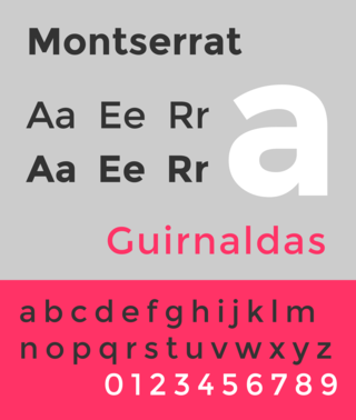
Montserrat is a geometric sans-serif typeface designed by Argentine graphic designer Julieta Ulanovsky and released in 2011. It was inspired by posters, signs and painted windows from the first half of the twentieth century, seen in the historic Montserrat neighbourhood of Buenos Aires.
This article is a summary of traffic signs used in each country.
