LLM Lettering

Last updated
LLM Lettering
LLM format 2.jpg
Category Sans-serif
Designer(s) Malaysian Highway Authority
Foundry N/A
LLM format.svg
Sample

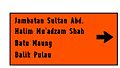
LLM Lettering is a set of sans-serif typefaces developed by the Malaysian Highway Authority (Lembaga Lebuhraya Malaysia, LLM) and used for road signage on expressways in Malaysia. The font was divided into two types: LLM Normal (Standard/Regular) and LLM Narrow (Condensed). [1] The LLM Normal typeface is a modified form of the Italian Alfabeto Normale and Alfabeto Stretto. The lettering is special use for the Malaysian Expressway System.

Contents

Examples on Malaysian road signs

See also

Related Research Articles

Palatino Typeface

Palatino is the name of an old-style serif typeface designed by Hermann Zapf, initially released in 1949 by the Stempel foundry and later by other companies, most notably the Mergenthaler Linotype Company.

Typeface Set of characters that share common design features

A typeface is the design of lettering that can include variations, such as extra bold, bold, regular, light, italic, condensed, extended, etc. Each of these variations of the typeface is a font.

Johnston (typeface) Sans-serif typeface

Johnston is a sans-serif typeface designed by and named after Edward Johnston. The typeface was commissioned in 1913 by Frank Pick, commercial manager of the Underground Electric Railways Company of London, as part of his plan to strengthen the company's corporate identity. Johnston was originally created for printing, but it rapidly became used for the enamel station signs of the Underground system as well.

North–South Expressway (Malaysia)

The North–South Expressway is a network of tolled controlled-access highways running through the west coast of Peninsular Malaysia. The expressway network consists of the northern route and southern route, having a total length of 772 kilometres. Running through seven states and connecting the Thailand and Singapore borders, the North–South Expressway is an important thoroughfare for local, interstate and international traffic. The expressway is part of route AH2, a designation of the Asian Highway Network.

Cooper Black Ultra-bold serif typeface

Cooper Black is an ultra-bold serif typeface intended for display use that was designed by Oswald Bruce Cooper and released by the Barnhart Brothers & Spindler type foundry in 1922. The typeface was drawn as an extra-bold weight of Cooper's "Cooper Old Style" family. It rapidly became a standard typeface and was licensed by American Type Founders and also copied by many other manufacturers of printing systems.

Oblique type is a form of type that slants slightly to the right, used for the same purposes as italic type. Unlike italic type, however, it does not use different glyph shapes; it uses the same glyphs as roman type, except slanted. Oblique and italic type are technical terms to distinguish between the two ways of creating slanted font styles; oblique designs may be labelled italic by companies selling fonts or by computer programs. Oblique designs may also be called slanted or sloped roman styles. Oblique fonts, as supplied by a font designer, may be simply slanted, but this is often not the case: many have slight corrections made to them to give curves more consistent widths, so they retain the proportions of counters and the thick-and-thin quality of strokes from the regular design.

Didone (typography) Classification of serif typefaces

Didone is a genre of serif typeface that emerged in the late 18th century and was the standard style of general-purpose printing during the nineteenth. It is characterized by:

Highway Gothic font used in the US for highway signs

Highway Gothic is a sans-serif typeface developed by the United States Federal Highway Administration and used for road signage in the Americas, including the U.S., Canada, and Latin American countries, as well as in Asian countries influenced by American signage practices, including the Philippines, China, Taiwan, Malaysia, Indonesia and Thailand. Variants, minor and major are used in countries like Turkey, Mexico, Australia, Spain, the Netherlands, Brazil, New Zealand, Macau, and some signs in countries like India and Saudi Arabia, when written in English. The typefaces were created to maximize legibility at a distance and at high speed. Computer typeface versions known as Highway Gothic or Interstate, which are for sale to the general public, include punctuation marks based on a rectangular shape. However, on signage the official FHWA Series punctuation is based on a circular shape.

The East Coast Expressway is an interstate controlled-access highway running parallel to the northeastern coast of Peninsular Malaysia. The currently operational 433-kilometre (269-mile) segment of the expressway runs between Karak, Pahang and Kuala Nerus, Terengganu.

SMART Tunnel

The Stormwater Management And Road Tunnel, E38, is a storm drainage and road structure in Kuala Lumpur, Malaysia, and a major national project in the country. The 9.7 km (6.0 mi) tunnel is the longest stormwater drainage tunnel in Southeast Asia and second longest in Asia.

Road signs in Malaysia Overview of road signs in Malaysia

Road signs in Malaysia are standardised road signs similar to those used in Europe but with certain distinctions. Until the early 1980s, Malaysia closely followed Australian, Irish and Japanese practice in road sign design, with diamond-shaped warning signs and circular restrictive signs to regulate traffic. Signs usually use the FHWA Series fonts typeface also used in the United States, Canada, and Australia, as well as New Zealand, although some signs on recently completed expressways use Transport Heavy. However, the new format signs use a font specially designed for the Malaysian Highway Authority (LLM). The font is called LLM Lettering. It has two type of typefaces, LLM Narrow and LLM Normal.

The Malaysian Highway Authority is a statutory body under the Malaysian Ministry of Works (MOW). The agency was founded on 24 October 1980 by the Highway Authority of Malaysia (Incorporation) Act 1980 to monitor the works and administration of expressways. The establishment of the agency coincided with the construction of the North-South Expressway.

A highway authority is a government organization responsible for public roads.

Transport (typeface) Road sign typeface used in the United Kingdom

Transport is a sans serif typeface first designed for road signs in the United Kingdom. It was created between 1957 and 1963 by Jock Kinneir and Margaret Calvert as part of their work as designers for the Department of Transport's Anderson and Worboys committees.

DIN 1451 Sans-serif font, used on german traffic signs

DIN 1451 is a sans-serif typeface that is widely used for traffic, administrative and technical applications.

Script typeface Class of typefaces inspired by handwriting

Script typefaces are based upon the varied and often fluid stroke created by handwriting. They are generally used for display or trade printing, rather than for extended body text in the Latin alphabet. Some Greek alphabet typefaces, especially historically, have been a closer simulation of handwriting.

PLUS Expressways

The PLUS Expressways Berhad is the largest highway concessionaries or build–operate–transfer operator company in Malaysia. A member of the UEM Group, the company is also the largest listed toll expressway operator in Southeast Asia and the eighth largest in the world.

Road signs in Italy Overview of road signs in Italy

Road signs in Italy conform to the general pattern of those used in most other European countries, with the notable exception that the background of motorway (autostrada) signs is green and those for 'normal' roads is blue. They are regulated by the Codice della Strada and by the Regolamento di Attuazione del Codice della Strada in conformity with the Vienna Convention on Road Signs and Signals.

Ministry of Works (Malaysia)

The Ministry of Works, abbreviated KKR, is a ministry of the Government of Malaysia that is responsible for public works, highway authority, construction industry, engineers, architects and quantity surveyors.

Display typeface Font that is used at large sizes for headings

A display typeface is a typeface that is intended for use at large sizes for headings, rather than for extended passages of body text.

References

  1. "Lembaga Lebuhraya Malaysia". www.llm.gov.my. Retrieved 29 April 2018.